Updating My Workspace

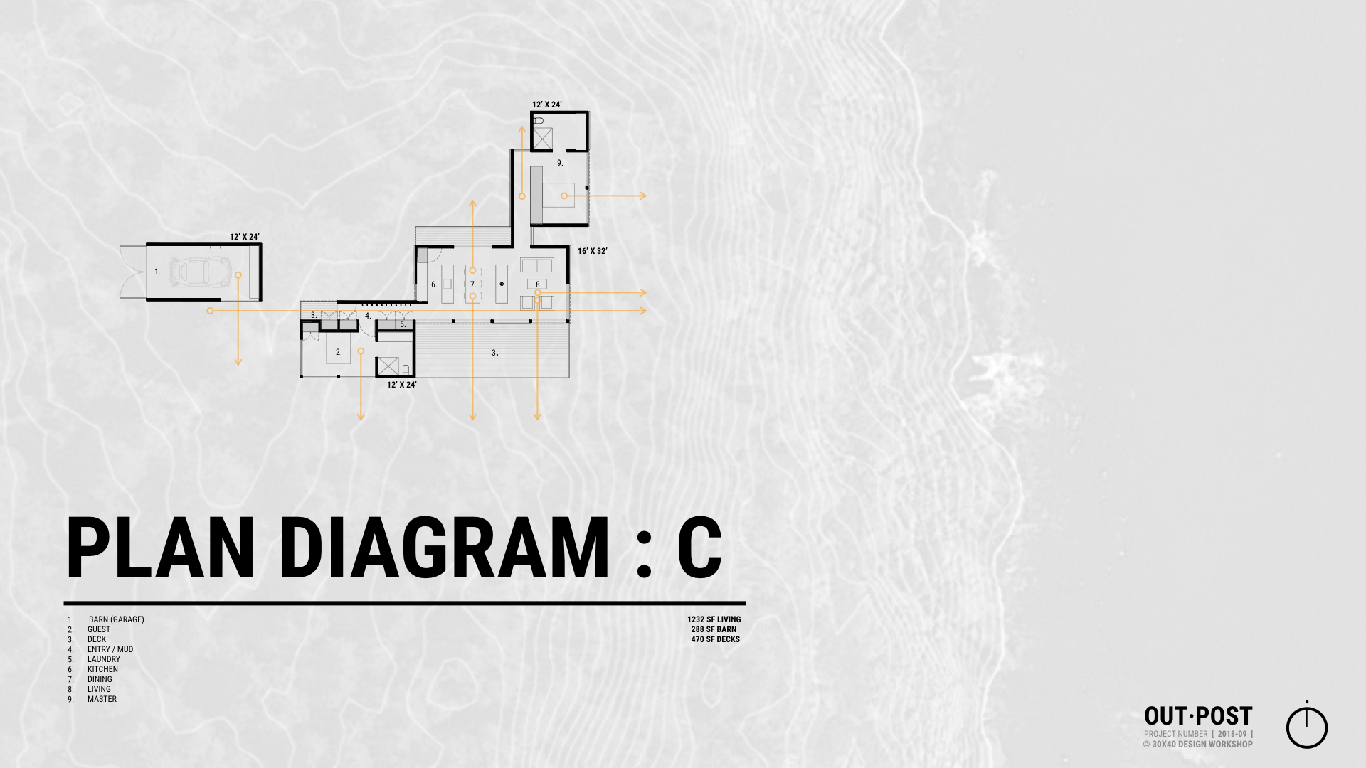
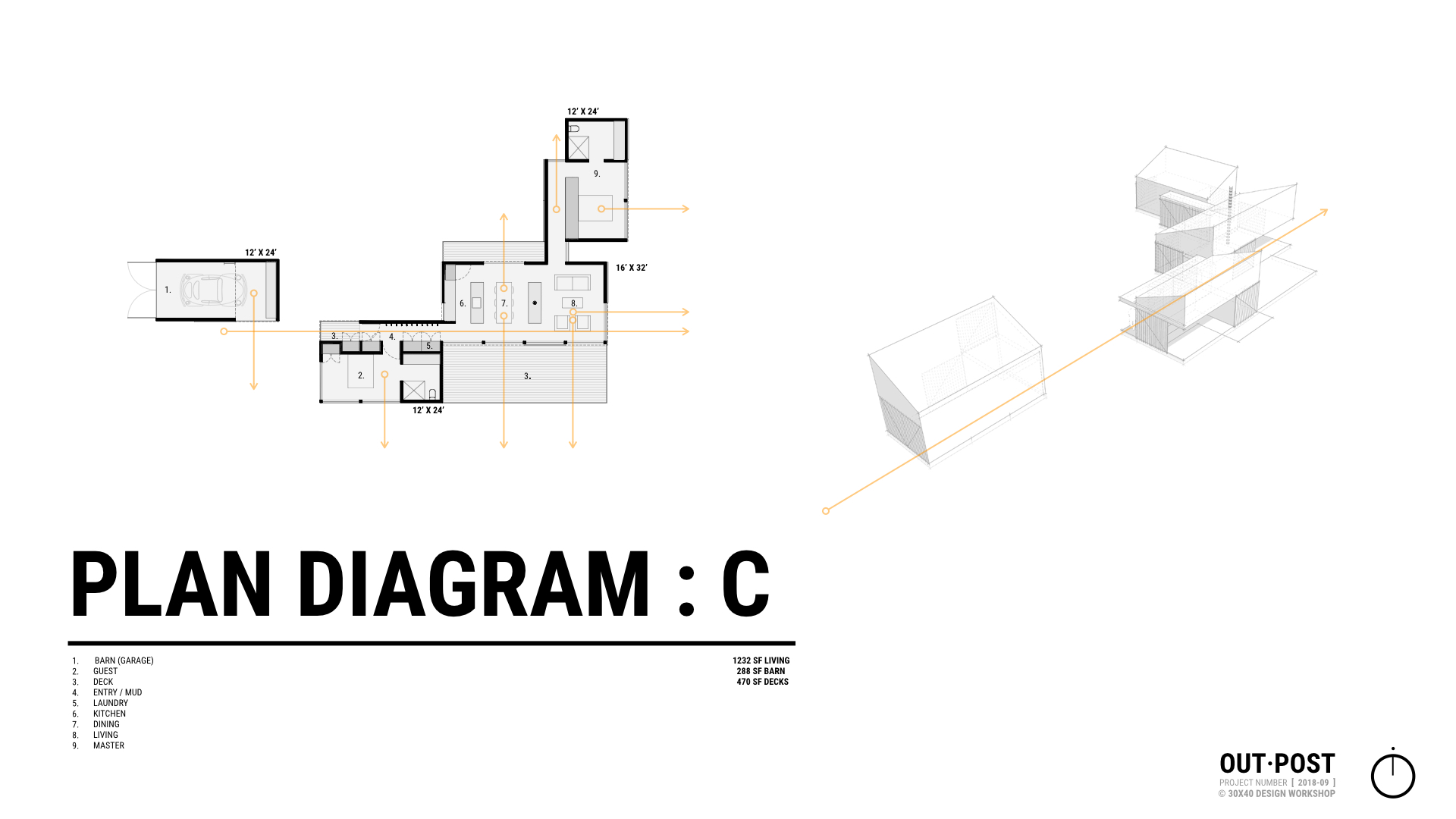
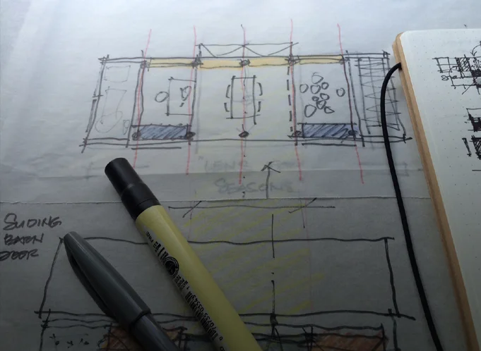
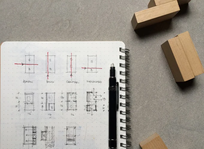
I’ve been in my studio workspace for about four years now and as my needs have changed it was time to adapt the studio to meet new demands. As a destination separate from my home, yet still nearby, the separation has worked out well but hiring an intern for the summer meant I needed a dedicated workstation. And, I knew that the storage situation needed improvement. To make room, I started by decluttering and removing all the non-essentials I had gathered over the years. From there I sketched out a quick plan to rethink the organization and layout. The video shows the refresh from start to finish, more details below.

See the original studio tour video here.

New Workstation

The studio workspace was designed to adapt to a variety of functions. When I first moved in, it doubled as a music practice + performance space in the off-hours for our two boys and their friends. This practice space took up a full third of the floor area and was the most obvious place to locate the new workstation. With the instruments relocated to the main house, it was time to place the new furniture.

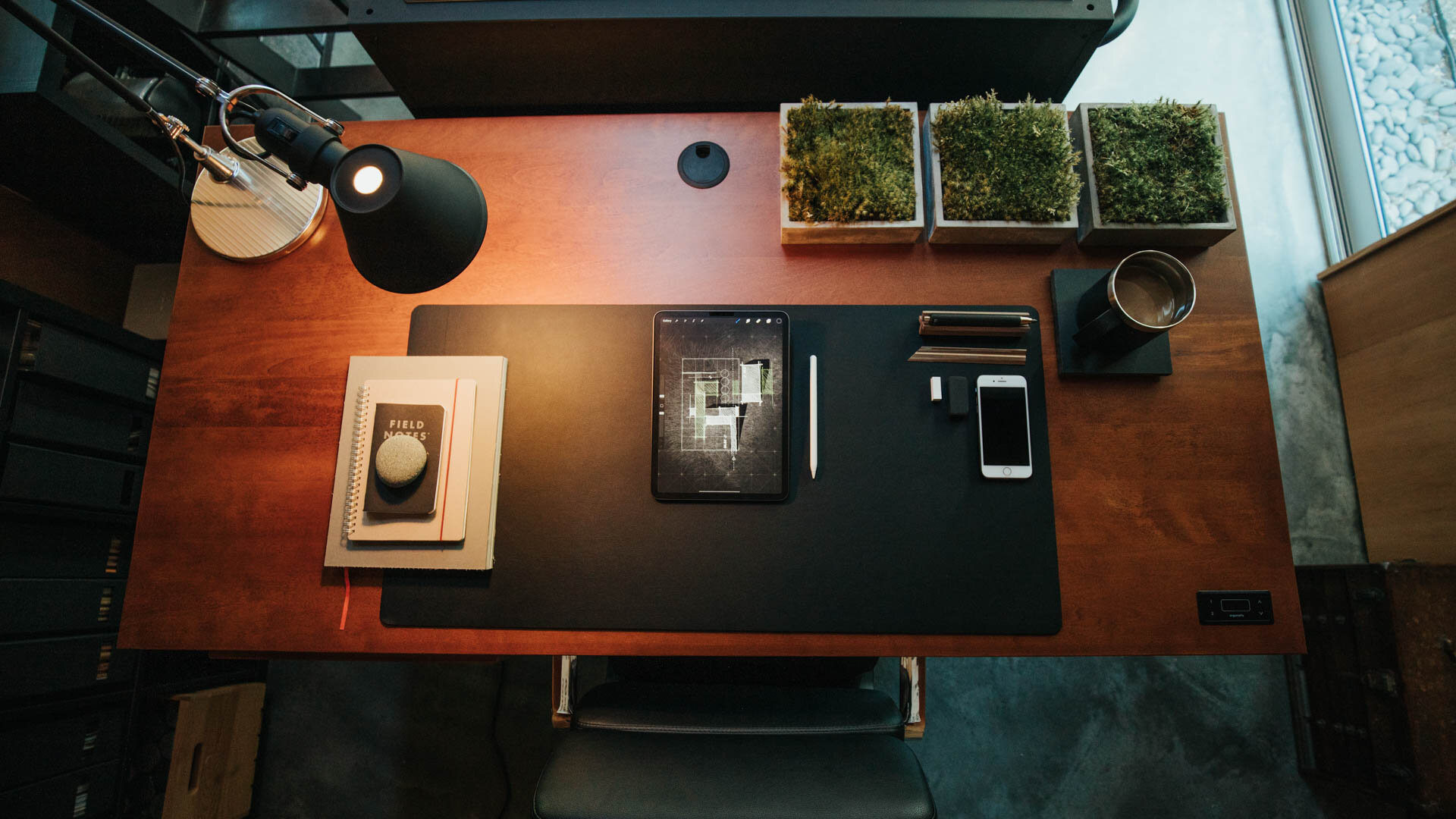
For the work surface, I chose a sit-stand desk with a massive, solid birch top and a flexible solution for a space used by multiple people. At 60” wide by 30” deep there’s plenty of room to accommodate everyone’s needs. The black hardware and natural wood top tie in with the other details in the studio. In a small space like this it helps to maintain a limited color palette so everything plays well together, here we’re using natural wood tones, browns, blacks and grays.

For seating I picked up two of the Soho drafting chairs by Laura Davidson. With heavy-duty cast aluminum bases, plush seats, tilting backs and removable arms these were a solid upgrade from my old creaking drafting chair. I swapped out the casters for roller blade style wheels for a quieter ride on the concrete floor.

New workstation (Sway desk by Ergonofis)

New workstation (Sway desk by Ergonofis)

On the Desk

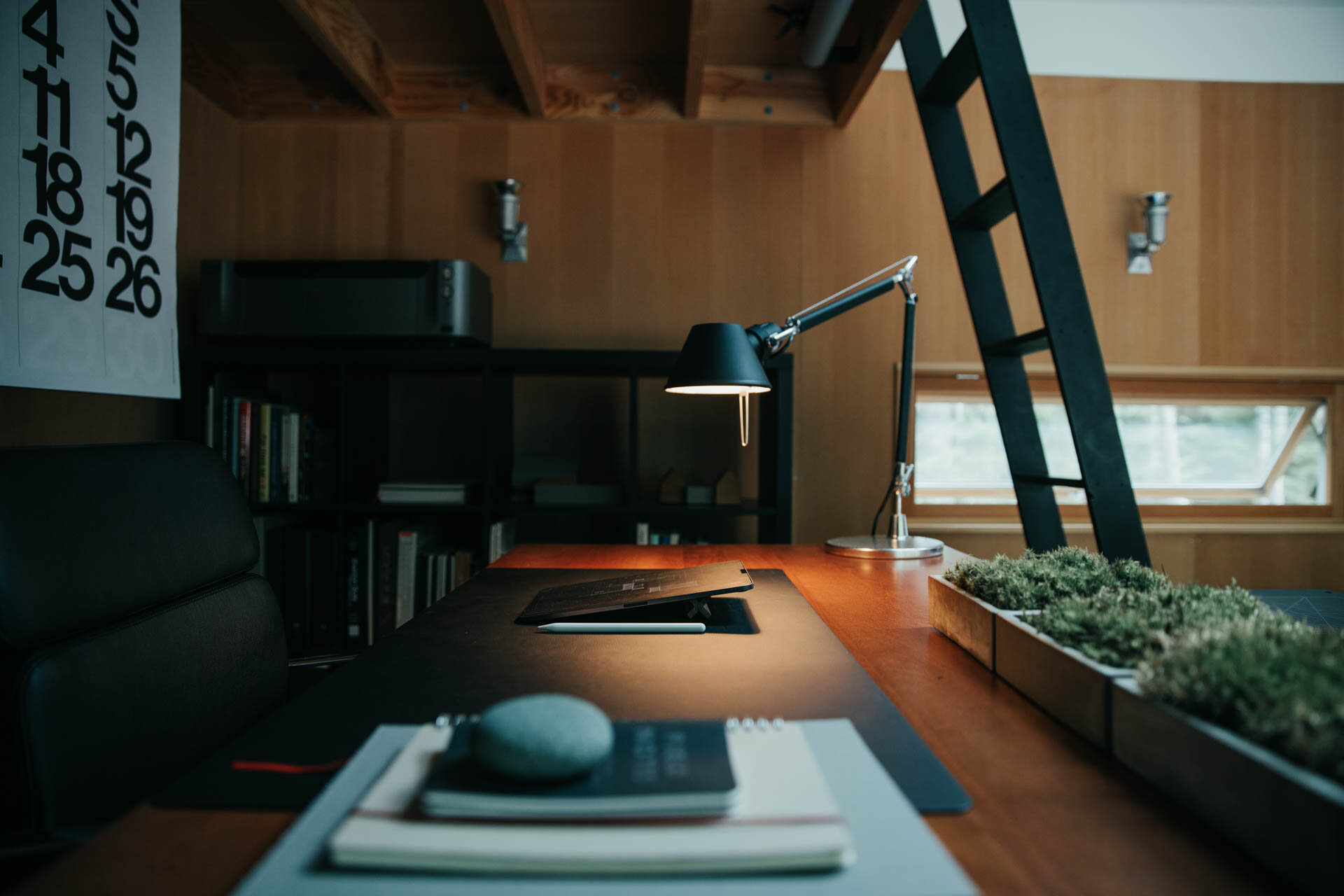
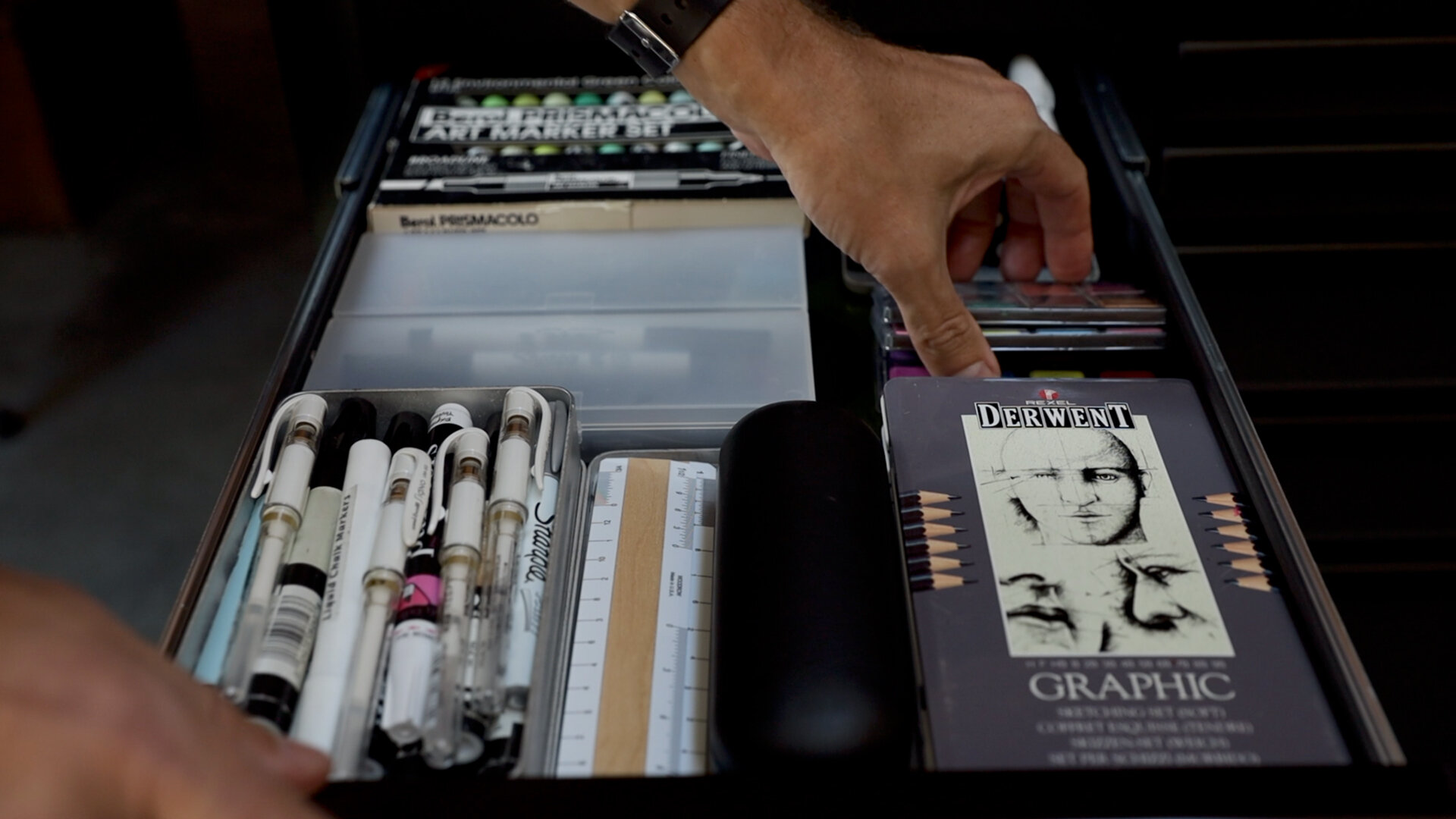
I removed all the knick-knacks, trays, external drives, and unnecessary clutter from my desktop and consolidated my small essentials (scissors, pens, pencils,) into a simple steel cylinder divided into four quadrants. To ground everything I purchased a large linoleum desk pad and swapped out the standard white apple keyboard and magic mouse for the space gray versions. I blacked out the front and base of my 27” iMac with a skin to complement the other black accessories. The coaster is a repurposed piece of black slate and I added a wireless charging pad by Anker.

Beneath the desk I mounted a black aluminum tray to hold my 8tb Lacie hard drive which stores all my digital files. I tidied up all the cables using split sleeve covers and used small black adhesive hooks throughout the space to keep my cables ordered and out-of-sight. I relocated the bluetooth soundbar that sat on the front of my desk to atop the shelving unit to my right to keep it out of view.

For task lighting, I picked up two of Artemide's Tolomeo mini desk lamps in black, I've always liked their timeless modern look and fitted them with 25W incandescent bulbs (much nicer light to sketch by than LED). Having stripped down my desk to the bare essentials, it was time for the rest of the studio to follow suit.

Walls + Backdrops

Because the north desk area often serves as a backdrop for filming I wanted a something different and darker there. One of the problems with the Douglas fir interior is that it's not a neutral tone, so it affects the ambient, reflected light in the space, which for filming isn’t ideal. Rather than painting the natural wood plywood on the north wall I chose to skin it with MDF and chalkboard paint. I mounted them on concealed Z-clips so I can easily remove them if I want to in the future.

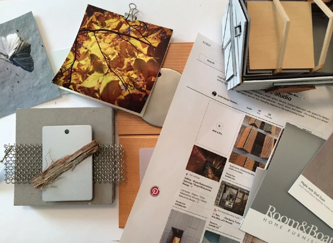
On the MDF I installed two metal ledges from CB2 adding 8' of horizontal display space without taking up any floor area. I'm using them to display material palettes, books I'm reading and various found objects. Concealed along the front of the ledge are two play lights from Philips controlled via the Hue bridge system and their mobile app they serve as practical lighting in the background and can be changed to any color I choose.

Storage

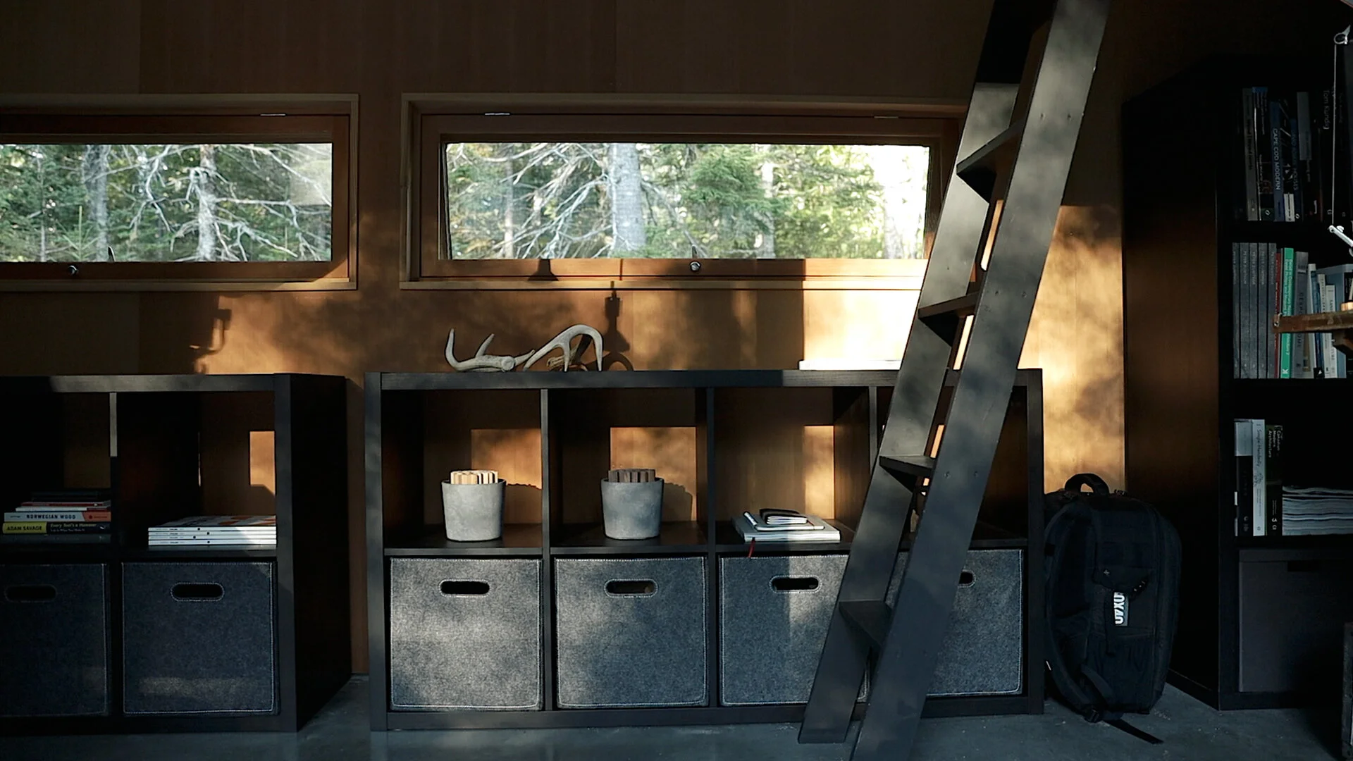
When I built the studio, I didn't have the budget for built-in storage but if you want a minimalist, organized and clutter-free space, storage is essential. I've added two IKEA Kallax shelving units beneath the west windows. The upper cubes I'm using to store objects and as reserve capacity for books. The lower cubes I've fitted with Bladdra felt boxes - also from IKEA - to hold irregular objects and things I don't want out in view and collecting dust.

The rolling tool chest is by Husky, I'm using only the lower portion of the unit in the studio (the upper half holds tools in the basement) to organize all of my studio essentials, kiXstand samples, and camera equipment which still leaves plenty of space for new tools. With eleven drawers of varying sizes and depths it can hold a lot. The shallow drawers are easy to keep organized in a single layer. For the deeper drawers I picked up a few pouches and organizers to keep cables and smaller items grouped together.

The height of the base unit is perfect for making models and for filming or photography projects. My two large Alvin cutting mats live on top and off to the side is a rare earth magnet to hold my rulers and utility knife. When the standing desk is raised, the tool chest can easily meet its surface to give me an even larger surface to work on if needed. And if I find myself wanting additional walking space in the studio, The desk can be raised a little more and the toolbox can roll comfortably beneath it.

Styling

To pull it all together I added a few styling upgrades. I added three new prints adjacent to the new standing desk which cleverly conceal the old guitar mounts and these are matted in ice-white with black aluminum frames. These were printed in-house using Canon's Pixma Pro 100 on low lustre paper an incredible printer for less than $300. (For printing drawing sets, I use the HP T210).

To hide the (off-center!) mini-split heating unit, I picked up the Stendig wall calendar by Massimo Vignelli, which I slipped into a concealed poster sleeve and mounted to the loft floor joists above.

To bring a little of the natural landscape inside, I repurposed four concrete napkin holders by Port Living Company to plant moss in and I picked up a tiny Chinese elm bonsai to live on the corner of my desk. By adding these minor accent pieces, you can bring a certain life and personality to your workspace that can simultaneously make your office feel much more inviting. To this I’ve added a few additional inspirational objects and I finally feel like it’s a cohesive workspace with room to spare.

It's a series of progressive upgrades, an evolved, tidier version of what I started with. Our workspaces are guaranteed to change over time along with our priorities and needs and I love that this is a space that can adapt and change with me.

Check out this and all of my curated kits on kit.co.


Considering a dedicated studio space?

Read more: Five signs it’s time to rent (or build) your own.


Studio Plan diagram


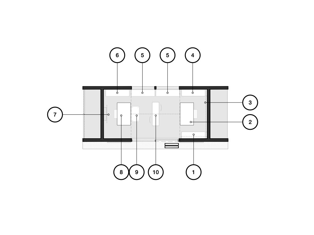
1. Photography/Printing Space: This is where I keep most of my essential photography equipment, from lenses to batteries. In addition, because of it’s proximity to my desk, My printing tools, including the large format printer also live here for easy accessibility.

Above this are two wall mounted cabinets with flip-down tops which hold stationery, pens and my drone (closest to the main door).

2. Main Workspace: Where I spend the most time in the studio. My iMac, Laura Davidson chair, sketching implements and computer accessories all find their place on my vintage drafting table to create a focused and productive work environment.

3. Display Shelves: A pair of metal ledges run behind my desk and are (currently) being used for display. They also hold my play lights by Philips that provide ambient lighting in the morning + evening, and, practical lighting for filming.

4. Book Storage: This shelf contains references, inspirations, information, entertainment, a few personal accolades. The books I keep here are amongst my most-prized possessions as an architect. On top I have a sound bar which streams music.

5. Storage Units: One of the most impactful upgrades in the refresh, these shelves house concealed items on the lower tier and provide buffer space for an ever-growing library above.

6. Shelving Unit: Unlike the unit of matching design on the other side of the studio, this shelf holds a variety of resources: material sample binders, floor samples, magazines, modeling supplies and paint and a few architectural models. For now, the Canon printer also lives atop this unit. It’s a solid choice to produce colorful, frame-worthy prints, but needs a more accessible permanent home.

7. Minimalist Calendar: Although it’s purpose is to cover the - distractingly off-center - mini-split heating head, this calendar by Massimo Vignelli is a minimalist graphic addition to the studio. Every other month inverses the white and black (see images above).

8. Secondary Workspace: The new workspace is anchored by the Sway Standing Desk by Ergonofis. It’s adjustable birch top allows me to be able to easily switch between standing or sitting work environments and accommodates a variety of uses. The Laura Davidson swivel chair is paired with the desk, a comfy upgrade at a fraction of the cost of the Eames Management chairs by Knoll.

9. Tool Chest: One of the largest new furniture pieces in the studio, the Husky rolling tool box houses everything from camera equipment to power tools. I’ve converted it’s available surface so that it when the new Ergonofis desk is brought level, it creates a massive, singular workspace. When the desk is raised higher, the chest can be easily moved under it to provide additional open space.

10. Meeting Table: As more new additions were made to the studio, I found that that the spaces for simply walking had become much too cramped. And given our current situation, in-person client meetings have become a rarity. So I removed one of the tables from the meeting space.


Design, Meet, Revise, Repeat.

The Outpost project enters a new phase as we refine the design and prepare the drawings for construction. This "awkward phase" is a natural part of the design process and working through it always results in a better building, this video illustrates the iterative process all designers use to improve our work.

Time stamps:

  • 1:04 Locating the Screened Porch

  • 1:35 Budget Considerations + Phasing

  • 2:15 Should every space orient to the view?

  • 3:47 Exploring one more location

  • 5:04 Master bed + bath options

  • 5:37 Remote presentations (using Loom)

  • 5:53 Skype meeting + new concerns

  • 8:17 "I find it a little...boring..."

  • 8:36 You are not your work.

  • 9:51 The need for reference images (I use Pinterest)

  • 10:17 Redesigning the Master Wing

  • 14:02 New information = new options


The video opens as we seek to locate the screened porch which I left out from the previous plans. It's natural - especially when building on site with sweeping views - to want every room to capture that view, but you'll see that prefer to position program spaces to take advantage of the full diversity of a site's features, not only the most dominant one.

As I return to the studio to incorporate the changes from our site meeting, I run through several revisions and schedule a Skype call to discuss progress. During that conversation it becomes clear that the master suite needs to be redesigned to create a separate dressing area and group the shower and soaking tub together.

As a young designer, I had difficulty separating myself from my work. Hearing a critical comment from a client (i.e.: "I find it a little...boring..." ) can be jarring at first. Having worked with many clients and heard a lot of critical feedback, I've learned to draw a very clear line. I am not my work. The work is the work. My job is to shepherd my clients through the design process and help them build the home that best suits them, not the one that will look best in my portfolio. It's possible to hold esthetics, form, and function in high regard whilst meeting the client's needs, they're not mutually exclusive.

The video ends with a brief charrette as I sketch and redesign the master wing. As you'll see, this creative friction from my client pushed the design to a new and better place. Having cleared these minor challenges and confirmed the project is on budget, we'll be moving ahead with the design of the exterior shell package preparing for a construction schedule in the early summer of 2020.

If you enjoy these videos, you can support 30X40’s work on YouTube by investing in a course, a toolkit or a digital tool. Many thanks!

Resources

Digital drawing templates

Specification + Schedule templates

Architect's Toolkit (includes the presentation templates shown in the video)

Architect + Entrepreneur Course

360 Cam for Site Shots

Notion template (free) - Organize meeting notes, wikis, to-dos, checklists

Studio Project: Plywood (as a wall finish)

My design studio acts a lab for experimentation, in this video I discuss lessons learned from installing plywood as a finished wall surface. The four main discussion points covered are:

1) Material thickness: 1/2" - 3/4" typical range. NOTE: if you're using sprayed foam insulation in your walls, the plywood covering must act as an ignition barrier for the foam - thickness will be critical. Thickness also affects: translation of framing inconsistencies to the finished surface, stability and price.

2) Panel cores and veneer faces. Steer clear of the Chinese Plywoods. Choose panels from the same lot and age if possible. Veneer plywood has a front and back side; the less banded side is the finished face. Take care when cutting to avoid material blow-out.

3) Attachment. Concealed versus exposed fastener. I recommend a concealed clip as well as a tip for aligning the finished face of the panels (it's a special fastener).

4) Finishing. Determine the project goals first, then select the finish. Mine were: - Low sheen - Preserve natural wood appearance - Easy to apply - Non-yellowing

I review oil-based and water-based finishes, Danish oil, spar varnish, paste wax, natural soap (Hans Wenger furniture), and finally WOCA oil + lye.

For a broader material discussion please see the video for part 1...

As always I welcome questions and feedback; you can reach me at: eric (at) thirtybyforty.com

Studio Project: Concrete Slab (as finished floor)

In this video I discuss five important considerations with a concrete slab that will act as a finished floor:

  1. Installer / subcontractor

  2. Color

  3. Consistency

  4. Control joints

  5. Reinforcing

You might also consider building a mock-up especially for large floor areas to ensure you’re getting the finish you expect.

I finish the video reviewing progress with a time lapse video of the slab placement and finishing.

Framing is up next...

Flat roofs and snow: 5 myths (busted)

In this video I dispel 5 common myths surrounding the use of flat roofs in snowy climates. The very notion of shelter is linked to the image of a roof above our heads. And while the elements of snow and rain may shape our living habits, advances in material technology and application now afford us a broad range of choice when it comes to the shape of the roofs over our heads. Contrary to popular belief, even those of us living in extremely snowy, wet environments are able to live beneath a flat roof. 


Designing a Small Studio - Lighting Plan (Part 7)

In this video I discuss the development of the lighting plan for our small studio project. I begin by discussed the (3) elements every professional lighting plan includes: ambient, task, & accent lights. I also describe a useful guideline for figuring out the amount of light required in a space as well as how I've applied the building concept to the lighting plan.I end the video by discussing a simple affordable fixture, why I chose not to use exposed conduit in spite of the aesthetics, and how to think about the location of your electrical panel (stay until the end for a cool little trick I employed).

Thanks for watching...

Four Homes Built on Boundaries

In this video I explore four homes built on boundaries. It's a look at how a home can challenge the natural environment and occupy the boundary between architectural convention and stunning natural beauty. When confronted with a design brief and an undeveloped site, architects often look to the edges of that site for inspiration and meaningful architectural solutions. These boundaries, both real and imagined, are exciting places to build. The boundary often gives rise to the form of the building, its materials and even how it’s structured.

Designing a Small Studio - Selecting Materials (Part 6)

Materials can be used to convey the underlying concept of a building or in some cases they can function as the entire concept (Peter Zumthor is an excellent example). In this video I detail the process I used for connecting the "lens for the seasons" and "barn" concepts to an attitude about building materials.

I begin with abstract imagery, then build Pinterest boards with inspirational images, then I gather and collage materials. Instead of directly quoting the Pinterest images I draw upon their essential ideas to develop the material palette for the building.

The concepts are hard to compress into a short video (my apologies) if you stay tuned to the end I talk about a quick tip for securing free material samples I recently discovered.

How to Borrow Light

In this video I discuss natural daylighting strategies anyone can take advantage of. I begin with a short history lesson which describes how daylighting actually shaped the largest of cities in the US. In 1915 the 38-story Equitable Building in New York City was the largest office building in the world. Containing 1.2 million square feet of office space, it consumed nearly every available square foot of its diminutive lot and cast an equally large shadow on its neighborhood in lower Manhattan. Its construction inspired the enactment of the city’s 1916 Zoning Resolution, which was designed to preserve access to light and air at the street level. The resolution prescribed specific limitations for a building’s envelope — its outer walls — and would go on to shape the stepped forms that you see today on many of the iconic towers in the city.

This underscores the importance that access to daylight had in shaping even the largest of cities, the individual buildings that make up those cities and, more broadly, sensible building design. With an increasing focus on sustainable design practices, the smart use of natural daylight in our homes is no longer a luxury — it has become a necessity. At the heart of any good daylighting strategy is a concept of “borrowed” light: the capture of light falling on the exterior of a home and transporting it to the spaces where it’s needed.

Designing a Small Studio - Building a Study Model (Part 5)

In this video I discuss the benefits of building a small scale, physical study model using the reference project I've been designing: my studio building. Computer models are excellent tools, but simple cardboard models allow real-time manipulation of forms and the development of ideas that don't always present themselves when working in a digital environment.

For me, model building has always been a part of the design process. They help: 1) To study building forms and spaces. 2) For real-time solar studies. 3) With envisioning scale of elements as they relate to the human form. 4) Allow one to explore a variety of material and color options, quickly and easily. 5) One can quickly flesh out ideas in much the same way a hand sketch might, however, model construction uniquely forces you to make decisions about building elements that sketching doesn't.

Future videos will describe sketchy model building hacks and tactics to more quickly build a useful avatar for your architectural project.

Designing a Small Studio - Revisiting and Integrating the Concept (Part 4)

In this video I overlay the plan diagrams on the site plan which reveals a clear favorite. I go on to describe 6 tactics I use to turn a simple diagram into a meaningful floor plan. They are:

1) Study a building precedent (in this case a barn).

2) Develop an ordering system (grid, column layout, geometry, functional). Once it's established you can decide when to "disobey" the rules.

3) Create zones: entry, circulation, storage, living. Divide public and private spaces.

4) Analyze adjacencies - group common functions and support spaces. Make sure their orientation makes sense for the plan location.

5) Refer back to the concept. In this case the "lens for the seasons" concept reinforced the barn plan typology and spurred on new ideas.

6) Create layers of meaning. Begin by thinking about the way we experience space or places and look for opportunities for the building to enhance daily life.

The next video explores the use of small physical study models for solar, material, and proportioning studies.

Designing a Small Studio - Plan Diagrams (Part 3)

Part 3 in a multi-part video series where I dissect the design process for a small studio space. In this video I sketch out the four basic plan ideas I generated for the studio and describe the benefits and liabilities of each. Designing a floor plan begins with an understanding of the site, where the sun is, the winds, the approach, public and private areas and a precise listing of the spaces to be incorporated.

A well-designed floor plan synthesizes all of this information into a simple, logical connection of rooms. The process I describe works for buildings that are extremely simple - such as my studio - as well as very complex structures.

Designing a Small Studio - Inspiration (Part 1)

In this video I discuss the inspiration for the design of my small studio and workshop here on Mount Desert Island. This is part 1 in a multi-part series I've been recording as I continue to refine the design and prepare for the construction of this project. Part 1 discusses the site inspiration and how living on the coast of Maine has informed my design process. My work is site specific, narrative based and craft-driven; these concepts appear continually in my work and I hope this video offers some insight into how these abstract ideas develop into architecture. In part 2, I sketch out the plan concepts and parse the options to show you how I typically begin a project and move through the various options.

Ethanol Fireplaces - An Architect's Review

Two common alternatives to the traditional fireplace that have been gaining favor with consumers ready for a simpler installation, lower maintenance and ease of use are the ethanol and gel-fueled fireplaces. If you’re considering purchasing one, this video describes everything you need to know. In it, I discuss costs, configurations, types, layout, and fuels along with a few caveats.

Concealing the Garage

Cars are among the largest physical objects we own, which helps us rationalize the generous square footage we allocate to them on our property and in our homes. Because of their size, they’re not an easy aesthetic problem to solve. Architects and designers have always struggled with how best to orient the mass and large footprint of the garage. Detached, connected, trellised, to the side, to the rear, beneath — every possible location requires compromise. In this video I discuss various strategies to conceal the garage. In hopes that we can move beyond arriving to the garage door rather than the porch or the front door.

Accessory Dwelling Units

In this video I review the the accessory dwelling unit (ADU), which is an additional, self-contained home located either within or adjacent to an existing house. They're also known as in-law units, granny flats, multigenerational homes, and laneway houses. These offer a compelling solution to the problem of suburban sprawl and are an excellent means of increasing the utilization of existing municipal infrastructure.

I discuss the permitting procedures, restrictions, and general planning framework for the ADU, where to start and the costs involved.

Resources mentioned in the video:

AccessoryDwellingUnits.org

HUD ADU Model Ordinance

Lilypad Flexible Home Initiative

Design Inspirations

This is a short list of the threads and inspirations that have been influencing my work lately. Some lurk just beneath the surface, waiting for the right opportunity, the right site or the right client, while others are more thematic and make appearances again and again. I hope they’ll help to replenish your creative stores and inspire you to see the world around you through a new lens.