Watch and follow along as I draw a floor plan for a new residential project in AutoCAD. See the settings, lineweights, and graphic conventions I use to make my drawings beautiful and readable.
Read MoreSketching Details for a House (my analog + digital process)
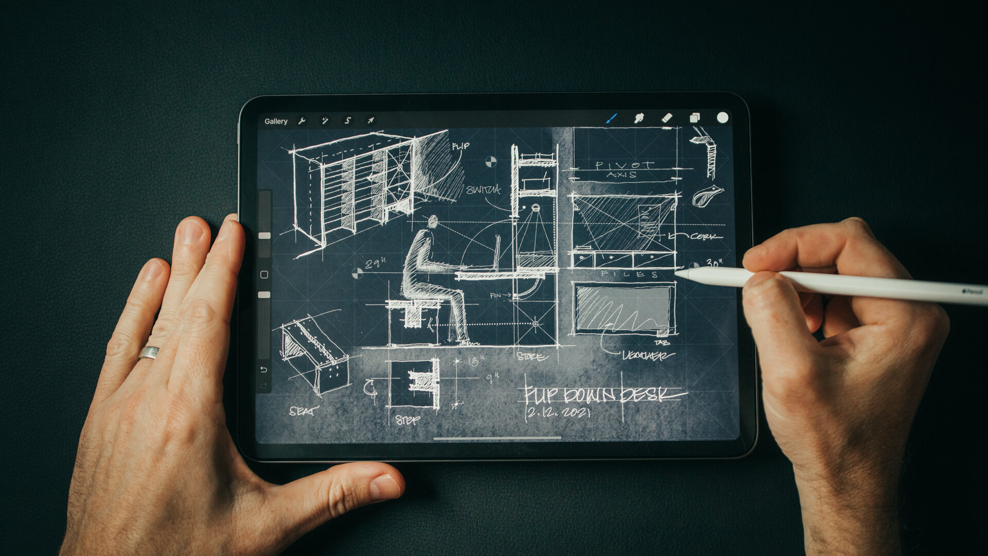
Sketch with me in this video as I design custom details for the Outpost project. Inventing bespoke solutions to design challenges is the reason I love designing homes. The places you brush up against and interact with each day are a chance to invent novel solutions to common problems like how to hang your coat in a mudroom or an informal flip-down desk to write a check. And, quite often, if I'm stuck on a design brief, I’ll zoom in and begin sketching a detail. There’s something about the scale and how manageable it is to solve simple problems that helps me move forward.
For me, this process always starts with a design brief and my sketchbook (or iPad). Once I’ve fleshed out a few ideas and a direction for the design I’ll move into the computer to draw it more precisely. Starting informally with a sketch allows me to be free and fast with ideas and it leads me to other threads I hadn't anticipated. You'll see this in the video as I chase down a few of the more absurd ones.
Before sketching I also like to compile inspiration imagery (like the military field desks you see in the video) and I make sure to have a ruler nearby as I'm designing. Relating to the human scale is an important part of detailing and a ruler helps you set proper proportions for drawers, desk height, etc.
A trick I use as I'm drawing is to really think hard about the daily patterns of life around the subject I'm designing. How would someone use this space? What would they have in their pockets, what would their daily routine moving through or around this space be like? Placing yourself there and asking what would make this experience better, or more "delightful" leads to novel insights. Delightful is kind of a corny word but it’s the best descriptor I can think of. It's the thing that makes you smile when you see it, and say, “Wow, they really thought this through! They really considered what it means to live here, in this place.”
The point of sketching is to chase down all the bad ideas, all the strange threads of thinking, including the absurd. Be open to thinking differently and the invented solutions may surprise you. It's important to not to put too much pressure on it, these aren’t beautiful drawings, they’re process, they show the steps from one idea to the next.


Tools Used:
Trace Sketchbook (designed by 30X40 **new for 2021**)
Project Materials


Material Palette:
Cork panel “Ebony”
Matte Black - hardware + light fixtures
White Oak Plank Floor - “Wheatfield” by Carlisle Wide Plank Flooring
Felt
Beach stone (sourced on-site)
Cocoa mat
White oak - Whitewashed finish
Leather, Antique natural (Edelman) - desk surface
“Anthra” Zinc
Sketching in Isolation - Work From Home Skill Building
Feeling the pressure to make the most of your time in isolation to learn new skills + be productive? If you haven’t quite lived up to your own lofty expectations of what you should be accomplishing, you're not alone. Spend 30 minutes with me in my sketchbook and learn what's been working for me as I design an invented architectural folly.

Time spent in my sketchbook is focused and without distraction. It’s space to think and be creative without the strict boundaries of budgets and schedules. It’s reminded me that not everything I design needs to be rooted in reality, that daydreaming and suspending the laws of physics have value too and can nourish my architecture practice in meaningful ways. Inventing imaginary architecture can be a source of control in a time when agency is in short supply. For me, it’s been an enriching, liberating win in this time of quarantine. I hope spending a few minutes with me in my (digital) sketchbook designing a Quarantine Chapel - whatever that is - will inspire you to get lost in your own sketchbook for an hour or two. And, if you build a few skills along the way, all the better!
DOWNLOAD the 30X40 PROCREATE PACK
Assets Used in this Sketch (most are custom + included in the 30X40 Procreate Pack):
App: Procreate
Canvas + Color palette: Blueprint
Brushes: Kuru Toga, Soft Colored Pencil, Sign Pen, Dotted Line Round, Dashed Line, Clouds Structured, Willow Charcoal.
Stamp Brushes: 45-degree grid, Target, H-uman
Vegetation Brushes: long grass, grass 3, deciduous 1 + deciduous 2 trees
Tablet: iPad Pro 11”
Stylus: Apple Pencil (2nd Gen)
Screen: Matte Screen Protector
Track to sketch to: Code Orange - Underneath

Quarantine Chapel Sketch - 04.17.2020

kiXstand
An Incredible Resource for Architectural Inspiration
With more than 581,000+ architectural drawings, photos, and documents to download and use as you please, I couldn't keep this incredible resource to myself any longer. The HABS (Historical American Buildings Survey) along with HAER (engineering), and HALS (landscape) are a collection of building surveys from the American architectural, engineering, building and landscape culture maintained by the Library of Congress in Washington, DC. In this video, you’ll peek in the collection and see how I use it in my architecture practice.
The program was born in the 1930's during the Great Depression as a means to put unemployed architects to work with a mission to preserve and document the architectural heritage of America. Since then, the archive has catalogued more than 43,000 individual structures and more are added each year.
I use it for: creative inspiration, precedent research, to improve my architectural drawing, graphics and delineation techniques, and to study details from some of America's most famous works of architecture.
If you enjoy these videos, you can support 30X40’s work on YouTube by investing in a course, a toolkit or a digital tool. Many thanks!
Architectural Sketching (techniques + tips)
Looking for all the links to my essential sketching tools? ( Here they are )
Below you’ll find the images shown in the video along with the media and tools I used to create each.

Copic markers (link is for the neutral gray set) YR20, N2, N4, N6, G40, G94
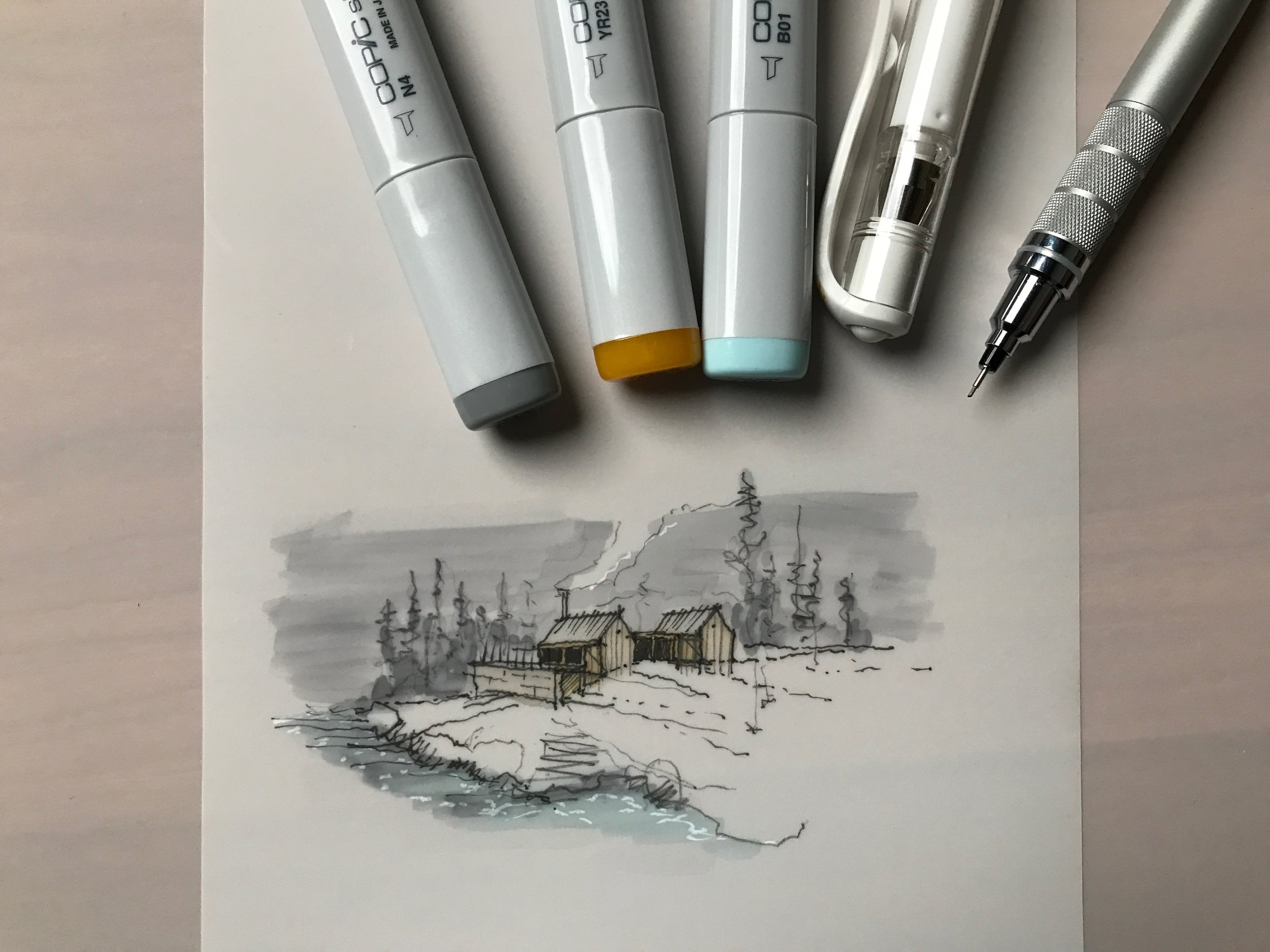
Copic markers (link is for the neutral gray set) B01, YR23, N4
Copic markers (link is for the neutral gray set) YR20, N2, N4, N6, G40, G94
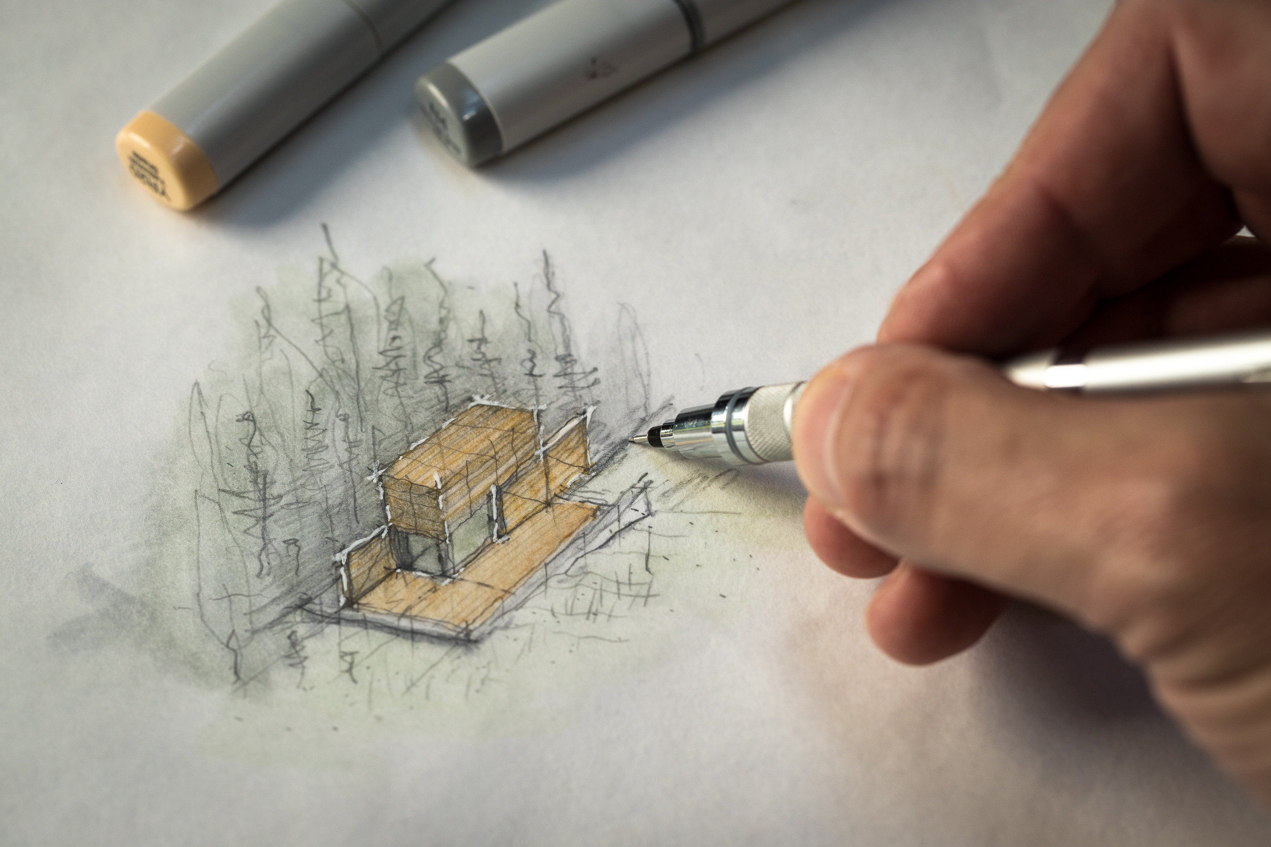
Copic markers (link is for the neutral gray set) Y18, YR20, N4

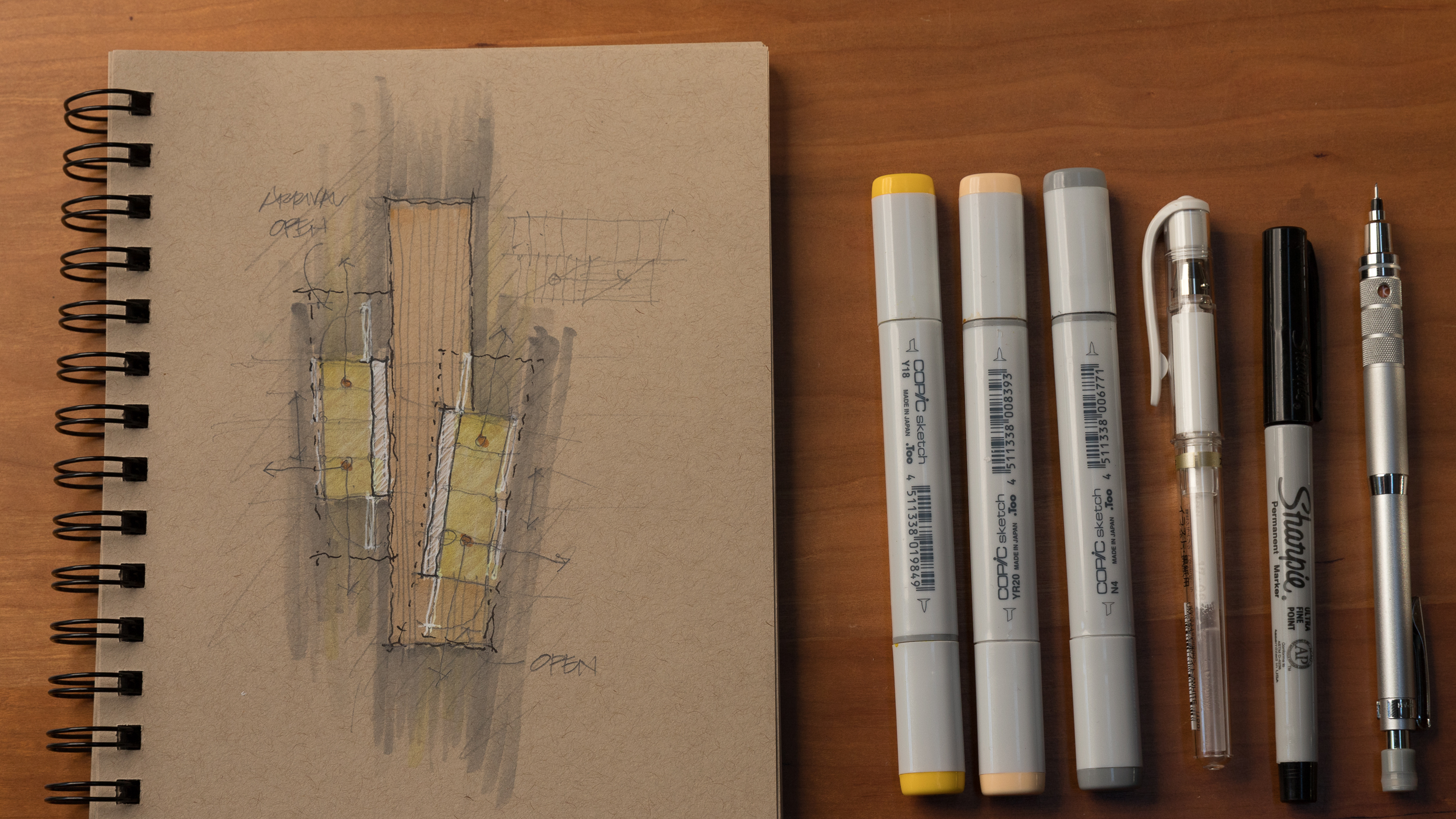
Copic markers (link is for the neutral gray set) B01, G40, YR20, N4
Inside My Sketchbook - An Architect's Essential Tools
A look inside my sketchbook as I start a new project and review my current favorite sketching tools. See my go-to paper, pens, pencils, markers; everything in my everyday carry kit for sketching.
Instead of the chronological approach I've used in the past, I now dedicate entire sketchbooks to individual projects, tasks, or idea categories. I've found this helps me to organize information and find it quickly when I'm searching for it later.
Sketchbook
BLANK Sketchbook - Custom designed + manufactured by 30X40
Pencils
Kuru Toga .5mm - I use this for sketching currently. If you prefer a chunkier lead, try this lead holder clutch made by E+M
Pens + Markers
Accessories
Floor Plan Design Tutorial
In this design tutorial I'll show you how I develop and sketch floor plan ideas quickly. From diagram to rough sketch and on to more formalized plan layouts, you can follow along as I show you everything you need to draw a floor plan using one of our new residential projects as an example.
I discuss in detail:
- why you should start with diagrams (and not floor plans)
- information you'll need before drawing
- tools I use and recommend
- tips for developing better ideas
- form, space, and order (of course)
- using grids
- scale
- and what I listen to when designing...
Architectural Plans Tutorial - How I Draw Floor Plans
Want to see all of my tools + gear?
In this architectural plan drawing tutorial I'll walk you through the exact settings, line weights, pen styles and layers I use to develop digital architectural drawings for my residential architecture practice. We’ll focus on how to recreate the floor plan you see in the thumbnail image below. You'll also learn how architects choose what to draw, how we approach our drawings conceptually, and how we organize information.
I use AutoCAD for all my drawing work right now, but you can do this with any tool you have on hand: pen, pencil, Revit, another BIM software, whatever you choose. Tools don’t make the drawing, you do. I use probably the most primitive form of CAD there is, Autocad LT; so that’s proof in itself that you don’t need multiple thousand dollar BIM software to make nice drawings. Use whatever tools you have available.
An architect’s job is to order things and this certainly extends to our drawings too. There’s the organization of the linework on the page - the layout of the sheet - and there’s also the order of information that you’re depicting - the overall drawing hierarchy. Each requires that you know exactly what you’re trying to communicate. Now, I want to keep this simple for this tutorial so I’ll really just be going over how I draw floor plans but the principles apply to all the different types of drawings. The goal of a floor plan is to show the relationship of the spaces to one another, all the physical features of the interior and exterior spaces and to precisely describe the real dimensions of those relationships. It also serves as a sort of overall map to show the team of tradespeople – the ones you’re relying on to construct your architecture - where to look for supplemental information. So it’s naturally a diagram; we can’t show everything, we have to decide just what’s important and leave out the rest.
A floor plan is an overhead view of a horizontal cut through the building usually taken at 4’ above the floor level and of course, it’s drawn to scale. And so, the first ordering principle is that the things you’re cutting through – primarily the walls – should always be the heaviest lines on the page. So key concept number one has to do with lineweight, and if that’s a confusing term check the video in the cards for another tutorial where I describe exactly what that is and its importance.
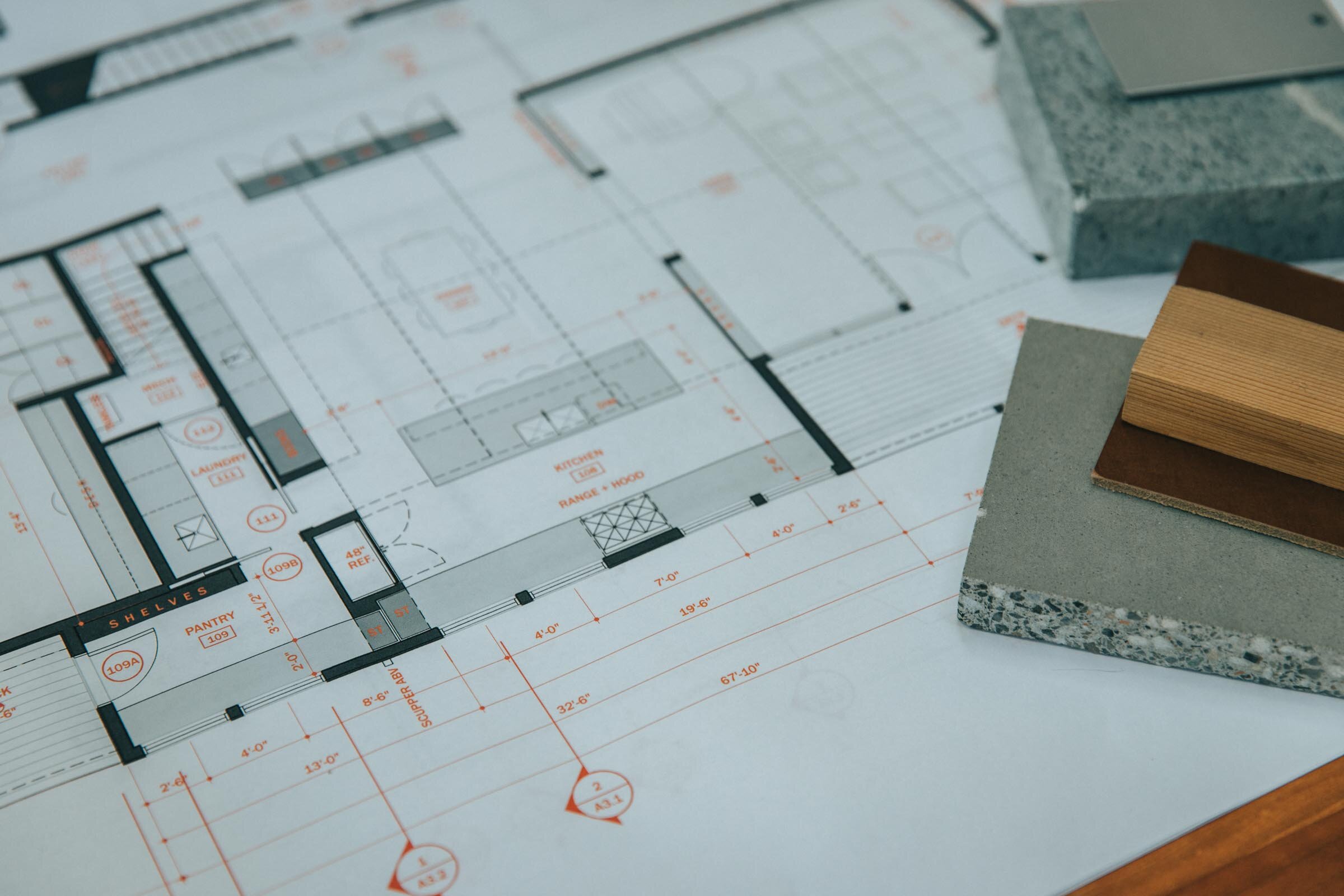
These drawings look this way because there’s a strong contrast between lineweight the very thin lines and the very thick ones. In CAD when we’re drawing we draw on different layers. Each layer is transparent and they stack together to form the drawing. You can control what you see and what you don’t by turning layers on and off. Separating things into layers allows us to modify our lineweights – among other things – to quickly change what’s being depicted as heavy and what’s not. The process of design involves many changes, so keeping things organized on separate layers will allow you to change things efficiently. Now, I like to keep things ultra-simple and for this exercise especially: I set up my layer groups by lineweight, that’s all. Some architects and consultants use hundreds of layers and I suppose in some cases it makes sense assuming you need that level of control, but I recommend starting with just a few. Mine are in a template file that I use to start new drawings and they’re described very simply: from heavy all the way to superfine. I also have a few additional layers which are helpful: one is for annotations – things like text, dimensions and detail bubbles, one for hidden lines – to show something above or below and then one for hatch patterns. I can turn off any of the layers I don’t need, so I can work more quickly or in a less-cluttered environment. So, you may need more or less depending on the type of work you do, but this is a nice simple place to start. Any heavy lines you want to draw, you’ll put on the heavy layer, very thin ones on the superfine and so forth. In this way, it’s a bulletproof system for forcing you to pay attention to lineweight, which is – I think - the most important thing in making your drawings graphically convincing.
My CAD program is setup to print these lines according to their color and color is assigned by layer. So if I’m drawing on the heavy layer, the line is always white and white always corresponds with a certain line thickness. Make sense? White is always associated with a certain thickness which is set in - what Autocad calls - the color table. But all of that is not really important, because whether or not you’re not using Autocad you can simply change the thickness of the line. In Autocad I use polylines to change thickness but there are other ways even in autocad and your software might call it something altogether different. By changing thickness, this adds even more control over how much punch your drawing has and what’s nice is that it’s clearly visible on the screen as having a heavier lineweight. Now, if you start making really thick lines everywhere just appreciate the fact that when you change the scale you’re printing your drawing at, the lines will look thicker or thinner so just be aware of that. For the quarter inch scale residential floor plans I’m drawing here, I like to draw the outer edges of the exterior walls on the heavy layer and add a little extra punch by using a 1” thick polyline. If you make a template drawing with a variety of thicknesses in it, you can adjust to whatever scale you’re printing or working at. If you’re drawing by hand, lay your walls out first, then come back later and add a heavier outline with a softer lead or darker pen.
To get into the nitty gritty, on the floor plan drawing, exterior walls are assigned to the heavy layer and I show them as a 1” thick polyline as I said. The medium layer is very close to the heavy one in weight and so I use it for accenting things like the top risers of stairs, or site retaining walls, or site boulder groupings. I use the ‘light’ layer for floor edges, door slabs, window frames, counters, cabinetry, and plumbing fixtures, while door swings and window sills I put on the superfine layer. Also on the ‘superfine’ layer I put all the wall sub-assemblies, things like stud framing lines or substrates like plywood sheathing or tile backer. But, more on this shortly. Furniture is drawn on the extra-fine layer, floor hatches on the hatch layer, cabinets and counters are hatched differently depending on how tall they are too. Overhead lines are on the ‘hidden’ layer and text and annotations are on the ‘text’ layer, again more on this in a minute.

The next key concept is to use screening. Now, I’m not talking about hatches per se here, but using screened pen weights. I use everything from a 10% screen all the way up to an 80% screen. In my color table - the file that tells my printer what to print - I’ve assigned the colors 201 – 208 different corresponding screened pen weights. So, anything assigned color 201 prints as a 10% screen, 202 is 20% and so on. And, you can apply this to your thick lines for even more control over how something looks and for even more variety, you might change the linetype too. Take a 1” thick line and assign it the 201 color and a hidden linetype and now you have a thick dashed line with a 10% screen which might be great for showing ventilation runs on a floor plan for example or use a solid one for a handrail or a louver vent in an elevation.
You can also apply this technique to our next key concept which is: using hatches to add depth and detail. Hatches are basically patterns that infill certain boundaries in your drawing, they can be made up of tiny dots, shapes, crisscrossing lines or dash-dot lines, or – my personal favorite - solids. When you start using hatches along with the screened pen weights, you have nearly infinite options for creating depth and subtlety in your drawings.
I use hatches to shade in the exterior walls – what architects call poche – in this drawing it’s an 80% screen on a solid hatch so color 208 on the hatch layer. I use hatches to indicate materials: like wood flooring, concrete block or tile patterns and I also use them for shade and shadow to call attention to something important in the drawing. On floor plans I use a variety of scales of dot pattern hatches on say descending stairs or as angled lines to show a partial height wall or cabinetry or a countertop surface. I also use solid screened hatches on all my glazed surfaces on exterior elevations, from between 40 and 60% screening. I use them in for the tree backgrounds too the ones you see here in the elevation drawings. I basically use them everywhere I can because they help call attention to things that are important and they add a softness to the drawing that I think looks I don’t know, painterly I guess.
Scale elements: By adding furniture, scale figures, cars, trees and other elements to indicate scale you’ll introduce a real sense that your architecture is meant to be inhabited. Doing this also ensures you’re accommodating the regular elements your end users will need to functionally use the architecture as well. Knowing your client wants to use an 8’ sofa will help you locate the floor outlets nearby and ensure it’s not obstructing a door swing.

When you’re drawing plans it’s good to begin thinking about materials and systems too. It’s okay if you’re missing this information early on and you’re working on conceptual plans, but I like to begin with at least some idea of how I’ll be constructing the building. For example, is it a masonry exterior? Is there a glass curtain wall? Concrete, wood framed walls, finishes, each of these materials has a thickness and when you start to turn corners and add jogs or if you begin intersecting different buildings or surfaces, knowing what those materials are becomes really important when you’re drawing.
Your final floor plan drawing can be as general or as detailed as you’d like, but the more detail you imbue your drawing with, the more useful a tool it will be later on when you’re drawing column details or figuring out how the glazed wall meets the concrete retaining wall. When I begin drawing a plan, I choose a wall thickness and some basic finishes as a starting point. So here I started by laying out the exterior face of the stud wall on the superfine layer. For our squid cove project we actually started with a double 2x4 stud wall on the exterior spaced apart to prevent thermal bridging. So I offset the outer perimeter by three and a half inches the width of a 2x4 wall, and then a quarter inch for the break, then another three and a half for the inner stud wall. Then I offset the interior finish thickness of ½” for the gypsum wallboard, then on the outside 1/2” for the exterior sheathing and another inch for the exterior shingled walls, Now, along the way, as the pricing came back for the double 2x4 wall system it was a lot more expensive than we anticipated so we had to change it back to 2x6 walls. Now, because windows take a long time to fabricate, this change actually happened after our windows had been ordered and so those openings were fixed on the plan, we had to use those openings. So, we were left with this detail at the interior corners to resolve. Knowing the actual systems and sizes of everything around them allowed us to design the trim around the windows that not only matched the detailing on the rest of the project but made it look like it was an intentional design decision. So when you can, show finishes. They also fill in this fine layer of linework that makes the contrast between thick and thin really pop.
Lastly, sort of the icing on the cake, we have the annotations. Annotations round out the information you’re conveying on the plan. They’re really important wayfinding tools for the contractor so they need be very clearly organized. I use red text to make it clear that the annotations are a part of another ordering system and also something they need to pay attention to. And, the ink is just pennies more to print them in color, honestly…I think it’s so worth it. You could make it blue or gray too, whatever you choose. I like the red because it’s easy to point to a note and say, it’s noted in red, hard to miss, right? This works in both directions by the way, so if it’s your mistake it’ll be pretty apparent! Annotations describe things you’re not able to draw, they reference other drawings and details, and should all be on the ‘text’ layer so you can turn them on and off as needed for presentation or while you’re making other changes to the plan. Annotations grow over time, they’ll be basic at first things like room labels and they’ll get progressively more numerous as you make design decisions. Now, I’m begging you please…please, please…don’t use those hand-lettered fonts…just uninstall those from your computer. I use Franklin Gothic for mine, but anything but the chiseled pseudo-hand lettering should be fine.
You’ll know you’ve done this all correctly when you squint your eyes and you can easily see what’s important. Do the walls stand out? Do the annotations fade. As you spend more time looking for information, more information should become apparent, almost like a pull focus or slow reveal. Light lines of the hatches should be the first to fade and last to come into focus.
So that’s it, I hope it was helpful!
If you want my template, there are two versions available:
AutoCAD template
Revit template
Drawing Like an Architect
In this video I share my essential tips for better architectural drawings. It's easy to forget that architectural delineation is part of our craft and - I believe - beautiful drawings communicate more clearly.
Important concepts discussed:
- Lineweight (and the pens I use: http://thirtybyforty.com/sign-pen )
- Atmospheric perspective
- Drawing technique
- Tracing paper (my favorite: http://thirtybyforty.com/trace )
- Corners
- Iteration
- Foreground, middle-ground, and background
- The 'squint' test
- Shade + shadow
- Entourage