Notion for Design Professionals

We all want to use our time efficiently and minimize effort spent on the administrative side of our design practice. Searching endless folders or open tabs for links to products you swore you found last week, trying to recall the milestones you agreed to or where the current Gantt chart lives and share it with the team isn’t a good use of anyone’s time.

I use Notion for all of this and more.

Notion has served as a second brain for me for a few years now; it’s the best “all-in-one-productivity and project management tool” I’ve found for both personal and professional documentation. It’s intuitive, capable and infinitely flexible; a blank canvas that can be almost anything you want. The open-ended structure is a strength when you know how to use it, but can be a little intimidating when you're just getting started and unsure of how to set up your workspace.

If you’re unfamiliar with it, watch the videos below to get set up; continue reading if you’re already using it see how I’ve set my workspace to run my design practice.

Getting Organized

Every Sunday I plan my Weekly schedule which is simply a favorited page that resides in the upper left corner of my workspace. I use the Maker’s Schedule + Manager’s Schedule as the structure for the week to keep me on-task. Also notice the annual objectives (set in the video above) are just a click away and serve as a reminder of the bigger goals and priorities I’m working toward each year.

I used to live in my inbox with the window open and collecting emails all day long. Every notification lured me back to the inbox, wasting my time and distracting me from the deep work that needed doing. The work that would push my business and projects forward. Maybe you can relate?

Using Notion has changed that. Now, I live in my “Week of” board which makes explicit the priorities I’ve set on Sunday rather than my inbox which is filled with the priorities of others.

Week Of Schedule Page (click the image to enlarge)

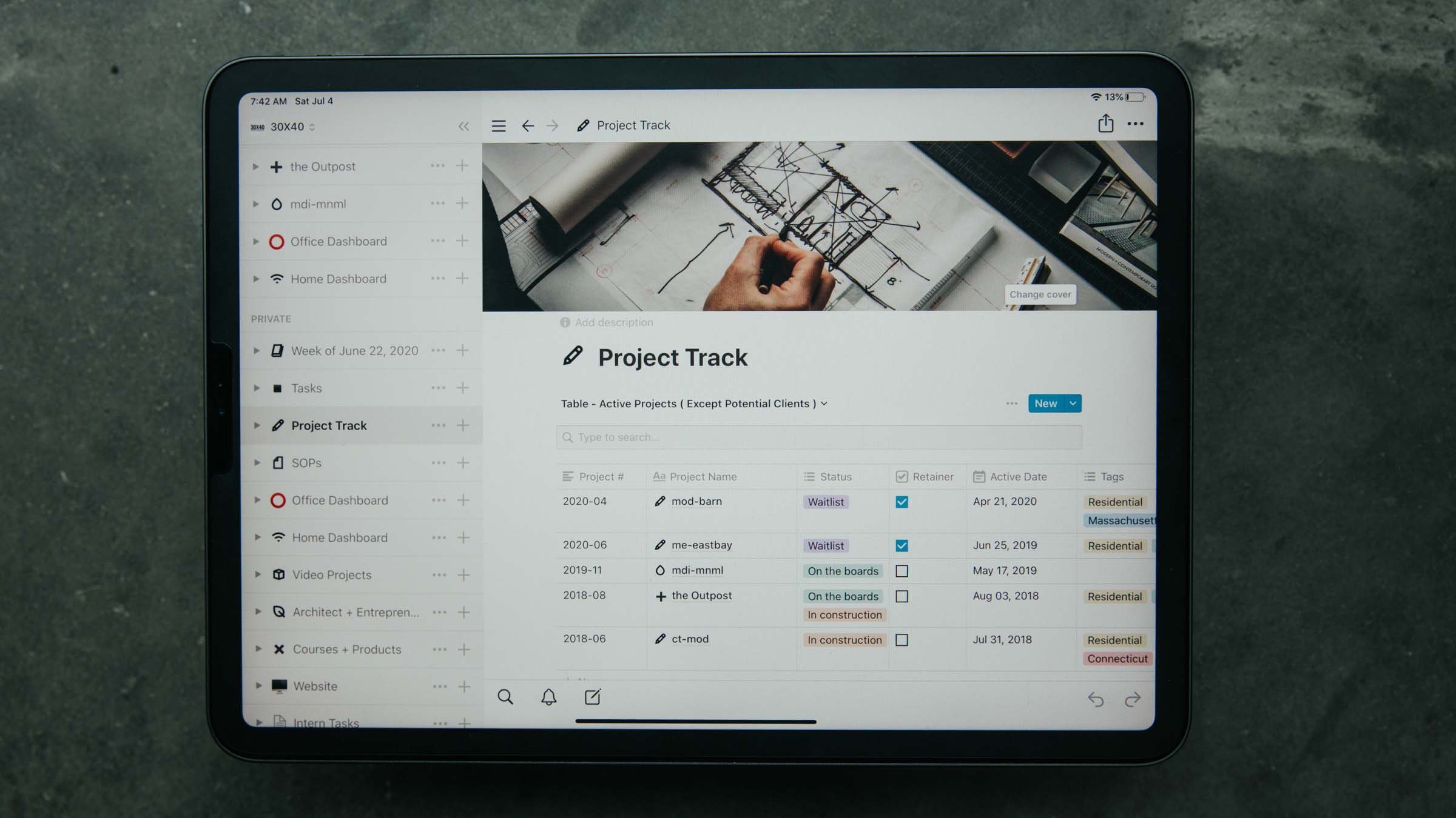
Below the schedule, I keep two to-do lists, one related to home the other for the business and a task table which is linked to my calendar. This is a great place to catalog recurring tasks you might otherwise neglect: like your annual architecture license renewal, LLC document filings, annual reports, etc. I also use it to schedule my regular monthly invoicing, which is something I’ve been getting better at over the years. I invoice every client, every 4 weeks, no matter what (setting a reminder in the task table is really helpful when you have multiple projects running).

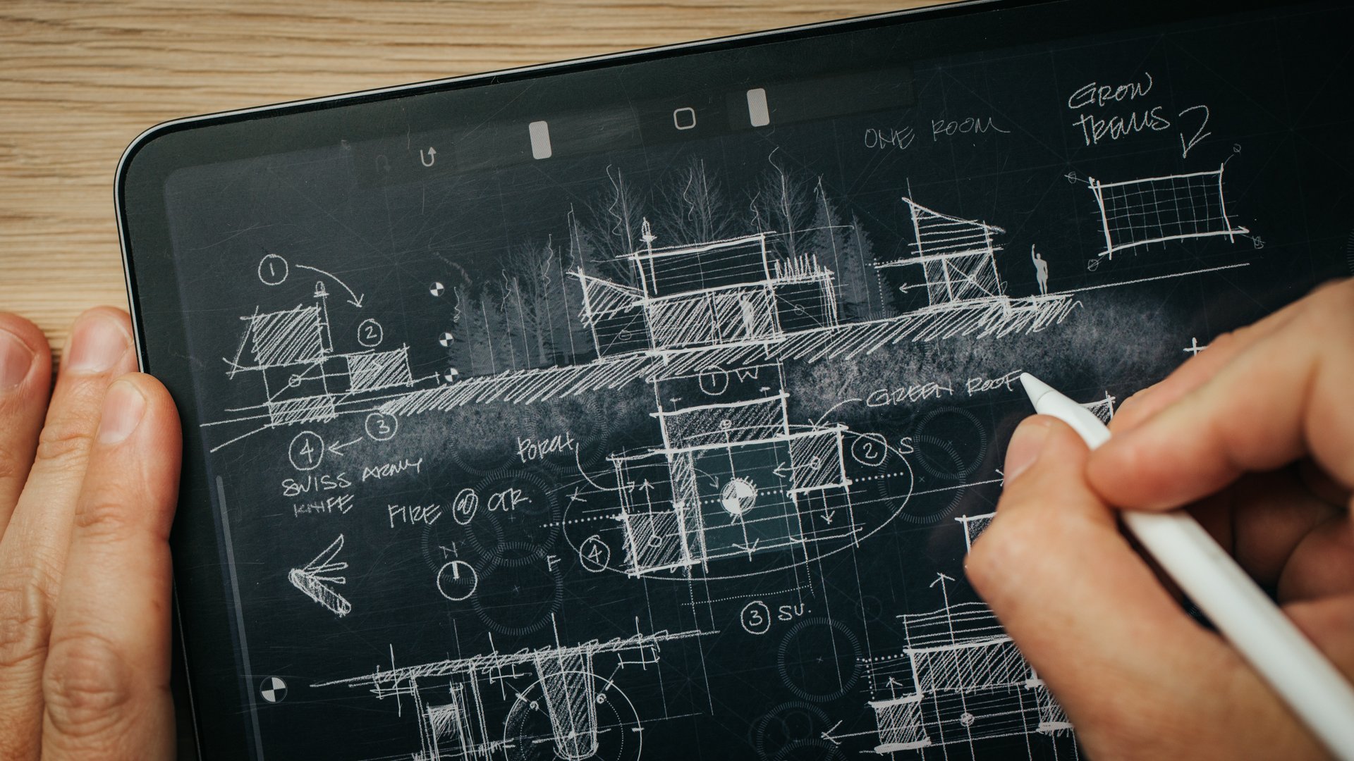
Sharing Inspiration Images with Clients or Team

Embed images from site visits

When entering the task on the table, you can use tags to assign it to a project, a person, or anything you choose. Then, on the project page, you can copy this table and filter the view to show only those tasks related to the project, or a team member, or any other tag you’ve set up. The tables are called ‘databases’ and are the key to unlocking the true power of Notion. If you’re running a team, each member can utilize a custom dashboard showing only their projects, tasks and deadlines.

This summer I’ve had an intern working in the studio and I build out the weekly task list each Sunday for the week ahead so it’s clearly laid out for them when they arrive on Monday. I can include links to SOPs and all the project files and information they need in one place. This saves both us time and limits questions (“Check your Notion dashboard”).

Task Table

Filtered Task Table for a Team Member

Any project specific commitments can be embedded directly in the weekly schedule by pasting a link to the project page or, even links to specific blocks from any page. In the schedule above you can see I made a site visit on Wednesday afternoon and the To-Do list for that project is hyperlinked right in the schedule. Clicking on it brings me to the project dashboard and the in-progress items for each stakeholder are immediately visible. Each toggle by the stakeholder can be clicked open revealing the outstanding items, documents and anything related right there.

Below that is a task table with a filtered view of the tasks related only to this project.

Project Dashboards

Dashboards are simply a collection of the various building blocks available to you in Notion: text, images, hyperlinks, images, videos, tables, quotes…the list is long. I create one for each project, and once you have a format you like you can turn it into a template to use for all projects (download my template to see the one I use).

When starting a new project this template brings over all your office standards in one click. My project template has an embedded a project brief, meeting notes templates, site visit templates, design and documentation checklists, code and site analysis information, client and contractor onboarding information, links to questionnaires, task tables, and more.

Don’t let this overwhelm you, all of this can be built out, customized and added to over time to suit your needs.

Creating custom dashboards for clients with all the project information you want to share - current drawings, checklists for next actions, contracts, permits, invoice due dates, and project wikis - empowers you and your clients/collaborators to seek out the information they need rather than picking up the phone, emailing, or worse - texting you - to ask! Simply share the project dashboard and teach them to check there for updates.

Project Specific Task Table

Checklist Example

As design professionals, our work involves handling an abundance of information. From site and field documentation, to client and contractor requests for changes, to design ideas and inspirations; all of the administrative tasks of project management can easily crowd out the exciting work that drew us to this profession, which for most of us is design.

I've found that Notion has provided a framework that's easy to keep updated with to-do checklists, preconfigured systems, a place to collaborate with clients, consultants and contractors, and a place for me to collect and organize all of the administrative minutiae in one place. No more stickies lining my monitor's perimeter, or bookmarked links in random folders; when it's project-related, I have a place to paste it and keep track of it.

Download my template and watch the videos above for more details on how it can help organize your professional practice.


Still not convinced?

A few more Reasons I use notion

In the past I’ve used Trello, Asana and Evernote to run and organize my business operations. While Evernote was searchable, it was messy. Trello and Asana were as customizable as I had wanted. And implementing templates and systems with each was hit or miss. These are some of the strengths of Notion and considerations when choosing a new tool:

  • Easy to use + implement

    • Onboarding with Notion is simple; a very low learning curve. Advanced features unlock more potential, but take longer to comprehend and integrate. It can grow with your needs.

  • Systems Oriented

    • Templated work will save you time managing your projects + administrative tasks. Notion allows you to create custom templates for almost anything you can imagine: projects, notes, files, tables, etc.

  • Collaborative

    • Sharing Projects + Pages with clients and collaborators is easy and allows everyone to see the most up-to-date files, checklists and information. You can assign tasks and comments to others by right-clicking on any object, assigning a due date and custom requests.

  • Searchable

    • Notion allows you to find the information you’re looking for quickly and reliably, listing every instance of your search phrase while typing. Evernote used to be amazing at search but the more I loaded it up, the less functional it became.

  • Customizable

    • Collating various media is important for our work as designers: images for reports + inspiration, video embeds, hyperlinks, product ideas + references, notes, checklists, tables…Notion has them all. Simply click the + to add. Dragging blocks around is intuitive so you can create the structure that suits your needs.

  • Graphically Pleasing

    • With a minimal interface, Notion can be what you want. Add images, banners, colors, etc. Out of the box, it just looks good and if I’m sharing this with clients I want it to be representative of my brand.

Building a 30-Minute Study Model

The digital tools of architecture practice are always changing, but I think most architects will tell you that analog tools - sketching and model making - are an unchanged part of their design process. I find making things by hand - the craft of it - forces me to slow down, to think and to explore. It’s often a failed experiment that pushes the work in a new, unexpected direction.

The design process always begins with a sketch and the idea I’m exploring with this new project is how the home can amplify the specific conditions of the site, from the topography to the weather and the changing seasons. The sketch is purposefully open-ended and left open to multiple readings. It’s not a fully formed idea and so to further explore the concept I construct a study model. I use it to study the building forms and site relationships and it’s essentially a three-dimensional sketch.

In the video watch as I turn the conceptual sketch into a working study model which I'll then use as a presentation and design tool for an upcoming client meeting.

Finished Study Model

Material List:

  1. Model base: 1/4” tempered hardboard (Masonite) on 1” thick corrugated cardboard

  2. Building Volumes: 1/16” Basswood Sheets

  3. Barn Doors: Basswood Profile Sheets + Guitar String Detail

  4. Interior Massing Blocks: Jenga + Cast Acrylic Samples

  5. Roof planes:Quartz Zinc’ Sheet

  6. Ground planes:Anthra-Zinc’ Sheet (water), ‘Quartz Zinc’ Sheet (parking surface)

  7. Decks: Skinny Sticks + Match Sticks

  8. Trees: SuperTrees

Tools Used:

  1. Sketchbook: TRACE Sketchbook (for more on my sketching tools, see this page.)

  2. Ruler: Alumicutter - proven to save fingers.

  3. Architect’s Scale

  4. Utility knife: Olfa L2 + blades

  5. Allex Stainless Steel Scissors - quick cuts on a variety of materials: paper, chipboard, wood

  6. Cutting Mats: 18x24 + 12x18

  7. Modeling Tweezers - immensely helpful for all modeling tasks

  8. Hot Glue Gun - for quick + dirty modeling tasks

  9. Elmer’s Glue-All - purchase in bulk, rack over to a small bottle to save time while gluing.

  10. Machinist’s Square

  11. X-Acto Plastic Clamps - an extra set of hands

  12. Gorilla Tape - for mounting metal pieces (like the roof planes)

Model in Process

What's In My Bag - Architect Essentials

Time spent on construction sites has unquestionably made me a better architect and improved my design process. During construction, I visit the job site as often as I can, it’s the best way to avoid surprises and keep the lines of communication open with the construction team. In the video below you’ll see how I prepare and pack for these field visits and all the gear I bring with me.

Pre-Planning

Before I head out, I always have an organized plan for the visit because the job site can be a busy place and this ensures I don’t forget anything while I’m out there. I use Notion for this as it syncs with all my devices in real-time. I have checklist templates for each stage of design and construction. Each includes a list of everything I need to bring and remember to do while I’m there. My general rule is to build templates for every repeatable process in the business and Notion makes it easy to create SOPs (Standard Operating Procedures).

With my checklists and meeting agenda done, I check-in with the drawings and previous meeting notes to familiarize myself with the work I’ll be reviewing and I update my iPad with the current PDF version of the contract documents: the drawing set, schedules and specifications.

The type of visit and stage of the project determines whether I’ll bring one or two bags. The backpack will always travel with me, it has all the essentials and I’ll bring along the tote for bulky or difficult to pack items.

Let’s start with the backpack.

BaCKPACK

I like camera bags for site visits and leisure travel and LowePro make some of my favorites. This is the ProTactic 450AWII and at 45 liters it’s definitely not a small bag, but it hits that perfect sweet spot for me. It’s large enough to fit a few extras but not so large that I can bring all the gear I own. It forces me to make some strategic choices while packing.

It has a clean, low-profile, semi-rigid exterior shell covered in MOLLE webbing which gives it a tactical vibe and I picked up a bag of MOLLE clips to fasten things to it as-needed. It came with a padded hip belt which I removed, and a few accessories which I can velcro to the shell (a tripod foot cup, water bottle holder and a small bag) but I prefer the clean exterior especially when I have to slide it into an overhead airline bin.

Most of what I’m carrying with me isn’t camera gear, but the reason I like camera bags is because of the padded interior dividers that I can easily change to suit whatever it is that I’m carrying. For site visits I like having separate compartments to keep things organized and protected and for travel I can set it up to carry my camera gear, a few tech pouches and some personal items, it makes a great day pack.

Cameras**

I have three cameras that travel with me, the best quality images and video come from my mirrorless DSLR, the Canon EOS R has been my go-to camera for a few years now. For lenses, if I have to choose just two for my site visit kit, I’d choose the Canon EF 16-35mm f4L IS for it’s wide field of view. And, for details I’d opt for the Canon EF 100mm f2.8L IS Macro. These allow me to capture most spaces I encounter on a typical job site - from very tight interiors and broad exterior facades to intricate details.

I also bring along a Pelican SD Card Case and a few extra batteries.

**(More on my camera gear here)

I recently added a 360 camera to my kit, the Insta360 OneX2 can be set up in the center of a space, connected to my iPad and in a few seconds I can record of construction progress for an entire room. It’s been a huge timesaver. I’ve also been using it to record memos as I’m walking through a space and, because the videos can be recomposed later in post, I use it to view areas I may have missed during my visit or export them to send to the client for discussion and general progress updates.

For aerial photography, terrain mapping, inspecting hard to reach places, and social posts I like having a drone with me. I still use the Gen 1 Mavic Pro from DJI, but if I were buying new today, I’d opt for the new Mavic Mini for its (even) smaller form factor and because it includes a controller. My current setup needs both a dedicated controller and an iPhone connection to fly.

Photos and video are an invaluable resource and I’ll often refer back to them as I’m writing my field report, or reviewing payment requisitions to verify the stage of completion of the work. I’m always glad to have a visual reminder of everything behind a wall finish - blocking, plumbing, gas lines - once it’s covered up.

Tablet/laptop

Inside the padded back panel is a sleeve that fits up to a 15” laptop, which I’ll usually bring for longer trips ( I use the 14-inch MacBook Pro ). For site visits, the 11-inch iPad Pro (+ Apple Pencil) serves as my daily driver. Most often I’m using the camera and Procreate to work through details in real-time on-site, or working through the meeting checklists in Notion and, of course, I keep all the updated drawings, specs and schedules there too. It’s impressive just how much space the iPad has actually freed up in my bag.

Tote

The tote bag I’m using is the Yeti Camino 35 and it’s a massive upgrade from the old LL Bean canvas bag I had been using. The large compartment has a zippered pocket on each side and two pop-out pockets at each end. Similar to the camera bag, I like the organization this affords. The molded EVA bottom stands on its own so it’s easy to load and unload and the puncture resistant shell is ultra-rugged and, because it’s completely waterproof, I can hose it out after use. When I’m camping, I can use it to haul water from a stream and the intermediate cross bars gives you different carrying options which is especially nice with heavier loads. They’ve even thought of details like a closure hook to keep larger items contained.

I use this bag more than I ever thought I would. Most often I’m carrying heavy material samples, reference books or catalogs to and from the job site. It also holds my water bottle, my tripod and it’s especially useful when I’m doing work on undeveloped sites holding my 100’ tape measure, flagging and reference documents. Its’ utility extends beyond the job site: I use it for car camping, the beach, and kayaking trips too and, the size perfectly complements my backpack giving me just a little additional overflow space.

It comes with a hefty price tag ($150) though, so you may want to mark it as your own. I made a little velcro-backed nameplate which I cut out of a scrap piece of zinc and mounted a custom sticker to for mine (see the video for details).

EDC (everyday carry) + PERSONAL ITEMS

Scattered throughout the bag are my everyday carry items. In the translucent pouch on the back flap, I always carry a sketchbook with me. Currently it’s the TRACE sketchbook with a subtle white reticle on 90# vellum. The translucent pages are great for iterating ideas and take ink, pencil, even Copic markers without bleeding. I also use the BLANK Sketchbook with the subtle dot grid, debossed cover + elastic closure. If I’m traveling and unplugged, I tend to prefer analog sketching to digital and it serves as a travel diary.

For site visits I’ll always bring a 25’ tape measure and a roll of painters tape. If it’s early in the design process I’ll also bring a 100 tape and surveyor’s flagging. I use them for checking dimensions, confirming layouts and marking areas that need follow-up. If I’m meeting with a client, taping out a seating arrangement on the floor or testing various shelving heights or TV sizes can be immensely helpful. You’ll notice in the video that I printed up a few sheets of stickers with my business name on them and I use them to tag my gear. This avoids disputes with popular site tools (like tape measures) and ensures all my things land back in my bag at the end of the visit.

To keep things connected and charged I have a 30000 mAh solar battery charger with ports for all my devices, and a tech pouch to keep cables organized. The SD card case by Pelican helps me stay organized too, when a card is full I put it in the case upside down so I don’t overwrite it.

The bag has a tiny pouch for SD cards, but I prefer to keep mine in a Pelican Case so I’ve repurposed it to hold an Apple AirTag. My iPhone is set to immediately alert me when I wander too far from the bag, or someone walks off with it.

EDC Links:

  1. Braun Watch - I replaced the band with a rubberized one.

  2. Bellroy Wallet - the magnetic closure is fidget-friendly

  3. Northwall Multitool / Key - Box opener, prying tool, screwdriver. I use this frequently, it’s tiny and TSA compliant.

  4. Coast PX15R Flashlight - Fits the tactical vibe of the bag and it’s rechargeable. High power, focuses between flood and spot, + clip.

  5. Kuru Toga .5mm Mechanical Pencil + Lead

  6. Tombow Click Eraser - for precision erasing

  7. Apple AirTag - cheap insurance to keep track of your bags + valuables.

  8. Vintage H. Chapin & Son #12 Boxwood Folding Ruler

  9. Bellroy Pencil Case - More details on everything in my sketching kit here.

  10. Derwent Color Pencils

  11. iPhone 13 mini + MagSafe Leather Case

Mentioned, not pictured:

Some of the links in this post are affiliate links. Clicking on them and purchasing costs you nothing extra, but I receive a small commission which helps support my work on YouTube. Thank you!

Moving Forward + Looking Back

In that quiet period between Christmas and New Year’s I always sneak an hour or two to reflect on the year as it draws to a close. I make note of what’s gone well and what hasn’t gone to plan in both my personal and professional life. I do this using Notion and this year I wanted to share my annual review process and let you in on the changes I’m making in the new year.

Read More

What's in a typical custom architectural plan set?

All architectural drawings are representations - abstractions - of what we intend to build. The two lines that make up the wall segments drawn on a floor plan aren’t enough to describe what the wall should be constructed with. So we rely on three main devices to convey that information: drawings, schedules and specifications. Together these documents organize and catalog all the decisions necessary to build our project in a very precise way. In this video, you’ll see everything I include in a typical set of custom documents from start to finish.

By any account, this is a lot of information to include. Consider this though: anything we don't delineate, anything that's not called out in the construction documents is a decision we’re choosing to defer to someone else to make, whether that's during pricing or in the field during construction. In general, I prefer to control and direct as many design decisions as possible, so I choose to draw and call out as much as I can in the studio where making changes is relatively inexpensive as compared with on-site where every move comes at great expense.

Creating "a tight set of documents" means we’ve taken the time to document the full range of decisions required to construct the project as designed. A tight set of documents will answer every question that arises along the way, from pricing through construction. Importantly, we don’t leave things to chance, we use our set to describe very specifically the design decisions we've made with our client prior to construction. The value of this is that it helps our clients feel confident that what’s been decided during the design process will be realized in the final home, it protects the architect as the author of the design against unwelcome surprises in the field, it helps the general contractor and the sub-trades to accurately price the project and ultimately to stay on budget and on-schedule as we're building because everyone knows what's expected.

More resources:

New tools for the Studio (iPad for Architects)

Do you really need an iPad as an architect, an intern or student? See if any of the four uses I came up with resonate with you. Having always sketched on paper or trace with pencil and ink, a tablet never really appealed to me or seemed entirely useful. I wasn’t sure how it would fit into my workflow, but the Apple pencil and Procreate have changed my mind.

Read More

Architecture, Design + Photography (podcast interview with Trent Bell)

A conversation between two architecture school graduates with similar approaches to work + life who followed two very different paths. This video is an excerpt from my conversation with Trent Bell an award-winning architectural photographer (Trent Bell Photography) as we chat in my studio. You'll also join us behind the scenes as he photographs one of my residential projects. For the full interview be sure to check out Trent’s Architecture, Design & Photography podcast, (video here) a project he’s launched in cooperation with Maine Home + Design magazine. See all the photos we captured that day here.

NOW

I’ve been wanting to make a “Now” page for a while and I’m posting here to introduce it. A “Now” page is just a collector…a place to post all the things that are inspiring my work + thinking in the studio right “Now”. My Instagram page used to be the place to do that, but fighting with an algorithm took some of the fun out of it for me. I found I wasn’t posting some of the pictures and work that I really wanted to…like the one below for example. I hope you’ll head over there to check it out (and maybe start your own).

Smoked Whitefish, Christmas Eve 2018 [ Photo: Eric Reinholdt, 6DMKII 100MM f2.8L ]

Smoked Whitefish, Christmas Eve 2018 [ Photo: Eric Reinholdt, 6DMKII 100MM f2.8L ]

Why Do Architects Make Models?

Architects build scale models for many reasons: they're a form of three-dimensional sketching, they help us visualize how light will illuminate spaces, they help us analyze the best forms, spatial and material relationships. Even with so many digital tools that are faster, more accurate and easier to change architects still build physical models, why?  In part, because the act of making and manipulating things with your hands has been shown to produce more efficient, more creative, and insightful solutions to problems.

Learn more and watch as I build this tiny model in the video.

Drones and Architecture | How Creatives Are Using Technology

An in-depth gear review of - what I think - is the best drone on the market today for architects, architectural photographers, and creatives. I discuss the factors that influenced my decision to purchase the Mavic Pro from DJI, unbox it, and describe the use cases and features architects and creatives will care most about.

Factors influencing my decision to purchase the Mavic: cost, portability, camera quality, ease of use, and flight time. The Mavic Pro managed to come out on top in each category almost every time. 

I purchased the Fly More Combo which included extra batteries, a four-hub charger, a car charger, extra propellers, carrying case and a power hub. See the video for the entire unboxing.

I'm using the Mavic Pro as a portable drone for:
- Project documentation
- Presentation + marketing
- Architectural cinematography
- Site analysis
- Topographic mapping
- Construction observation
- Educational tool
- Lead generation (working with Realtors)

I also discuss the essential accessories and apps you'll need to operate the Mavic Pro
- ND filters by PolarPro, Airmap, DJI Go 4, UAV Forecast, SunSeeker

I close the video by reviewing current FAA regulations regarding hobby and commercial use of drones in the USA.

Design Process - Selecting Materials

This is the third in a mini-series I've created which chronicles the design process for small project I've been working on - the design of a modern Barn Studio outbuilding.  In the first post I talk about how I developed the design concept and the second post describes the evolution of the elevations, which shapes the final appearance of the barn studio. I've recorded a video that discusses the material selection process for this small project.

Read on for the specifics not covered in the video.

Material Ideas

I can never seem to make enough room for material samples in my personal sample library. They take up more room than my physical book collection. For me, they offer inspiration and they speak to who I am as an architect. I’m driven by the process that turns these raw materials into a home. I love how they can speak about a client or a site - it’s part of the magic of architecture for me. 

Selecting materials usually comes from a larger idea about the site, the place, or a specific building reference. For this project, the material inspiration comes from the barn typology. Barns were often frugal constructions clad in whatever materials were locally available to the farmer. Historically, local sawmills would mill the trees felled from a building site into rough lumber. This was used for both the timber frame structural system as well as the exterior sheathing. Wood sheathing was an obvious material choice for the side walls.

Walls

Knowing what material we'll be using is only one aspect to consider. Will the siding be horizontal boarding, vertical tongue and groove, clapboards, shingles? What's the finish? My client requested I consider board and batten in a vertical configuration - this was their image of what a barn was. It wasn't my first choice, but it's a perfectly reasonable and appropriate aesthetic. So that was the foundation for one of the three options. I usually propose at least three options for our discussions. The first is an expected option, usually based on a specific client request. The second is an option they may not have considered at all, something unexpected. The third is usually a hybrid that combines the two - a middle ground. This way we're sure we've explored a range of possibility. There's usually a fourth that comes out of my client's feedback that hybridizes these options in ways even I hadn't expected. I love this aspect of the process.

Back to the vertical board and batten. The reason I didn't like it? The vertical scale of the barn. It's much shorter than it is long. My preference, especially for small structures, is to reinforce whatever the dominant ordering proportion is with the siding. The barn's dominant scale is its horizontal scale, it's length.

To highlight the building's horizontality, I'm proposing a horizontal tongue and groove siding up to the seven foot level. This reinforces our earlier decision to go with a shorter seven foot door and canopy height to achieve a taller, more barn-like proportion. We're tricking the eye into thinking the building is taller than it is by creating this horizontal band with blank wall above it.  Above this horizontal band would then be shingles to create a finer texture, smaller scale and let the upper portion of the structure recede - again this reinforces the scale shift we're looking to achieve.

Roof

For the roof, metal was another obvious choice - an appropriate agrarian reference, with a durable and clean aesthetic.  To me it was a better choice than wood because it has a crisp, tailored look that fits with the tight, simple geometry of the outbuilding. However, the design review committee didn't agree. It was apparently deemed too industrial for the neighborhood. So, wood shingles was a next best option, and this reinforced the decision to use shingles in the zone above the seven foot level.

Doors, Windows, Hardware, Flat Roof

For the doors and windows, hardware, and flat roof canopy element - gray metal and stainless steel. Simple, durable, utilitarian and monochromatic.

Trim

I opted to minimize the trim on the structure completely eliminating the corner trim and keeping the other profiles as narrow as possible. The siding boards are mitered at the corners and the shingles are woven allowing the horizontal lines to continue uninterrupted along all faces of the building. Window trim is minimal at only two and one-half inches wide and it will be stained to match the gray of the shingles.

Color

All siding is left to weather naturally to a gray color. We may use a bleaching oil or weathering stain to control the process ensuring it weathers evenly, but the idea is to minimize any maintenance. Low maintenance is a hallmark of the barn typology.

Site Elements

The main house siding is partially clad in stone and the property has a number of dry-laid stone walls as well. It was the inspiration for the long dry-laid retaining wall to the north edge and it fits well with our neutral gray palette.

So this is the basic process by which I go about selecting the materials. It's informed by a number of factors but there's an overriding logic to the decisions. They're decisions made with intent to achieve certain effects. Decisions drawn not only from an idea about what a barn should be clad in, but also from the proportion and size of the building. We look to the architecture to help us make decisions about the right solution.

I hope you'll continue to follow the process as we move forward with the next steps designing the Barn Studio. We'll discuss lighting and the interior materials in a future post. If you’d like your very own Barn Studio it's available for download. And, there are a few other variations I'd gladly share if you're interested, just drop me a line and let me know.

Design Process - The Elevations

This is the second in a mini-series I've created which chronicles the design process for small project I've been working on - the design of a modern Barn Studio outbuilding. If you haven't watched the first video where I talk about the design concept and how the floor plan was conceived be sure to check that out first. I've chosen this project to use as an example because it's so simple. For an average 2,200 square foot house the back and forth developing floor plans, the site plan, and the elevations typically takes quite a while - several weeks is average. But because the program (the number and types of spaces) isn't overly complex and the structure isn't very large it's the ideal candidate to describe my process. I've recorded a video that summarizes the evolution of the elevation options presented to my client.

https://youtu.be/6Sxg1r8MnVE

Having developed the concept and designed a series of working floor plan options around that concept my next step was to submit it to my client for their review and comment. Our dialogue revealed the things that were working and the things that weren't working about each of the concepts. I request that my clients are honest and upfront about likes and dislikes, I have a thick skin and my goal is to design a structure that meets their needs - not mine. Iteration and revision is fundamental to the design process. I sketch, design, draw, erase, redraw, submit for review and iterate again. While this back and forth was abbreviated because of the scale of the structure and the limited number of decisions to be made, larger projects can take quite a while to finalize the plans. In every project I'm in a constant state of revision and reevaluation. If I find an opportunity to make something better along the way, even when I'm much further into the design process, I do encourage the revisiting of prior decisions when better alternatives present themselves.

My client had some really useful feedback which I then incorporated into the plans in preparation for the next steps. For me, that step, is to define exactly what the exterior of the building is going to look like. This means materials, proportions of walls, windows, doors, lighting, roof shapes - everything that makes up the exterior look and feel of a structure.

Read on for a few of the insights that didn't make their way into the video.

Proportions

The first and most basic step when designing the exterior elevations is to develop an initial proportion. There are two things that inform my decisions on this project, the primary one is the barn concept. In the end, the structure must appear barn-like. The second is the size relative to the existing structures on the property. We could easily overpower the main home if we were to borrow from typical barn eave heights which can be quite tall. Because this is a residential neighborhood, I need to be sensitive to a residential scale. The existing home's walls have a 10' plate, which seems like a reasonable starting point for this building. I'll draw that as the wall height on the eaves to get started and revise it up or down later as needed. The actual proportion of the wall can appear different depending on the size opening I place in it. The video describes this concept in more detail, it's an interesting visual trick.

The other proportional exercise will be the roof shape and pitch. I'll be matching the existing house's roof pitch at 12:12 - which means for every 12" in horizontal run, the roof rises 12"; a 45 degree pitch. Orienting the roof along the length of the structure allows me to maintain a minimal profile facing the street and it orients the pitched roof to work with the short span of the building. At 14' wide, we'll have no trouble purchasing simple trusses to structure the roof.

I sketch out the basic shape as an extruded gable and begin thinking about openings next.

Barn Studio Exterior ElevationsDoors

Again we revisit the barn concept when thinking about doors. A standard door will be fine for accessing the side of the structure closest to the pool but the doors flanking the studio space should be large. My client and I have shared the initial image of large sliding barn doors on the exterior of the building to signify 'barn'. I've developed a flat canopy as a modern way of concealing the track required for these sliding panels and you'll notice that it wraps the corner and turns into a deeper overhang at the side door. This keeps the weather out and marks that area an an entry zone. Architects are always looking for ways to tell the story of how to use a building without words - overhangs communicate entry.

Large sliding barn door panels are relatively inexpensive, large sliding glass doors are, by contrast, not. I developed five different door options for my client to review using differing configurations of sliding doors ranging from the relatively expensive to the extremely expensive. The trick with these doors is find the balance between a convenient size, function, and cost.  Sliding doors make sense because the space is narrow and taking up any of the floor space with a swinging door just didn't make sense.

Barn Studio Transparent View

I first tried using French sliders, basically a 4 panel sliding door unit with two center panels that slide to either side. Standard sizes limit their cost, but also limit the overall opening. In my case the overall opening in the studio wall I was looking to fill was 24'. So, I placed two 12' units side by side using a total of four of the standard 3' wide panels. The two center panels slide to provide a 6' center opening. This didn't seem barn-like enough to me. So, among other less successful options, I transitioned manufacturers and embraced a more commercial system without the same limitations. The commercial system would allow me a 12' wide unit and 6' of that would be operable. If I put two side by side, that would leave me with a center opening of 12' in width. Much more barn-like, see what you think.

Windows

There are limited options for openings in this project, I'm recommending the bulk of the money be put toward large doors. But we'll need some windows for light, balance and ventilation. Usually with windows I start by envisioning the desired quality of each space they're looking to serve. Does the space require a large window or a small one, does it need privacy, or should it feel connected to the outdoors? I then go about sketching an underlying ordering system which they'll fit into.

In this case, the two spaces that absolutely required windows were the bath and the studio space. Since the studio had more light requirements I started there. The project is sited near the northern edge of their property with the long studio flank facing any future development. This immediately suggested a clerestory window configuration as it preserves privacy while still letting light in. Clerestory windows because they're positioned higher in the wall also permit light deeper into the space. This line of reasoning translates nicely to the bath space as well where privacy is paramount to views out. I developed a repetitive ordered system of clerestory windows to the north aligning them with the openings on the south wall as a starting point.

One last window detail to think about was the addition of a couple of small windows. You'll often see barns utilize either very small openings, or very large openings. The large openings were for letting in large equipment, the small for ventilation and light. They seemed even smaller than they actually were because they were usually placed in large blank walls. I added one on each gable as a reference to the barn aesthetic even though they'll contribute relatively little light to the overall space.

Materials

In the next post, I'll describe the process for selecting the material palette and what we have planned.

Please continue to follow the process as we move forward with the next steps designing the Barn Studio. If you’d like your very own Barn Studio it's now available for download.  I would happily share some of the interesting variants I've been developing just drop me a line and let me know.

Design Process - The Plans

The floor plan is probably the most widely recognized sign of an architect's work. To someone unfamiliar with the design process it's appears as simple definitions of rooms in space. To an architect, it represents much more. It's the manifestation of ideas, concepts, and a considered synthesis of many disparate pieces of information: the site, the client, the budget, cultural context, and building traditions to name a few. I thought it would be fun to walk through the design process for a small project I’m just digging into in my studio. It reveals my early design thinking and more importantly how design problem solving works. Here's a short video I recorded that describes the early evolution of the floor plan.

The details of how I arrived at these options are described below.

The Request

We begin with a client’s simple request for a multifunctional recreation and studio space. It must also have a bathroom to support a nearby pool, overflow guest-sleeping space, entertaining space (indoor and outdoor), a kitchenette and the flexibility to convert it into an in-law apartment in future – oh, right - I almost forgot the fireplace. This will be an ancillary structure on an existing property and it must be subservient to the existing architecture of the site and modest in size.

As it turns out, there’s a lot we’re asking of this little structure.

However, this isn’t everything we’ll need to include. What isn’t in the client’s wish list is often just as important. The infrastructure. We’ll need circulation space or walking space to get into and out of and around, storage space, and mechanical space too. These are items I know we’ll need given the things my client has already said – the idea that it will accommodate sleeping means it must be heated and of course that means it needs a heating plant. Walking space and storage must be baked in just to accommodate every day life. This is what architects call ‘The Program’. It’s a list of all of the required spaces.

Larger projects will have extensive program lists, this one is fairly small and manageable. Once the program list is developed, the next step is to assign each space a square footage estimate. The main flexible space will be the dominant element in the plan. I know from my client that the new structure is to appear secondary and play a supporting role on the estate. I also know that it’s to be positioned close to the driveway and pool. At this point I can make some informed guesses at the size of the structure. If I make it too wide it will compete with the existing structures as the wider it gets the taller the roof becomes. If the structure becomes too long – again it begins to compete.

Sizing the Structure

The existing nearby garage is about 44’ long. That's a good reference point to shape the building and I can revise it later if need be so I’ll start there. Many people think that architects have an innate sense for the size a building should be – immediately. While we have a general sense of the size of spaces, garages, living rooms, kitchens, the more important exercise for an architect is determining the scale in relation to the context. A 44’ long structure next to a 24’ long cottage will dominate while a 44’ long structure next to a rambling, highly detailed, 150’ long home will read as an ancillary structure. The context determines the scale.

Usually, my client’s arrive with a notion of what the structure will look like. While this isn’t always appropriate, in this particular case their image was that of a barn. Which, to me, makes perfect sense. Barns are open, multifunctional, flexible, simple, supporting structures. This already satisfies almost every parameter we’re working with.

The Building Site

The one thing we haven’t mentioned yet is the site. The site can be an extremely strong generator of form and layout for my projects. In this case, I have to know a little more about the site than I already do, but because it’s an existing property in a relatively flat area it holds a secondary place in the design process. The existing buildings and adjacencies will dictate where the Barn Studio will be located. The client has sent me their site plan and I’ll make do a cursory site analysis to get started.

Site analysis for a new project on an undeveloped site can be quite extensive. In general all sites will require an understanding of topography, local climate conditions, how the sun moves, and other significant site features (trees, water, neighboring properties) and of course code and zoning restrictions.

For this project, one of the initial priorities is for me is to determine whether or not the site can accommodate an additional dwelling unit. Whenever I'm designing a structure for habitation, zoning regulations will play a role. Many properties are zoned based on an allowable square footage per dwelling unit. This property already has one dwelling unit in place and we’ve determined that a second is allowable.  The general principles at work in this phase, beyond the environmental factors (which are easily divined for most sites) are a confirmation of the rules governing construction. Zoning is the key player at this stage – dictating development, height, setbacks, lot coverage and other constraints. Deed restrictions and special restrictions based on the site’s location can be factors in the general design process, but for this one it’s straightforward. We can move on.

Sketching

Now the fun begins. I’ll pick up my favorite lead pencil, my black sign pen, and a sharpie and begin by quickly sketching concepts on tracing paper. I’ll block out plan shapes on the site plan where I can think about access, building size and location. I’ll sketch out my initial impressions along with a three dimensional concept for the building. I like to work at all scales at this point. I’ll think about what the materials might be, what the doors might look like, and very specific nuances of how the building meets the ground and sky. These sketches frame the problem and help me to quickly test and work through ideas without a lot of commitment. The process of sketching for me reveals the latent possibilities of the project.

Design is an iterative process, where I test and re-test, either confirming or repositioning and re-testing all the while building on previous set of decisions.

The Plans

Once I’ve narrowed it to a few strong organizational ideas, I begin blocking out the floor plans, the process is best described in the video.

Client feedback is of course extremely important. Once we get to this stage, I’ve already put a lot of time and thought into the project. Unfortunately, all of this thought isn’t explicit or necessarily visible. By the time I’ve generated floor plans in my CAD (computer aided drafting) program, I’ve internalized, processed and devised a solution to many of the problems presented by the client. Now, it’s my job to communicate that to the client and solicit their feedback. Which will necessitate the next iteration and an evolution of the design.

I'm eager to hear from them about what they liked and what they didn't. This is where the building begins to take on a life of its own - with the client weighing in. To me, it's the best part. We all engage and contribute, fine tuning and pivoting and each step brings the final building more into better focus.

Stay tuned as we move forward with the next steps designing the Barn Studio. If you’d like your very own Barn Studio it's now available for download.