This is the second in a mini-series I've created which chronicles the design process for small project I've been working on - the design of a modern Barn Studio outbuilding. If you haven't watched the first video where I talk about the design concept and how the floor plan was conceived be sure to check that out first. I've chosen this project to use as an example because it's so simple. For an average 2,200 square foot house the back and forth developing floor plans, the site plan, and the elevations typically takes quite a while - several weeks is average. But because the program (the number and types of spaces) isn't overly complex and the structure isn't very large it's the ideal candidate to describe my process. I've recorded a video that summarizes the evolution of the elevation options presented to my client.
https://youtu.be/6Sxg1r8MnVE
Having developed the concept and designed a series of working floor plan options around that concept my next step was to submit it to my client for their review and comment. Our dialogue revealed the things that were working and the things that weren't working about each of the concepts. I request that my clients are honest and upfront about likes and dislikes, I have a thick skin and my goal is to design a structure that meets their needs - not mine. Iteration and revision is fundamental to the design process. I sketch, design, draw, erase, redraw, submit for review and iterate again. While this back and forth was abbreviated because of the scale of the structure and the limited number of decisions to be made, larger projects can take quite a while to finalize the plans. In every project I'm in a constant state of revision and reevaluation. If I find an opportunity to make something better along the way, even when I'm much further into the design process, I do encourage the revisiting of prior decisions when better alternatives present themselves.
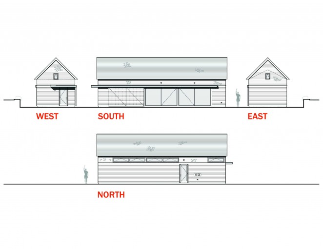
My client had some really useful feedback which I then incorporated into the plans in preparation for the next steps. For me, that step, is to define exactly what the exterior of the building is going to look like. This means materials, proportions of walls, windows, doors, lighting, roof shapes - everything that makes up the exterior look and feel of a structure.
Read on for a few of the insights that didn't make their way into the video.
Proportions
The first and most basic step when designing the exterior elevations is to develop an initial proportion. There are two things that inform my decisions on this project, the primary one is the barn concept. In the end, the structure must appear barn-like. The second is the size relative to the existing structures on the property. We could easily overpower the main home if we were to borrow from typical barn eave heights which can be quite tall. Because this is a residential neighborhood, I need to be sensitive to a residential scale. The existing home's walls have a 10' plate, which seems like a reasonable starting point for this building. I'll draw that as the wall height on the eaves to get started and revise it up or down later as needed. The actual proportion of the wall can appear different depending on the size opening I place in it. The video describes this concept in more detail, it's an interesting visual trick.
The other proportional exercise will be the roof shape and pitch. I'll be matching the existing house's roof pitch at 12:12 - which means for every 12" in horizontal run, the roof rises 12"; a 45 degree pitch. Orienting the roof along the length of the structure allows me to maintain a minimal profile facing the street and it orients the pitched roof to work with the short span of the building. At 14' wide, we'll have no trouble purchasing simple trusses to structure the roof.
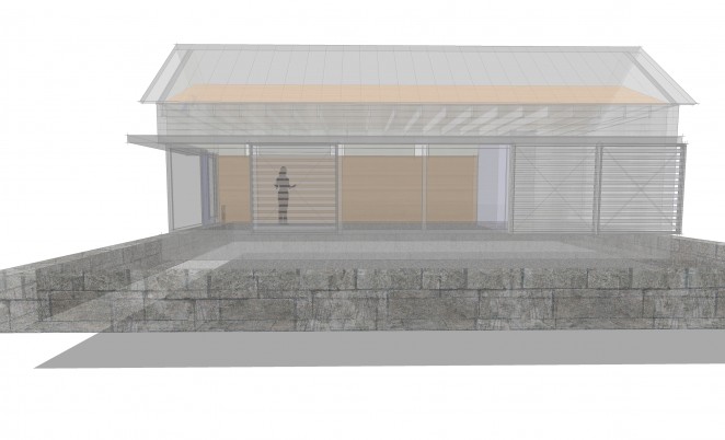
I sketch out the basic shape as an extruded gable and begin thinking about openings next.
 Doors
Doors
Again we revisit the barn concept when thinking about doors. A standard door will be fine for accessing the side of the structure closest to the pool but the doors flanking the studio space should be large. My client and I have shared the initial image of large sliding barn doors on the exterior of the building to signify 'barn'. I've developed a flat canopy as a modern way of concealing the track required for these sliding panels and you'll notice that it wraps the corner and turns into a deeper overhang at the side door. This keeps the weather out and marks that area an an entry zone. Architects are always looking for ways to tell the story of how to use a building without words - overhangs communicate entry.
Large sliding barn door panels are relatively inexpensive, large sliding glass doors are, by contrast, not. I developed five different door options for my client to review using differing configurations of sliding doors ranging from the relatively expensive to the extremely expensive. The trick with these doors is find the balance between a convenient size, function, and cost. Sliding doors make sense because the space is narrow and taking up any of the floor space with a swinging door just didn't make sense.
I first tried using French sliders, basically a 4 panel sliding door unit with two center panels that slide to either side. Standard sizes limit their cost, but also limit the overall opening. In my case the overall opening in the studio wall I was looking to fill was 24'. So, I placed two 12' units side by side using a total of four of the standard 3' wide panels. The two center panels slide to provide a 6' center opening. This didn't seem barn-like enough to me. So, among other less successful options, I transitioned manufacturers and embraced a more commercial system without the same limitations. The commercial system would allow me a 12' wide unit and 6' of that would be operable. If I put two side by side, that would leave me with a center opening of 12' in width. Much more barn-like, see what you think.
Windows
There are limited options for openings in this project, I'm recommending the bulk of the money be put toward large doors. But we'll need some windows for light, balance and ventilation. Usually with windows I start by envisioning the desired quality of each space they're looking to serve. Does the space require a large window or a small one, does it need privacy, or should it feel connected to the outdoors? I then go about sketching an underlying ordering system which they'll fit into.
In this case, the two spaces that absolutely required windows were the bath and the studio space. Since the studio had more light requirements I started there. The project is sited near the northern edge of their property with the long studio flank facing any future development. This immediately suggested a clerestory window configuration as it preserves privacy while still letting light in. Clerestory windows because they're positioned higher in the wall also permit light deeper into the space. This line of reasoning translates nicely to the bath space as well where privacy is paramount to views out. I developed a repetitive ordered system of clerestory windows to the north aligning them with the openings on the south wall as a starting point.
One last window detail to think about was the addition of a couple of small windows. You'll often see barns utilize either very small openings, or very large openings. The large openings were for letting in large equipment, the small for ventilation and light. They seemed even smaller than they actually were because they were usually placed in large blank walls. I added one on each gable as a reference to the barn aesthetic even though they'll contribute relatively little light to the overall space.
Materials
In the next post, I'll describe the process for selecting the material palette and what we have planned.
Please continue to follow the process as we move forward with the next steps designing the Barn Studio. If you’d like your very own Barn Studio it's now available for download. I would happily share some of the interesting variants I've been developing just drop me a line and let me know.

