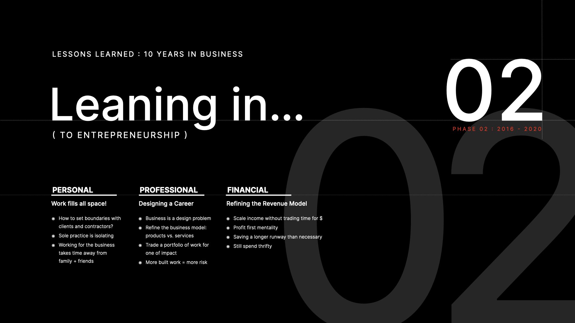
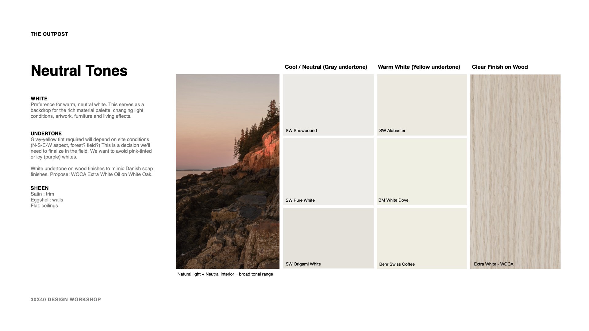
This post is part of an ongoing experiment using AI to help surface patterns hiding in plain sight. I’ve been exploring how to reflect on potential client inquiries and communication habits by reviewing emails sent and received over time.
The audit process revealed some blind spots that helped me improve systems so I thought why not apply the same technique to a difficult project from the past to see if I could learn anything.
I headed into the email archive and selected all email correspondence from a particularly stressful architectural project with hundreds of messages. I’ve anonymized the project details here (I’m calling it "X House") out of respect for the people involved. I printed them as a single PDF and then asked ChatGPT to serve as my ‘business communications consultant’ and help me look for “communication breakdowns, hidden stressors, and decision bottlenecks.”
The goal wasn’t to assign blame; only to learn from the patterns and fix my own blind spots.
Here’s what I learned:
The stress was a result of ambiguity.
The client was hesitant, often unsure, and slow to make decisions. Questions would pile up about cabinet layouts, siding types, energy systems, and trim details. The more they did so, the more the overwhelm set in and clear decisions lagged. When they did come, they often reopened earlier ones (questioning led to re-questioning).
In short:
Weeks of silence followed by last-minute asks.
Requests for redraws that reopen earlier decisions.
Client worry about making the “wrong” choice—without a framework to guide them.
Important decisions farmed out to consultants or mystery trusted ‘expert friends’... who didn’t attend meetings but weighed in behind-the-scenes.
There were long stretches of indecision followed by sudden urgency (usually on the weekend when the client had time to focus on the project). It was hard to plan around and taxing as I agreed to ride the same emotional roller coaster as my client.
To be fair, I allowed it. At the time there wasn’t a system in place to say: “this isn’t mine to fix.”
Actual chat excerpt
But there was something else. Reviewing this thread also surfaced how I communicate when under pressure. AI flagged moments where my tone became overly accommodating or vague, where I delayed saying “no,” or softened a boundary that should’ve been firm. Here were some of the communication patterns that created downstream issues (quotes are actual things I wrote, cringe!):
Delaying direct replies in hopes the client would self-resolve.
“No rush on this.”Burying key points inside overly long or overly polite responses.
“I hope this makes sense, but happy to clarify further or walk through it together.”Offering solutions too quickly, before clarifying whether the issue was mine to solve.
“I can look into that and get some preliminary numbers if that helps.”Avoiding reminders that a decision was overdue or already made.
”Just checking in on this again—totally understand if it’s still in process.”
There were dozens of improvements suggested, here are a few I’ve incorporated:
Write shorter emails with bolded action items.
Restate decisions when a client circles back. “Just to recap where we landed: we decided on [X] during our last review—let me know if something’s changed on your end.”
Respond to scope creep with a simple phrase: “Happy to explore this. Let me check how it impacts scope.”

how to run your own project postmortem audit:
Pick the project. For this example, it’s the one that drained you most. You can also do the same for a great project and use that to refine your acquisition process + client avatar. You want more of those!
Export all communications. Select all → Print → PDF. If you have subfolders: SD, DD, CD, CO, etc. export each separately to give ChatGPT more context. Perhaps everything goes smoothly during SD + DD but falls apart in CD and CO. You can extract those insights with this technique.
Open ChatGPT (or another AI assistant). Use this prompt:
“Act as a business communication strategist with special expertise in architectural design, construction and documentation. I’ll share all emails from a past project in a single PDF. Help me identify patterns of stress, confusion, or poor decision-making. Be specific and actionable.”
Prompt for deeper insights. Use follow-up prompts like:
“Where do you notice tension or confusion building?”
“Which replies signal scope creep or boundary slippage?”
“What could I have said earlier or more clearly?”
“Which of these issues created the most downstream effects? Prioritize them.”
“How many times was this decision revisited?”
“Was the client ever given a clear, bounded choice?”
“Where did I continue designing without key decisions locked?”
Improve your Process. Ask:
“What systems would’ve helped here?”
“What template or script might I reuse in the future?”
“Where did I unintentionally signal I was responsible for something I wasn’t?”
“Which messages created more work down the line, even if they seemed fine in the moment?”
“What else haven’t I asked that would be important to know?”
Build better Systems. After gathering insights, prompt ChatGPT to help you design new tools:
“Based on this thread, suggest specific tools, templates, or boundary-setting phrases I should develop. Focus on making communication clearer, reducing decision fatigue, and protecting my time.”
Then ask: “Which of these patterns are likely to show up in future projects—and how can I systematize my response?”
Use the feedback to draft:
A boundary-setting phrase bank
A “pending decisions” tracker shared with clients
A visual timeline that flags who decides what—and when
Taking it further
This kind of audit works for any aspect of your life that flows through your inbox. One of the most useful ways I’ve applied it lately is reviewing the last 30 days of sent emails. Export them as a PDF, then ask ChatGPT to look for patterns: Do I delay responses until a problem escalates? Do I soften direct feedback? Overuse certain phrases? Come across as vague—or domineering? Am I unintentionally assuming more risk than I should?
That last one can be particularly costly.
I hope this helps you spot habits you weren’t aware of, and once you do, you can begin re-wiring some of your defaults.