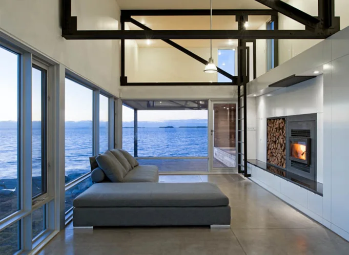
Architect vs. Engineer : Design Meeting

A structural engineer is a part of the design team for all my residential work in the studio. In this video you'll join me for the kick-off meeting with my engineer as we begin developing the structural design for the Outpost project. You’ll see how we choose a foundation strategy, work through framing + detail ideas, and understand how lateral loads are transferred and how they affect the materials we choose to build with. The professional tug-of-war between engineer and architect isn't adversarial, rather it's collaborative and makes for a better, more efficient project.

The most interesting part of our dialogue begins around minute eighteen where I ask Albert to comment on one of the most common objections I hear from contractors in the field: "This design is way over-engineered." His answer illuminates how a structural engineer can complement the architectural design process in ways you may not have anticipated.

If you enjoy these videos, you can support 30X40’s work on YouTube by investing in a course, a toolkit or a digital tool. Many thanks!

An Incredible Resource for Architectural Inspiration

With more than 581,000+ architectural drawings, photos, and documents to download and use as you please, I couldn't keep this incredible resource to myself any longer. The HABS (Historical American Buildings Survey) along with HAER (engineering), and HALS (landscape) are a collection of building surveys from the American architectural, engineering, building and landscape culture maintained by the Library of Congress in Washington, DC. In this video, you’ll peek in the collection and see how I use it in my architecture practice.

The program was born in the 1930's during the Great Depression as a means to put unemployed architects to work with a mission to preserve and document the architectural heritage of America. Since then, the archive has catalogued more than 43,000 individual structures and more are added each year.

I use it for: creative inspiration, precedent research, to improve my architectural drawing, graphics and delineation techniques, and to study details from some of America's most famous works of architecture.

If you enjoy these videos, you can support 30X40’s work on YouTube by investing in a course, a toolkit or a digital tool. Many thanks!
Travel Habits of an Architect

I’ve been doing a lot of traveling lately so in this video, I wanted to share some of my architect travel habits for sketching and photography. These tips apply even if you’re not an aspiring architect and will help you wring the most out of any trip you take, near or far. (And, be sure to stick around at 4:46...wait for it...)

GEAR

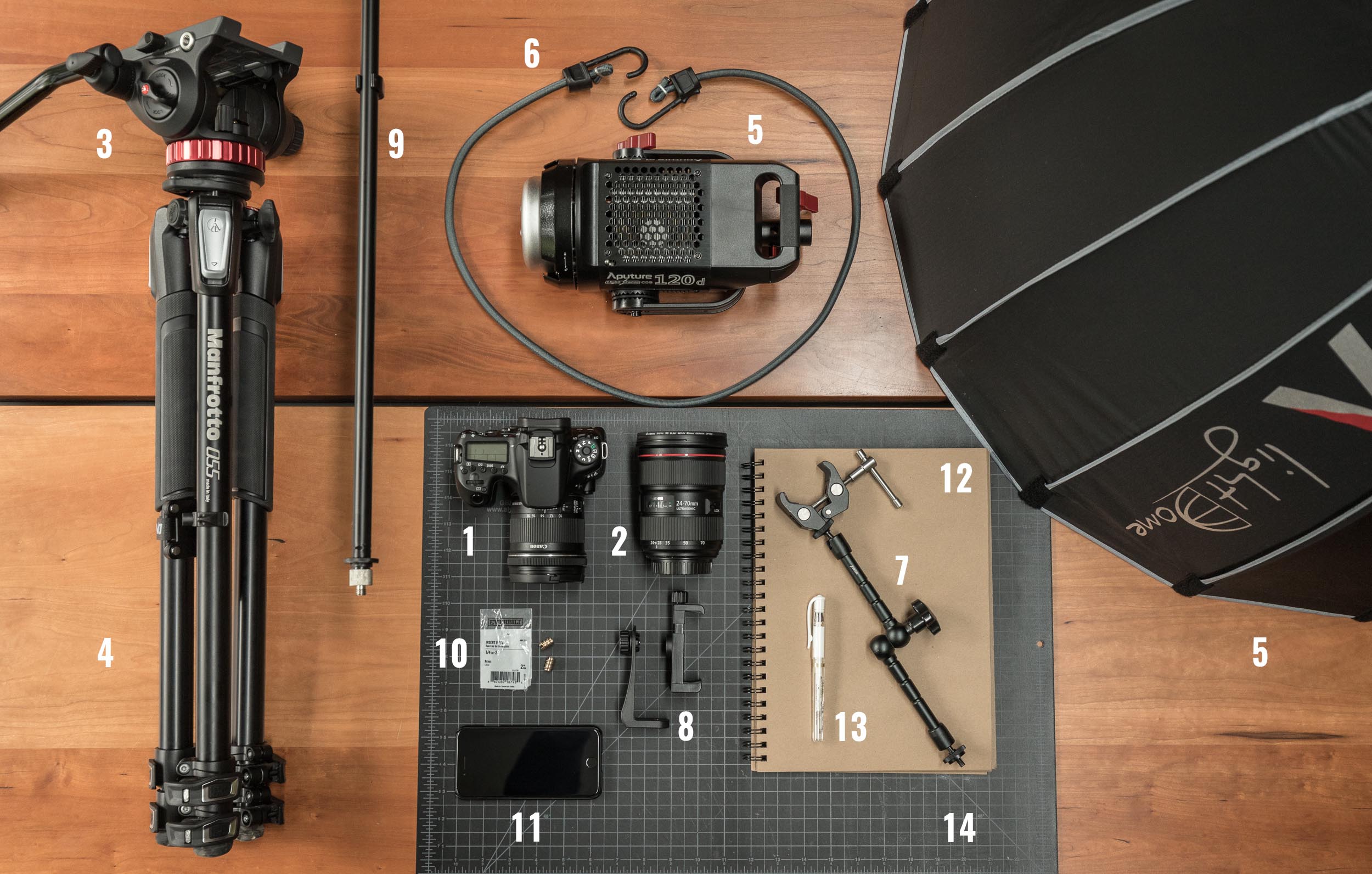
My travel kit is as lean as it’s ever been, just a sketchbook, a few drawing tools, my camera gear (more details here) and a small laptop. You don’t need an expensive camera or special tools though to do what I do. The DSLR is an intentional choice for me as it forces me to slow down when I'm traveling. It makes me think about lens selection and composition, the subject, the lighting. It’s probably the single best investment I’ve made in the past 10 years (aside from travel).

**MY UPDATED DAILY CARRY CAN ALWAYS BE FOUND HERE.

For lenses on this trip I brought a wide zoom, a medium zoom, a telephoto and a macro. And this was way too many. Lenses are heavy and to lug these things around in a backpack in the tropics is…well, sweaty. Of the four I brought along, I used the 24-70mm and the 100mm most of the time. The zoom is great because the 24mm end on a full frame camera is wide enough to capture landscapes or interiors and the 70mm is perfect for details. Then you have the right around 50mm is great for portraits. So this one lens covers a lot of situations.

You'll learn why I reject guidebooks in general, my process for observing, documenting and then cataloguing my travels and you'll see what I do in the downtime between destinations.

Time Stamps:

  • 0:22 Start Now. Don’t wait until you arrive at your destination to start taking photos or sketching.

  • 0:42 Follow 30by40 on Instagram: http://thirtybyforty.com/instagram

  • 0:49 Travel Essentials.

  • 1:28 My Routine (Shoot then Sketch)

  • 1:55 Subjects. Not everything has to be architectural.

  • 2:53 Details + Materials = Experience. Learn to observe the world this way.

  • 4:46 Wait for it…

  • 4:55 Has this ever happened to you? Relaxing on the beach and out of nowhere…!?

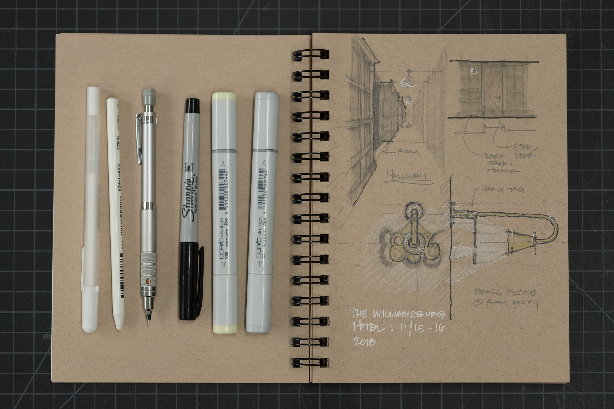
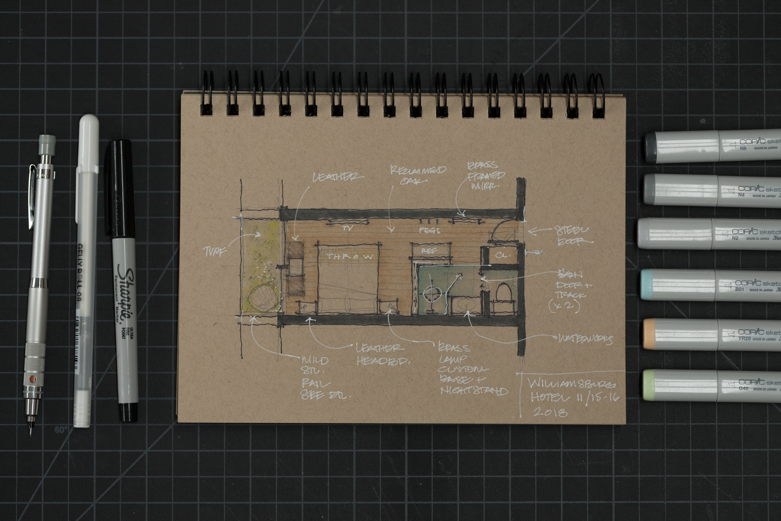
Sketchbook - 50pages from Strathmore (trying something new…I quite like it)

White pen - ink isn’t semi-transparent, but flows nicely, not gummy at all

Copic Marker Set (grays) - essential (this is a set of 5 and includes a non-smudging Multiliner pen too)

Blue + Tan + Green + Yellow Copics are from the blending trio sets (they’re cheaper to buy as sets)

Mechanical Pencil (a personal favorite)

White colored pencil (wood-free)

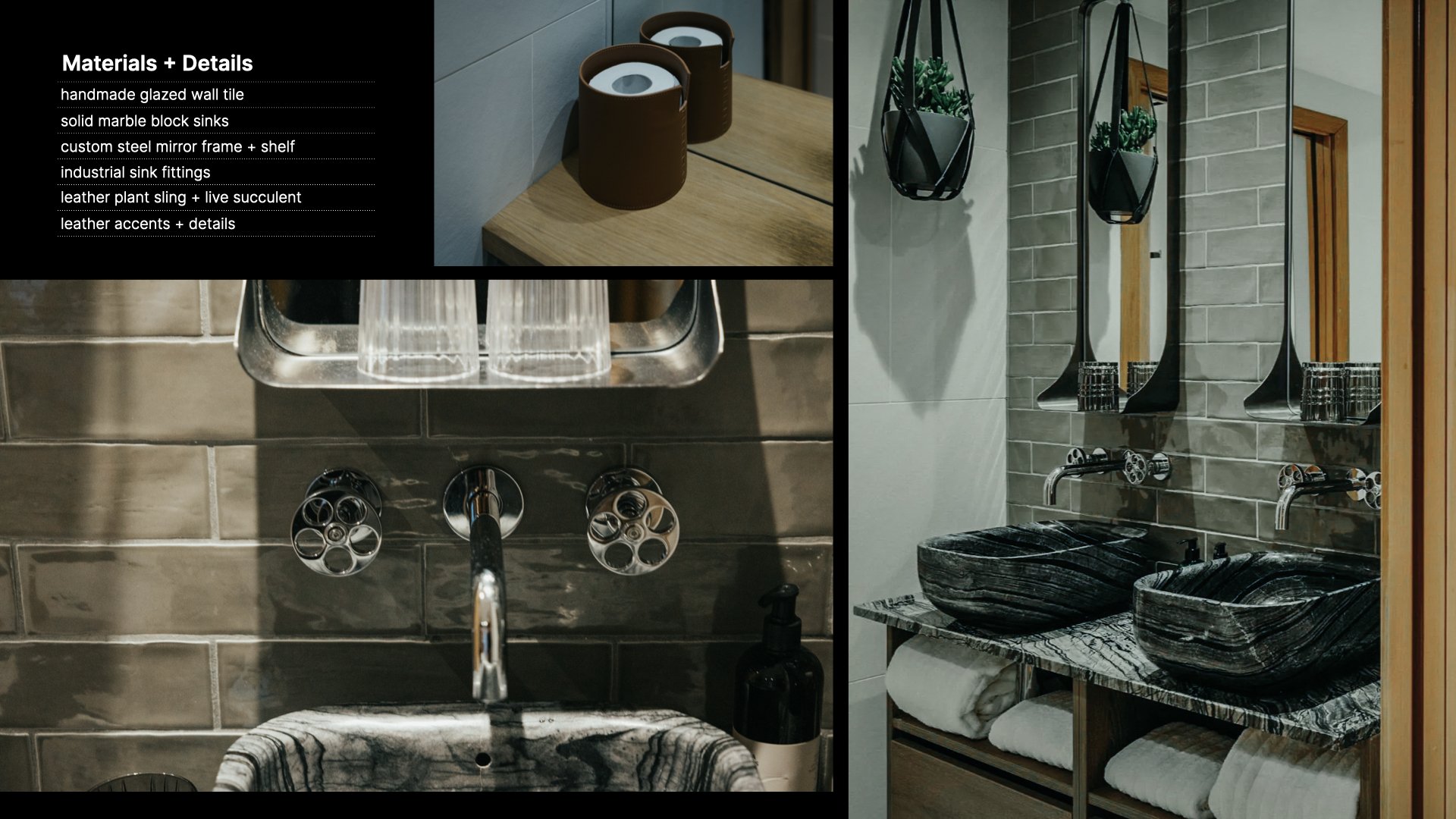
Hallway Light + Room Numbers at The Williamsburg Hotel

Hallway Light + Room Numbers at The Williamsburg Hotel

SIDE NOTE: The Williamsburg Hotel (at 3:16) in Brooklyn, NY was designed by the London Architecture Firm: Michaelis Boyd and completed in 2017. We actually had no plans to stay here, but we arrived in NYC to an early season snowstorm and our connecting flight back to Maine was canceled. Our flight the following day wasn’t due to leave until 10pm, so at my better half’s urging, we traveled from JFK airport to Williamsburg in Brooklyn and spent the next 24 hours exploring the neighborhood and staying in this fantastic hotel. Completely worth the little bit of extra effort to get there from JFK.

Railing Study at The Williamsburg Hotel (clever design, but, man it really whistles in the wind!)

Railing Study at The Williamsburg Hotel (clever design, but, man it really whistles in the wind!)

Modern Practice Series - Ep 2 Eponymous Architecture (cont'd)

After more than two decades of working for other architects, John decided to step out on his own. In part 2 he recounts the move from moonlighting to starting Eponymous Architecture and his early client work. He shares the difficulties he’s faced along the way, how he’s structured his life and practice, where he’s been finding new projects, and even a few unexpected advantages of going solo. This is a window into the early days of starting an architecture firm from nothing.

Topics discussed: 
1:01 Testing the waters
1:59 Making the leap
3:51 The Lean Startup – Software + Hardware
5:37 Challenges of Sole Practice
8:30 Material library (in a small space)
9:47 Becoming a Better Architect
11:49 Your Portfolio (of someone else’s work)
15:21 One Year. Enough time?
17:02 Why Eponymous? 

**Did you miss part 1? Here’s the link: https://youtu.be/yOAIf6WX6mY
 

(Another) Day in the Life of an Architect vlog

In this installment of the vlog, look through a drawing set for a project under construction and learn how I approach and draw architectural details. I discuss one of the most common struggles of working alone, what happens when a project is delayed, how to create a balanced practice, and I share my thoughts on the innovative business plan presentations I reviewed as a juror for the architecture business plan competition.

Don't miss the view from my mid-day hike (!) and what I learned on the podcast I was listening to.

Learning to See (Like an Architect)


As architects, our job is to uncover what’s hidden...in a place, in our clients, in the materials we use. We're taught to make our discoveries visible and tangible. We're taught to give the silent a voice. To do this, we explore, analyze, consider, dissect, unearth and seek to understand the meaning of things which are often hiding in plain view. Finding a muse is one of the best tools I've discovered to teach the depth of research and skill required to become a more thoughtful designer. A muse will teach you how to truly see like an architect.

Learn more about mine here:

Happy New Year - 2018

After a brief break for the holidays, I'm excited welcome 2018 and get started on everything I have planned. With my design boards full of new work + new collaborations, and a renewed vision for the YouTube channel, I wanted to share one of my favorite videos from 2017 here on the blog. Cheers...!

Architectural Design Process : Form, Orientation and Sunlight

Learn how you can use the Sun to locate, orient, shape, and inspire the details for your architectural design. In this video, I walk you through the design process for a project whose form, orientation, and details were all developed by carefully analyzing the solar path on the building site.

How I find Architectural Ideas

Eight strategies I use to find architectural ideas and confront - the intimidating - blank page.

Topics covered:

  • Bisociation 

  • Trusting the design process

  • Embracing constraints

  • Inventing deadlines

  • Doing the opposite (anti-project)

  • Subtracting to solve

  • Stealing (like an artist)

These are just a few of the design tricks I use to help grease the creative wheels and instill the confidence I need to keep moving forward. What's great is these techniques work for a whole host of disciplines and creative fields, they're not exclusive to architecture.

Books mentioned: 
The Art of Thought
The Act of Creation


Storing Architectural Samples in the Studio

I'm limited in the studio by the amount of space available to store things and material samples can take up a lot of room. I've seen many types of storage racks used in studios where I’ve worked and tried a number of things myself here in the studio – from metro shelving, to archival folios and wooden, felt and cardboard boxes and bookcases. The problem: they all keep the materials hidden. So although they’re great from an organizational standpoint from a creative standpoint they're stifling. I’m much less likely to grab a material while designing to help me solve a problem or during a meeting if I have to dig through boxes to find what I’m looking for.

When I stumbled across this inexpensive baking cart it seemed perfect and I had to try it out. Learn more in the video.

Essential Architecture Books

The books in an architect's library provide context for their work: history, precedent, theory, technics, best practices, fresh perspectives and creative stimuli. The ones I return to often are like harmonic frequencies, which continue to vibrate and resonate over time even as my ideology is evolving.

Is it a coincidence that some of the most emotive connections to books and architectural writings were forged in architecture school many years ago? You know how they say the music you’ll listen to the rest of your life is the music you were into when you were 18? That’s how many of these books are for me. So, these precise books may not find the same resonance with you, but as a thought exercise, consider what your library currently says about you, your interests and your blind spots or your knowledge gaps one you might want to fill in.

Books feed the intellect, and a studio full of books assures we're surrounded by the ideas of many – the masters, colleagues, artists, entrepreneurs, performers, and documentarians. They’re a great equalizer when it comes to education and at a fraction of the cost of architecture school.

Be sure to check the resource page for links to all the books I mention in the video. 

Developing the Concept: Architecture Short Course (part 2)

Developing the architectural concept into floor plans, designing the form, and refining the spatial ideas are all covered in part 2 of our architecture short course.

The first step in making the abstract concept real is to sketch a floor plan and then give that plan a three-dimensional form. A floor plan is a quick way of describing the hierarchy and relationship of spaces and it begins fixing their real physical dimensions and shapes. Throughout the design process architects must continually consider the design in both the plan, or overhead view, and the sectional, or volumetric view. The easiest way I’ve found to do this is to begin by sketching a plan and then construct a three-dimensional version of that plan either in model form or by sketching.

In order to get to three dimensions, we have to make some decisions about form, space, and order. When we speak about form we’re referring not only to a building’s shape but also to its size, scale, color, and texture…basically, all the visual properties of an object. Form has a direct relationship to space in that it influences both interior and exterior rooms. And lastly, order is how we choose to orient and relate the forms and spaces to each other. This directs the inhabitant’s experience of a place.

We'll review strategies for refining the floor plan, designing meaningful building forms, editing, and converting two-dimensional abstract concepts into three-dimensional buildings.

Exterior Lighting Concepts

There are two fundamental points to understand about outdoor lighting. The first is that we actually require much less light in outdoor living situations than indoors, which means the overall lighting can generally be more theatrical and less focused on tasks. 

The second is that in lower ambient light situations, we actually prefer lower color temperature light (warmer); it’s actually visually more comfortable. Whether it’s our primal draw to the flickering flame of fire or the fact that warm light renders the skin so naturally, our outdoor design objective is to aim for low, warmly toned lighting levels.

In this video we'll review the general concepts pros think about when considering how to light outdoor spaces. Specific topics covered are:

  1. The Lantern Effect - using a structure's glazed walls to provide ambient light to nearby exterior spaces.
  2. Layering of light - ambient, task and accent light tips.
  3. Path lighting
  4. Color (and) temperature
  5. Object or sentinel lighting
  6. Fire
  7. Wall washing
  8. Dynamic range and dimming
  9. Uplighting
  10. Light pollution

Studio Project: Plywood (as a wall finish)

My design studio acts a lab for experimentation, in this video I discuss lessons learned from installing plywood as a finished wall surface. The four main discussion points covered are:

1) Material thickness: 1/2" - 3/4" typical range. NOTE: if you're using sprayed foam insulation in your walls, the plywood covering must act as an ignition barrier for the foam - thickness will be critical. Thickness also affects: translation of framing inconsistencies to the finished surface, stability and price.

2) Panel cores and veneer faces. Steer clear of the Chinese Plywoods. Choose panels from the same lot and age if possible. Veneer plywood has a front and back side; the less banded side is the finished face. Take care when cutting to avoid material blow-out.

3) Attachment. Concealed versus exposed fastener. I recommend a concealed clip as well as a tip for aligning the finished face of the panels (it's a special fastener).

4) Finishing. Determine the project goals first, then select the finish. Mine were: - Low sheen - Preserve natural wood appearance - Easy to apply - Non-yellowing

I review oil-based and water-based finishes, Danish oil, spar varnish, paste wax, natural soap (Hans Wenger furniture), and finally WOCA oil + lye.

For a broader material discussion please see the video for part 1...

As always I welcome questions and feedback; you can reach me at: eric (at) thirtybyforty.com

Studio Project: Concrete Slab (as finished floor)

In this video I discuss five important considerations with a concrete slab that will act as a finished floor:

  1. Installer / subcontractor

  2. Color

  3. Consistency

  4. Control joints

  5. Reinforcing

You might also consider building a mock-up especially for large floor areas to ensure you’re getting the finish you expect.

I finish the video reviewing progress with a time lapse video of the slab placement and finishing.

Framing is up next...

Flat roofs and snow: 5 myths (busted)

In this video I dispel 5 common myths surrounding the use of flat roofs in snowy climates. The very notion of shelter is linked to the image of a roof above our heads. And while the elements of snow and rain may shape our living habits, advances in material technology and application now afford us a broad range of choice when it comes to the shape of the roofs over our heads. Contrary to popular belief, even those of us living in extremely snowy, wet environments are able to live beneath a flat roof. 


Designing a Small Studio - Lighting Plan (Part 7)

In this video I discuss the development of the lighting plan for our small studio project. I begin by discussed the (3) elements every professional lighting plan includes: ambient, task, & accent lights. I also describe a useful guideline for figuring out the amount of light required in a space as well as how I've applied the building concept to the lighting plan.I end the video by discussing a simple affordable fixture, why I chose not to use exposed conduit in spite of the aesthetics, and how to think about the location of your electrical panel (stay until the end for a cool little trick I employed).

Thanks for watching...

Four Homes Built on Boundaries

In this video I explore four homes built on boundaries. It's a look at how a home can challenge the natural environment and occupy the boundary between architectural convention and stunning natural beauty. When confronted with a design brief and an undeveloped site, architects often look to the edges of that site for inspiration and meaningful architectural solutions. These boundaries, both real and imagined, are exciting places to build. The boundary often gives rise to the form of the building, its materials and even how it’s structured.