Interior Design with an Architect's Eye: My Process

As this project enters its twenty seventh month in construction (!) the crew have begun finishing the interiors. The supply chain delays of the pandemic, a prolonged labor shortage, unlucky and unfortunate delays have made for an epic build.

I’m working with the most patient clients in the universe it turns out.

February is roughly mid-winter in Maine and a good time to turn attention inside!

Not all architects consider interior design as part of their scope of work, but for a residential architect it’s at least half - and an essential part - of what I do. I want a singular holistic vision and a reflection of the architectural design solution applied consistently throughout. There are, of course, varying degrees of influence we can exert. I’m hardly a Frank Lloyd Wright fan, but I always admired his ability to design every last detail in his clients’ homes. From window glazing to tableware, linens, art, and accessories. He designed every piece of furniture and, fixed their positions, to curate the overall experience, both inside and out. Although most people have limited budgets and patience for this degree of design integration (especially after 27 months in construction), for architects it remains an aspiration.

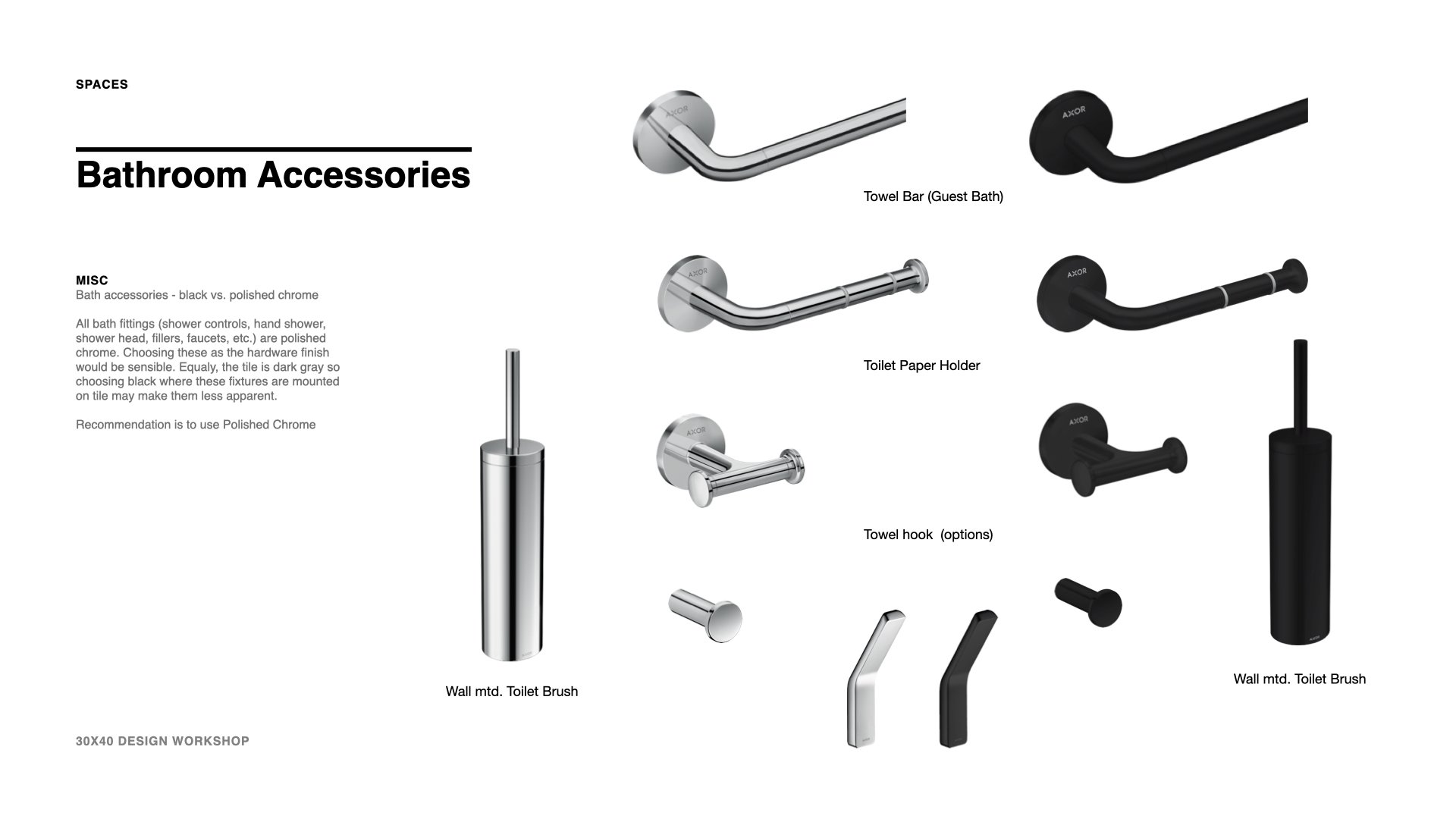
My interior design process is a combination of design and curation. Some elements, such as door and window details, cabinetry, hardware selection, plumbing, and lighting fixtures, need to be designed and integrated, while others, such as furniture, accessories, and textiles, can be left for curation.

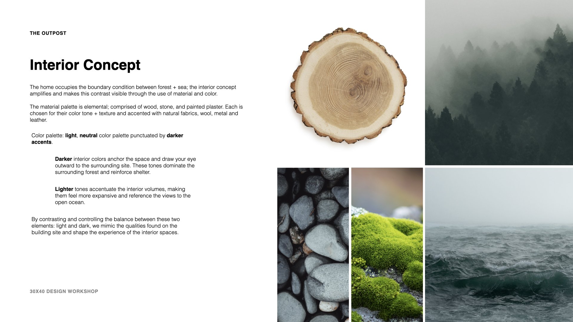
In the video I share my interior design process and the story (mood) boards I create for my clients. It starts with a concept and ends with a detailed focus on each space. The concept here is drawn from the colors, textures, and light patterns in the natural surroundings. You’ll see how materials, texture and color combine with the architecture to mimic the unique boundary condition this home occupies between forest and sea.

Designing a home involves many decisions, from furniture and color choices to lighting and accessories. Every aspect contributes to the overall look, feel, and function of the space. Without a concept guiding our decisions, it’s easy to simply collage and combine images we like of disparate ideas. The sum total can feel disjointed.

A concept provides:

  1. Cohesiveness: A strong concept ensures that all elements of the design work together in a harmonious and cohesive manner.

  2. Clarity: A concept provides direction and helps define the overall aesthetic and style of the space, which can be especially helpful when making design decisions.

  3. Functionality: A concept can help dictate the functional aspects of the space, such as furniture arrangements, lighting, and storage solutions.

  4. Emotion: A concept can evoke emotions and create a desired atmosphere or mood in the space, making it a personalized and meaningful environment.

  5. Impact: A well-designed concept can make a lasting impression and create a memorable experience for those who use and interact with the space.

Architectural Material Palette

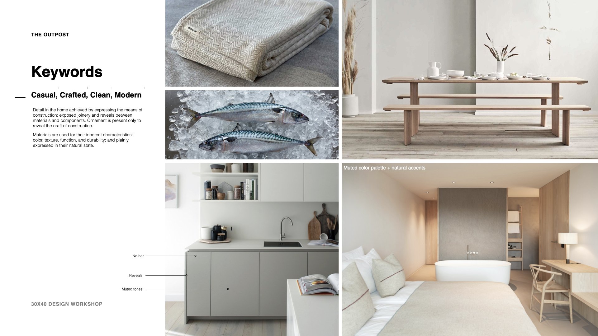
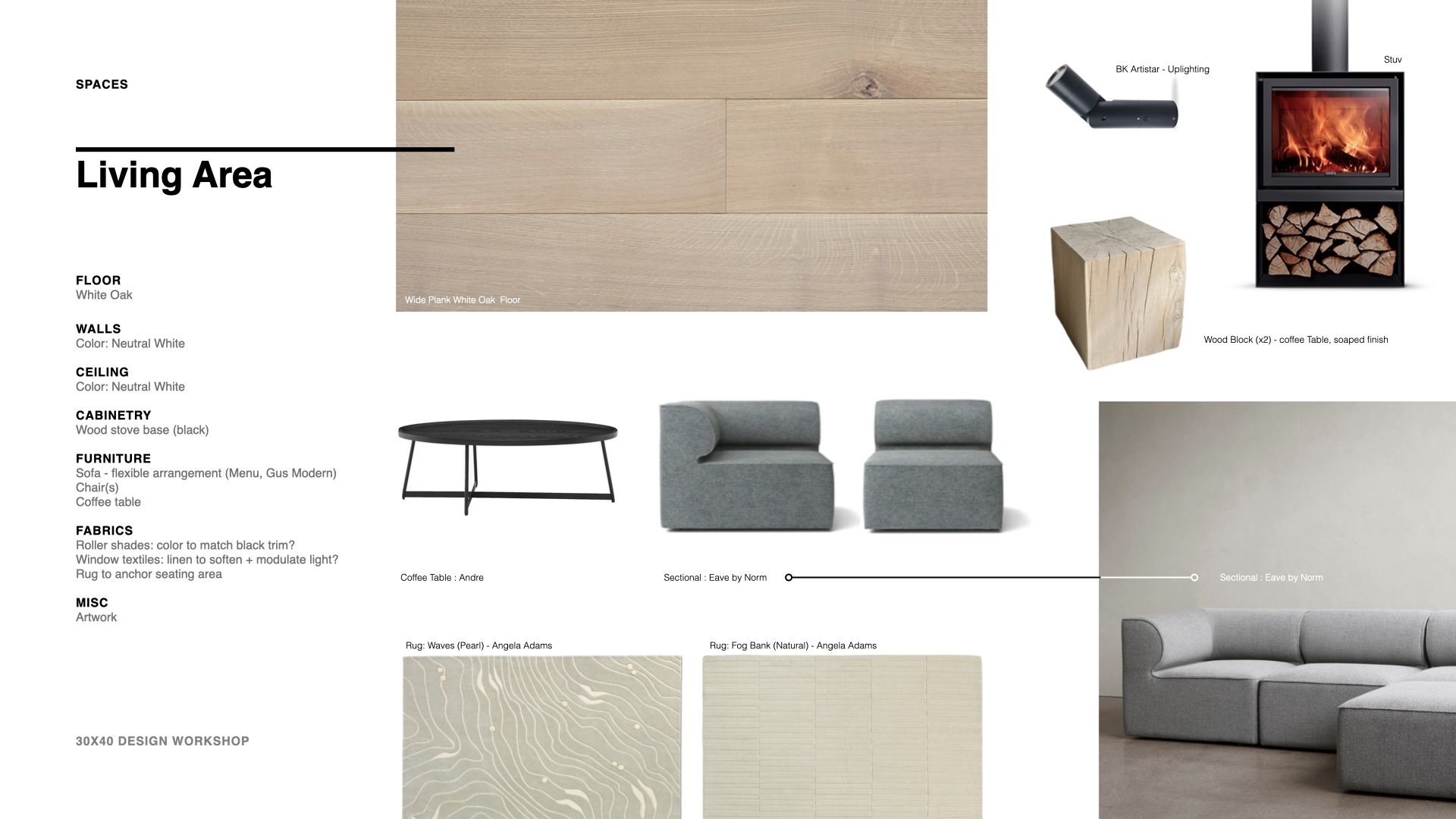
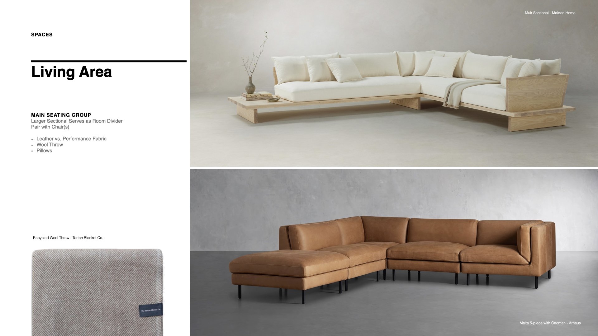
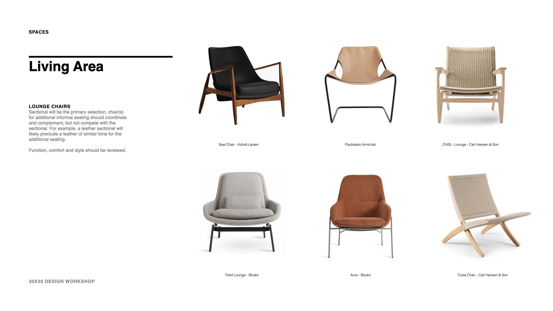
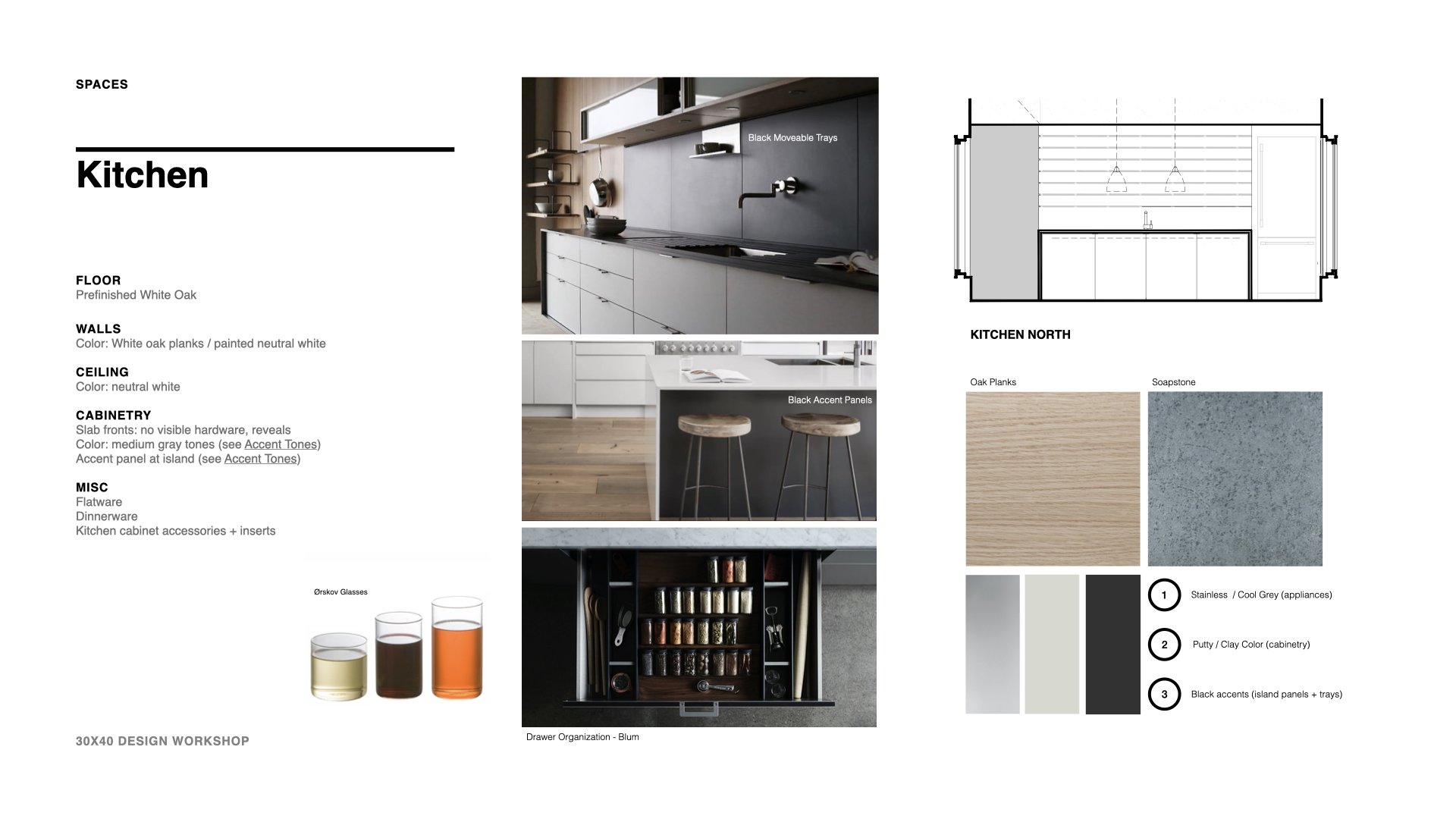
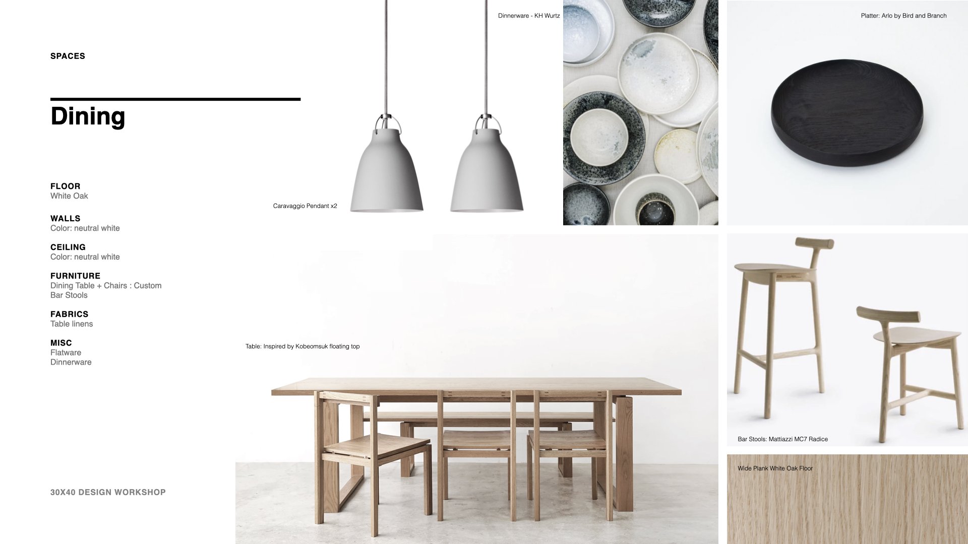
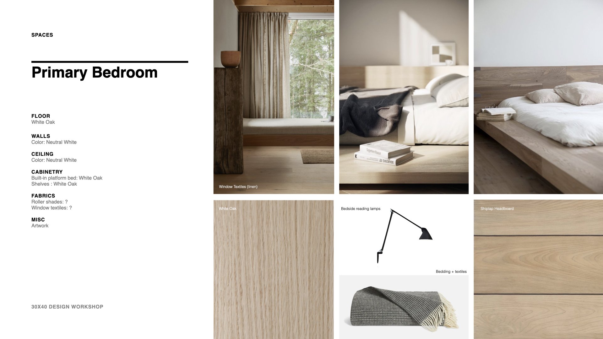
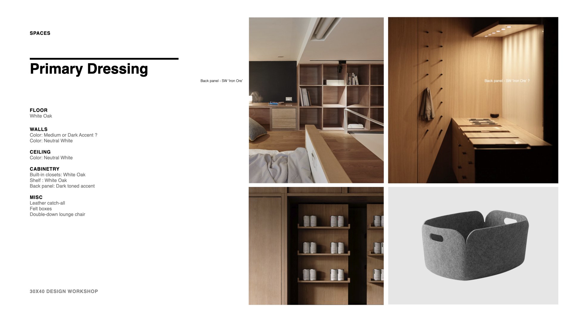
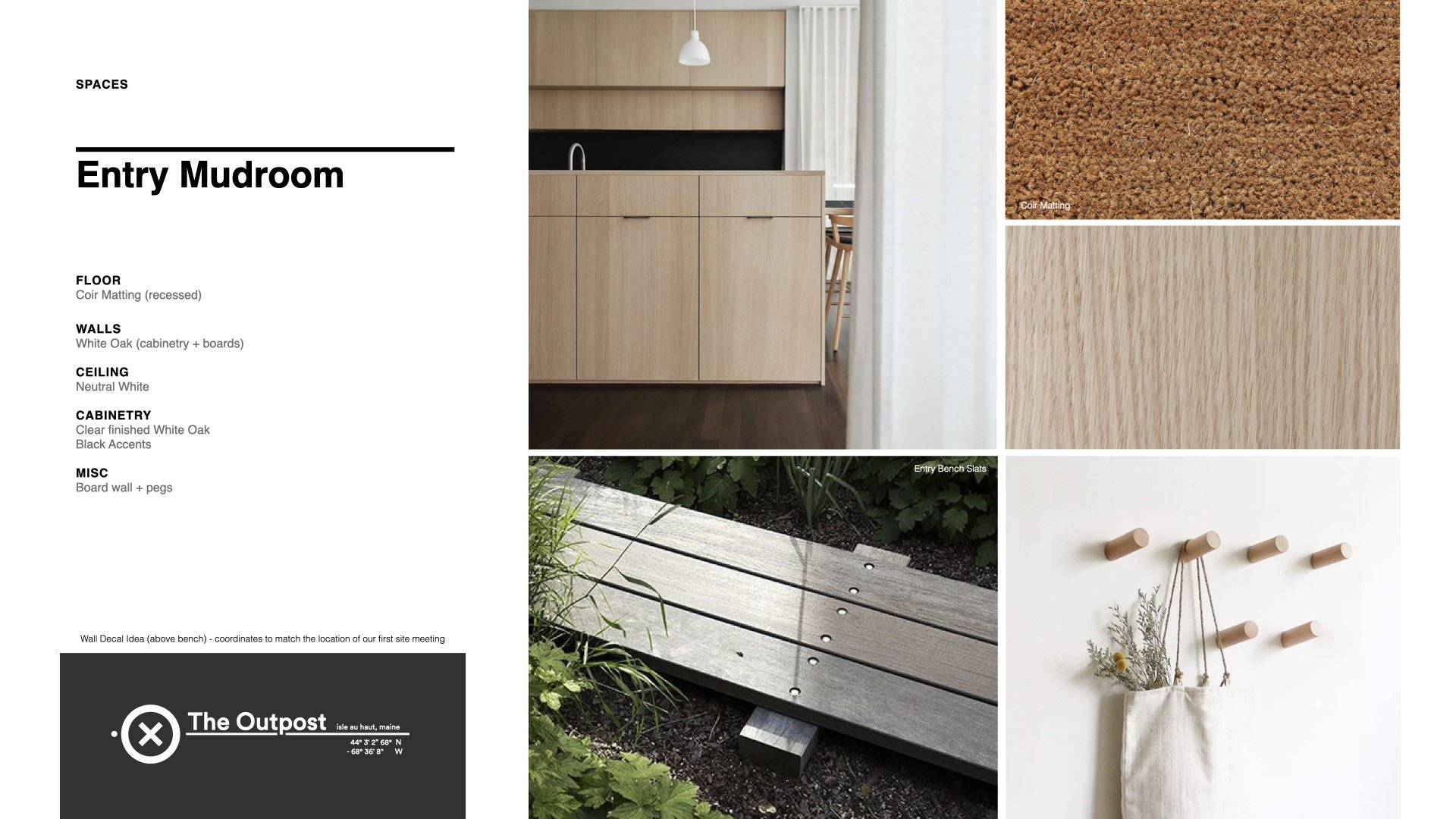
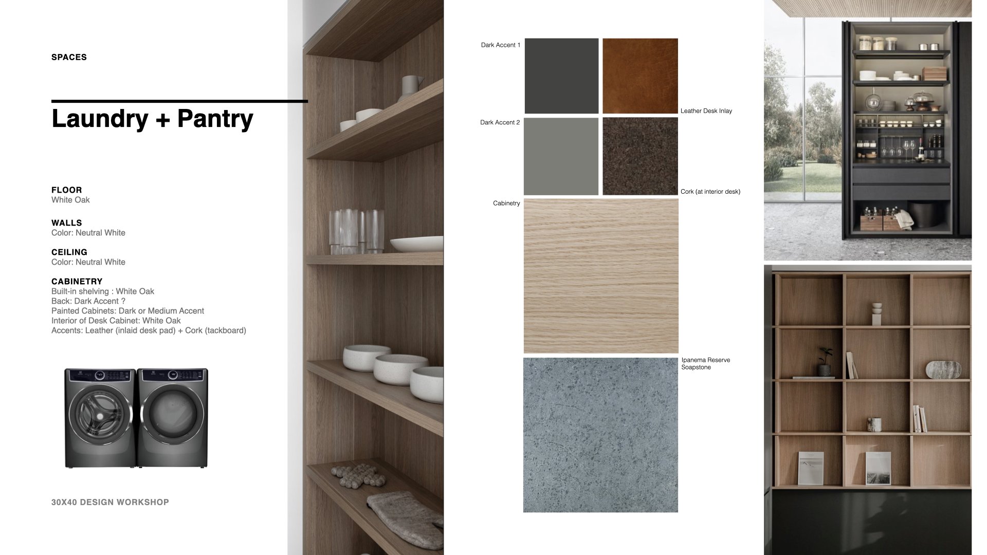
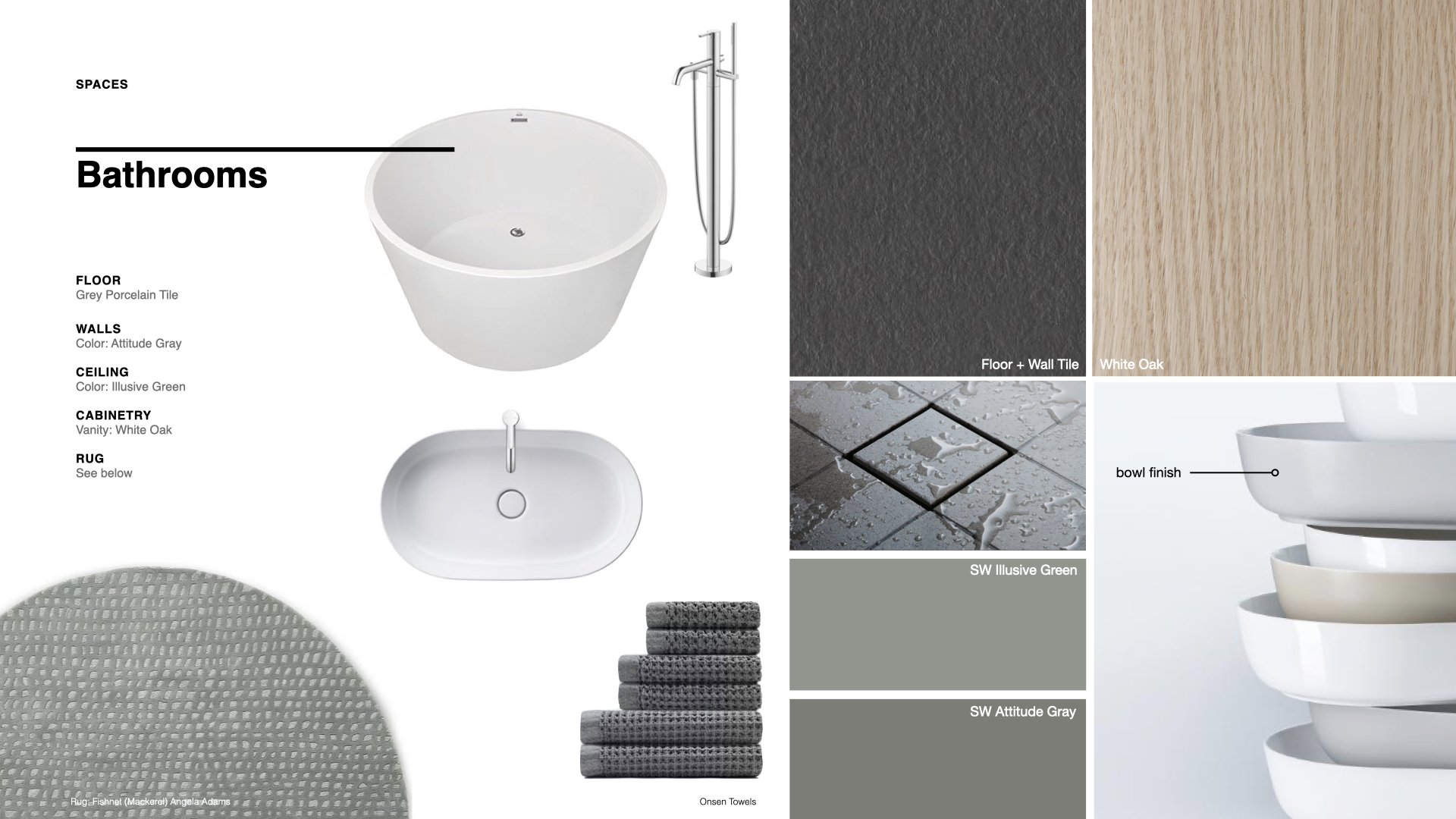
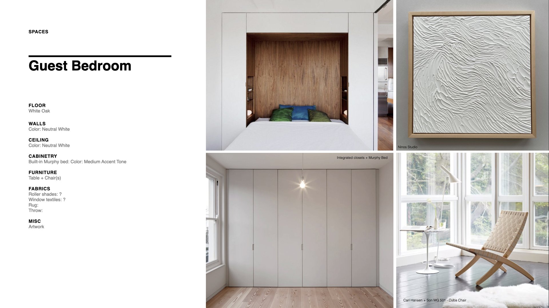
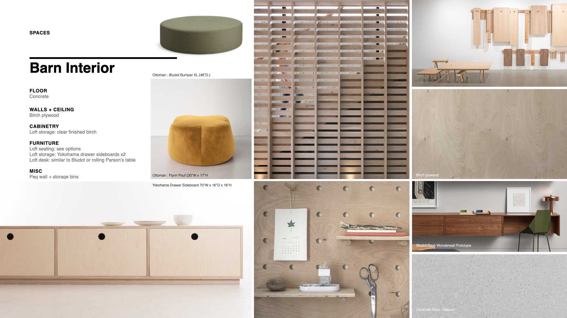
Most people lack the ability to articulate precisely what they want in a space and Pinterest can unify our vision. My clients and I use Pinterest to collaborate and establish a common design language once a concept is agreed upon rather than to define the design vision or stylistic overlay. We don’t linger there though, I prefer to further cull the images and develop a story board presentation (see images below). We want to create our own unique work, derived of our own ideas not simply a collage of rooms taken from dozens of other spaces. I find using story boards in the process helps my clients see the home as their own unique design.

It’s our job as interior designers and architects to make visible the invisible, latent forces in a place. This home is sited on an island, six miles out to sea and there the weather, the changing light, the seasons; everything is about contrast. The home sits on the boundary between two very different environments, the forest and the sea and it controls one’s experience of each. I want the interiors to be the canvas that makes this contrast visible.

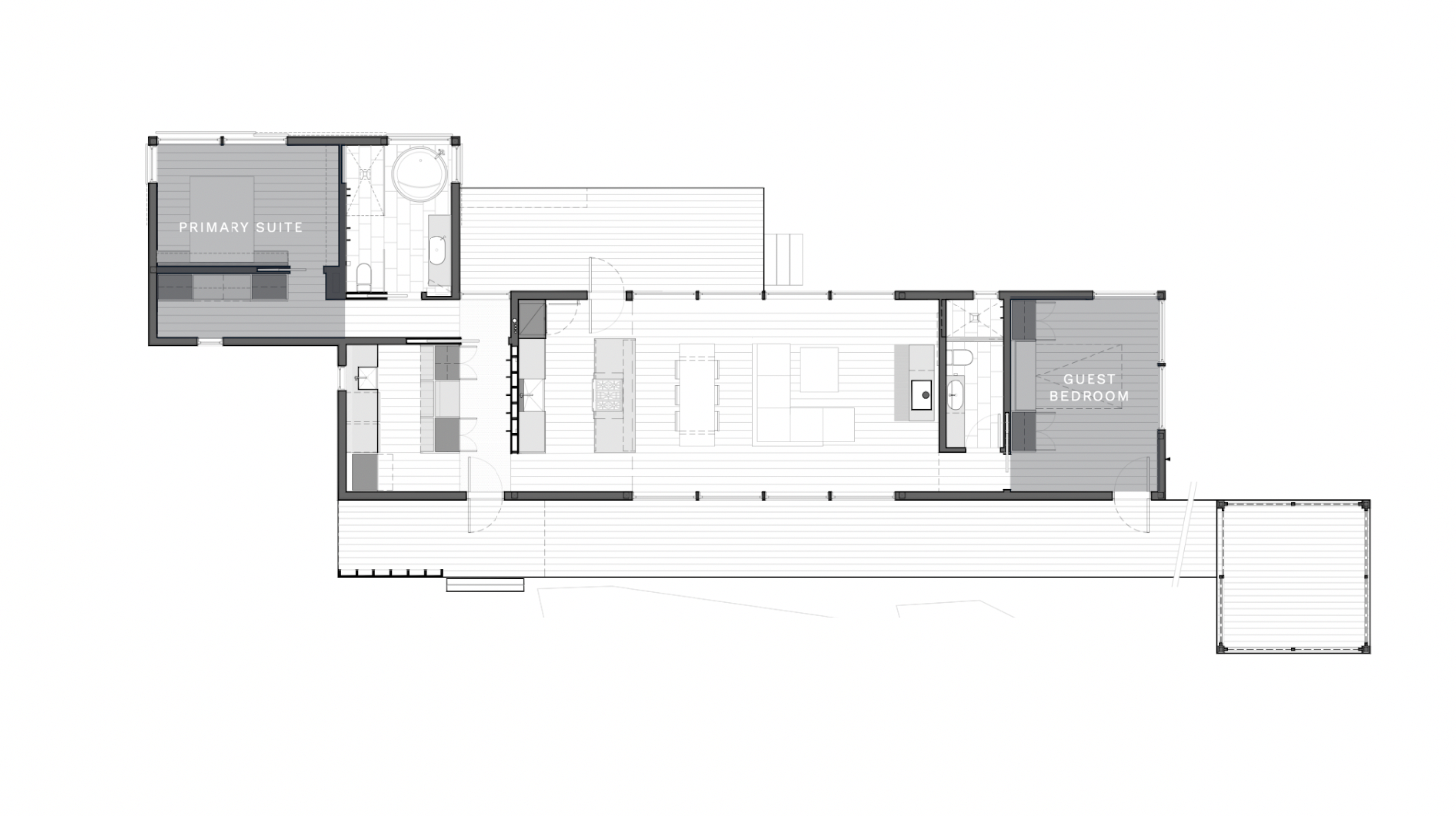
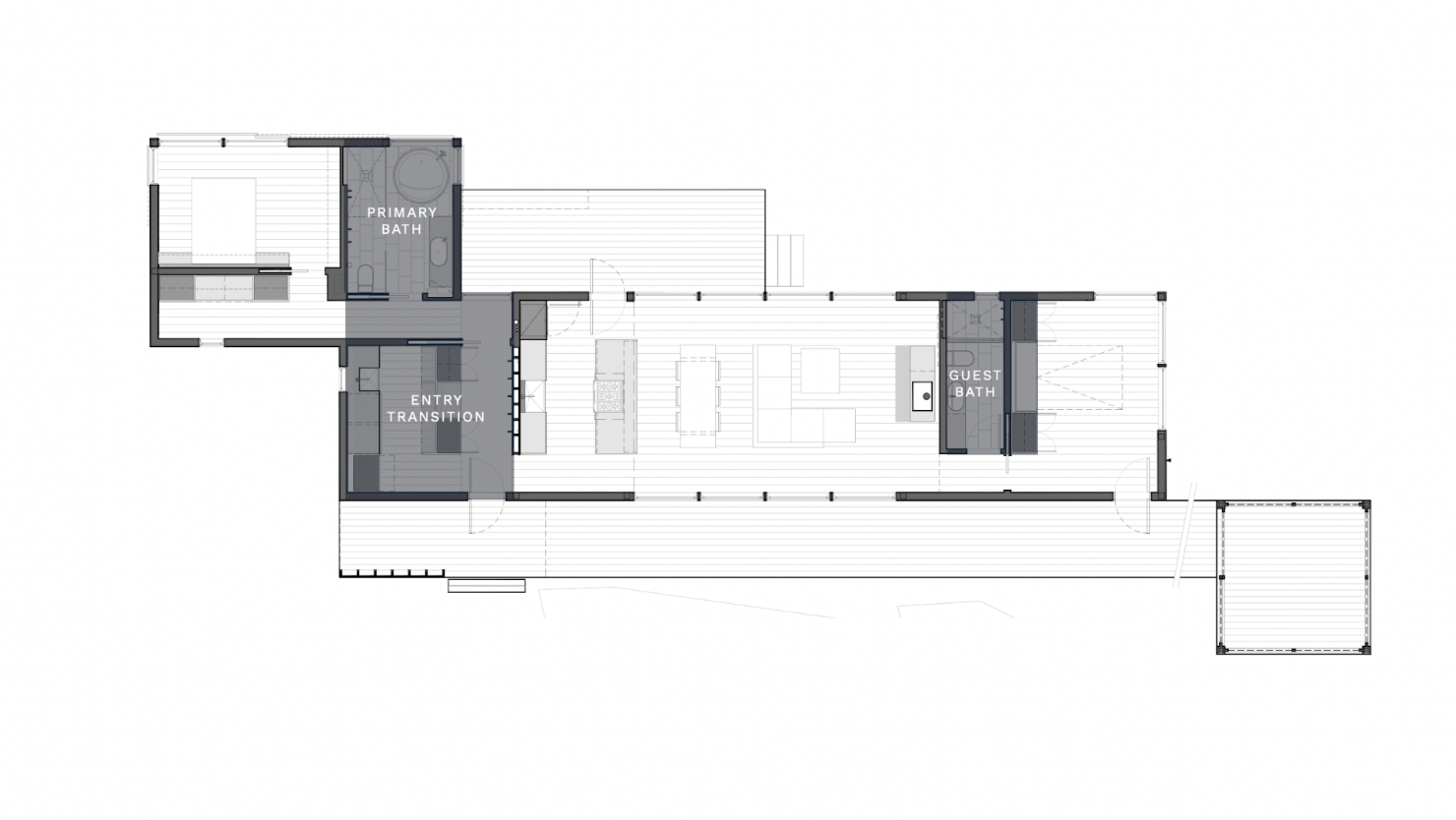
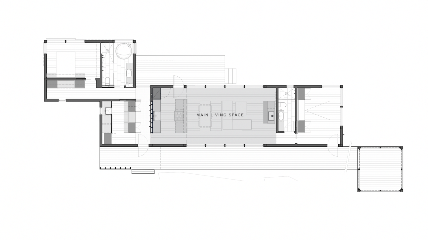
As we look at the floor plan there are natural places that might be more like the forest, more sheltering, darker, and lower in scale. The obvious places are the entry area, and the bathing spaces. And then there are the main living spaces which are larger, brighter with taller ceilings and sweeping views. In the bedroom and supporting spaces we can alter the balance between light and dark, mixing the two.
Material Palette Flat Lay

Materials

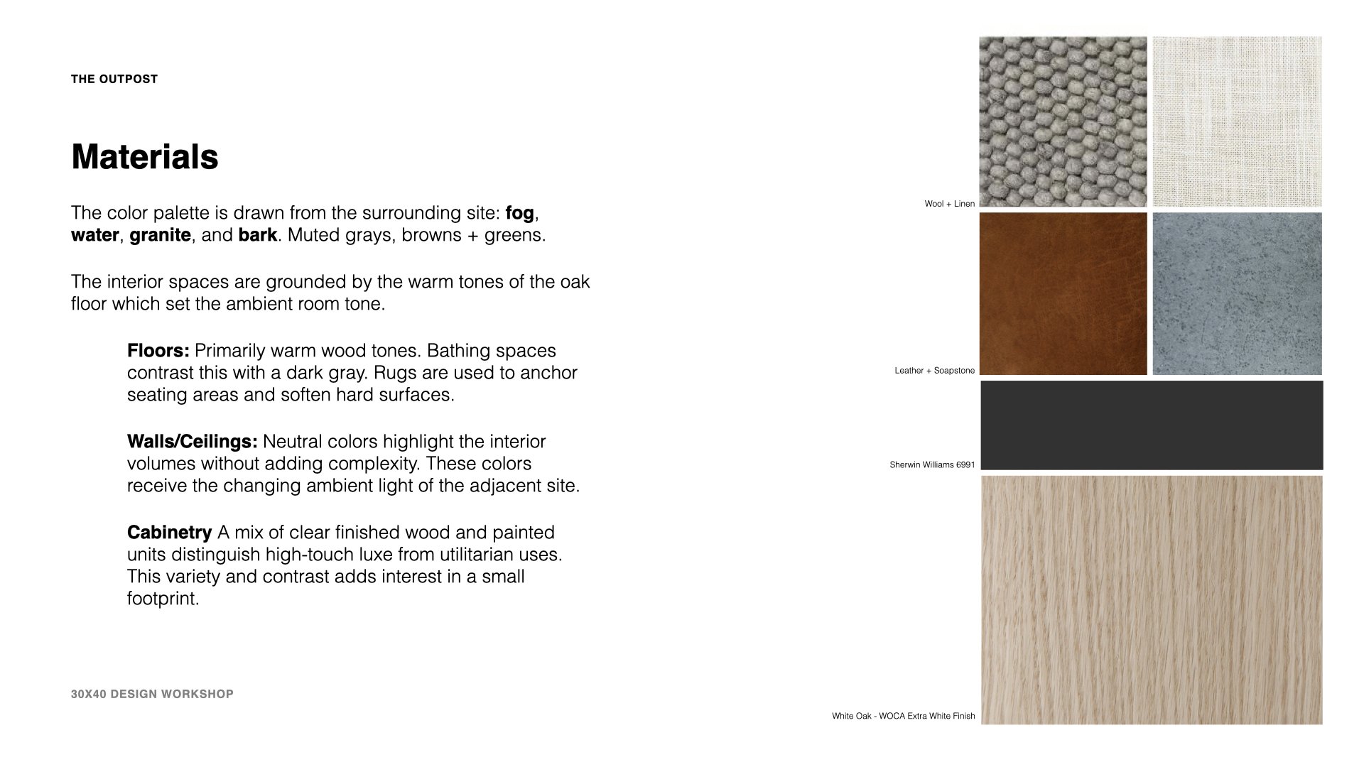
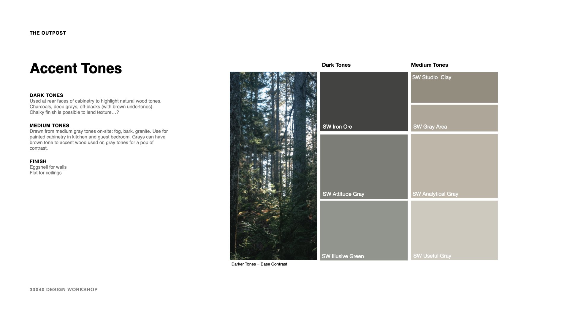
Contast as a concept is versatile and can operate on many levels: tonal (light and dark), textural (smooth and rough), emotional (refined and casual, high/low) and so on. Given this is a small home, we want to limit the material palette so, I’m proposing to use natural wood, painted plaster, and stone as the primary materials. I’ll be accenting these with metal, leather and some fabrics.

Be sure to watch the video for more details on the material selections. Here’s the palette I’ve chosen:

  • Floors

  • Walls/Ceilings

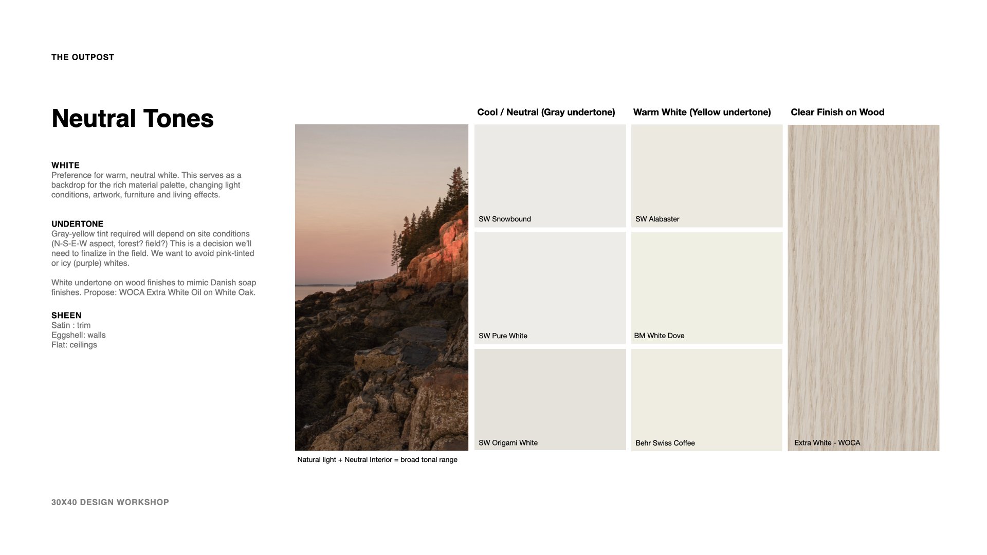
    • Snowbound, Sherwin Williams

    • Illusive Green, Sherwin Williams

    • Attitude Gray, Sherwin Williams

    • Iron Ore, Sherwin Williams

  • Cabinetry

    • Stamped Concrete, Sherwin Williams

    • Argos, Sherwin Williams

    • QS White Oak, WOCA Extra White Oil

  • Counters

    • Ipanema Reserve Soapstone


Below is an excerpt from the working presentation I reviewed with my clients. Download the presentation template here.

Sketching Details for a House (my analog + digital process)

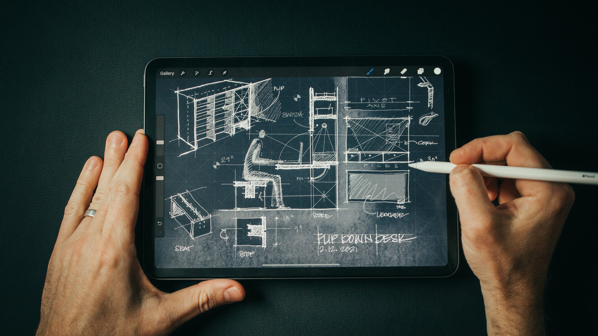
Sketch with me in this video as I design custom details for the Outpost project. Inventing bespoke solutions to design challenges is the reason I love designing homes. The places you brush up against and interact with each day are a chance to invent novel solutions to common problems like how to hang your coat in a mudroom or an informal flip-down desk to write a check. And, quite often, if I'm stuck on a design brief, I’ll zoom in and begin sketching a detail. There’s something about the scale and how manageable it is to solve simple problems that helps me move forward.

For me, this process always starts with a design brief and my sketchbook (or iPad). Once I’ve fleshed out a few ideas and a direction for the design I’ll move into the computer to draw it more precisely. Starting informally with a sketch allows me to be free and fast with ideas and it leads me to other threads I hadn't anticipated. You'll see this in the video as I chase down a few of the more absurd ones.

Before sketching I also like to compile inspiration imagery (like the military field desks you see in the video) and I make sure to have a ruler nearby as I'm designing. Relating to the human scale is an important part of detailing and a ruler helps you set proper proportions for drawers, desk height, etc.

A trick I use as I'm drawing is to really think hard about the daily patterns of life around the subject I'm designing. How would someone use this space? What would they have in their pockets, what would their daily routine moving through or around this space be like? Placing yourself there and asking what would make this experience better, or more "delightful" leads to novel insights. Delightful is kind of a corny word but it’s the best descriptor I can think of. It's the thing that makes you smile when you see it, and say, “Wow, they really thought this through! They really considered what it means to live here, in this place.”

The point of sketching is to chase down all the bad ideas, all the strange threads of thinking, including the absurd. Be open to thinking differently and the invented solutions may surprise you. It's important to not to put too much pressure on it, these aren’t beautiful drawings, they’re process, they show the steps from one idea to the next.

sketch-like-an-architect-details-blog-1.jpg

Material Palette:

  1. Cork panel “Ebony”

  2. Matte Black - hardware + light fixtures

  3. White Oak Plank Floor - “Wheatfield” by Carlisle Wide Plank Flooring

  4. Felt

  5. Beach stone (sourced on-site)

  6. Cocoa mat

  7. White oak - Whitewashed finish

  8. Leather, Antique natural (Edelman) - desk surface

  9. “Anthra” Zinc

How this award-winning architect designs homes

It’s always been about the drawings for me. It’s the singular aspect that led me to choose this profession: the making of drawings. And this is how I came to know Russ Tyson’s work, through his beautifully delineated architectural sketches. They have all the qualities I aspire to emulate. They’re well-composed, with subtle coloration, they’re narrative, loose and informal. They’re believable as architecture, yet they don’t fix any one particular outcome. They leave room for interpretation. Glass is rendered as if air, volumes as textures and always there’s an acknowledgment that these are places meant to be inhabited by people.

A principal at Whitten Architects, Russ’ design skills have realized projects that defy a singular stylistic bent, opting instead to craft plans and spaces that fit his clients’ needs and tastes. Admirable goals for any architect to aspire to. In this video I spoke with him about his design process and we deconstructed it using his Englishman Bay Retreat as a reference point. It’s a wide-ranging conversation and a prying, behind-the-scenes peek at his personal working style.

Architectural Design Process : Form, Orientation and Sunlight

Learn how you can use the Sun to locate, orient, shape, and inspire the details for your architectural design. In this video, I walk you through the design process for a project whose form, orientation, and details were all developed by carefully analyzing the solar path on the building site.

How I find Architectural Ideas

Eight strategies I use to find architectural ideas and confront - the intimidating - blank page.

Topics covered:

  • Bisociation 

  • Trusting the design process

  • Embracing constraints

  • Inventing deadlines

  • Doing the opposite (anti-project)

  • Subtracting to solve

  • Stealing (like an artist)

These are just a few of the design tricks I use to help grease the creative wheels and instill the confidence I need to keep moving forward. What's great is these techniques work for a whole host of disciplines and creative fields, they're not exclusive to architecture.

Books mentioned: 
The Art of Thought
The Act of Creation


Architecture Short Course - How Architects Begin the Design Process

All architecture begins with a concept. If you’re struggling to find one, curious as to what one is, or simply wondering how architects begin their projects, this short video course will walk you through the process I use and some of the techniques I rely on to develop architectural concepts all illustrated with one of my residential projects.

Very simply stated, a concept is an idea that underpins your project. To an architect, the concept is what distinguishes a work of architecture from a mere building. At its core, architecture seeks to solve problems. It’s the questions we ask that will determine which problems our architecture will solve. Developing a concept allows us to frame the questions we’re asking and it guides the design process. Choosing the starting point for your design can be intimidating and an early stumbling block for designers of any skill level. But it doesn’t have to be.  

A concept shouldn’t be rigorous; the more malleable it is, the better. In fact, most architecture can’t be reduced to one singular concept diagram rather it’s informed by many concepts working in concert. There may be organizational concepts, material concepts, functional, or structural or formal concepts. Don’t fret if your design idea isn’t reducible to a single elegant black stroke on the page. It’s best to illustrate concept development with a real project as I said. So, we’ll use our Squid Cove Residence as an example. Before we can develop the concept, we have to first understand the practical constraints.

My design process begins only after gathering and assessing all the given parameters for a project. Now, this primarily consists of three types of information. There’s information derived from the site - things like: local climate, the prevailing winds, the solar aspect, vegetation, neighboring structures, the site’s history, and any unique liabilities or opportunities. The site of course also comes along with legal frameworks for development, which describe where and what we can and can’t build. The second type of information we’ll gather is from the client. Every client has a set of cultural beliefs and preconceptions, preferences and agendas. Of course, we’ll want to determine their budget, and understand the personality traits and organizational politics which might also shape the design. The client and the building type together determine what architects call, “the program” which is essentially a detailed accounting of all the spaces the building will contain.

And, the third type of information I gather is related to the building typology – is it a museum, a home…or a school for example? To learn about a building typology we often conduct an analysis of notable or relevant historical precedents. We want to know the essential problems these types of structures grapple with. Understanding the history of the archetype allows us to approach a problem from a fresh perspective. All of this is necessary information that we collect for every project. This inventory can also serve as the progenitor for the design concept – our seed idea. Rather than shunting creativity, these constraints often incite the creative process.

As with a good film, the setting, the characters, the cinematography, and the plot all conspire to make it what it is. It’s the experience you’ll recall rather than the concept per se. Sure, the concept sets the film in motion and it’s the starting point for all that follows. But this concept – the one or two-line description – can’t possible capture the richness and depth of the finished film…or in our case the architecture. Yet without it, the work is unfulfilling and so it should be clear that the concept is necessary for all our work as architects.

Be sure to watch the video for an inside look at how I craft an abstract idea into a home.