Sketching Details for a House (my analog + digital process)

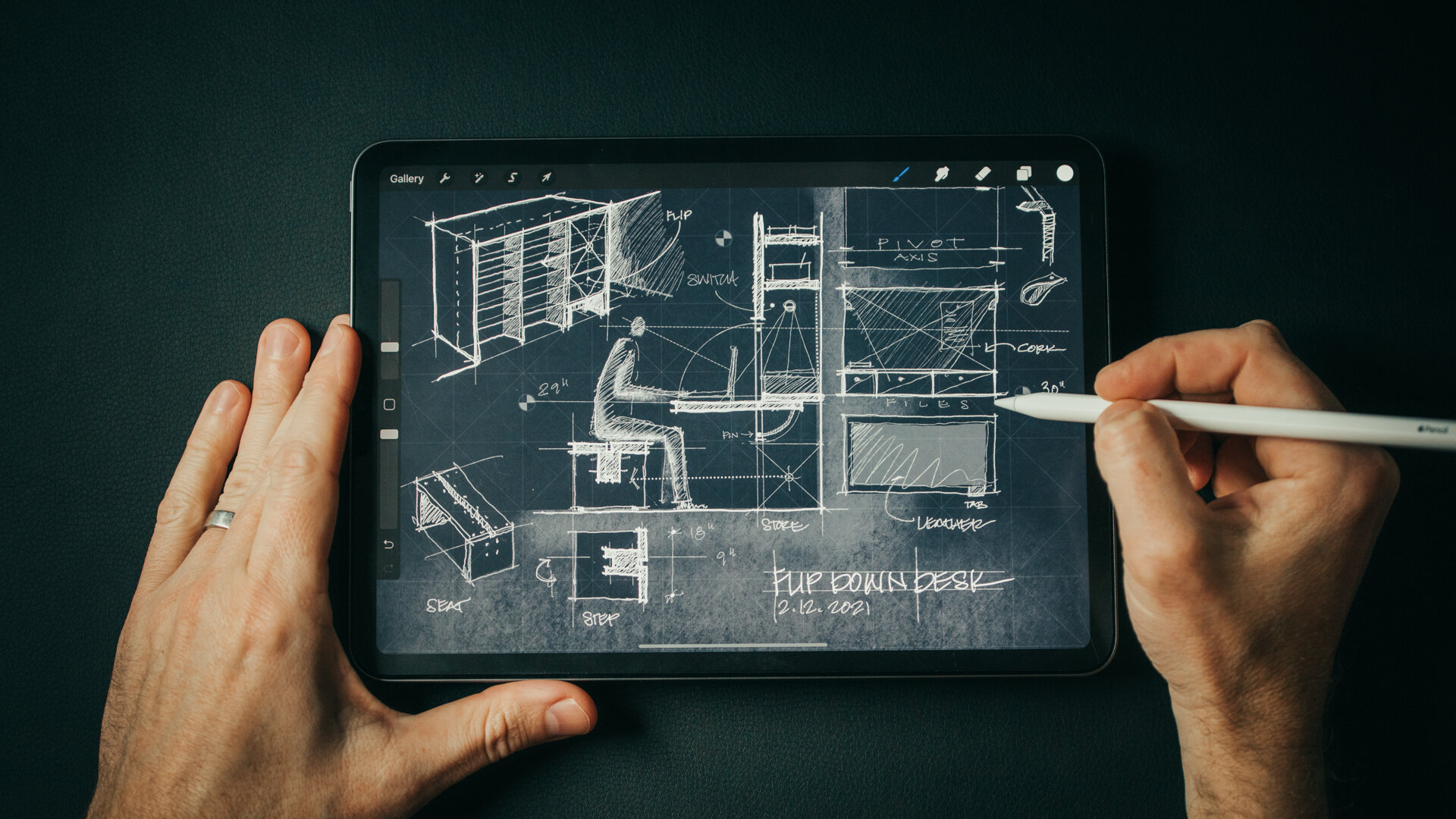
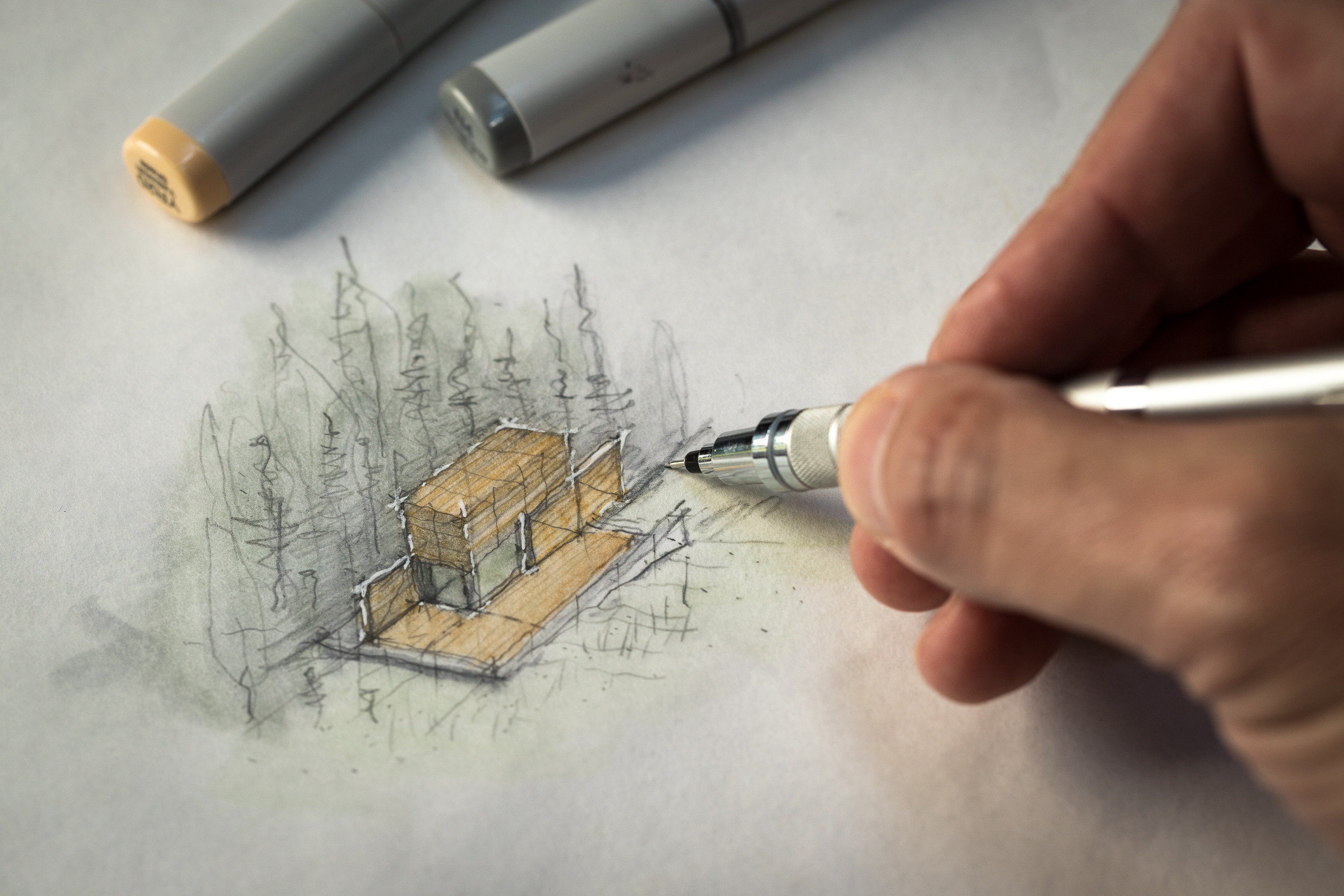
Sketch with me in this video as I design custom details for the Outpost project. Inventing bespoke solutions to design challenges is the reason I love designing homes. The places you brush up against and interact with each day are a chance to invent novel solutions to common problems like how to hang your coat in a mudroom or an informal flip-down desk to write a check. And, quite often, if I'm stuck on a design brief, I’ll zoom in and begin sketching a detail. There’s something about the scale and how manageable it is to solve simple problems that helps me move forward.

For me, this process always starts with a design brief and my sketchbook (or iPad). Once I’ve fleshed out a few ideas and a direction for the design I’ll move into the computer to draw it more precisely. Starting informally with a sketch allows me to be free and fast with ideas and it leads me to other threads I hadn't anticipated. You'll see this in the video as I chase down a few of the more absurd ones.

Before sketching I also like to compile inspiration imagery (like the military field desks you see in the video) and I make sure to have a ruler nearby as I'm designing. Relating to the human scale is an important part of detailing and a ruler helps you set proper proportions for drawers, desk height, etc.

A trick I use as I'm drawing is to really think hard about the daily patterns of life around the subject I'm designing. How would someone use this space? What would they have in their pockets, what would their daily routine moving through or around this space be like? Placing yourself there and asking what would make this experience better, or more "delightful" leads to novel insights. Delightful is kind of a corny word but it’s the best descriptor I can think of. It's the thing that makes you smile when you see it, and say, “Wow, they really thought this through! They really considered what it means to live here, in this place.”

The point of sketching is to chase down all the bad ideas, all the strange threads of thinking, including the absurd. Be open to thinking differently and the invented solutions may surprise you. It's important to not to put too much pressure on it, these aren’t beautiful drawings, they’re process, they show the steps from one idea to the next.

sketch-like-an-architect-details-blog-1.jpg

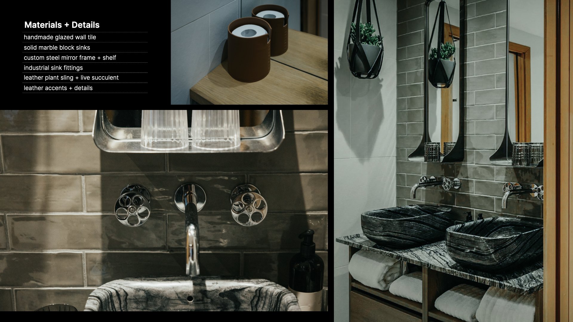
Material Palette:

  1. Cork panel “Ebony”

  2. Matte Black - hardware + light fixtures

  3. White Oak Plank Floor - “Wheatfield” by Carlisle Wide Plank Flooring

  4. Felt

  5. Beach stone (sourced on-site)

  6. Cocoa mat

  7. White oak - Whitewashed finish

  8. Leather, Antique natural (Edelman) - desk surface

  9. “Anthra” Zinc

Sketching in Isolation - Work From Home Skill Building

Feeling the pressure to make the most of your time in isolation to learn new skills + be productive? If you haven’t quite lived up to your own lofty expectations of what you should be accomplishing, you're not alone. Spend 30 minutes with me in my sketchbook and learn what's been working for me as I design an invented architectural folly.

Time spent in my sketchbook is focused and without distraction. It’s space to think and be creative without the strict boundaries of budgets and schedules. It’s reminded me that not everything I design needs to be rooted in reality, that daydreaming and suspending the laws of physics have value too and can nourish my architecture practice in meaningful ways. Inventing imaginary architecture can be a source of control in a time when agency is in short supply. For me, it’s been an enriching, liberating win in this time of quarantine. I hope spending a few minutes with me in my (digital) sketchbook designing a Quarantine Chapel - whatever that is - will inspire you to get lost in your own sketchbook for an hour or two. And, if you build a few skills along the way, all the better!

DOWNLOAD the 30X40 PROCREATE PACK

Assets Used in this Sketch (most are custom + included in the 30X40 Procreate Pack):

Quarantine Chapel Sketch - 04.17.2020

Quarantine Chapel Sketch - 04.17.2020

kiXstand

kiXstand

New tools for the Studio (iPad for Architects)

Do you really need an iPad as an architect, an intern or student? See if any of the four uses I came up with resonate with you. Having always sketched on paper or trace with pencil and ink, a tablet never really appealed to me or seemed entirely useful. I wasn’t sure how it would fit into my workflow, but the Apple pencil and Procreate have changed my mind.

Read More

Design, Meet, Revise, Repeat.

The Outpost project enters a new phase as we refine the design and prepare the drawings for construction. This "awkward phase" is a natural part of the design process and working through it always results in a better building, this video illustrates the iterative process all designers use to improve our work.

Time stamps:

  • 1:04 Locating the Screened Porch

  • 1:35 Budget Considerations + Phasing

  • 2:15 Should every space orient to the view?

  • 3:47 Exploring one more location

  • 5:04 Master bed + bath options

  • 5:37 Remote presentations (using Loom)

  • 5:53 Skype meeting + new concerns

  • 8:17 "I find it a little...boring..."

  • 8:36 You are not your work.

  • 9:51 The need for reference images (I use Pinterest)

  • 10:17 Redesigning the Master Wing

  • 14:02 New information = new options


The video opens as we seek to locate the screened porch which I left out from the previous plans. It's natural - especially when building on site with sweeping views - to want every room to capture that view, but you'll see that prefer to position program spaces to take advantage of the full diversity of a site's features, not only the most dominant one.

As I return to the studio to incorporate the changes from our site meeting, I run through several revisions and schedule a Skype call to discuss progress. During that conversation it becomes clear that the master suite needs to be redesigned to create a separate dressing area and group the shower and soaking tub together.

As a young designer, I had difficulty separating myself from my work. Hearing a critical comment from a client (i.e.: "I find it a little...boring..." ) can be jarring at first. Having worked with many clients and heard a lot of critical feedback, I've learned to draw a very clear line. I am not my work. The work is the work. My job is to shepherd my clients through the design process and help them build the home that best suits them, not the one that will look best in my portfolio. It's possible to hold esthetics, form, and function in high regard whilst meeting the client's needs, they're not mutually exclusive.

The video ends with a brief charrette as I sketch and redesign the master wing. As you'll see, this creative friction from my client pushed the design to a new and better place. Having cleared these minor challenges and confirmed the project is on budget, we'll be moving ahead with the design of the exterior shell package preparing for a construction schedule in the early summer of 2020.

If you enjoy these videos, you can support 30X40’s work on YouTube by investing in a course, a toolkit or a digital tool. Many thanks!

Resources

Digital drawing templates

Specification + Schedule templates

Architect's Toolkit (includes the presentation templates shown in the video)

Architect + Entrepreneur Course

360 Cam for Site Shots

Notion template (free) - Organize meeting notes, wikis, to-dos, checklists

Learning to Sketch

I spend most of my day in a digital work environment and I’ll often find myself tweaking the smallest of details just because I can. Digital space is without limitation, yet creativity thrives on constraints. It’s the boundaries that we’re forced to work within that shape our work. There’s no question digital tools are an integral part of how we realize our architecture today and in the 25 years I’ve been practicing, those tools have changed and improved the way I work significantly. Digital tools are for executing ideas. I turn to my favorite analog tools - pencil + paper - to birth those ideas.

Sketching is thinking. Sketching is seeing. Sketching is learning. With pencil in hand, I’m a child. I think that’s part of the magic of learning to sketch, it allows me to see problems with a child’s mind, the mind of an amateur.

I designed the BLANK sketchbook because I know how transformative establishing a sketching habit can be. Buying a pair helps to support my educational mission on YouTube.

With gratitude

/Eric @30X40

Travel Habits of an Architect

I’ve been doing a lot of traveling lately so in this video, I wanted to share some of my architect travel habits for sketching and photography. These tips apply even if you’re not an aspiring architect and will help you wring the most out of any trip you take, near or far. (And, be sure to stick around at 4:46...wait for it...)

GEAR

My travel kit is as lean as it’s ever been, just a sketchbook, a few drawing tools, my camera gear (more details here) and a small laptop. You don’t need an expensive camera or special tools though to do what I do. The DSLR is an intentional choice for me as it forces me to slow down when I'm traveling. It makes me think about lens selection and composition, the subject, the lighting. It’s probably the single best investment I’ve made in the past 10 years (aside from travel).

**MY UPDATED DAILY CARRY CAN ALWAYS BE FOUND HERE.

For lenses on this trip I brought a wide zoom, a medium zoom, a telephoto and a macro. And this was way too many. Lenses are heavy and to lug these things around in a backpack in the tropics is…well, sweaty. Of the four I brought along, I used the 24-70mm and the 100mm most of the time. The zoom is great because the 24mm end on a full frame camera is wide enough to capture landscapes or interiors and the 70mm is perfect for details. Then you have the right around 50mm is great for portraits. So this one lens covers a lot of situations.

You'll learn why I reject guidebooks in general, my process for observing, documenting and then cataloguing my travels and you'll see what I do in the downtime between destinations.

Time Stamps:

  • 0:22 Start Now. Don’t wait until you arrive at your destination to start taking photos or sketching.

  • 0:42 Follow 30by40 on Instagram: http://thirtybyforty.com/instagram

  • 0:49 Travel Essentials.

  • 1:28 My Routine (Shoot then Sketch)

  • 1:55 Subjects. Not everything has to be architectural.

  • 2:53 Details + Materials = Experience. Learn to observe the world this way.

  • 4:46 Wait for it…

  • 4:55 Has this ever happened to you? Relaxing on the beach and out of nowhere…!?

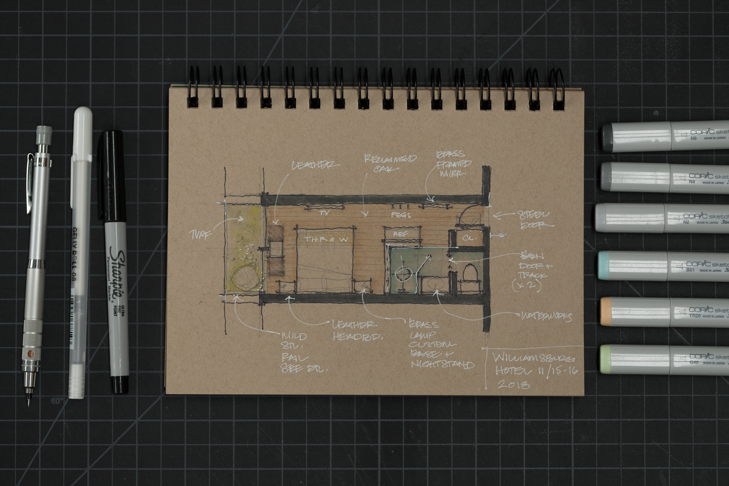
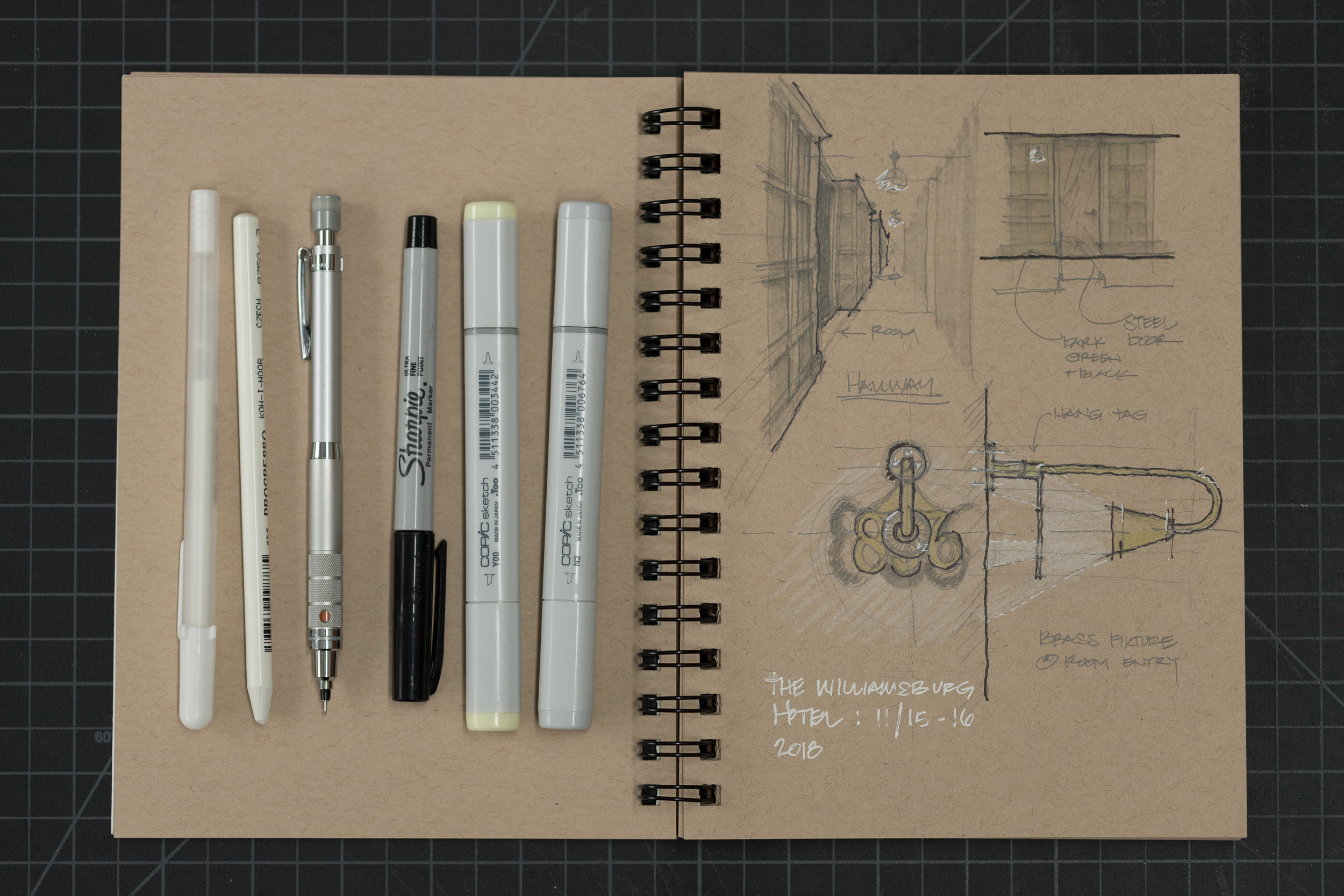
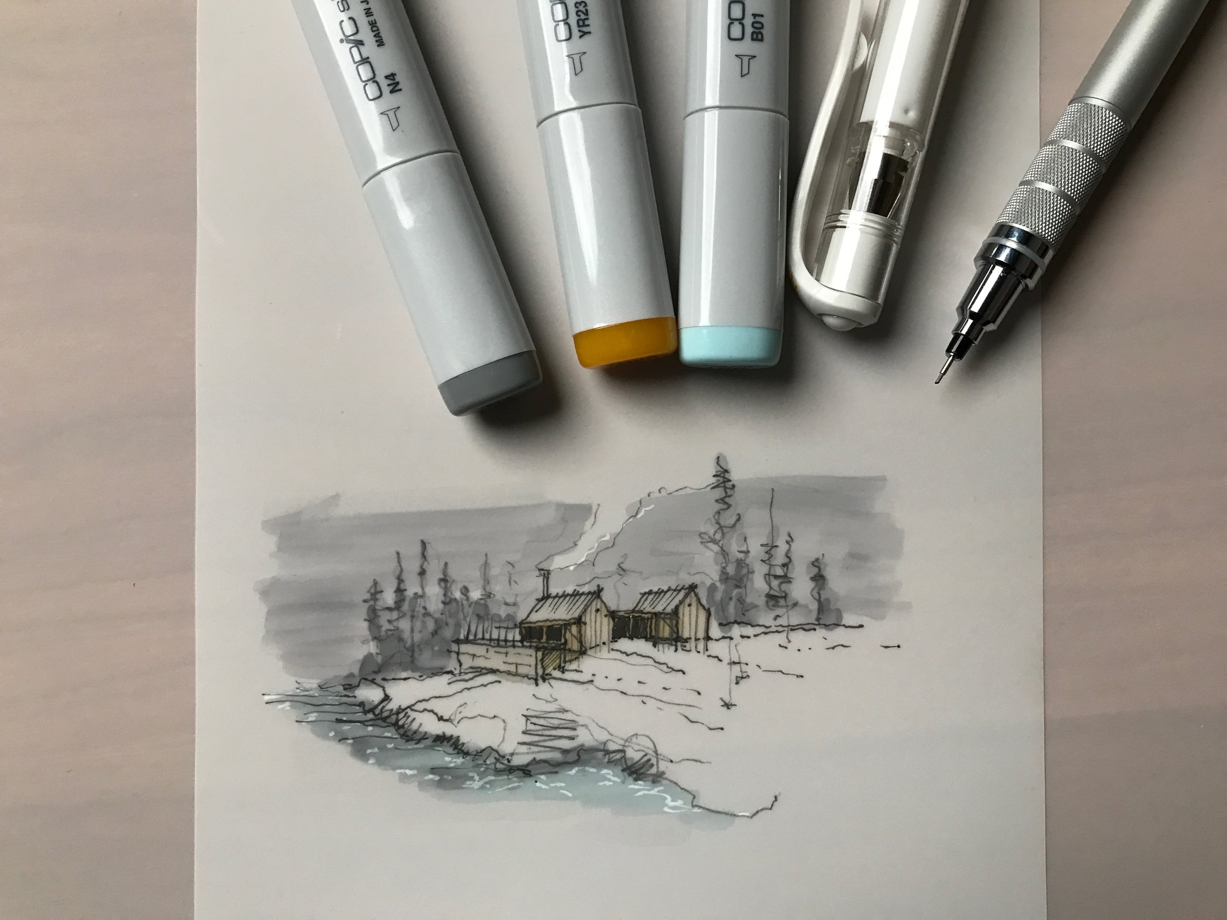
Sketchbook - 50pages from Strathmore (trying something new…I quite like it)

White pen - ink isn’t semi-transparent, but flows nicely, not gummy at all

Copic Marker Set (grays) - essential (this is a set of 5 and includes a non-smudging Multiliner pen too)

Blue + Tan + Green + Yellow Copics are from the blending trio sets (they’re cheaper to buy as sets)

Mechanical Pencil (a personal favorite)

White colored pencil (wood-free)

Hallway Light + Room Numbers at The Williamsburg Hotel

Hallway Light + Room Numbers at The Williamsburg Hotel

SIDE NOTE: The Williamsburg Hotel (at 3:16) in Brooklyn, NY was designed by the London Architecture Firm: Michaelis Boyd and completed in 2017. We actually had no plans to stay here, but we arrived in NYC to an early season snowstorm and our connecting flight back to Maine was canceled. Our flight the following day wasn’t due to leave until 10pm, so at my better half’s urging, we traveled from JFK airport to Williamsburg in Brooklyn and spent the next 24 hours exploring the neighborhood and staying in this fantastic hotel. Completely worth the little bit of extra effort to get there from JFK.

Railing Study at The Williamsburg Hotel (clever design, but, man it really whistles in the wind!)

Railing Study at The Williamsburg Hotel (clever design, but, man it really whistles in the wind!)

Architectural Sketching (techniques + tips)

Inside My Sketchbook - An Architect's Essential Tools

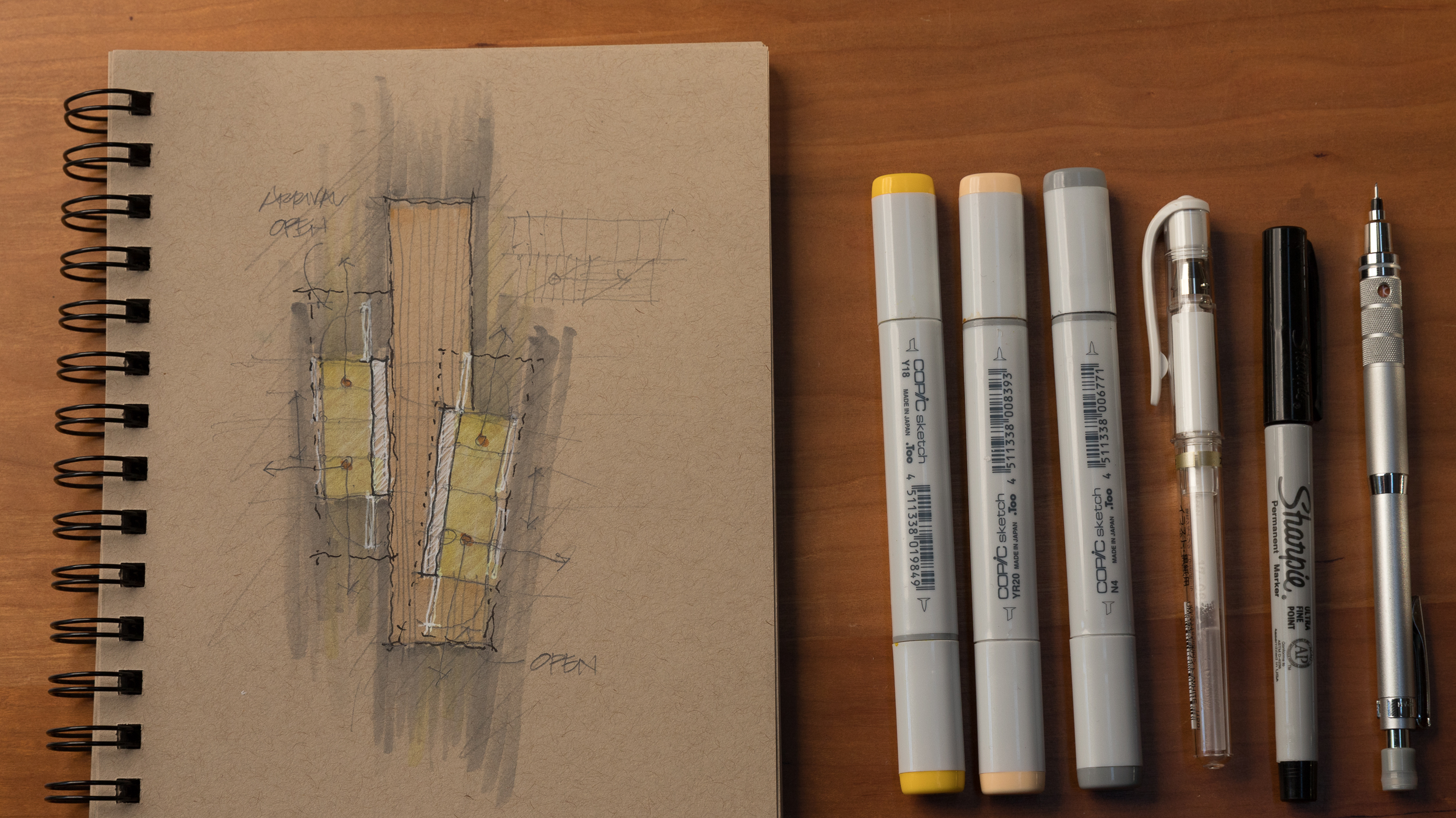
A look inside my sketchbook as I start a new project and review my current favorite sketching tools. See my go-to paper, pens, pencils, markers; everything in my everyday carry kit for sketching.
Instead of the chronological approach I've used in the past, I now dedicate entire sketchbooks to individual projects, tasks, or idea categories. I've found this helps me to organize information and find it quickly when I'm searching for it later.


Sketchbook

BLANK Sketchbook - Custom designed + manufactured by 30X40

Pencils

Kuru Toga .5mm - I use this for sketching currently. If you prefer a chunkier lead, try this lead holder clutch made by E+M

Colored Pencils

Pens + Markers

Pilot Precise V7

Signo

Sign Pen

Markers

Accessories

Pencil Case

Eraser

Eraser Pen

Desk Brush

Chop Stamp

Floor Plan Design Tutorial

In this design tutorial I'll show you how I develop and sketch floor plan ideas quickly. From diagram to rough sketch and on to more formalized plan layouts, you can follow along as I show you everything you need to draw a floor plan using one of our new residential projects as an example.
 

I discuss in detail: 
- why you should start with diagrams (and not floor plans)
- information you'll need before drawing
- tools I use and recommend
- tips for developing better ideas
- form, space, and order (of course)
- using grids
- scale
- and what I listen to when designing...

Be an Amateur (Architect)

Learning from the life and work of Charles and Ray Eames, in this video I discuss why it's important to approach problems with the mind of an amateur. The Eameses believed in never delegating understanding and that one must learn by doing. It's this ethos of experimentation and the use of various media types for artistic expression that's fueling my architecture practice today. And, it's positively effecting how many people I'm able to reach and impact in the world. You'll learn how I've applied the amateur strategy to release my first film and to make better architecture.
***I'm also proud to announce that my short film: A Choice to Make (you've seen it on YouTube right?) was selected to be screened at the 9th annual Architecture and Design Film Festival held in NYC (adfilmfest.com) on November 1st through 5th of 2017. I'll be there and if you're in town, I'd love to meet you there too. Come say hi and feast on some architecture films at the CINÉPOLIS CHELSEA, 260 W 23RD St, NY, NY.

Drawing Like an Architect

In this video I share my essential tips for better architectural drawings. It's easy to forget that architectural delineation is part of our craft and - I believe - beautiful drawings communicate more clearly. 
Important concepts discussed: