Building a 30-Minute Study Model

The digital tools of architecture practice are always changing, but I think most architects will tell you that analog tools - sketching and model making - are an unchanged part of their design process. I find making things by hand - the craft of it - forces me to slow down, to think and to explore. It’s often a failed experiment that pushes the work in a new, unexpected direction.

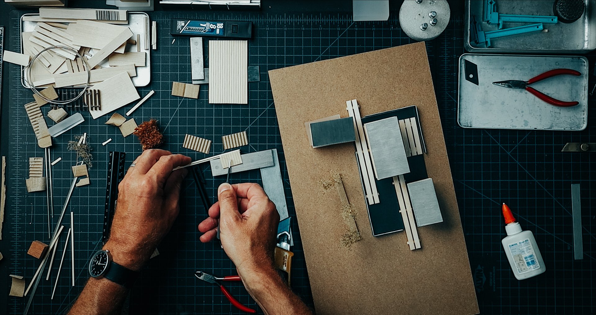
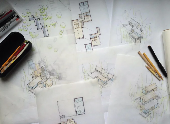
The design process always begins with a sketch and the idea I’m exploring with this new project is how the home can amplify the specific conditions of the site, from the topography to the weather and the changing seasons. The sketch is purposefully open-ended and left open to multiple readings. It’s not a fully formed idea and so to further explore the concept I construct a study model. I use it to study the building forms and site relationships and it’s essentially a three-dimensional sketch.

In the video watch as I turn the conceptual sketch into a working study model which I'll then use as a presentation and design tool for an upcoming client meeting.

Finished Study Model

Material List:

  1. Model base: 1/4” tempered hardboard (Masonite) on 1” thick corrugated cardboard

  2. Building Volumes: 1/16” Basswood Sheets

  3. Barn Doors: Basswood Profile Sheets + Guitar String Detail

  4. Interior Massing Blocks: Jenga + Cast Acrylic Samples

  5. Roof planes:Quartz Zinc’ Sheet

  6. Ground planes:Anthra-Zinc’ Sheet (water), ‘Quartz Zinc’ Sheet (parking surface)

  7. Decks: Skinny Sticks + Match Sticks

  8. Trees: SuperTrees

Tools Used:

  1. Sketchbook: TRACE Sketchbook (for more on my sketching tools, see this page.)

  2. Ruler: Alumicutter - proven to save fingers.

  3. Architect’s Scale

  4. Utility knife: Olfa L2 + blades

  5. Allex Stainless Steel Scissors - quick cuts on a variety of materials: paper, chipboard, wood

  6. Cutting Mats: 18x24 + 12x18

  7. Modeling Tweezers - immensely helpful for all modeling tasks

  8. Hot Glue Gun - for quick + dirty modeling tasks

  9. Elmer’s Glue-All - purchase in bulk, rack over to a small bottle to save time while gluing.

  10. Machinist’s Square

  11. X-Acto Plastic Clamps - an extra set of hands

  12. Gorilla Tape - for mounting metal pieces (like the roof planes)

Model in Process

Revising + Updating the Drawing Set

A recent site visit + client request sets in motion a process every architect is familiar with: redesign + revisions. This is my process for solving real-world architectural problems, from sketching to updating the drawings and documents.

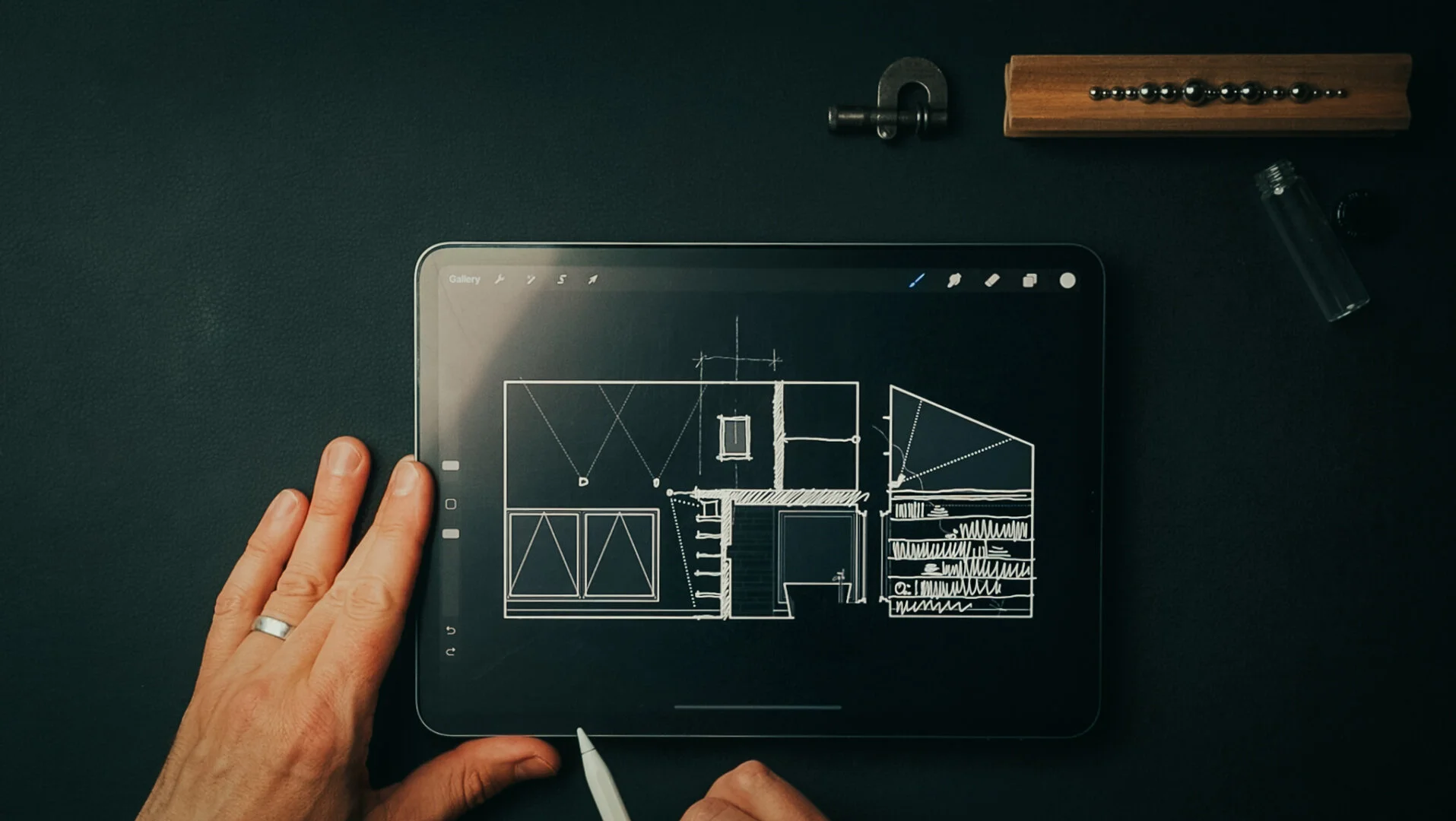
Revisions begin by clearly defining the problem and constraints governing the redesign. All design benefits from constraints, without them the possibilities are limitless. As we’re in construction the restrictions are numerous: there are budgetary, esthetic, physical, legal, and functional considerations. And, of course client preference is chief among them. I’ll often work through solutions that are less than optimal to illustrate shortcomings and to help move the design process forward. Below are a few examples of the initial solutions I developed.

Sketching Solutions

Sketching Solutions

Material Palette for inspiration

Material Palette for inspiration

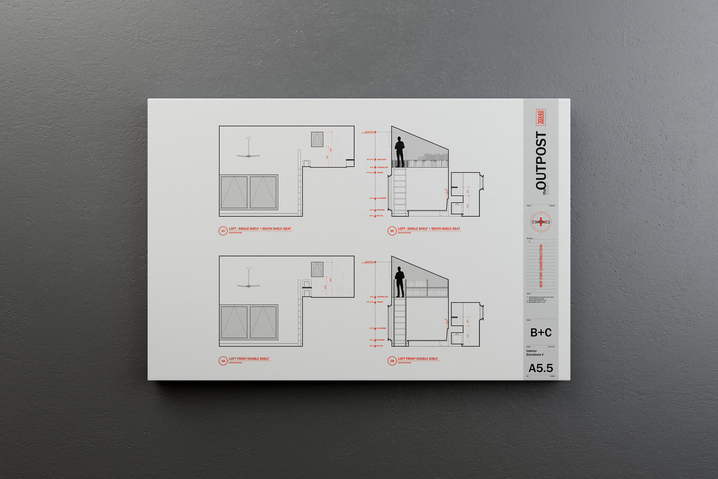
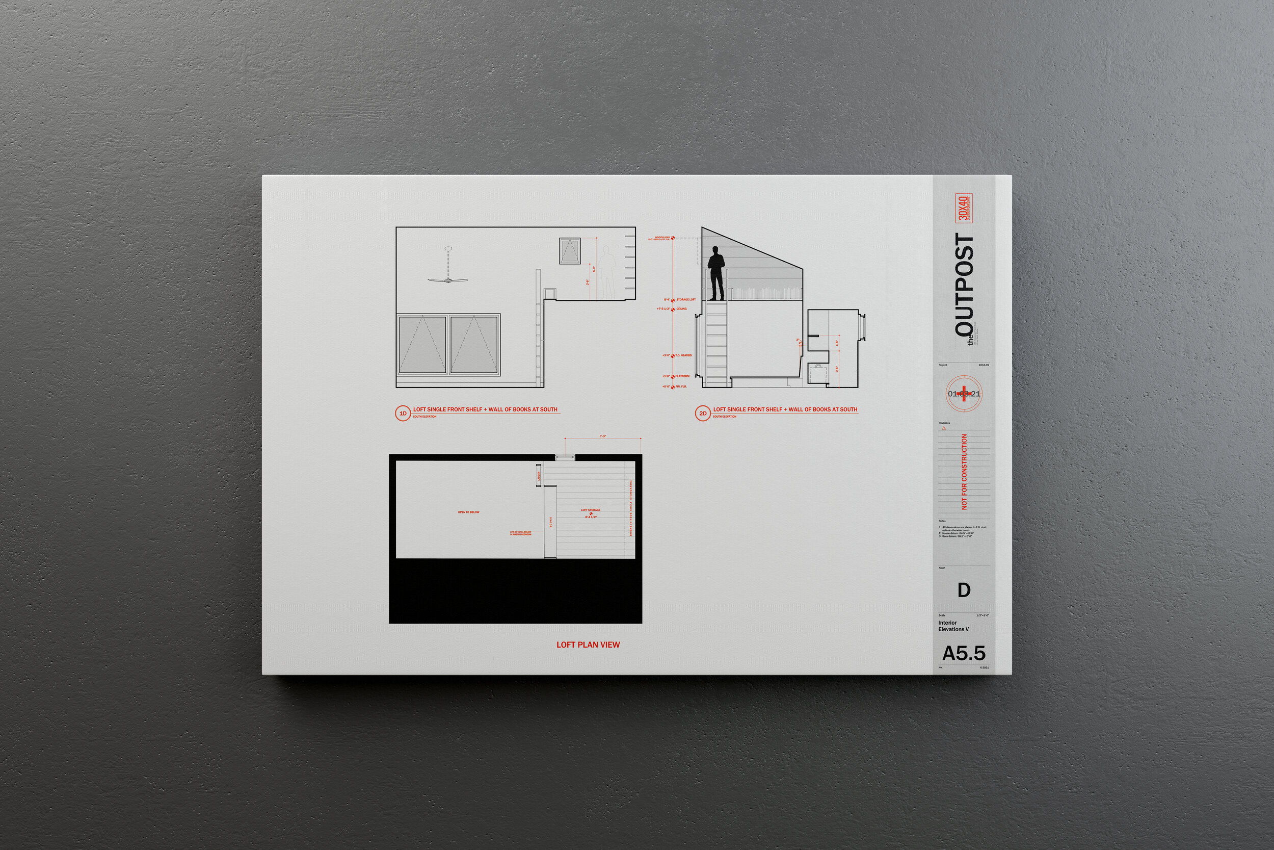
A ladder clearly takes up the least space in the room, but it’s also the most difficult means of accessing the loft space. As my clients imagined cleaning it and bringing books to and from it, the use cases narrowed. Even though it may be possible to recapture extra space in a home, if it’s not useful or easily accessible, the cost-benefit is questionable.

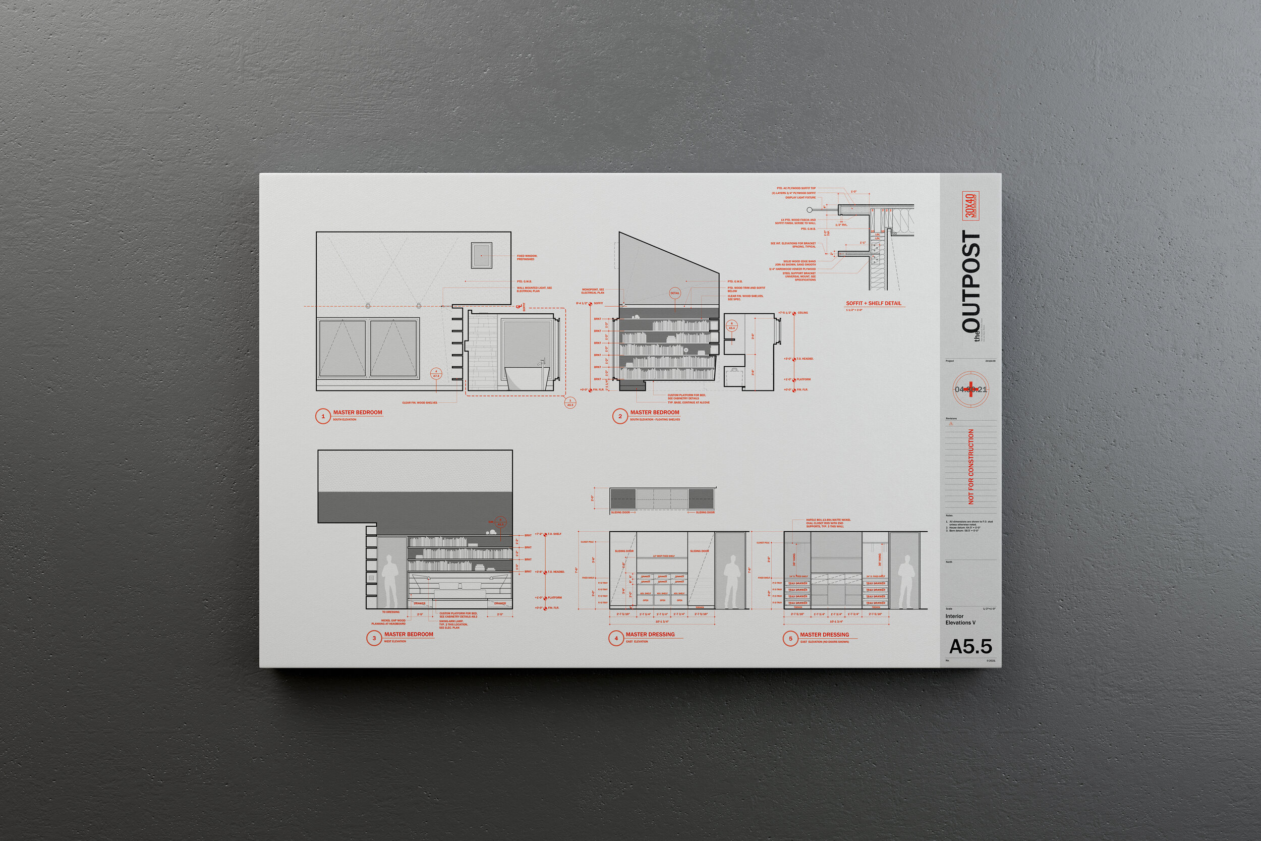
As we worked through the options, this need for book storage suggested a new opportunity. By shifting the pocket door entry to the north and creating an alcove for the books on the main level we solved a few problems at once. The books found a natural home within arms’ reach and this singular, sweeping gesture on the south wall of the room also created a soffit above for display, increasing the perceived volume of the room and it allowed us to add a small eyebrow window to let light in from above. The soffit and shelf repeated a motif we had used elsewhere on the interiors whereby we nest smaller volumes within larger volumes of space.

Idea becomes sketch. Sketch becomes presentation drawing. Presentation drawing becomes construction drawing. And now, we build!

Outpost Updates - July 2023

To see all the latest progress + the current interior design iteration check out the links below:

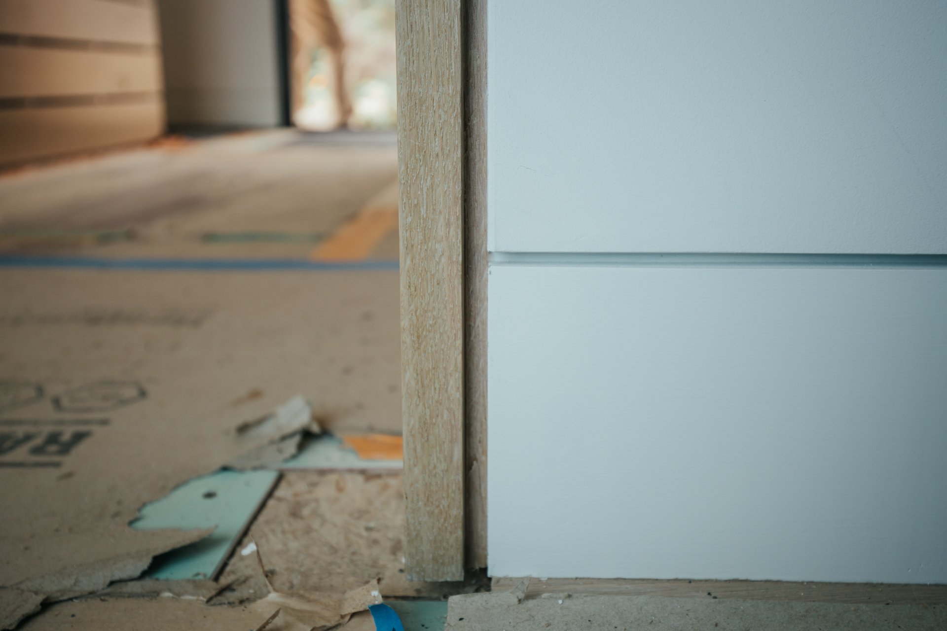
Door Jamb Head Reveal Detail

Door Jamb + Base Reveal Detail

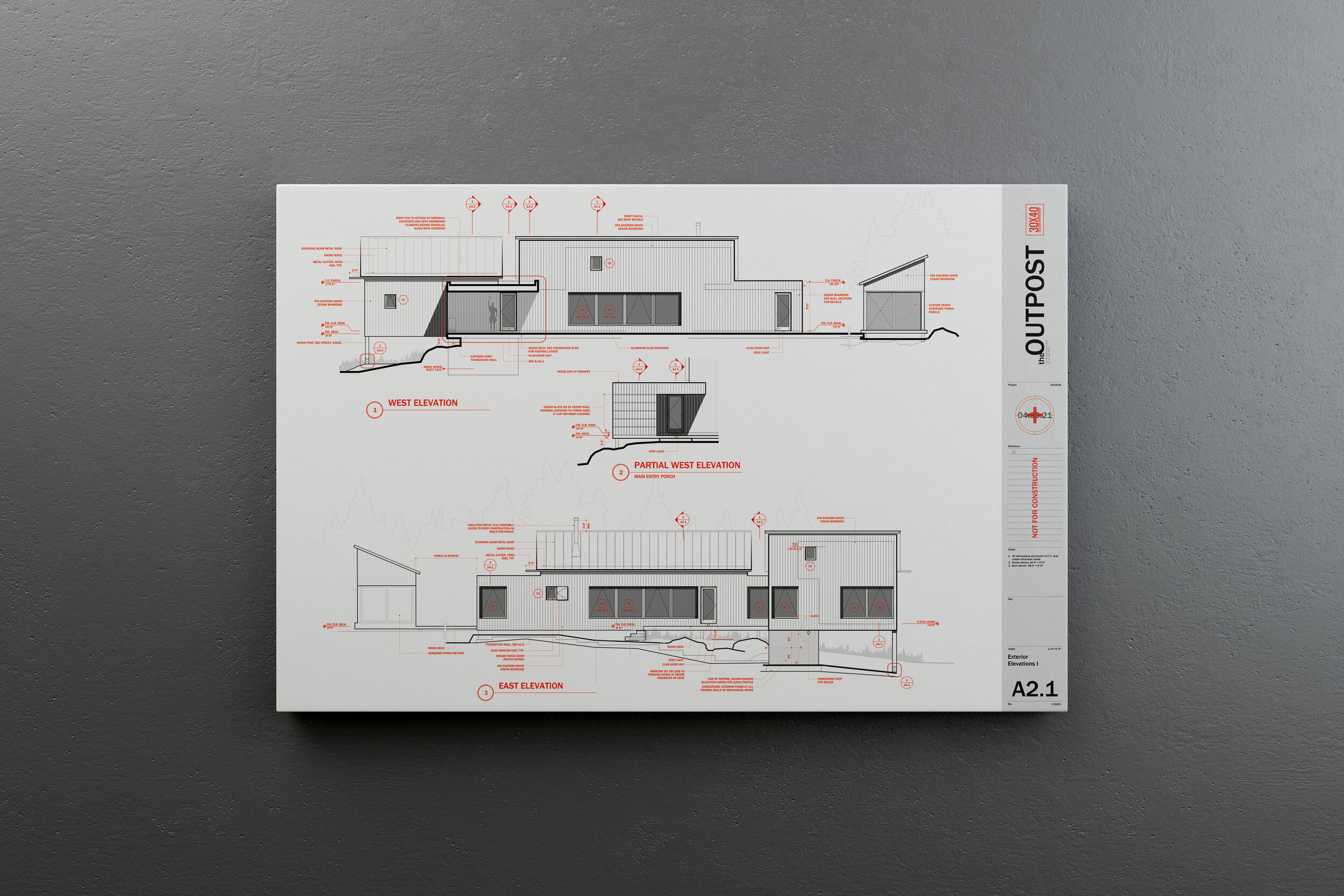
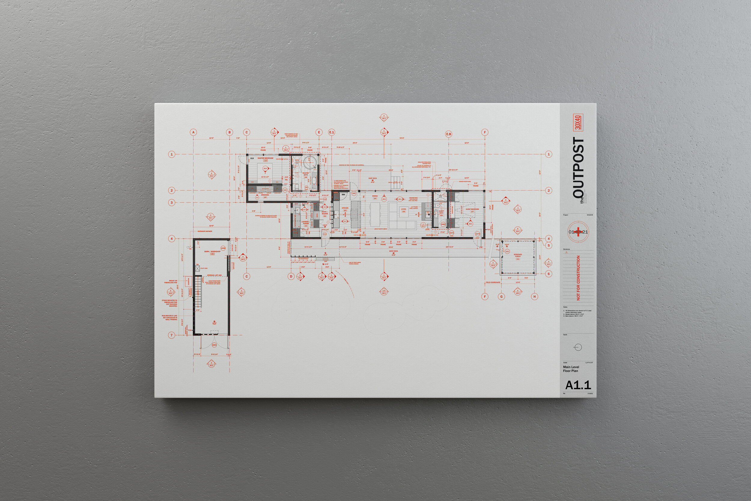
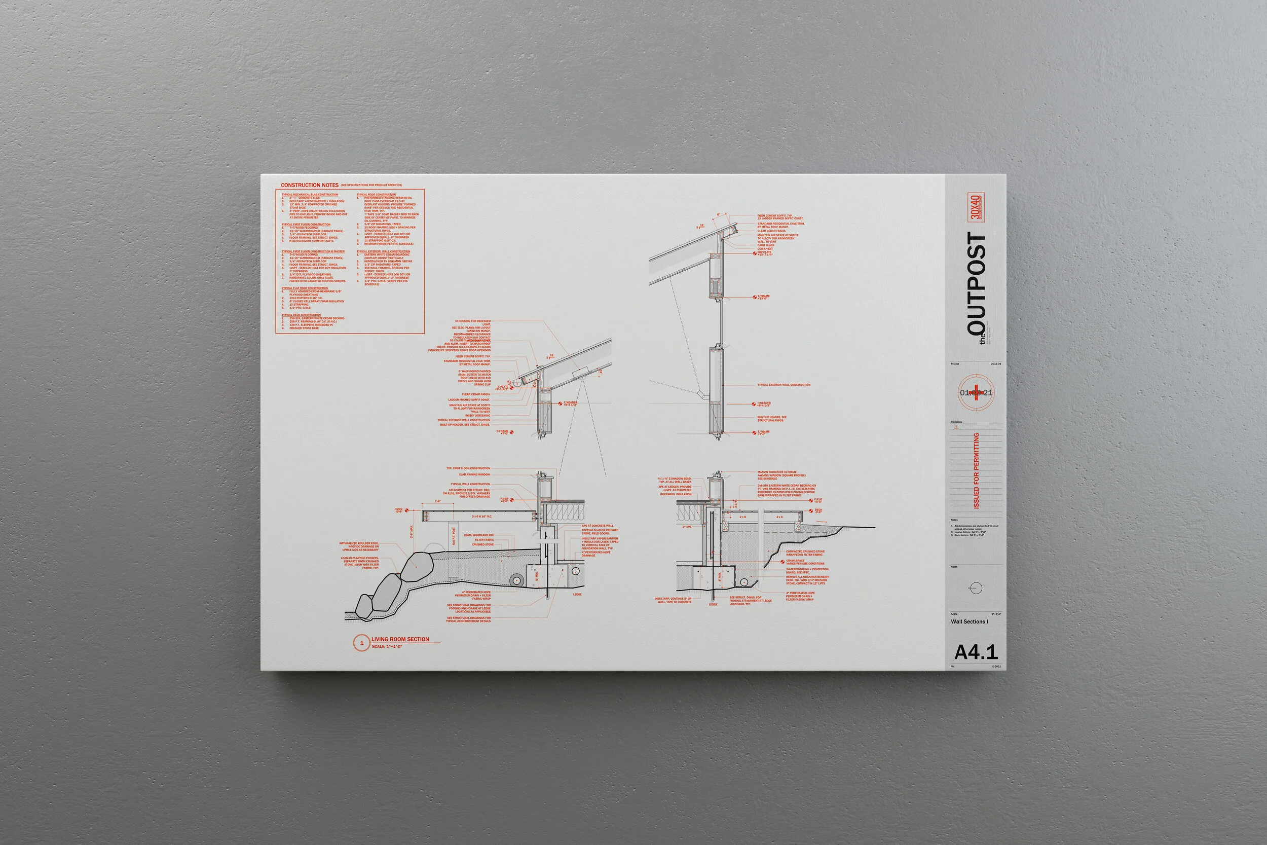
What's in a typical custom architectural plan set?

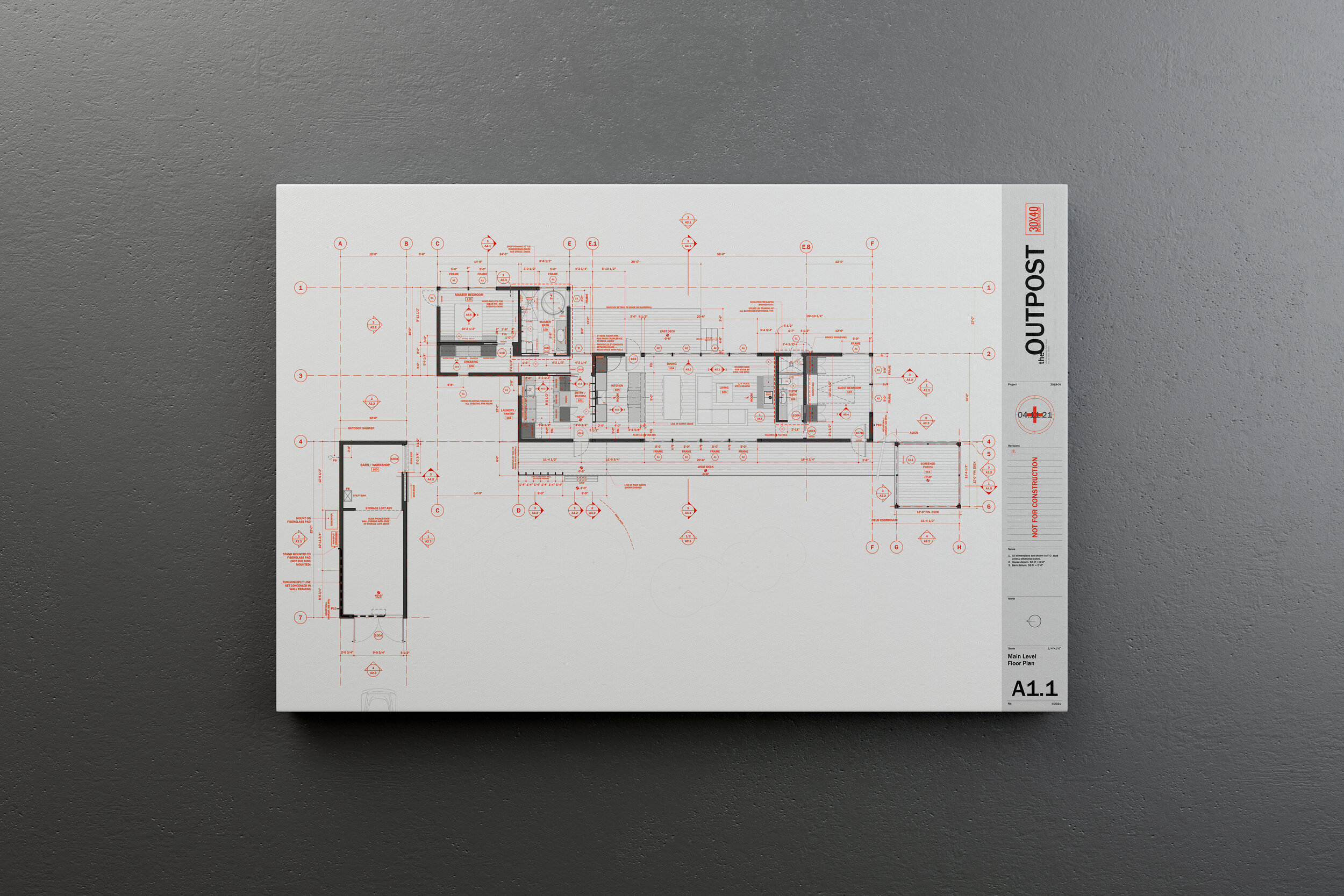
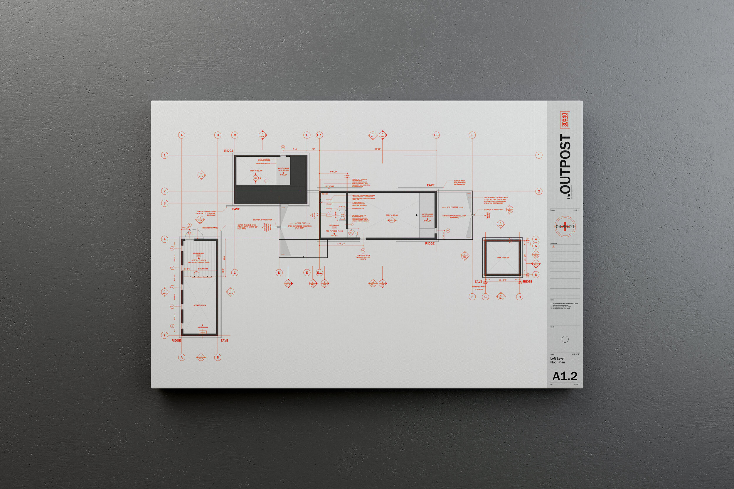
All architectural drawings are representations - abstractions - of what we intend to build. The two lines that make up the wall segments drawn on a floor plan aren’t enough to describe what the wall should be constructed with. So we rely on three main devices to convey that information: drawings, schedules and specifications. Together these documents organize and catalog all the decisions necessary to build our project in a very precise way. In this video, you’ll see everything I include in a typical set of custom documents from start to finish.

By any account, this is a lot of information to include. Consider this though: anything we don't delineate, anything that's not called out in the construction documents is a decision we’re choosing to defer to someone else to make, whether that's during pricing or in the field during construction. In general, I prefer to control and direct as many design decisions as possible, so I choose to draw and call out as much as I can in the studio where making changes is relatively inexpensive as compared with on-site where every move comes at great expense.

Creating "a tight set of documents" means we’ve taken the time to document the full range of decisions required to construct the project as designed. A tight set of documents will answer every question that arises along the way, from pricing through construction. Importantly, we don’t leave things to chance, we use our set to describe very specifically the design decisions we've made with our client prior to construction. The value of this is that it helps our clients feel confident that what’s been decided during the design process will be realized in the final home, it protects the architect as the author of the design against unwelcome surprises in the field, it helps the general contractor and the sub-trades to accurately price the project and ultimately to stay on budget and on-schedule as we're building because everyone knows what's expected.

More resources:

Updating My Workspace

I’ve been in my studio workspace for about four years now and as my needs have changed it was time to adapt the studio to meet new demands. As a destination separate from my home, yet still nearby, the separation has worked out well but hiring an intern for the summer meant I needed a dedicated workstation. And, I knew that the storage situation needed improvement. To make room, I started by decluttering and removing all the non-essentials I had gathered over the years. From there I sketched out a quick plan to rethink the organization and layout. The video shows the refresh from start to finish, more details below.

See the original studio tour video here.

New Workstation

The studio workspace was designed to adapt to a variety of functions. When I first moved in, it doubled as a music practice + performance space in the off-hours for our two boys and their friends. This practice space took up a full third of the floor area and was the most obvious place to locate the new workstation. With the instruments relocated to the main house, it was time to place the new furniture.

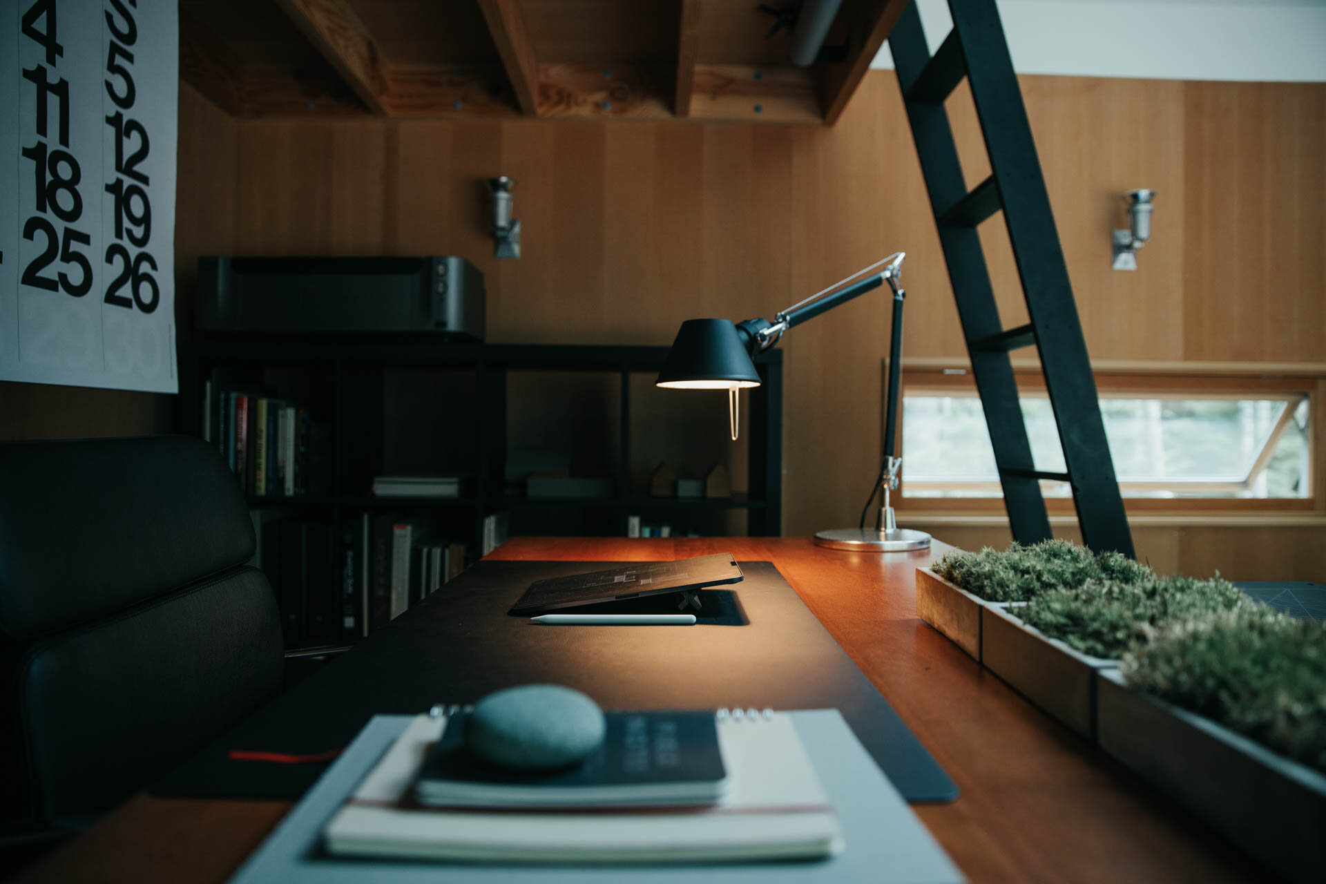
For the work surface, I chose a sit-stand desk with a massive, solid birch top and a flexible solution for a space used by multiple people. At 60” wide by 30” deep there’s plenty of room to accommodate everyone’s needs. The black hardware and natural wood top tie in with the other details in the studio. In a small space like this it helps to maintain a limited color palette so everything plays well together, here we’re using natural wood tones, browns, blacks and grays.

For seating I picked up two of the Soho drafting chairs by Laura Davidson. With heavy-duty cast aluminum bases, plush seats, tilting backs and removable arms these were a solid upgrade from my old creaking drafting chair. I swapped out the casters for roller blade style wheels for a quieter ride on the concrete floor.

New workstation (Sway desk by Ergonofis)

New workstation (Sway desk by Ergonofis)

On the Desk

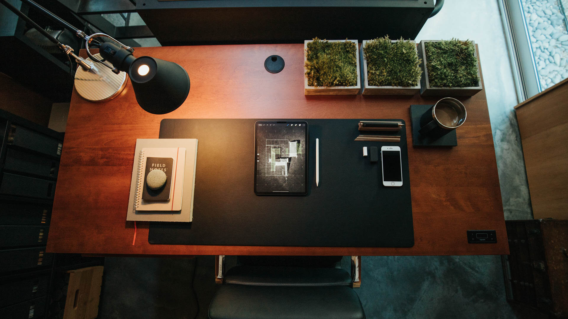
I removed all the knick-knacks, trays, external drives, and unnecessary clutter from my desktop and consolidated my small essentials (scissors, pens, pencils,) into a simple steel cylinder divided into four quadrants. To ground everything I purchased a large linoleum desk pad and swapped out the standard white apple keyboard and magic mouse for the space gray versions. I blacked out the front and base of my 27” iMac with a skin to complement the other black accessories. The coaster is a repurposed piece of black slate and I added a wireless charging pad by Anker.

Beneath the desk I mounted a black aluminum tray to hold my 8tb Lacie hard drive which stores all my digital files. I tidied up all the cables using split sleeve covers and used small black adhesive hooks throughout the space to keep my cables ordered and out-of-sight. I relocated the bluetooth soundbar that sat on the front of my desk to atop the shelving unit to my right to keep it out of view.

For task lighting, I picked up two of Artemide's Tolomeo mini desk lamps in black, I've always liked their timeless modern look and fitted them with 25W incandescent bulbs (much nicer light to sketch by than LED). Having stripped down my desk to the bare essentials, it was time for the rest of the studio to follow suit.

Walls + Backdrops

Because the north desk area often serves as a backdrop for filming I wanted a something different and darker there. One of the problems with the Douglas fir interior is that it's not a neutral tone, so it affects the ambient, reflected light in the space, which for filming isn’t ideal. Rather than painting the natural wood plywood on the north wall I chose to skin it with MDF and chalkboard paint. I mounted them on concealed Z-clips so I can easily remove them if I want to in the future.

On the MDF I installed two metal ledges from CB2 adding 8' of horizontal display space without taking up any floor area. I'm using them to display material palettes, books I'm reading and various found objects. Concealed along the front of the ledge are two play lights from Philips controlled via the Hue bridge system and their mobile app they serve as practical lighting in the background and can be changed to any color I choose.

Storage

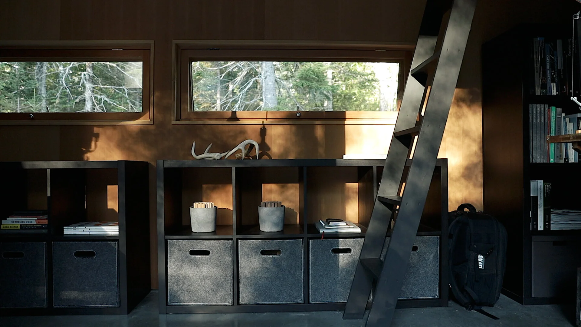
When I built the studio, I didn't have the budget for built-in storage but if you want a minimalist, organized and clutter-free space, storage is essential. I've added two IKEA Kallax shelving units beneath the west windows. The upper cubes I'm using to store objects and as reserve capacity for books. The lower cubes I've fitted with Bladdra felt boxes - also from IKEA - to hold irregular objects and things I don't want out in view and collecting dust.

The rolling tool chest is by Husky, I'm using only the lower portion of the unit in the studio (the upper half holds tools in the basement) to organize all of my studio essentials, kiXstand samples, and camera equipment which still leaves plenty of space for new tools. With eleven drawers of varying sizes and depths it can hold a lot. The shallow drawers are easy to keep organized in a single layer. For the deeper drawers I picked up a few pouches and organizers to keep cables and smaller items grouped together.

The height of the base unit is perfect for making models and for filming or photography projects. My two large Alvin cutting mats live on top and off to the side is a rare earth magnet to hold my rulers and utility knife. When the standing desk is raised, the tool chest can easily meet its surface to give me an even larger surface to work on if needed. And if I find myself wanting additional walking space in the studio, The desk can be raised a little more and the toolbox can roll comfortably beneath it.

Styling

To pull it all together I added a few styling upgrades. I added three new prints adjacent to the new standing desk which cleverly conceal the old guitar mounts and these are matted in ice-white with black aluminum frames. These were printed in-house using Canon's Pixma Pro 100 on low lustre paper an incredible printer for less than $300. (For printing drawing sets, I use the HP T210).

To hide the (off-center!) mini-split heating unit, I picked up the Stendig wall calendar by Massimo Vignelli, which I slipped into a concealed poster sleeve and mounted to the loft floor joists above.

To bring a little of the natural landscape inside, I repurposed four concrete napkin holders by Port Living Company to plant moss in and I picked up a tiny Chinese elm bonsai to live on the corner of my desk. By adding these minor accent pieces, you can bring a certain life and personality to your workspace that can simultaneously make your office feel much more inviting. To this I’ve added a few additional inspirational objects and I finally feel like it’s a cohesive workspace with room to spare.

It's a series of progressive upgrades, an evolved, tidier version of what I started with. Our workspaces are guaranteed to change over time along with our priorities and needs and I love that this is a space that can adapt and change with me.

Check out this and all of my curated kits on kit.co.


Considering a dedicated studio space?

Read more: Five signs it’s time to rent (or build) your own.


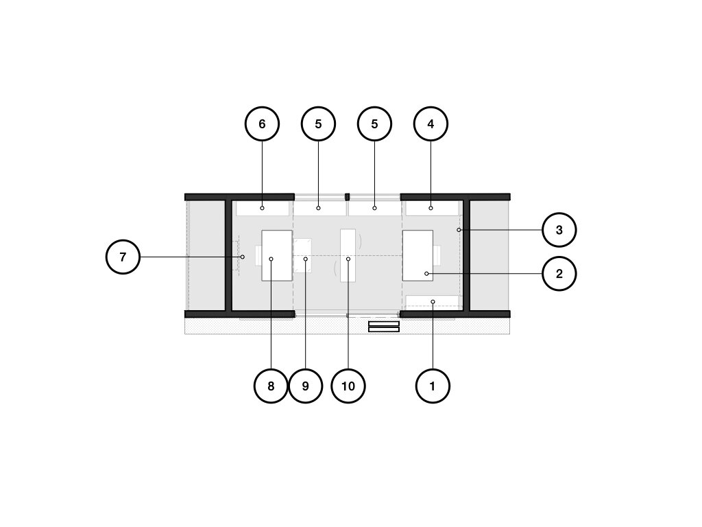
Studio Plan diagram


1. Photography/Printing Space: This is where I keep most of my essential photography equipment, from lenses to batteries. In addition, because of it’s proximity to my desk, My printing tools, including the large format printer also live here for easy accessibility.

Above this are two wall mounted cabinets with flip-down tops which hold stationery, pens and my drone (closest to the main door).

2. Main Workspace: Where I spend the most time in the studio. My iMac, Laura Davidson chair, sketching implements and computer accessories all find their place on my vintage drafting table to create a focused and productive work environment.

3. Display Shelves: A pair of metal ledges run behind my desk and are (currently) being used for display. They also hold my play lights by Philips that provide ambient lighting in the morning + evening, and, practical lighting for filming.

4. Book Storage: This shelf contains references, inspirations, information, entertainment, a few personal accolades. The books I keep here are amongst my most-prized possessions as an architect. On top I have a sound bar which streams music.

5. Storage Units: One of the most impactful upgrades in the refresh, these shelves house concealed items on the lower tier and provide buffer space for an ever-growing library above.

6. Shelving Unit: Unlike the unit of matching design on the other side of the studio, this shelf holds a variety of resources: material sample binders, floor samples, magazines, modeling supplies and paint and a few architectural models. For now, the Canon printer also lives atop this unit. It’s a solid choice to produce colorful, frame-worthy prints, but needs a more accessible permanent home.

7. Minimalist Calendar: Although it’s purpose is to cover the - distractingly off-center - mini-split heating head, this calendar by Massimo Vignelli is a minimalist graphic addition to the studio. Every other month inverses the white and black (see images above).

8. Secondary Workspace: The new workspace is anchored by the Sway Standing Desk by Ergonofis. It’s adjustable birch top allows me to be able to easily switch between standing or sitting work environments and accommodates a variety of uses. The Laura Davidson swivel chair is paired with the desk, a comfy upgrade at a fraction of the cost of the Eames Management chairs by Knoll.

9. Tool Chest: One of the largest new furniture pieces in the studio, the Husky rolling tool box houses everything from camera equipment to power tools. I’ve converted it’s available surface so that it when the new Ergonofis desk is brought level, it creates a massive, singular workspace. When the desk is raised higher, the chest can be easily moved under it to provide additional open space.

10. Meeting Table: As more new additions were made to the studio, I found that that the spaces for simply walking had become much too cramped. And given our current situation, in-person client meetings have become a rarity. So I removed one of the tables from the meeting space.


Floor Plan Design Tutorial

In this design tutorial I'll show you how I develop and sketch floor plan ideas quickly. From diagram to rough sketch and on to more formalized plan layouts, you can follow along as I show you everything you need to draw a floor plan using one of our new residential projects as an example.
 

I discuss in detail: 
- why you should start with diagrams (and not floor plans)
- information you'll need before drawing
- tools I use and recommend
- tips for developing better ideas
- form, space, and order (of course)
- using grids
- scale
- and what I listen to when designing...

Book Review: Operative Design + Conditional Design

Reviewing two architecture books: Operative Design + Conditional Design and sharing my thoughts on the kit-of-parts design methodology they promote. Together these volumes are an excellent primer on architectural form making, iterative design, and can serve as handy portable, pocket-sized reference manuals. The diagrams are beautifully composed in full-color and the accompanying text - although brief - offers enough information to guide the reader / viewer on the book’s use. Recommended for: architecture students, teachers and professionals looking to revisit first principles or reinvent their own tired formal language.

**Operative Design: A Catalogue of Spatial Verbs**
**Conditional Design: An Introduction to Elemental Architecture**

How I find Architectural Ideas

Eight strategies I use to find architectural ideas and confront - the intimidating - blank page.

Topics covered:

  • Bisociation 

  • Trusting the design process

  • Embracing constraints

  • Inventing deadlines

  • Doing the opposite (anti-project)

  • Subtracting to solve

  • Stealing (like an artist)

These are just a few of the design tricks I use to help grease the creative wheels and instill the confidence I need to keep moving forward. What's great is these techniques work for a whole host of disciplines and creative fields, they're not exclusive to architecture.

Books mentioned: 
The Art of Thought
The Act of Creation


How to Choose Architectural Materials

Architecture can’t exist on a page it must be built. Transforming drawings and tiny cardboard models into physical reality means choosing materials to represent our ideas. In part four of the architecture short course I discuss materials – how architects choose them, how we know what’s right, how they can shape how we feel in a space, how they influence our designs, and a rubric you can use when selecting your own.

Instead of an abstract exercise, I walk through the precise process I used to choose the materials for the case study project we’ve been following throughout the course.

Links to all my favorite material resources.

Developing the Concept: Architecture Short Course (part 2)

Developing the architectural concept into floor plans, designing the form, and refining the spatial ideas are all covered in part 2 of our architecture short course.

The first step in making the abstract concept real is to sketch a floor plan and then give that plan a three-dimensional form. A floor plan is a quick way of describing the hierarchy and relationship of spaces and it begins fixing their real physical dimensions and shapes. Throughout the design process architects must continually consider the design in both the plan, or overhead view, and the sectional, or volumetric view. The easiest way I’ve found to do this is to begin by sketching a plan and then construct a three-dimensional version of that plan either in model form or by sketching.

In order to get to three dimensions, we have to make some decisions about form, space, and order. When we speak about form we’re referring not only to a building’s shape but also to its size, scale, color, and texture…basically, all the visual properties of an object. Form has a direct relationship to space in that it influences both interior and exterior rooms. And lastly, order is how we choose to orient and relate the forms and spaces to each other. This directs the inhabitant’s experience of a place.

We'll review strategies for refining the floor plan, designing meaningful building forms, editing, and converting two-dimensional abstract concepts into three-dimensional buildings.

Architecture Short Course - How Architects Begin the Design Process

All architecture begins with a concept. If you’re struggling to find one, curious as to what one is, or simply wondering how architects begin their projects, this short video course will walk you through the process I use and some of the techniques I rely on to develop architectural concepts all illustrated with one of my residential projects.

Very simply stated, a concept is an idea that underpins your project. To an architect, the concept is what distinguishes a work of architecture from a mere building. At its core, architecture seeks to solve problems. It’s the questions we ask that will determine which problems our architecture will solve. Developing a concept allows us to frame the questions we’re asking and it guides the design process. Choosing the starting point for your design can be intimidating and an early stumbling block for designers of any skill level. But it doesn’t have to be.  

A concept shouldn’t be rigorous; the more malleable it is, the better. In fact, most architecture can’t be reduced to one singular concept diagram rather it’s informed by many concepts working in concert. There may be organizational concepts, material concepts, functional, or structural or formal concepts. Don’t fret if your design idea isn’t reducible to a single elegant black stroke on the page. It’s best to illustrate concept development with a real project as I said. So, we’ll use our Squid Cove Residence as an example. Before we can develop the concept, we have to first understand the practical constraints.

My design process begins only after gathering and assessing all the given parameters for a project. Now, this primarily consists of three types of information. There’s information derived from the site - things like: local climate, the prevailing winds, the solar aspect, vegetation, neighboring structures, the site’s history, and any unique liabilities or opportunities. The site of course also comes along with legal frameworks for development, which describe where and what we can and can’t build. The second type of information we’ll gather is from the client. Every client has a set of cultural beliefs and preconceptions, preferences and agendas. Of course, we’ll want to determine their budget, and understand the personality traits and organizational politics which might also shape the design. The client and the building type together determine what architects call, “the program” which is essentially a detailed accounting of all the spaces the building will contain.

And, the third type of information I gather is related to the building typology – is it a museum, a home…or a school for example? To learn about a building typology we often conduct an analysis of notable or relevant historical precedents. We want to know the essential problems these types of structures grapple with. Understanding the history of the archetype allows us to approach a problem from a fresh perspective. All of this is necessary information that we collect for every project. This inventory can also serve as the progenitor for the design concept – our seed idea. Rather than shunting creativity, these constraints often incite the creative process.

As with a good film, the setting, the characters, the cinematography, and the plot all conspire to make it what it is. It’s the experience you’ll recall rather than the concept per se. Sure, the concept sets the film in motion and it’s the starting point for all that follows. But this concept – the one or two-line description – can’t possible capture the richness and depth of the finished film…or in our case the architecture. Yet without it, the work is unfulfilling and so it should be clear that the concept is necessary for all our work as architects.
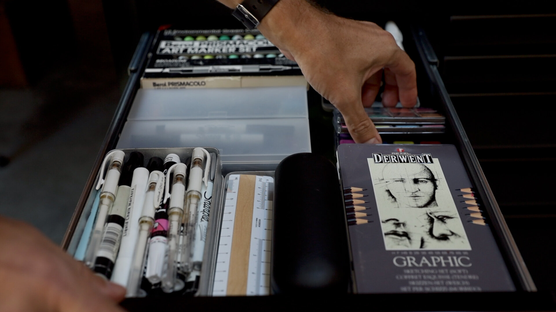
Be sure to watch the video for an inside look at how I craft an abstract idea into a home.

Exterior Lighting Concepts

There are two fundamental points to understand about outdoor lighting. The first is that we actually require much less light in outdoor living situations than indoors, which means the overall lighting can generally be more theatrical and less focused on tasks. 

The second is that in lower ambient light situations, we actually prefer lower color temperature light (warmer); it’s actually visually more comfortable. Whether it’s our primal draw to the flickering flame of fire or the fact that warm light renders the skin so naturally, our outdoor design objective is to aim for low, warmly toned lighting levels.

In this video we'll review the general concepts pros think about when considering how to light outdoor spaces. Specific topics covered are:

  1. The Lantern Effect - using a structure's glazed walls to provide ambient light to nearby exterior spaces.
  2. Layering of light - ambient, task and accent light tips.
  3. Path lighting
  4. Color (and) temperature
  5. Object or sentinel lighting
  6. Fire
  7. Wall washing
  8. Dynamic range and dimming
  9. Uplighting
  10. Light pollution

Translucency (An Architect's Guide)

“Light is to architecture what sound is to music.” (Steven Holl) At the two ends of the spectrum of light control and transmission stand transparency and opacity. Translucency inhabits the broad middle ground between those two. The word “translucent” is derived from the Latin “trans“ ("through") and “lucere“ ("to shine"). Translucent surfaces permit the passage of light while visually obscuring what’s behind it. Historical examples of the use of translucency in architecture abound: the poetic sliced alabaster window above the main altar in St. Peter’s Basilica in Rome, the shoji (screens) at the Katsura Villa in Kyoto, the stained glass rose windows at the great Chartres Cathedral in France. And there are countless others.

Translucency promotes ambiguity, a sense of mystery and a complexity that allows for multiple understandings of what a space can be. In the video I review examples which illustrate the power of this ambiguity as well as the practical things you need to know when employing translucent materials in your project.

Other topics covered: - How iron impacts the color of glass - Walls, floors, stairs - Material properties and options - Using transparency to imbue a design with meaning (be sure to catch the last project in the video)

How a site can shape a home

Good design is the result of strong, simple concepts that give meaning to a home's shape, form and materials. When you look to your site for inspiration, these ideas often arise very naturally. A site is composed of many things: topography, plants, trees, regional and local climate, surrounding structures, water bodies and zoning and code regulations. Each site has very specific solar orientations, views (good and bad) and often a very explicit character. Each one of these areas is an opportunity to generate a meaningful conceptual approach for your home design — a way to devise its shape, layout, form and materials. In this video I discuss the strategies architects use to find design inspiration and derive meaningful architecture from a home's site.

Designing a Long Kitchen Island

In this video I discuss design considerations for extra-long kitchen islands. We dig in to the benefits: added prep, seating, counter and storage space - among others. I also highlight special considerations: traffic flow, seams and more you'll want to pay attention to when designing a long island. As our kitchens have become more and more connected to our living spaces, they’ve changed from being solely utilitarian to being social gathering hubs. The island is often a central player in having a whole host of functions now, and the longer it is, the more function you can pack into it.

Typical kitchen islands range between 7 and 10 feet; the long islands in this video begin at 12 feet and they have definite advantages; however, they're not without a few special planning challenges.

Specifics covered: - Circulation - Clearances - Flexibility - Focus - Function - Spatial definition - Seating + dining - Materials

Modern Barn Doors

In this video we continue our look at the studio project as we construct and install our modern barn doors. Want the details? Download here

Materials: aluminum tube subframe, vertical wood intermediate supports, Hardiepanel siding, barn door track and accessories. Alum. frame fabrication by: Lyman Morse

Studio Project: Plywood (as a wall finish)

My design studio acts a lab for experimentation, in this video I discuss lessons learned from installing plywood as a finished wall surface. The four main discussion points covered are:

1) Material thickness: 1/2" - 3/4" typical range. NOTE: if you're using sprayed foam insulation in your walls, the plywood covering must act as an ignition barrier for the foam - thickness will be critical. Thickness also affects: translation of framing inconsistencies to the finished surface, stability and price.

2) Panel cores and veneer faces. Steer clear of the Chinese Plywoods. Choose panels from the same lot and age if possible. Veneer plywood has a front and back side; the less banded side is the finished face. Take care when cutting to avoid material blow-out.

3) Attachment. Concealed versus exposed fastener. I recommend a concealed clip as well as a tip for aligning the finished face of the panels (it's a special fastener).

4) Finishing. Determine the project goals first, then select the finish. Mine were: - Low sheen - Preserve natural wood appearance - Easy to apply - Non-yellowing
I review oil-based and water-based finishes, Danish oil, spar varnish, paste wax, natural soap (Hans Wenger furniture), and finally WOCA oil + lye.

For a broader material discussion please see the video for part 1...

As always I welcome questions and feedback; you can reach me at: eric (at) thirtybyforty.com

Studio Project: Concrete Slab (as finished floor)

In this video I discuss five important considerations with a concrete slab that will act as a finished floor:

  1. Installer / subcontractor

  2. Color

  3. Consistency

  4. Control joints

  5. Reinforcing

You might also consider building a mock-up especially for large floor areas to ensure you’re getting the finish you expect.

I finish the video reviewing progress with a time lapse video of the slab placement and finishing.

Framing is up next...