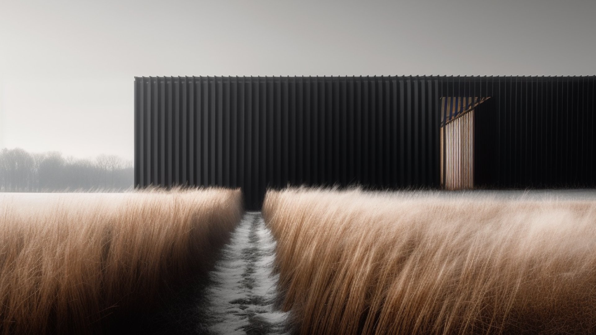
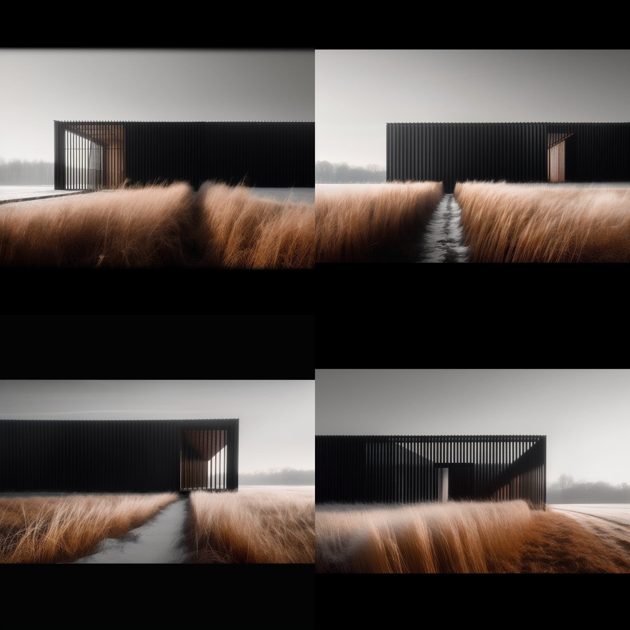
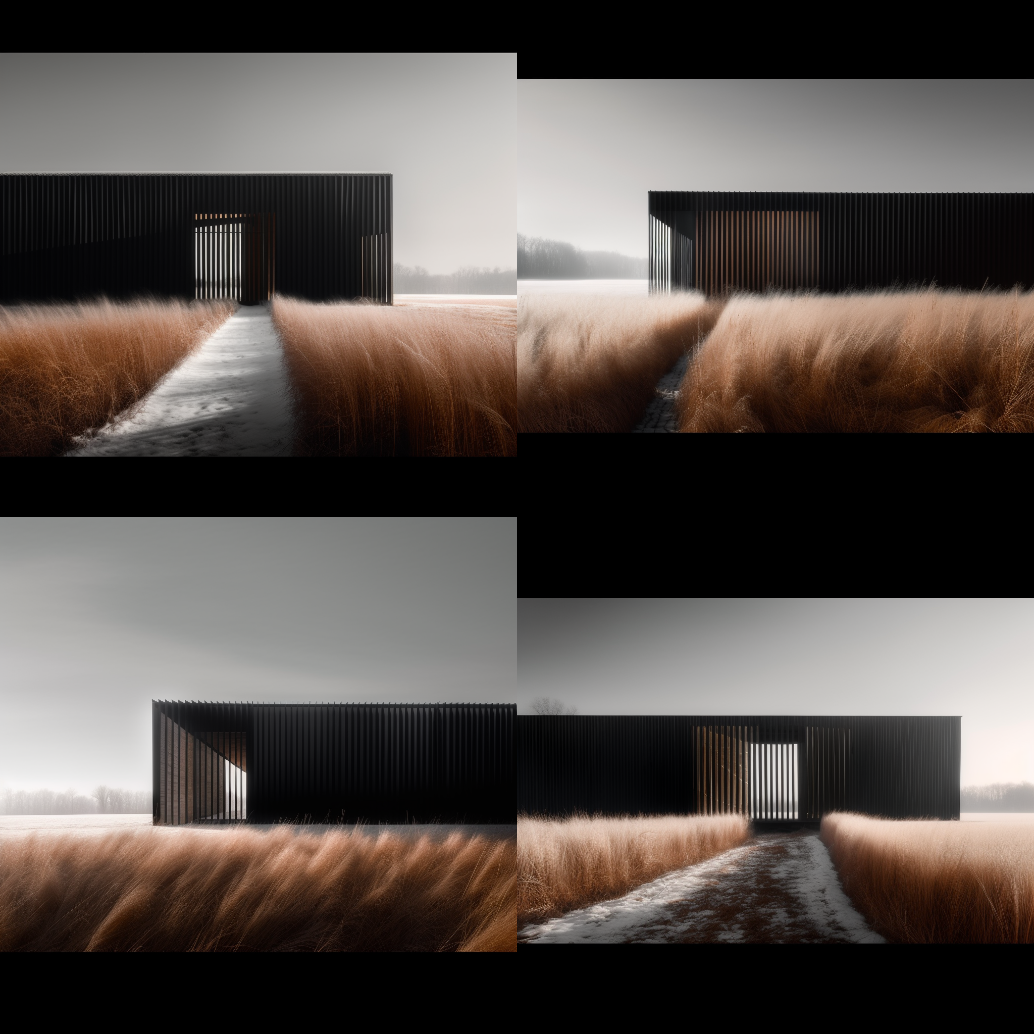
I’ve been practicing architecture for almost thirty years now and although my design process has evolved over that time, it’s one I’m wholly comfortable with. It’s efficient, it’s safe, and I know following it will yield good work. I’ve noticed too that it can produce similar-looking results as I return to familiar forms, plan layouts and details that have worked in the past. And this is a perfect use case for generative AI design tools - like Midjourney - to help break the frame and help me quickly explore options I may not have previously considered.
“Copying others is a good way to start a career. Copying yourself is a disappointing way to end one.” - Kevin Kelly
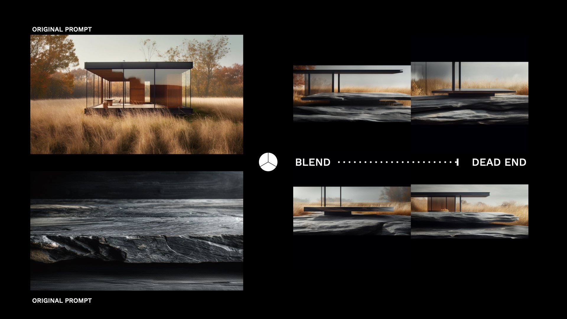
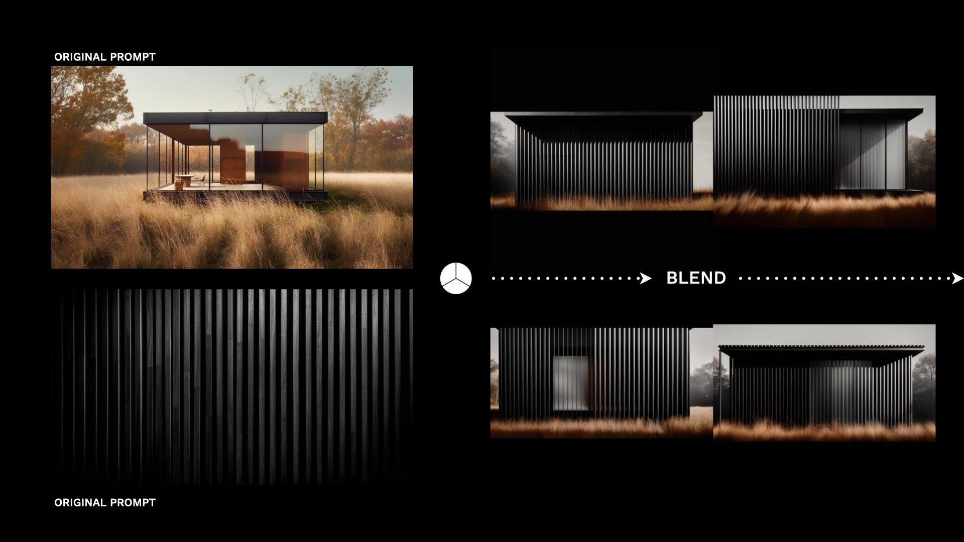
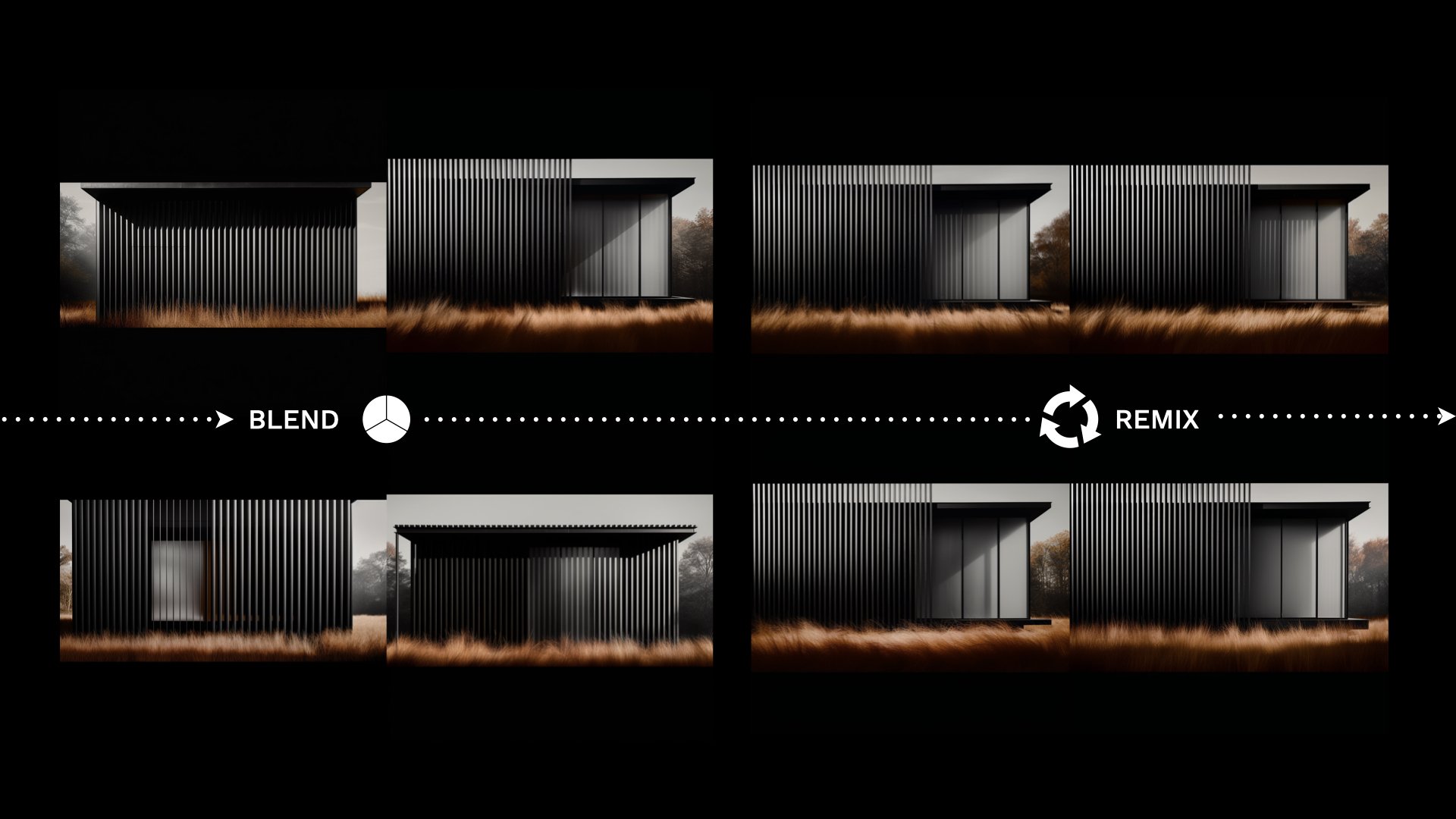
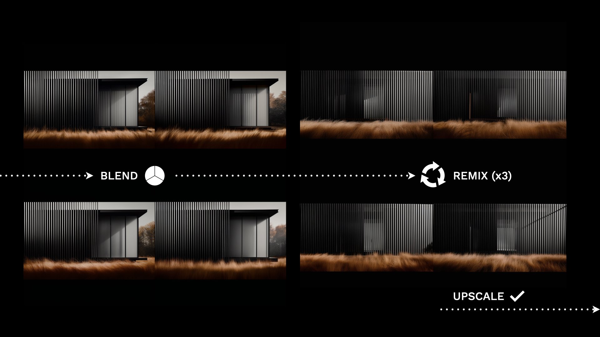
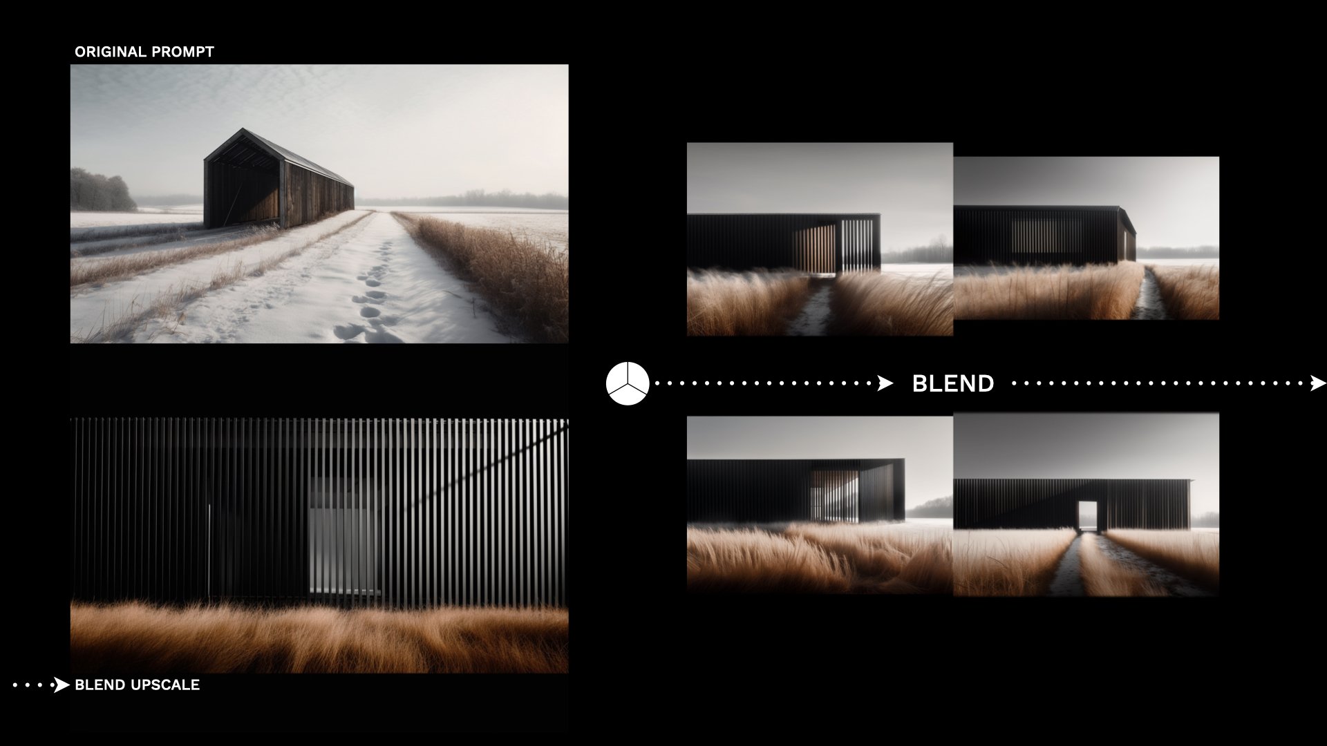
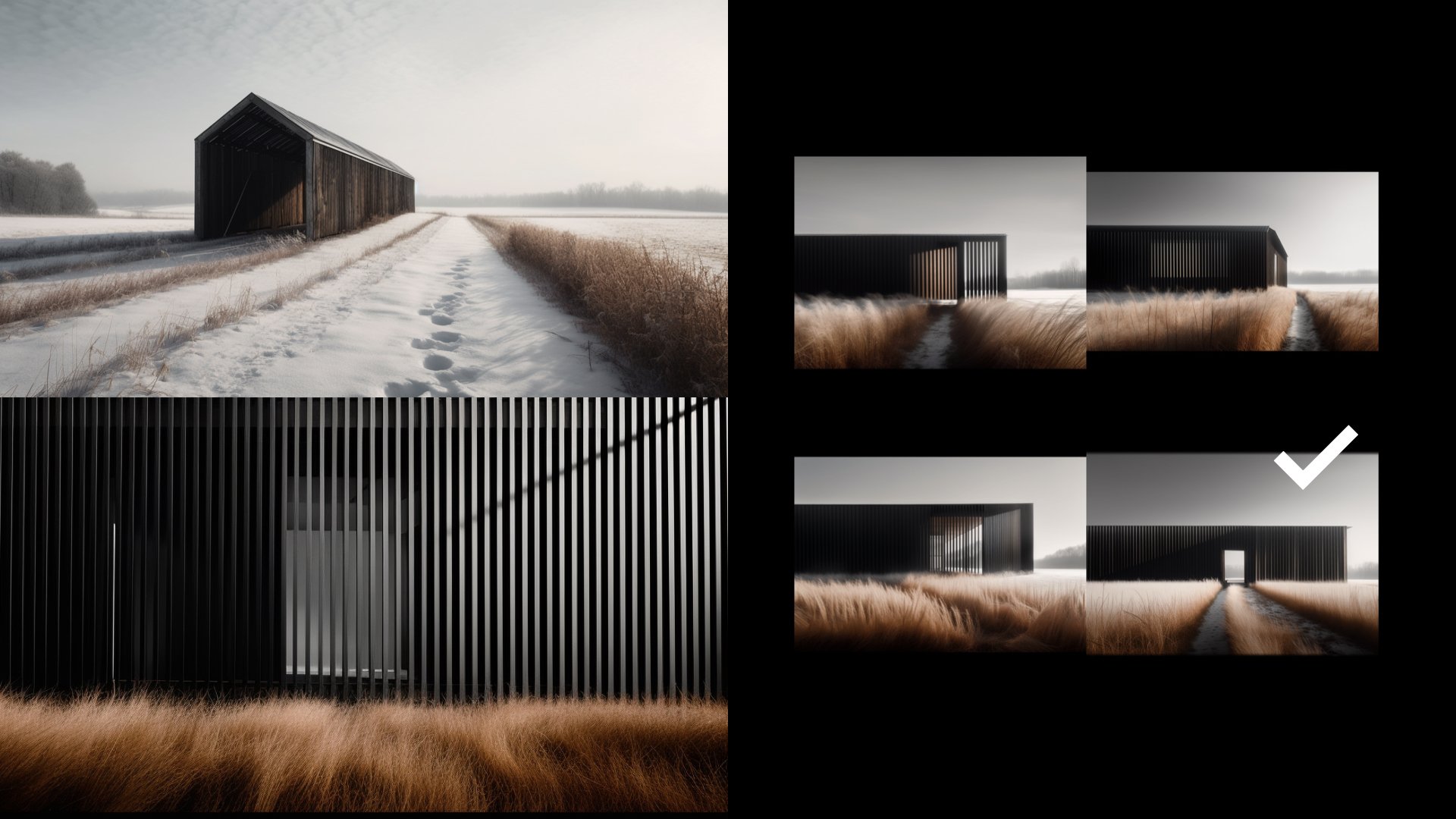
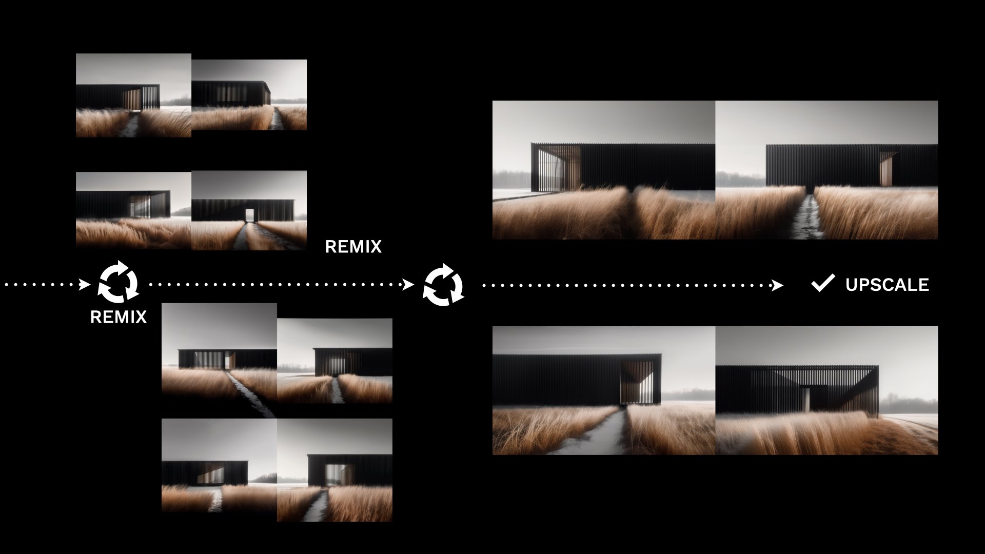
Using Midjourney, is strangely addictive. You enter a prompt and watch as four hyper-realistic images ‘hatch’ before you, resolving like an old Polaroid photo as the algorithm compiles the pixels. It feels a lot like gambling. Each prompt promises a new chance to get lucky. The results are captivating images of seemingly perfect buildings and it’s easy to mistake them for finished work which they’re not. Accepting these first results would deny the true power of Midjourney as a tool for ideation. Remixing, upscaling and blending images recaptures the autonomy of the designer to shape the outcome and preserves the capabilities of Midjourney to quickly deliver many iterations of the same idea.
Watch the video to see how I’ve been experimenting with it in my practice.
Heading to MidJourney without an idea or a concept guiding your efforts means you’ll likely spend a lot of time creating seductive images of buildings that have no place in a design process. Images without substance. For me, the design process starts with a sketch and an idea. I head to Midjourney to solve a problem I had before heading to Midjourney which is quite different than using it to cycle through an averaging of the imagery that the algorithm has ingested.
Midjourney is a text-to-image generative AI app that uses Discord as the prompt interface and creates a four panel image spread based on a text prompt. Entering something simple like: “iron lace by Tadao Ando ––ar 16:9” produces this image:
A short prompt like this allows Midjourney the freedom to be inventive. It recognizes Ando is an architect and produces a building with his characteristic elemental form language. Importantly, the algorithm has ingested many photographs of his work which tend to be dramatic, sweeping one or two point perspective views with water features and concrete and you’re receiving an average slice of the hybrid of those and the ‘iron lace’ images it’s been trained on. The ––ar 16:9 is an aspect ratio modifier that delivers a wide angle view.
To wrest more control from the AI, you may be inclined to create longer, more precise prompts which, in my experience, can produce mixed results. The recipe below balances precision with room for Midjourney to be creative.
Prompt Recipe:
Once you get beyond the clunky Discord interface used to create the images. The key to unlocking Midjourney as a creative assistant lies in controlling the output through specific prompt language. Words closer to the beginning of the prompt will have more weight in the final result and you’ll want a basic understanding of the parameters before getting too far, Midjourney keeps an updated parameter list here. Now, on to the prompt recipe:
Trying to recreate someone else’s visual style in Midjourney is less interesting to me than the process of experimenting with the tool to produce the kind of image that’s useful to my design process. For example, I’m more interested in creating building forms that don’t look anything like their antecedents. I often force Midjourney to produce buildings without common attributes, like windows or doors, by using the modifier “no” (––no windows ––no doors). I find the results more interesting and useful to me.
Aberrations
What I love about using generative AI for ideation is that it introduces error and randomness into an intentional, too-highly controlled process. It’s similar to analog processes like model-making or sketching, where an error presents an unexpected opportunity. New ideas often come from noticing flaws, where something is strange, misplaced, or missing altogether. Exploring these aberrations can push the design forward. The circled corner of the abstract barn image I created suggested I might consider eroding a heavier base and tucking the work program below the living program vertically separating it rather than the initial idea to separate it horizontally.
Finding a secret sauce of your own making will take some experimentation, just remember that AI is a mirror for your own creativity. Overly constrained thinking will yield similar results. Plying it with interesting prompts it’s become an indispensable office intern who has helped to reinvigorate my design process with fresh ideas and new perspectives.
