Architecture School in a Box

Before I enrolled in architecture school in the late summer of 1991 (has it been 32 years?), I received a long list of “required tools + supplies” from my university. As it turns out, I spent a lot of money on things I never used. As architecture schools greet new students this fall, I thought it would be fun to revisit that list of “must-haves” after having practiced architecture for 30 years. What’s stood the test of time in my practice? If I had go to architecture school again, this is what I’d bring.

Storage

I’ll admit, I’m a sucker for everything Yeti makes and their GoBox 30 is no exception. It’s just about perfect for studio storage with an included removable tray and a center divider to subdivide the 11”W x 18”L x 9” interior. Left undivided it can handle all the irregularly shaped tools and supplies we’re about to fill it with. It’s large enough to hold all your supplies, but it’s small enough that it’s still portable. Just under the lid there are three mesh pouches, Yeti calls this the ‘pack attic’ which adds another layer of organization to the box for storing a tablet, a laptop and sketching tools. The lid has eyelets so you can lock it to your studio desk.

I know this will last a lifetime, but there are certainly cheaper options and you might opt for a tool chest or tackle box as a lower cost alternative; they just won’t hold quite as much stuff.

(pre)Design

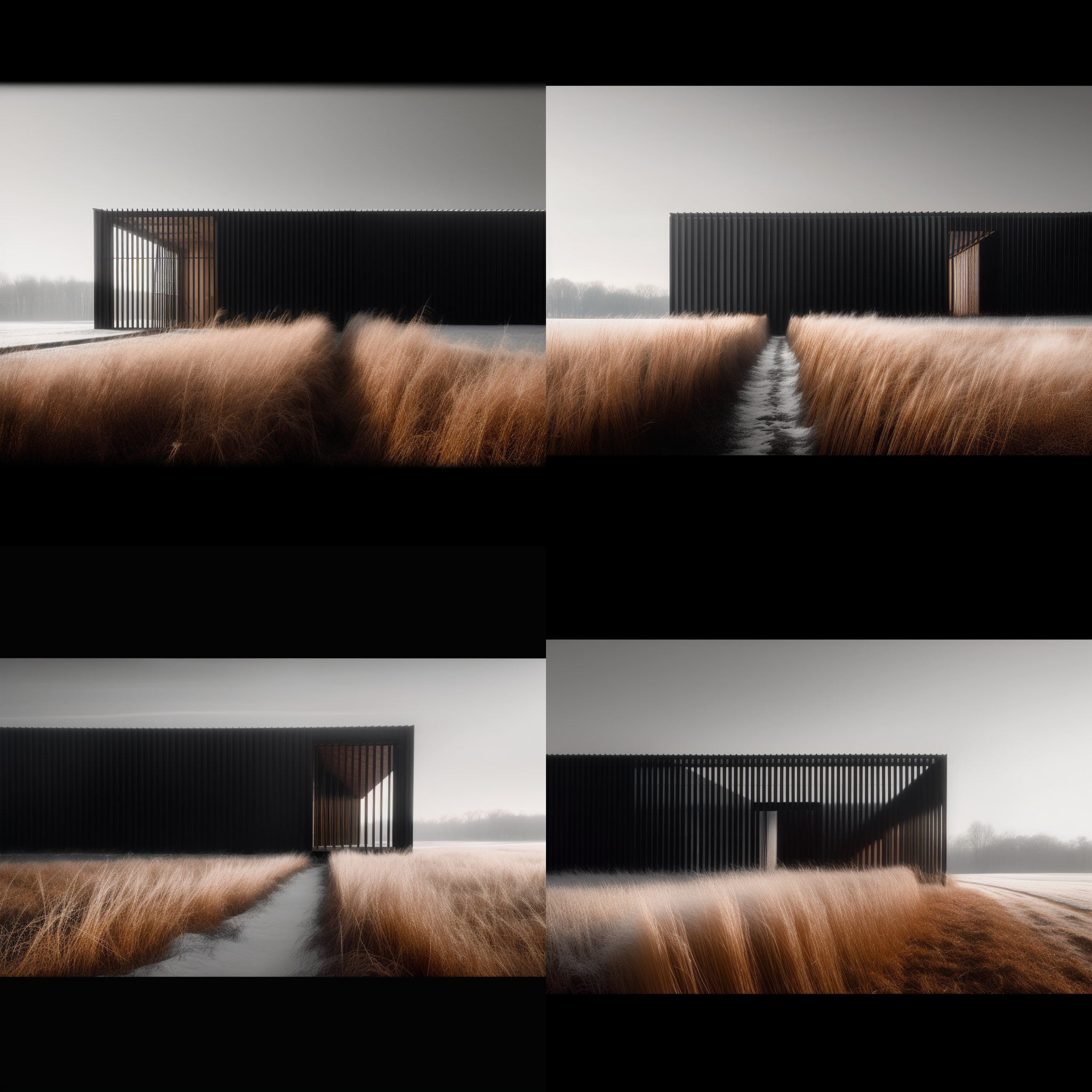
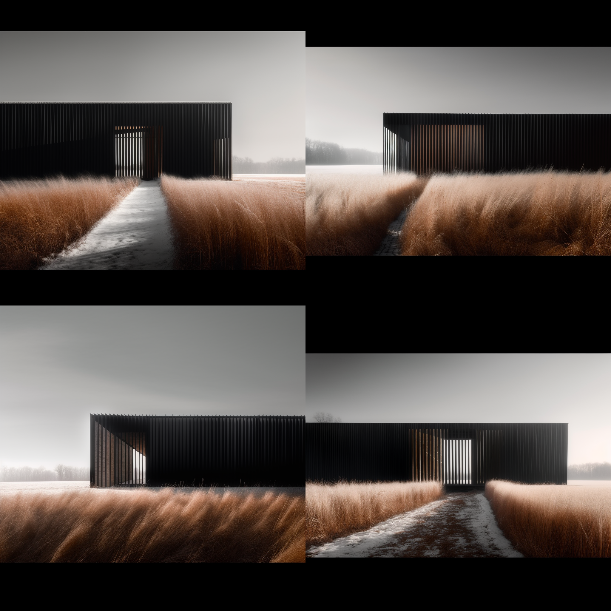
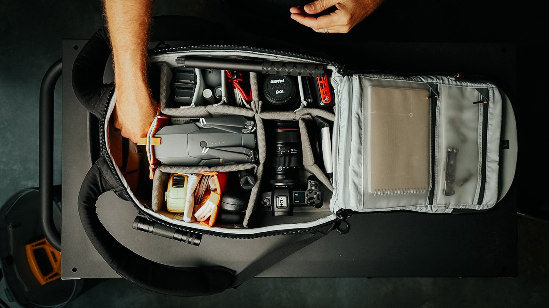
Before we can begin design we start with a period called predesign where we understand the design problem and conduct research. So, first on my list is a camera to document existing site conditions, for precedent studies, travelogues, and later for documenting construction progress. A wide angle zoom lens is versatile enough to capture both exterior and interior spaces as well as details. I find using a camera improves my visual acuity, it sees things in a way I’m not able.

Next, a 25’ tape measure is a tool I use in practice every day. As I’m drawing I use it to gauge how tall or wide an element should be, to measure existing spaces and structures, I use it in client meetings to show mounting heights, and on-site to verify dimensions. Understanding scale and proportion are key skills we rely on in this profession, a tape will help you learn to become spatially and dimensionally aware.

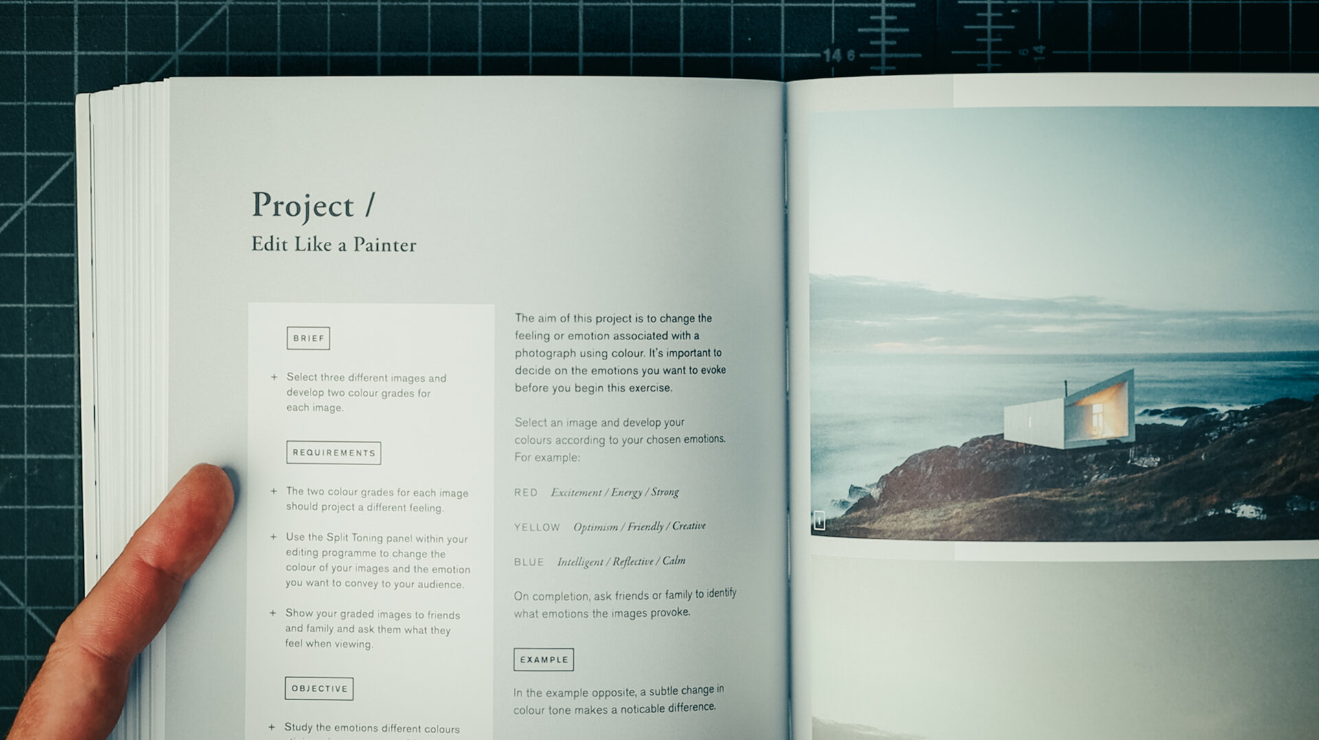
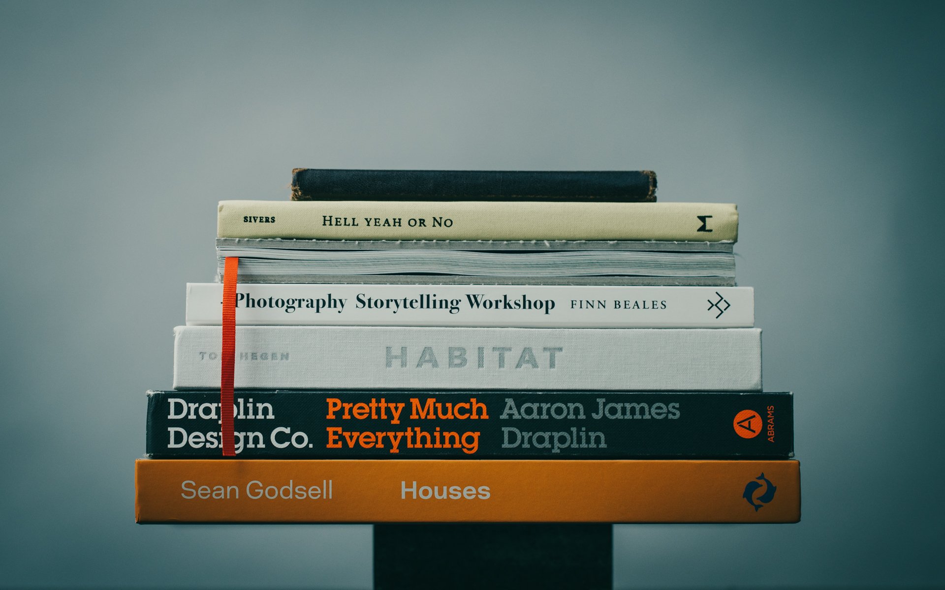
The essential reading and research in architecture school these days is all done digitally. But as you progress, you'll want to build a reference and an inspiration library. And I just like having physical books nearby as I'm designing, and I use them to reference details and standards during the design process.

Design

“Sketching is thinking,” as they say and initial concept development (for me) always happens in my sketchbook. You want a sketchbook that fits easily in your hands, something that's portable so you’ll always have it with you. I like a wire-bound one because it lays flat on the desk and choosing one with a grid allows you to sketch to scale by assigning each grid a unit of measurement.

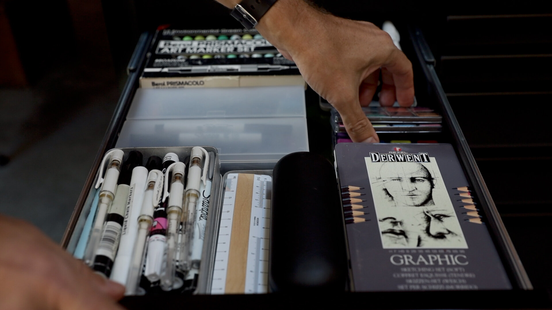
Your sketchbook is where you document all of your ideas and of course, you'll need pens and pencils to do that. For ink, I use three pens: for thick lines I like the Pentel Sign Pen, for medium lines it’s a Sharpie Ultra Fine, and for thin lines, I like the Pilot Precise V7 and V5.

I prefer to sketch in graphite, the Kuru Toga remains my all-time favorite. It has a geared mechanism at the tip that twists the lead as you write so you always have a sharp point. Don’t forget to throw in some extra leads and some erasers. A small click eraser is great for precisely erasing things on the page.

If you want to add a splash of color to your drawings, it's nice having some colored pencils (I like Derwents) and markers for shading and shadow. Copic markers are the premium choice because they’re alcohol-based they allow you to blend on page. When you're choosing colors for all of these, choose things that match with architectural materials (wood, metal, glass, stone) or site colors (vegetation, etc.) - browns, greens, yellows, and blues.

I keep everything orgranized in a pencil case, my current favorite is made by Bellroy. The seaming allows it to lay flat and propped open on your desk, and the loop allows you to hook it to your backpack easily, grab and go.

You also want to pick up a few rolls of tracing paper. This is just an inexpensive translucent paper we use to lay over an existing drawing and iterate and refine our designs. You'll use a lot of this in architecture school. I like the 12”x50yd format in white by Bienfang.

presentation + modeling

Manual drafting tools are relics of the past; we don’t use these in practice today as everything is drawn digitally. Your school will dictate the how much hand drafting you'll be doing. So, although I look at my old tools with some fondness, they're nothing that I've used in my 30 years of practice.

You will, however, need an architectural scale: an Imperial and a metric one (location dependent of course). Download the guide for my recommendations.

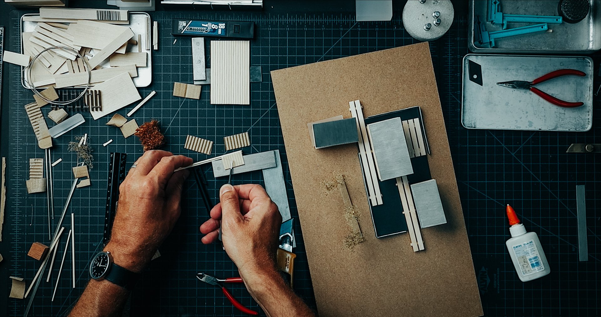
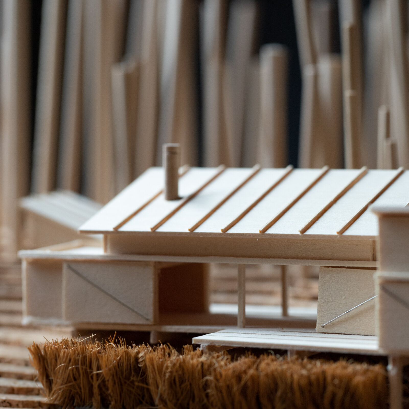
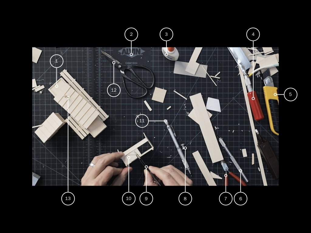
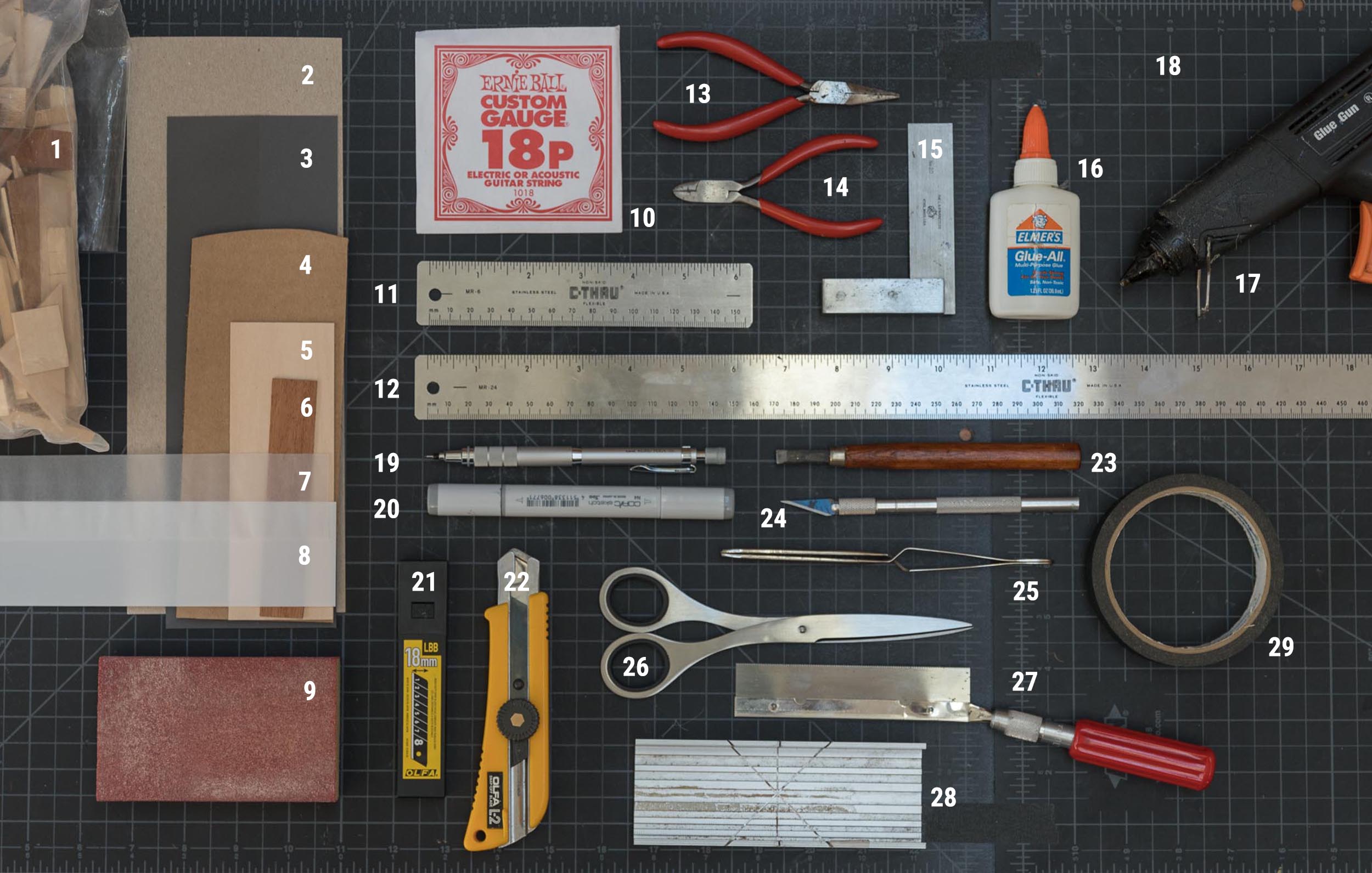
Physical model building is a part of many design professionals process and it will always have a place in mine. Check out the videos and posts linked below for more information on the model making tools I use in practice.

Digital Tools

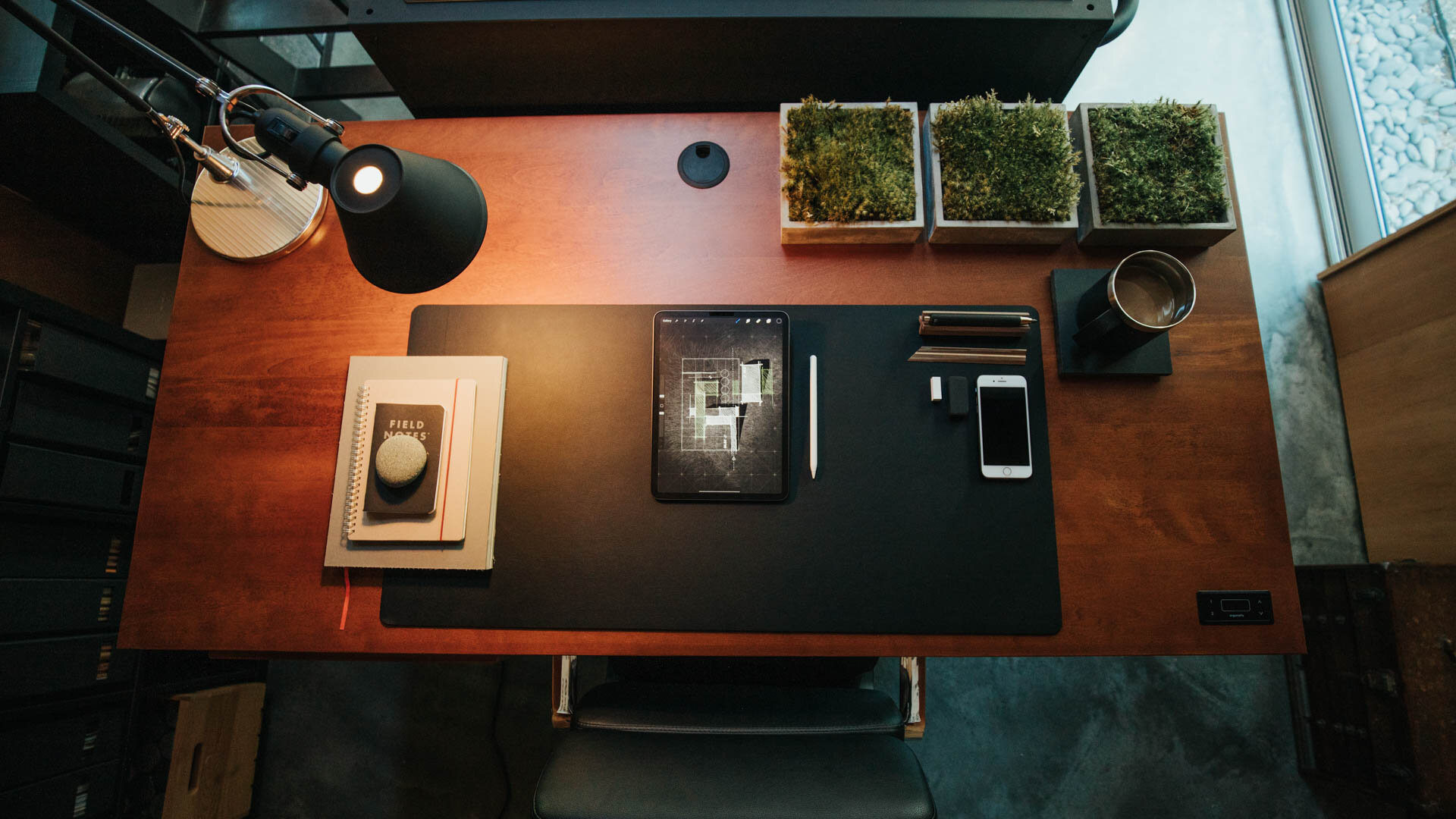
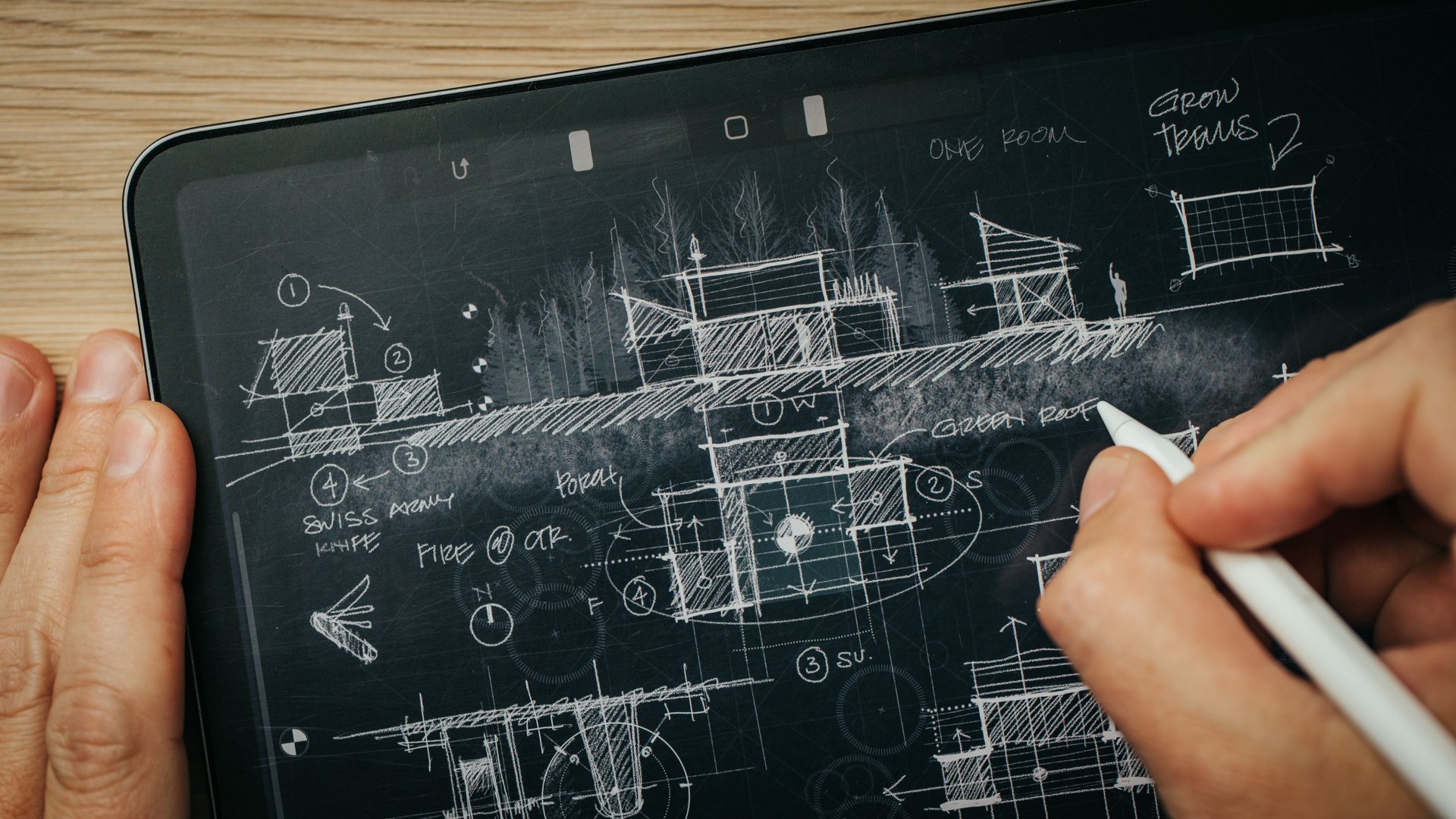
I use my iPad every single day. I use it to sketch in Procreate, for client presentations, for accessing drawings and specs on site visits. Learning to incorporate an iPad or a tablet into your workflow is going to be a skill you'll need as you graduate into the profession.

It's not, however, a replacement for a laptop. Because technology is always changing, check my laptop buying guide which I regularly update. Every school is going to have different requirements and they’re informed by the level of task you require (drafting is very different to real-time rendering). It's probably not going to be Mac-based, even though that’s what I use as a sole practitioner. Most of the software that we use as architects run on a PC. Be sure to check with your school.

Links to all the suggested tools, tech and accessories are included in the FREE resource download. Click the button below to download it.


Using AI as Design Tool in My Architecture Practice

I’ve been practicing architecture for almost thirty years now and although my design process has evolved over that time, it’s one I’m wholly comfortable with. It’s efficient, it’s safe, and I know following it will yield good work. I’ve noticed too that it can produce similar-looking results as I return to familiar forms, plan layouts and details that have worked in the past. And this is a perfect use case for generative AI design tools - like Midjourney - to help break the frame and help me quickly explore options I may not have previously considered.

Copying others is a good way to start a career. Copying yourself is a disappointing way to end one.” - Kevin Kelly

Using Midjourney, is strangely addictive. You enter a prompt and watch as four hyper-realistic images ‘hatch’ before you, resolving like an old Polaroid photo as the algorithm compiles the pixels. It feels a lot like gambling. Each prompt promises a new chance to get lucky. The results are captivating images of seemingly perfect buildings and it’s easy to mistake them for finished work which they’re not. Accepting these first results would deny the true power of Midjourney as a tool for ideation. Remixing, upscaling and blending images recaptures the autonomy of the designer to shape the outcome and preserves the capabilities of Midjourney to quickly deliver many iterations of the same idea.

Watch the video to see how I’ve been experimenting with it in my practice.

Heading to MidJourney without an idea or a concept guiding your efforts means you’ll likely spend a lot of time creating seductive images of buildings that have no place in a design process. Images without substance. For me, the design process starts with a sketch and an idea. I head to Midjourney to solve a problem I had before heading to Midjourney which is quite different than using it to cycle through an averaging of the imagery that the algorithm has ingested.


Midjourney is a text-to-image generative AI app that uses Discord as the prompt interface and creates a four panel image spread based on a text prompt. Entering something simple like: “iron lace by Tadao Ando ––ar 16:9” produces this image:

A short prompt like this allows Midjourney the freedom to be inventive. It recognizes Ando is an architect and produces a building with his characteristic elemental form language. Importantly, the algorithm has ingested many photographs of his work which tend to be dramatic, sweeping one or two point perspective views with water features and concrete and you’re receiving an average slice of the hybrid of those and the ‘iron lace’ images it’s been trained on. The ––ar 16:9 is an aspect ratio modifier that delivers a wide angle view.

To wrest more control from the AI, you may be inclined to create longer, more precise prompts which, in my experience, can produce mixed results. The recipe below balances precision with room for Midjourney to be creative.

Prompt Recipe:

Once you get beyond the clunky Discord interface used to create the images. The key to unlocking Midjourney as a creative assistant lies in controlling the output through specific prompt language. Words closer to the beginning of the prompt will have more weight in the final result and you’ll want a basic understanding of the parameters before getting too far, Midjourney keeps an updated parameter list here. Now, on to the prompt recipe:

Trying to recreate someone else’s visual style in Midjourney is less interesting to me than the process of experimenting with the tool to produce the kind of image that’s useful to my design process. For example, I’m more interested in creating building forms that don’t look anything like their antecedents. I often force Midjourney to produce buildings without common attributes, like windows or doors, by using the modifier “no” (––no windows ––no doors). I find the results more interesting and useful to me.

Aberrations

What I love about using generative AI for ideation is that it introduces error and randomness into an intentional, too-highly controlled process. It’s similar to analog processes like model-making or sketching, where an error presents an unexpected opportunity. New ideas often come from noticing flaws, where something is strange, misplaced, or missing altogether. Exploring these aberrations can push the design forward. The circled corner of the abstract barn image I created suggested I might consider eroding a heavier base and tucking the work program below the living program vertically separating it rather than the initial idea to separate it horizontally.

Finding a secret sauce of your own making will take some experimentation, just remember that AI is a mirror for your own creativity. Overly constrained thinking will yield similar results. Plying it with interesting prompts it’s become an indispensable office intern who has helped to reinvigorate my design process with fresh ideas and new perspectives.

Building a 30-Minute Study Model

The digital tools of architecture practice are always changing, but I think most architects will tell you that analog tools - sketching and model making - are an unchanged part of their design process. I find making things by hand - the craft of it - forces me to slow down, to think and to explore. It’s often a failed experiment that pushes the work in a new, unexpected direction.

The design process always begins with a sketch and the idea I’m exploring with this new project is how the home can amplify the specific conditions of the site, from the topography to the weather and the changing seasons. The sketch is purposefully open-ended and left open to multiple readings. It’s not a fully formed idea and so to further explore the concept I construct a study model. I use it to study the building forms and site relationships and it’s essentially a three-dimensional sketch.

In the video watch as I turn the conceptual sketch into a working study model which I'll then use as a presentation and design tool for an upcoming client meeting.

Finished Study Model

Material List:

  1. Model base: 1/4” tempered hardboard (Masonite) on 1” thick corrugated cardboard

  2. Building Volumes: 1/16” Basswood Sheets

  3. Barn Doors: Basswood Profile Sheets + Guitar String Detail

  4. Interior Massing Blocks: Jenga + Cast Acrylic Samples

  5. Roof planes:Quartz Zinc’ Sheet

  6. Ground planes:Anthra-Zinc’ Sheet (water), ‘Quartz Zinc’ Sheet (parking surface)

  7. Decks: Skinny Sticks + Match Sticks

  8. Trees: SuperTrees

Tools Used:

  1. Sketchbook: TRACE Sketchbook (for more on my sketching tools, see this page.)

  2. Ruler: Alumicutter - proven to save fingers.

  3. Architect’s Scale

  4. Utility knife: Olfa L2 + blades

  5. Allex Stainless Steel Scissors - quick cuts on a variety of materials: paper, chipboard, wood

  6. Cutting Mats: 18x24 + 12x18

  7. Modeling Tweezers - immensely helpful for all modeling tasks

  8. Hot Glue Gun - for quick + dirty modeling tasks

  9. Elmer’s Glue-All - purchase in bulk, rack over to a small bottle to save time while gluing.

  10. Machinist’s Square

  11. X-Acto Plastic Clamps - an extra set of hands

  12. Gorilla Tape - for mounting metal pieces (like the roof planes)

Model in Process

Longhouse Kitchen Refresh - Before + After

Mixing high and low finishes in our simple modern kitchen renovation, we created a refined, luxe style on a modest budget. In part two of the video series we set to work demolishing the existing finishes in our kitchen and begin the makeover process. See the before and after transformation in the video; for the finishes, materials, and details, keep reading.

Read More

Architect + Photographer

Studying adjacent disciplines has always yielded new perspectives and inspiration for my own creative work so I jumped at the chance to serve as a juror for this year's APA Architectural Photography Competition. I asked Mike Kelley, the founder of the APA, to join me to review my final selections, offer advice on what makes a great architectural photo and dig in to a wide ranging set of topics from the use of human scale, to lens choice, post-processing, color, composition, drones, and shooting techniques.

Read More

Fresh Inspiration from My Library

Books have always played a role in my design process. I recall many hours spent in the architecture library at university mining the shelves for new ideas. In daily practice one has to actively make space for seeking out fresh ideas and inspiration. I’ve found that some of the most inspirational books have nothing to do with architecture, they're in adjacent or completely unrelated disciplines. By consuming a variety of source material I find it easier to make connections and surface new ideas overlaying the work of others with problems I’m actively trying to solve in my architectural work. This is called bisociation, defined as : the simultaneous mental association of an idea or object with two fields ordinarily not regarded as related. A pun might be the simplest form of bisociation.

Here’s a list of the books highlighted in the video, in order:

Because my inspirations and collecting tastes are always evolving, I keep a record of what's inspiring me "NOW" on a dedicated page here on my site. When it's time to update it, I simply copy it so I don't lose record of it and can keep it as a running archive of how things have changed over time.

How this award-winning architect designs homes

It’s always been about the drawings for me. It’s the singular aspect that led me to choose this profession: the making of drawings. And this is how I came to know Russ Tyson’s work, through his beautifully delineated architectural sketches. They have all the qualities I aspire to emulate. They’re well-composed, with subtle coloration, they’re narrative, loose and informal. They’re believable as architecture, yet they don’t fix any one particular outcome. They leave room for interpretation. Glass is rendered as if air, volumes as textures and always there’s an acknowledgment that these are places meant to be inhabited by people.

A principal at Whitten Architects, Russ’ design skills have realized projects that defy a singular stylistic bent, opting instead to craft plans and spaces that fit his clients’ needs and tastes. Admirable goals for any architect to aspire to. In this video I spoke with him about his design process and we deconstructed it using his Englishman Bay Retreat as a reference point. It’s a wide-ranging conversation and a prying, behind-the-scenes peek at his personal working style.

Updating My Workspace

I’ve been in my studio workspace for about four years now and as my needs have changed it was time to adapt the studio to meet new demands. As a destination separate from my home, yet still nearby, the separation has worked out well but hiring an intern for the summer meant I needed a dedicated workstation. And, I knew that the storage situation needed improvement. To make room, I started by decluttering and removing all the non-essentials I had gathered over the years. From there I sketched out a quick plan to rethink the organization and layout. The video shows the refresh from start to finish, more details below.

See the original studio tour video here.

New Workstation

The studio workspace was designed to adapt to a variety of functions. When I first moved in, it doubled as a music practice + performance space in the off-hours for our two boys and their friends. This practice space took up a full third of the floor area and was the most obvious place to locate the new workstation. With the instruments relocated to the main house, it was time to place the new furniture.

For the work surface, I chose a sit-stand desk with a massive, solid birch top and a flexible solution for a space used by multiple people. At 60” wide by 30” deep there’s plenty of room to accommodate everyone’s needs. The black hardware and natural wood top tie in with the other details in the studio. In a small space like this it helps to maintain a limited color palette so everything plays well together, here we’re using natural wood tones, browns, blacks and grays.

For seating I picked up two of the Soho drafting chairs by Laura Davidson. With heavy-duty cast aluminum bases, plush seats, tilting backs and removable arms these were a solid upgrade from my old creaking drafting chair. I swapped out the casters for roller blade style wheels for a quieter ride on the concrete floor.

New workstation (Sway desk by Ergonofis)

New workstation (Sway desk by Ergonofis)

On the Desk

I removed all the knick-knacks, trays, external drives, and unnecessary clutter from my desktop and consolidated my small essentials (scissors, pens, pencils,) into a simple steel cylinder divided into four quadrants. To ground everything I purchased a large linoleum desk pad and swapped out the standard white apple keyboard and magic mouse for the space gray versions. I blacked out the front and base of my 27” iMac with a skin to complement the other black accessories. The coaster is a repurposed piece of black slate and I added a wireless charging pad by Anker.

Beneath the desk I mounted a black aluminum tray to hold my 8tb Lacie hard drive which stores all my digital files. I tidied up all the cables using split sleeve covers and used small black adhesive hooks throughout the space to keep my cables ordered and out-of-sight. I relocated the bluetooth soundbar that sat on the front of my desk to atop the shelving unit to my right to keep it out of view.

For task lighting, I picked up two of Artemide's Tolomeo mini desk lamps in black, I've always liked their timeless modern look and fitted them with 25W incandescent bulbs (much nicer light to sketch by than LED). Having stripped down my desk to the bare essentials, it was time for the rest of the studio to follow suit.

Walls + Backdrops

Because the north desk area often serves as a backdrop for filming I wanted a something different and darker there. One of the problems with the Douglas fir interior is that it's not a neutral tone, so it affects the ambient, reflected light in the space, which for filming isn’t ideal. Rather than painting the natural wood plywood on the north wall I chose to skin it with MDF and chalkboard paint. I mounted them on concealed Z-clips so I can easily remove them if I want to in the future.

On the MDF I installed two metal ledges from CB2 adding 8' of horizontal display space without taking up any floor area. I'm using them to display material palettes, books I'm reading and various found objects. Concealed along the front of the ledge are two play lights from Philips controlled via the Hue bridge system and their mobile app they serve as practical lighting in the background and can be changed to any color I choose.

Storage

When I built the studio, I didn't have the budget for built-in storage but if you want a minimalist, organized and clutter-free space, storage is essential. I've added two IKEA Kallax shelving units beneath the west windows. The upper cubes I'm using to store objects and as reserve capacity for books. The lower cubes I've fitted with Bladdra felt boxes - also from IKEA - to hold irregular objects and things I don't want out in view and collecting dust.

The rolling tool chest is by Husky, I'm using only the lower portion of the unit in the studio (the upper half holds tools in the basement) to organize all of my studio essentials, kiXstand samples, and camera equipment which still leaves plenty of space for new tools. With eleven drawers of varying sizes and depths it can hold a lot. The shallow drawers are easy to keep organized in a single layer. For the deeper drawers I picked up a few pouches and organizers to keep cables and smaller items grouped together.

The height of the base unit is perfect for making models and for filming or photography projects. My two large Alvin cutting mats live on top and off to the side is a rare earth magnet to hold my rulers and utility knife. When the standing desk is raised, the tool chest can easily meet its surface to give me an even larger surface to work on if needed. And if I find myself wanting additional walking space in the studio, The desk can be raised a little more and the toolbox can roll comfortably beneath it.

Styling

To pull it all together I added a few styling upgrades. I added three new prints adjacent to the new standing desk which cleverly conceal the old guitar mounts and these are matted in ice-white with black aluminum frames. These were printed in-house using Canon's Pixma Pro 100 on low lustre paper an incredible printer for less than $300. (For printing drawing sets, I use the HP T210).

To hide the (off-center!) mini-split heating unit, I picked up the Stendig wall calendar by Massimo Vignelli, which I slipped into a concealed poster sleeve and mounted to the loft floor joists above.

To bring a little of the natural landscape inside, I repurposed four concrete napkin holders by Port Living Company to plant moss in and I picked up a tiny Chinese elm bonsai to live on the corner of my desk. By adding these minor accent pieces, you can bring a certain life and personality to your workspace that can simultaneously make your office feel much more inviting. To this I’ve added a few additional inspirational objects and I finally feel like it’s a cohesive workspace with room to spare.

It's a series of progressive upgrades, an evolved, tidier version of what I started with. Our workspaces are guaranteed to change over time along with our priorities and needs and I love that this is a space that can adapt and change with me.

Check out this and all of my curated kits on kit.co.


Considering a dedicated studio space?

Read more: Five signs it’s time to rent (or build) your own.


Studio Plan diagram


1. Photography/Printing Space: This is where I keep most of my essential photography equipment, from lenses to batteries. In addition, because of it’s proximity to my desk, My printing tools, including the large format printer also live here for easy accessibility.

Above this are two wall mounted cabinets with flip-down tops which hold stationery, pens and my drone (closest to the main door).

2. Main Workspace: Where I spend the most time in the studio. My iMac, Laura Davidson chair, sketching implements and computer accessories all find their place on my vintage drafting table to create a focused and productive work environment.

3. Display Shelves: A pair of metal ledges run behind my desk and are (currently) being used for display. They also hold my play lights by Philips that provide ambient lighting in the morning + evening, and, practical lighting for filming.

4. Book Storage: This shelf contains references, inspirations, information, entertainment, a few personal accolades. The books I keep here are amongst my most-prized possessions as an architect. On top I have a sound bar which streams music.

5. Storage Units: One of the most impactful upgrades in the refresh, these shelves house concealed items on the lower tier and provide buffer space for an ever-growing library above.

6. Shelving Unit: Unlike the unit of matching design on the other side of the studio, this shelf holds a variety of resources: material sample binders, floor samples, magazines, modeling supplies and paint and a few architectural models. For now, the Canon printer also lives atop this unit. It’s a solid choice to produce colorful, frame-worthy prints, but needs a more accessible permanent home.

7. Minimalist Calendar: Although it’s purpose is to cover the - distractingly off-center - mini-split heating head, this calendar by Massimo Vignelli is a minimalist graphic addition to the studio. Every other month inverses the white and black (see images above).

8. Secondary Workspace: The new workspace is anchored by the Sway Standing Desk by Ergonofis. It’s adjustable birch top allows me to be able to easily switch between standing or sitting work environments and accommodates a variety of uses. The Laura Davidson swivel chair is paired with the desk, a comfy upgrade at a fraction of the cost of the Eames Management chairs by Knoll.

9. Tool Chest: One of the largest new furniture pieces in the studio, the Husky rolling tool box houses everything from camera equipment to power tools. I’ve converted it’s available surface so that it when the new Ergonofis desk is brought level, it creates a massive, singular workspace. When the desk is raised higher, the chest can be easily moved under it to provide additional open space.

10. Meeting Table: As more new additions were made to the studio, I found that that the spaces for simply walking had become much too cramped. And given our current situation, in-person client meetings have become a rarity. So I removed one of the tables from the meeting space.


Sketching in Isolation - Work From Home Skill Building

Feeling the pressure to make the most of your time in isolation to learn new skills + be productive? If you haven’t quite lived up to your own lofty expectations of what you should be accomplishing, you're not alone. Spend 30 minutes with me in my sketchbook and learn what's been working for me as I design an invented architectural folly.

Time spent in my sketchbook is focused and without distraction. It’s space to think and be creative without the strict boundaries of budgets and schedules. It’s reminded me that not everything I design needs to be rooted in reality, that daydreaming and suspending the laws of physics have value too and can nourish my architecture practice in meaningful ways. Inventing imaginary architecture can be a source of control in a time when agency is in short supply. For me, it’s been an enriching, liberating win in this time of quarantine. I hope spending a few minutes with me in my (digital) sketchbook designing a Quarantine Chapel - whatever that is - will inspire you to get lost in your own sketchbook for an hour or two. And, if you build a few skills along the way, all the better!

DOWNLOAD the 30X40 PROCREATE PACK

Assets Used in this Sketch (most are custom + included in the 30X40 Procreate Pack):

Quarantine Chapel Sketch - 04.17.2020

Quarantine Chapel Sketch - 04.17.2020

kiXstand

kiXstand

New tools for the Studio (iPad for Architects)

Do you really need an iPad as an architect, an intern or student? See if any of the four uses I came up with resonate with you. Having always sketched on paper or trace with pencil and ink, a tablet never really appealed to me or seemed entirely useful. I wasn’t sure how it would fit into my workflow, but the Apple pencil and Procreate have changed my mind.

Read More

Design, Meet, Revise, Repeat.

The Outpost project enters a new phase as we refine the design and prepare the drawings for construction. This "awkward phase" is a natural part of the design process and working through it always results in a better building, this video illustrates the iterative process all designers use to improve our work.

Time stamps:

  • 1:04 Locating the Screened Porch

  • 1:35 Budget Considerations + Phasing

  • 2:15 Should every space orient to the view?

  • 3:47 Exploring one more location

  • 5:04 Master bed + bath options

  • 5:37 Remote presentations (using Loom)

  • 5:53 Skype meeting + new concerns

  • 8:17 "I find it a little...boring..."

  • 8:36 You are not your work.

  • 9:51 The need for reference images (I use Pinterest)

  • 10:17 Redesigning the Master Wing

  • 14:02 New information = new options


The video opens as we seek to locate the screened porch which I left out from the previous plans. It's natural - especially when building on site with sweeping views - to want every room to capture that view, but you'll see that prefer to position program spaces to take advantage of the full diversity of a site's features, not only the most dominant one.

As I return to the studio to incorporate the changes from our site meeting, I run through several revisions and schedule a Skype call to discuss progress. During that conversation it becomes clear that the master suite needs to be redesigned to create a separate dressing area and group the shower and soaking tub together.

As a young designer, I had difficulty separating myself from my work. Hearing a critical comment from a client (i.e.: "I find it a little...boring..." ) can be jarring at first. Having worked with many clients and heard a lot of critical feedback, I've learned to draw a very clear line. I am not my work. The work is the work. My job is to shepherd my clients through the design process and help them build the home that best suits them, not the one that will look best in my portfolio. It's possible to hold esthetics, form, and function in high regard whilst meeting the client's needs, they're not mutually exclusive.

The video ends with a brief charrette as I sketch and redesign the master wing. As you'll see, this creative friction from my client pushed the design to a new and better place. Having cleared these minor challenges and confirmed the project is on budget, we'll be moving ahead with the design of the exterior shell package preparing for a construction schedule in the early summer of 2020.

If you enjoy these videos, you can support 30X40’s work on YouTube by investing in a course, a toolkit or a digital tool. Many thanks!

Resources

Digital drawing templates

Specification + Schedule templates

Architect's Toolkit (includes the presentation templates shown in the video)

Architect + Entrepreneur Course

360 Cam for Site Shots

Notion template (free) - Organize meeting notes, wikis, to-dos, checklists

Architect vs. Engineer : Design Meeting

A structural engineer is a part of the design team for all my residential work in the studio. In this video you'll join me for the kick-off meeting with my engineer as we begin developing the structural design for the Outpost project. You’ll see how we choose a foundation strategy, work through framing + detail ideas, and understand how lateral loads are transferred and how they affect the materials we choose to build with. The professional tug-of-war between engineer and architect isn't adversarial, rather it's collaborative and makes for a better, more efficient project.

The most interesting part of our dialogue begins around minute eighteen where I ask Albert to comment on one of the most common objections I hear from contractors in the field: "This design is way over-engineered." His answer illuminates how a structural engineer can complement the architectural design process in ways you may not have anticipated.

If you enjoy these videos, you can support 30X40’s work on YouTube by investing in a course, a toolkit or a digital tool. Many thanks!

Learning to Sketch

I spend most of my day in a digital work environment and I’ll often find myself tweaking the smallest of details just because I can. Digital space is without limitation, yet creativity thrives on constraints. It’s the boundaries that we’re forced to work within that shape our work. There’s no question digital tools are an integral part of how we realize our architecture today and in the 25 years I’ve been practicing, those tools have changed and improved the way I work significantly. Digital tools are for executing ideas. I turn to my favorite analog tools - pencil + paper - to birth those ideas.

Sketching is thinking. Sketching is seeing. Sketching is learning. With pencil in hand, I’m a child. I think that’s part of the magic of learning to sketch, it allows me to see problems with a child’s mind, the mind of an amateur.

I designed the BLANK sketchbook because I know how transformative establishing a sketching habit can be. Buying a pair helps to support my educational mission on YouTube.

With gratitude

/Eric @30X40

Model Build: Outpost Project

Although many architects today default to digital renderings and virtual modeling, I still use physical models in my practice. I spend a lot of my professional time in digital space and perhaps that’s why I find making tangible objects so satisfying. Cutting, gluing, revising and thinking with my hands surfaces ideas I’m not able to access any other way. Equally, when you build a scale model you’re forced to confront the physics of reality.

This build is what architects call a study model. It’s essentially a three-dimensional sketch, intentionally imperfect and slightly messy. It’s an iterative design tool rather than made specifically as a presentation tool. This one was approximately a 2-hour build from start to finish, of course, that doesn’t include any of the setup or filming time necessary to make the video!

Check out the video for a behind the scenes look at my process.

I use basswood for many of my models because it’s dimensionally stable, easy to cut, takes paint without warping and has a thickness that’s appropriate for the scale I’m working with (3/32” = 1’-0”). To fasten the pieces I use a combination of hot glue and white glue. The hot glue is used more for connections which are concealed and don’t require a high degree of precision. I use white glue for components that may need to be repositioned after they’re set in place, ones that are tiny or fragile, and for parts of the model that are subject to scrutiny by clients. White glue takes longer to set but it has a nicer finished appearance.

Materials + Tools list:

  1. Basswood sheets (1/16” thick) 2” x 24”, Skinny Sticks 1/4” x 6”x 1/16”, 1/16” square sticking (see my Amazon page for more)

  2. Self-healing cutting mats (12” x 18” + 18” x 24”)

  3. White PVA Glue

  4. Fine-toothed saw (cutting dowels + square sticking)

  5. Olfa L2 + utility blades

  6. X-acto + #11 blades

  7. Wire cutters (metal details) + nippers (for flush cuts of wood sticking)

  8. Pushpin, hat pins, + T-pins (for inserting metal details in wood + making holes in cork)

  9. Forceps/tweezers

  10. Guitar string (details)…piano wire works too

  11. Kuru toga mechanical pencil

  12. Scissors (bonsai scissors are great for tight areas), I also like these Allex ones.

  13. 1/4” + 1/8” wood dowel (chimney)

  14. Hot glue gun (not pictured)

  15. Coir mat (not pictured) for landscape elements, shrubbery, green roofscapes

  16. Cork backed metal rule (6” + 24”) + Squares

  17. Cork underlayment (more info. on the site model here)

If you enjoy these videos, you can support 30X40’s work on YouTube by investing in a course, a toolkit or a digital tool. Many thanks!

Architecture, Design + Photography (podcast interview with Trent Bell)

A conversation between two architecture school graduates with similar approaches to work + life who followed two very different paths. This video is an excerpt from my conversation with Trent Bell an award-winning architectural photographer (Trent Bell Photography) as we chat in my studio. You'll also join us behind the scenes as he photographs one of my residential projects. For the full interview be sure to check out Trent’s Architecture, Design & Photography podcast, (video here) a project he’s launched in cooperation with Maine Home + Design magazine. See all the photos we captured that day here.

Architectural Model Making Tips

Architects build two fundamentally different types of models: presentation models and study models. Presentation models are often used in client meetings to convey a finished design in miniature while study models are used by architects as part of the design process. Study models are the equivalent of a three-dimensional sketch and allow us to explore and iterate design ideas quickly. We often begin these by collaging ideas using planes of cardboard and wood.

In this video, I share my best tips for building architectural models something I’ve done professionally for close to 30 years.

Building models remains an important tool and part of my personal process for making architecture. And while many have moved to completely digital forms of modeling, I’ve maintained the habit of building models. Here’s why: there’s a sensory feedback loop between the hands and the brain known as embodied cognition. It’s been shown that our motor system influences our understanding and cognition in much the same way the mind can influence our physical actions. I build models to unlock creative inspiration I can’t otherwise access (they’re also pretty fun to build).

architecture-model-making-tools.jpg

Making Architecture Models (a tutorial)

I've always found satisfaction in turning scraps of wood and cardboard into a tiny model, but I haven't always loved the finished product. If you've struggled with this too (or if you’re just curious about model making) you'll appreciate this week's video where I share my model making techniques.

I'll show you the materials I chose, why I chose them and a few - less expensive - alternatives. I discuss why you would choose one modeling style over another, how to conceptualize what to model and how a few simple tweaks can make a big difference in the esthetics of your architectural models.

If you enjoy these videos, you can support 30X40’s work on YouTube by investing in a course, a toolkit or a digital tool. Many thanks!