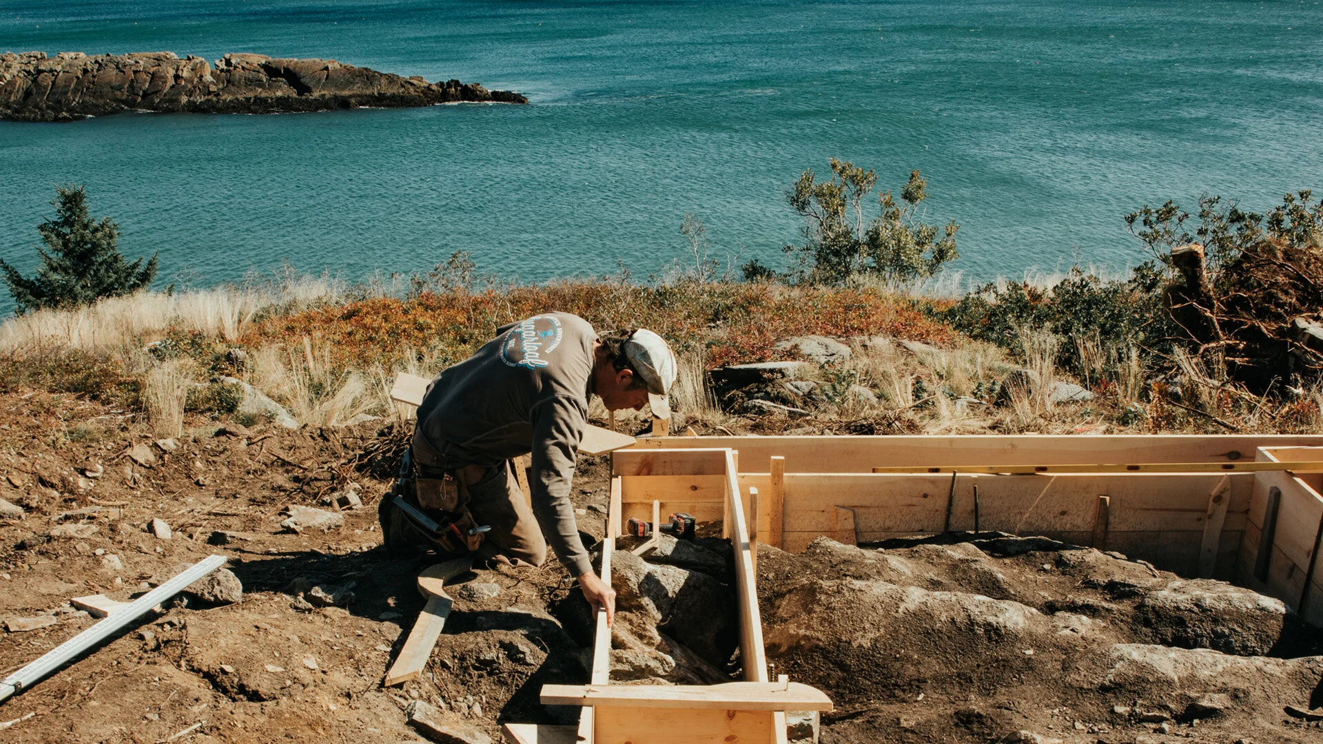
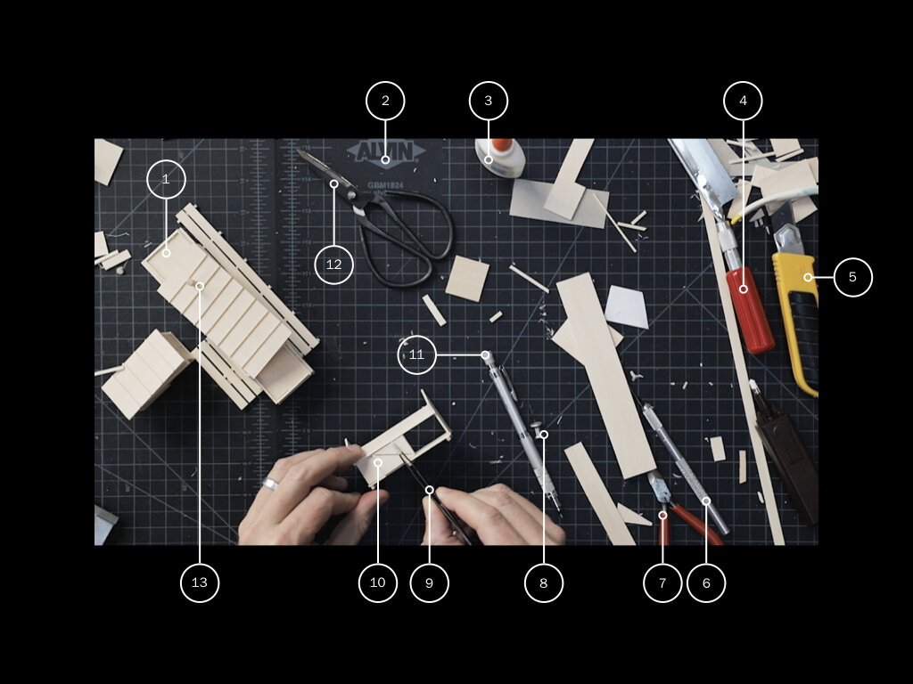
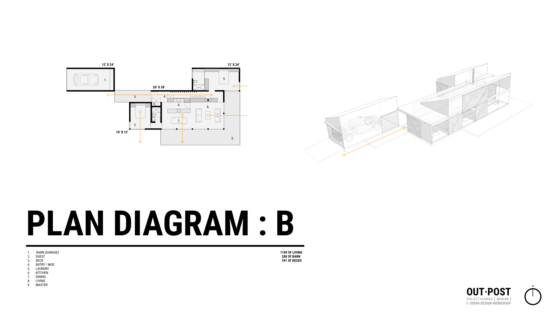
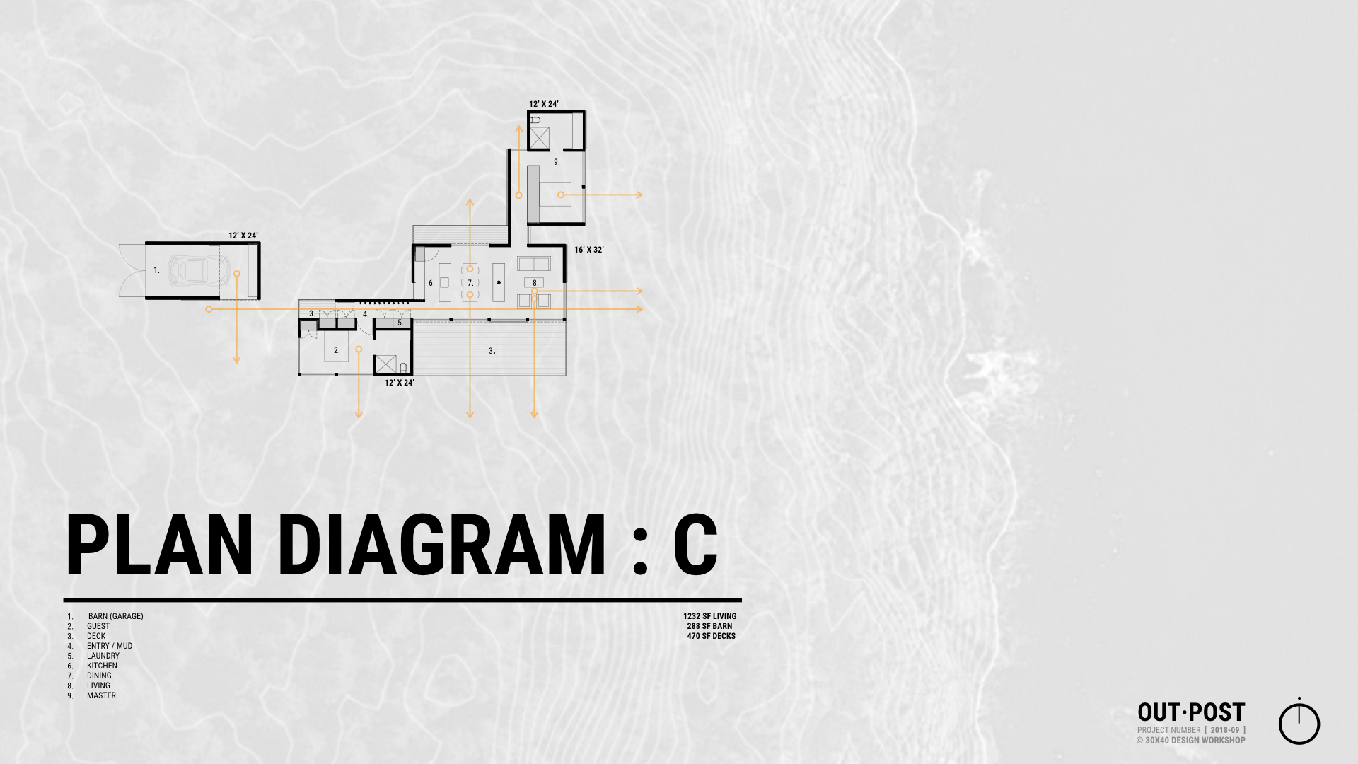
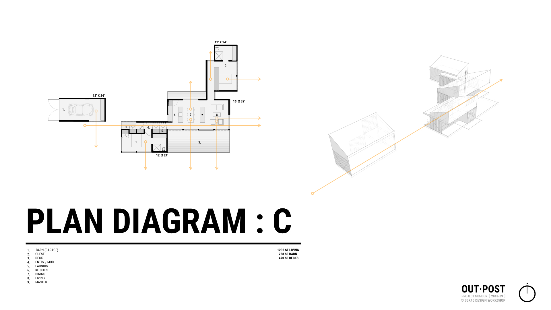
A recent site visit + client request sets in motion a process every architect is familiar with: redesign + revisions. This is my process for solving real-world architectural problems, from sketching to updating the drawings and documents.
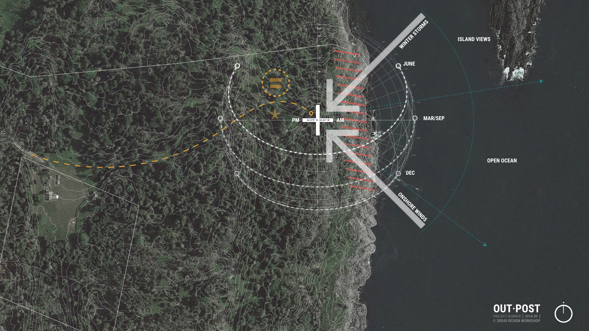
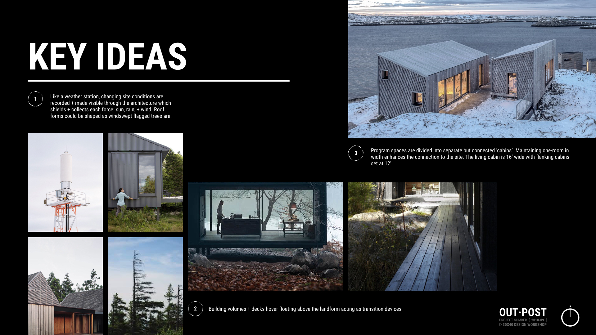
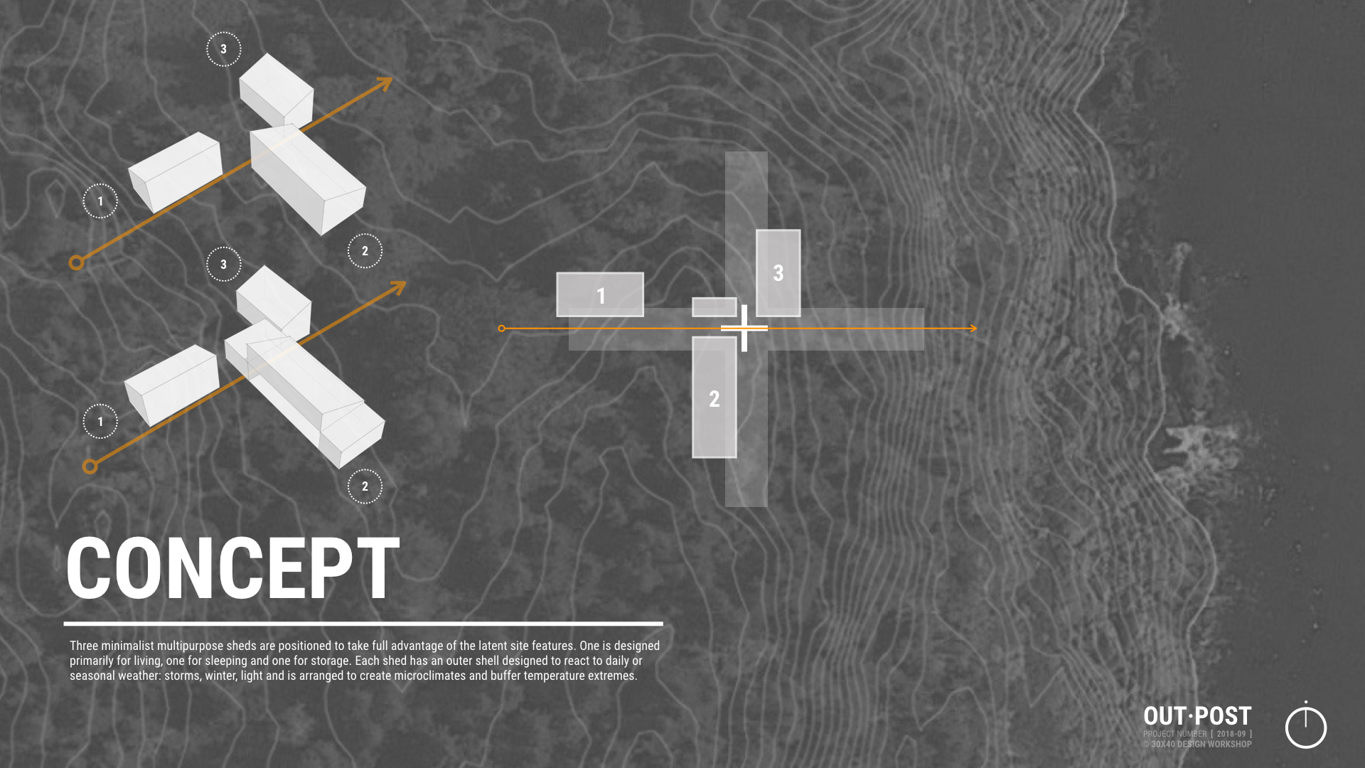
Revisions begin by clearly defining the problem and constraints governing the redesign. All design benefits from constraints, without them the possibilities are limitless. As we’re in construction the restrictions are numerous: there are budgetary, esthetic, physical, legal, and functional considerations. And, of course client preference is chief among them. I’ll often work through solutions that are less than optimal to illustrate shortcomings and to help move the design process forward. Below are a few examples of the initial solutions I developed.
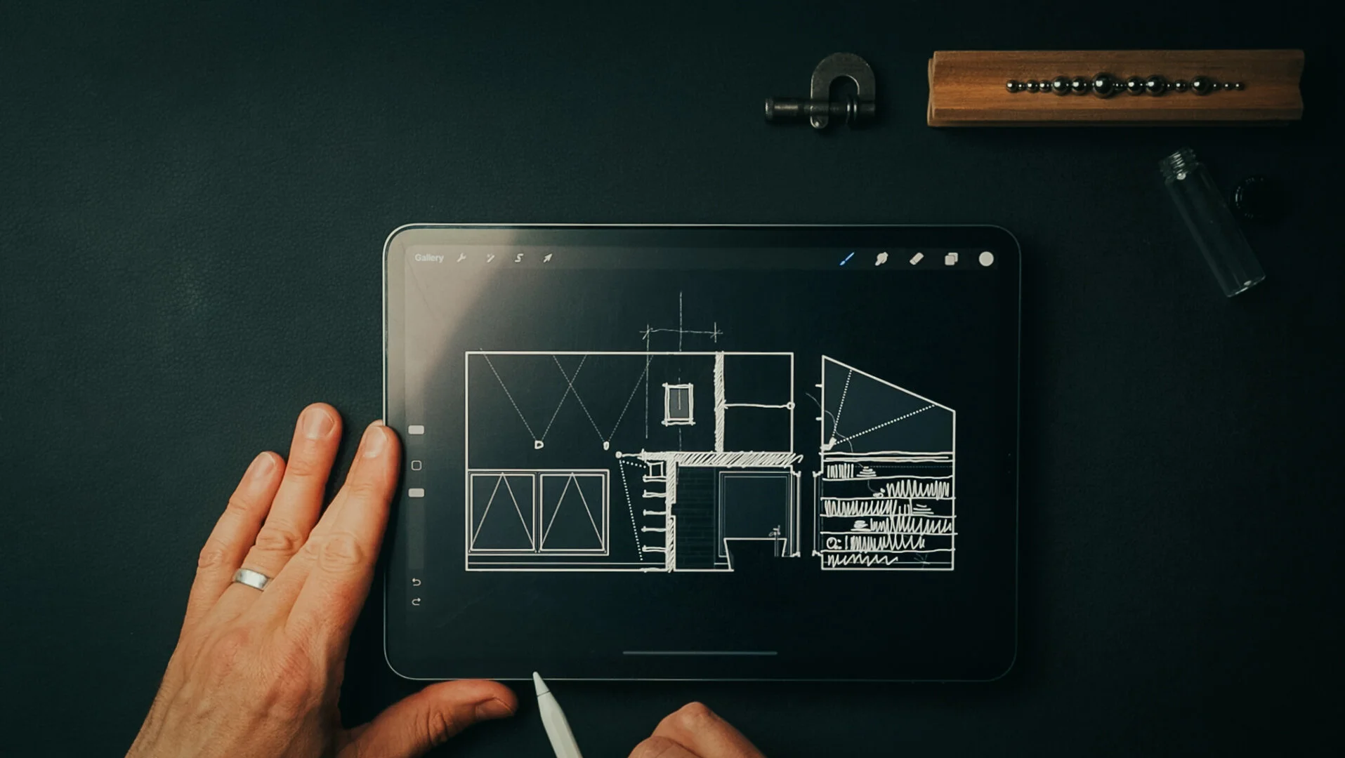
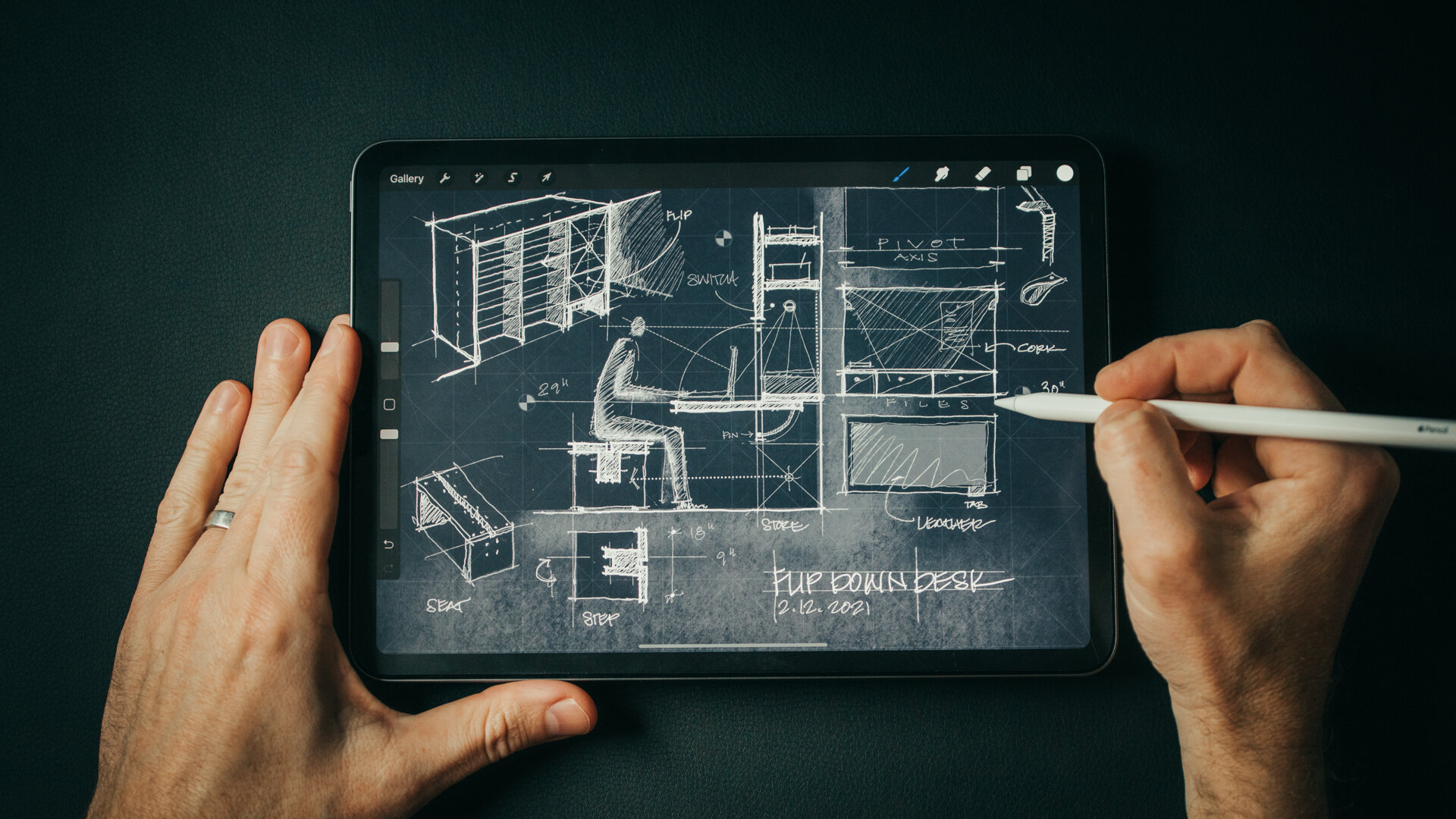
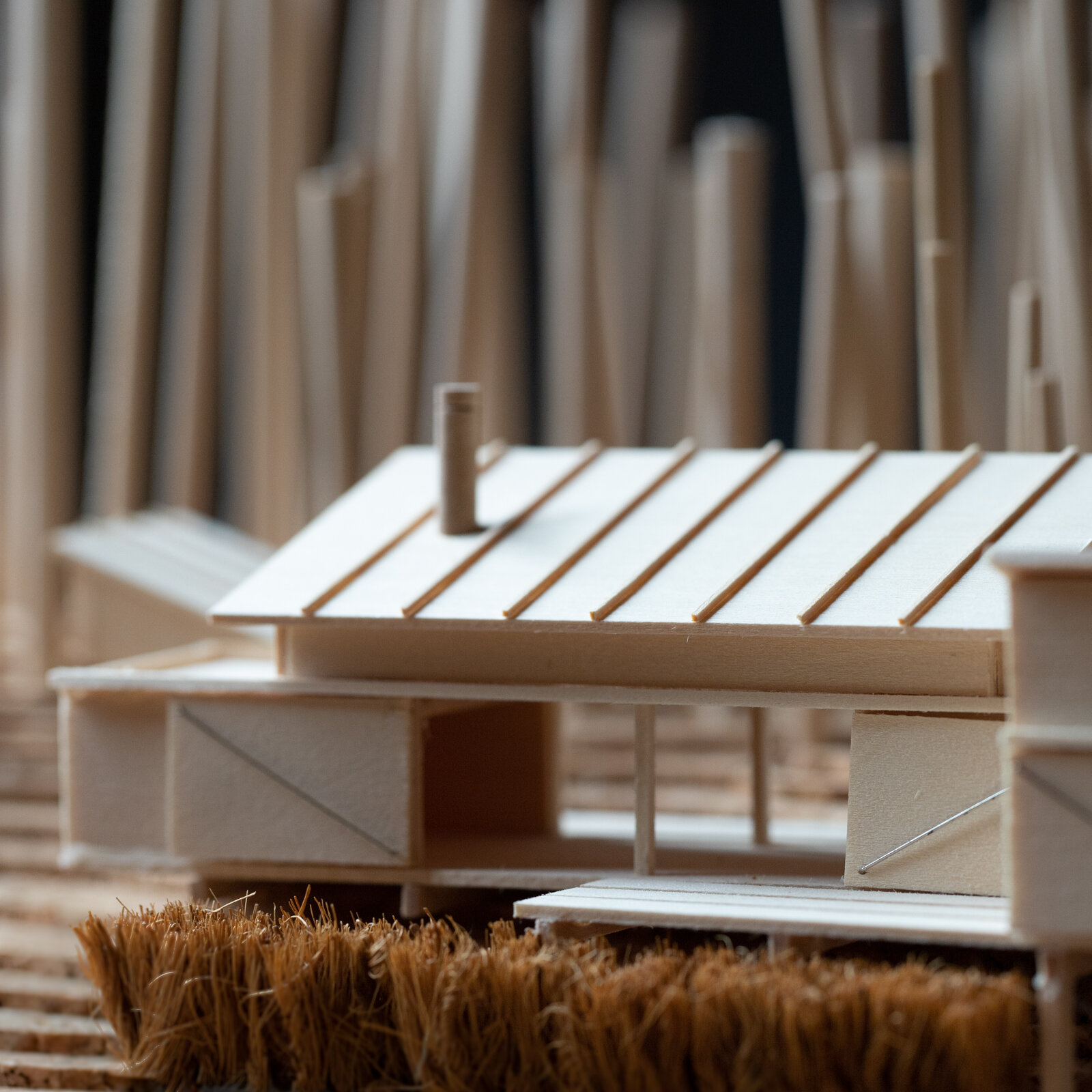
Sketching Solutions

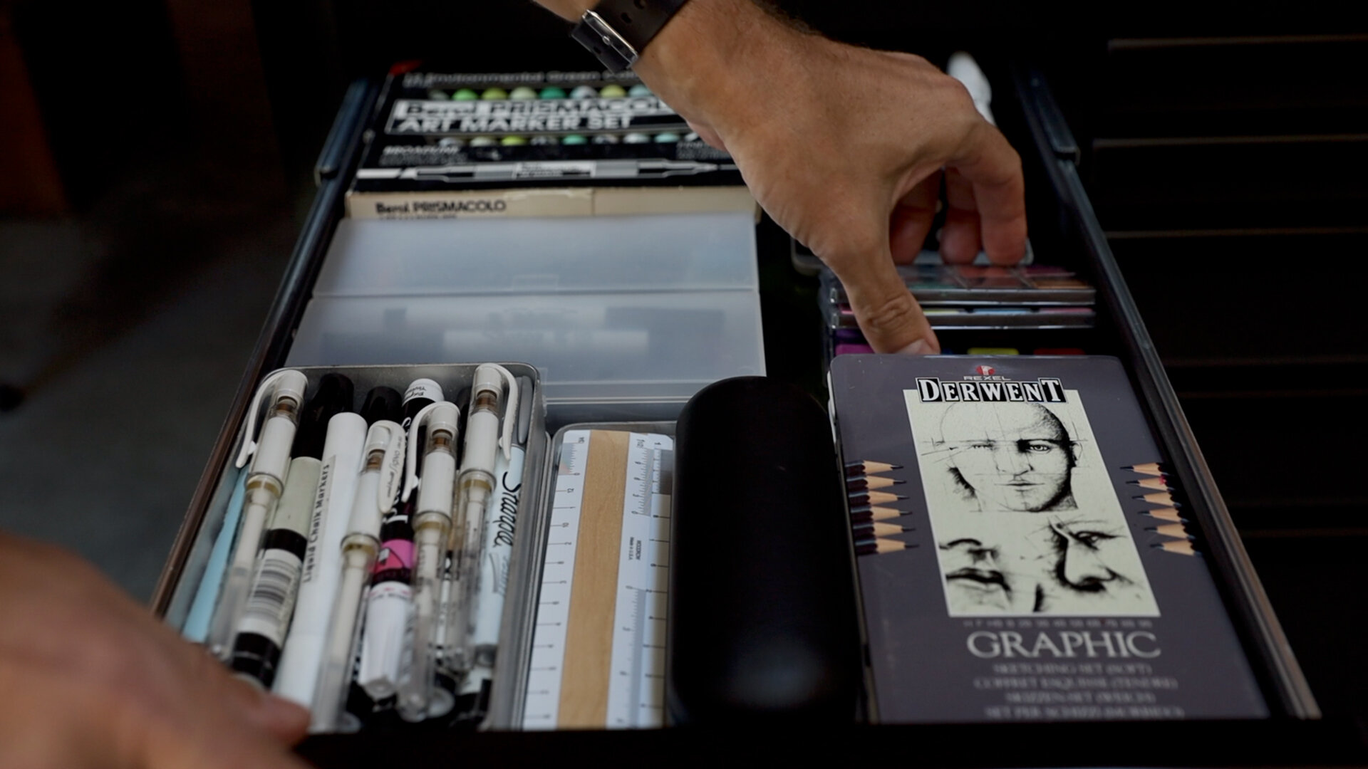
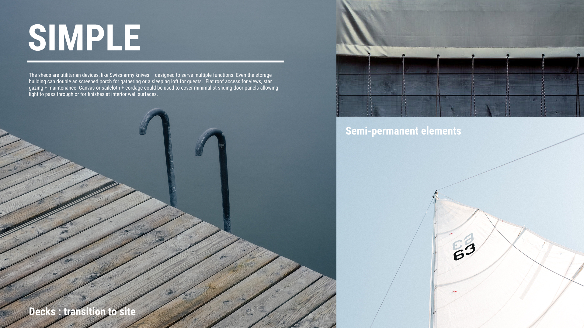
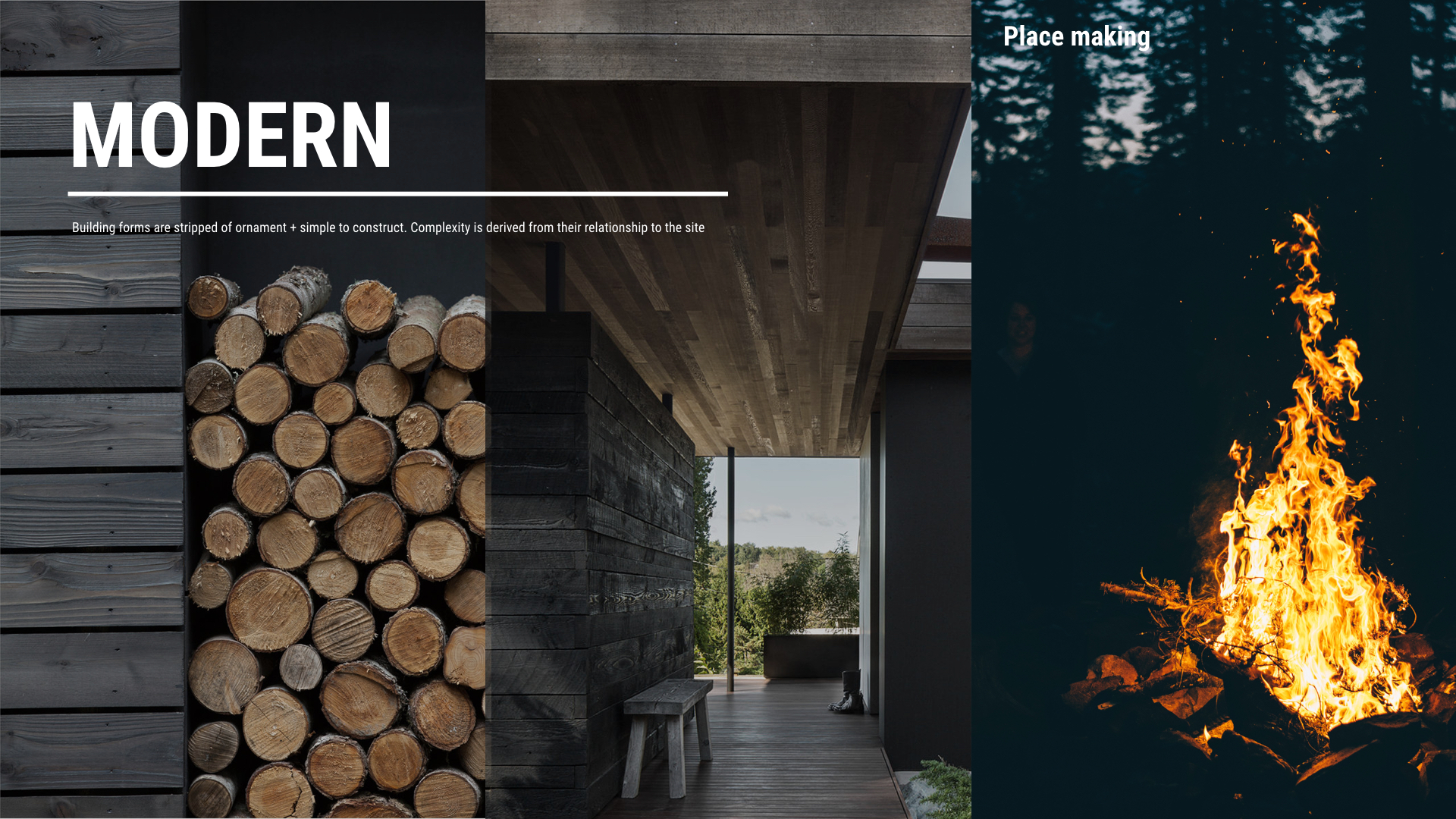
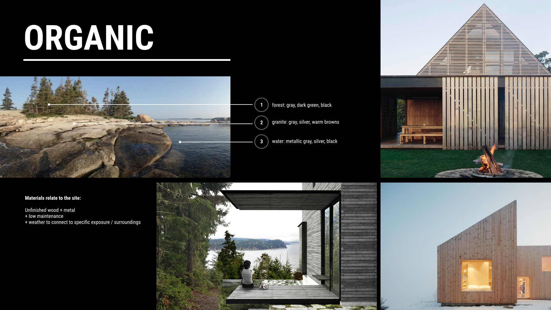
Material Palette for inspiration
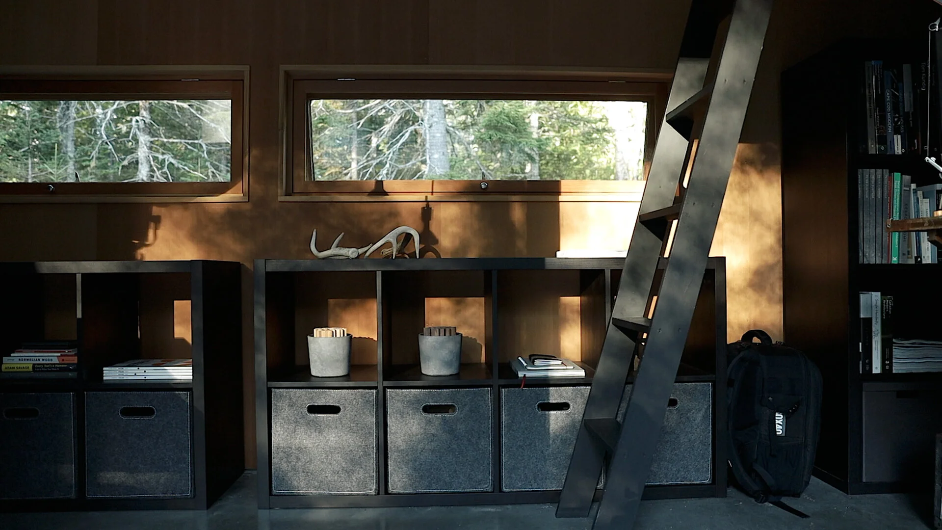
A ladder clearly takes up the least space in the room, but it’s also the most difficult means of accessing the loft space. As my clients imagined cleaning it and bringing books to and from it, the use cases narrowed. Even though it may be possible to recapture extra space in a home, if it’s not useful or easily accessible, the cost-benefit is questionable.
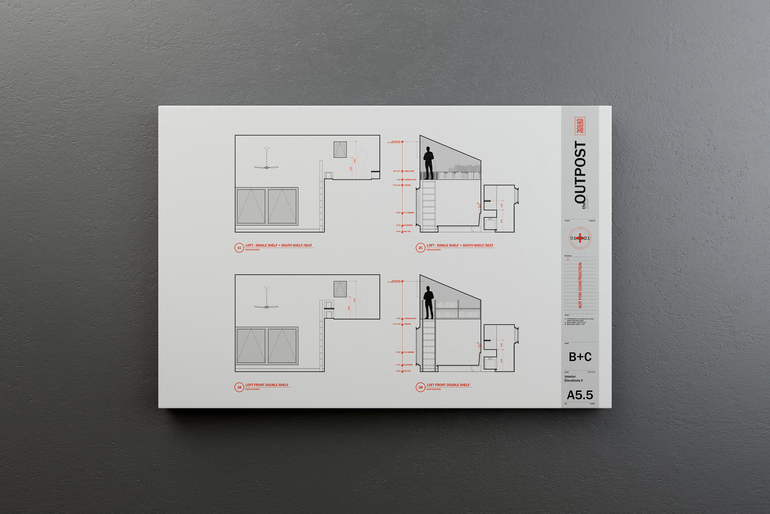
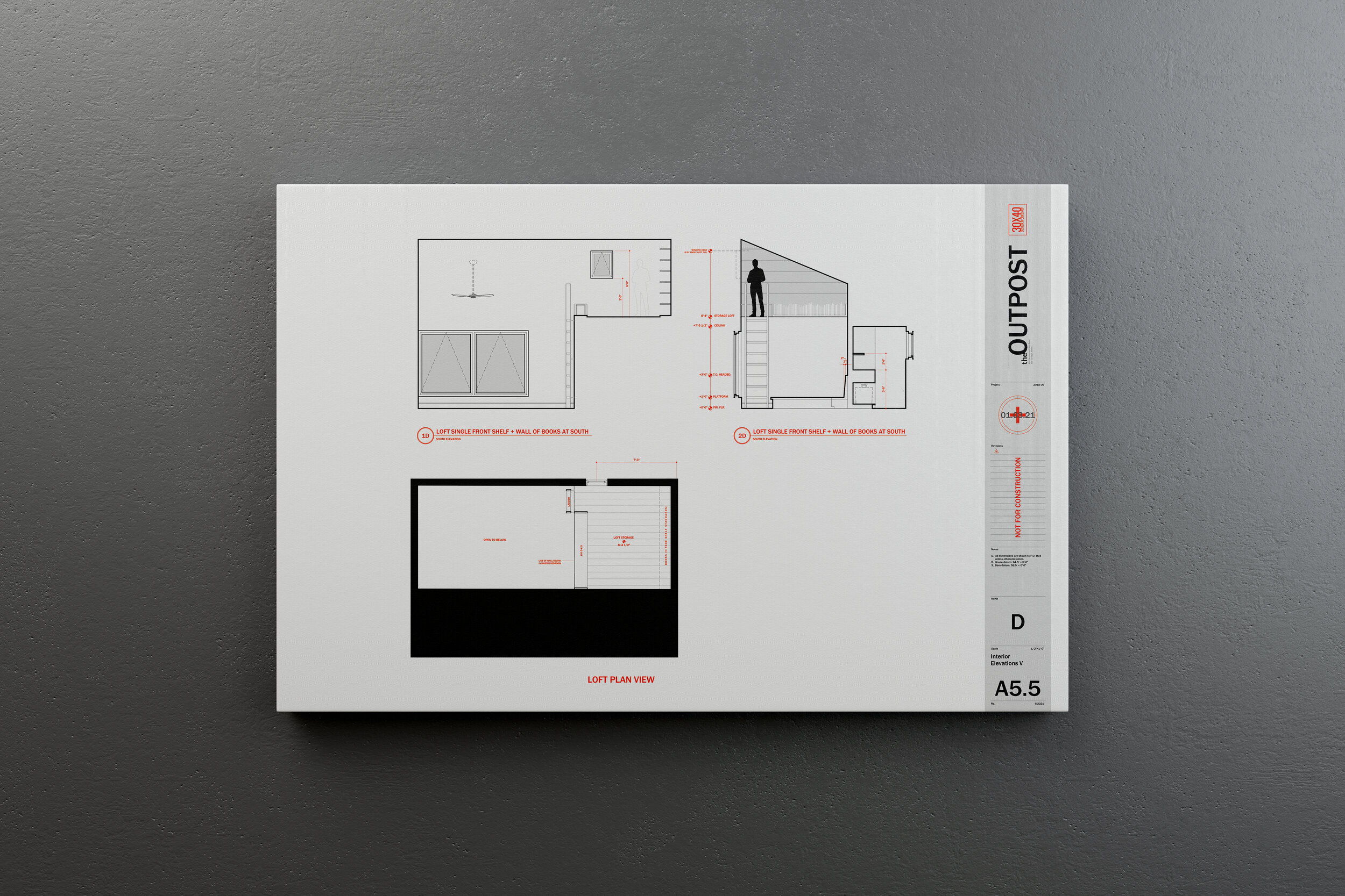
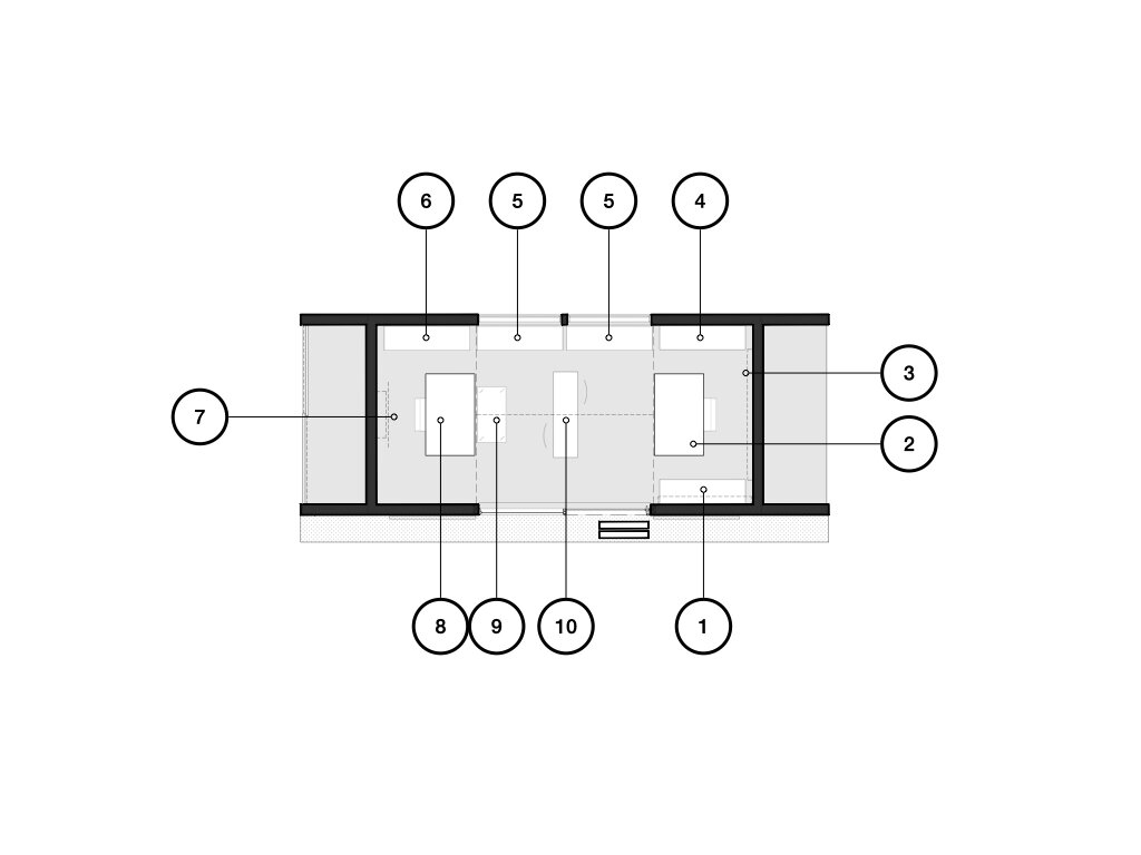
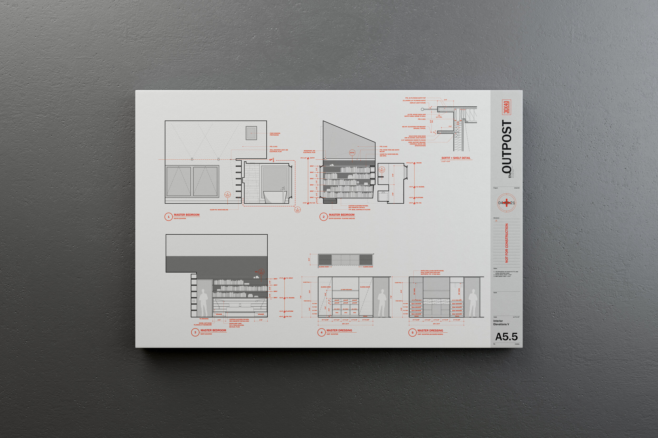
As we worked through the options, this need for book storage suggested a new opportunity. By shifting the pocket door entry to the north and creating an alcove for the books on the main level we solved a few problems at once. The books found a natural home within arms’ reach and this singular, sweeping gesture on the south wall of the room also created a soffit above for display, increasing the perceived volume of the room and it allowed us to add a small eyebrow window to let light in from above. The soffit and shelf repeated a motif we had used elsewhere on the interiors whereby we nest smaller volumes within larger volumes of space.
Idea becomes sketch. Sketch becomes presentation drawing. Presentation drawing becomes construction drawing. And now, we build!
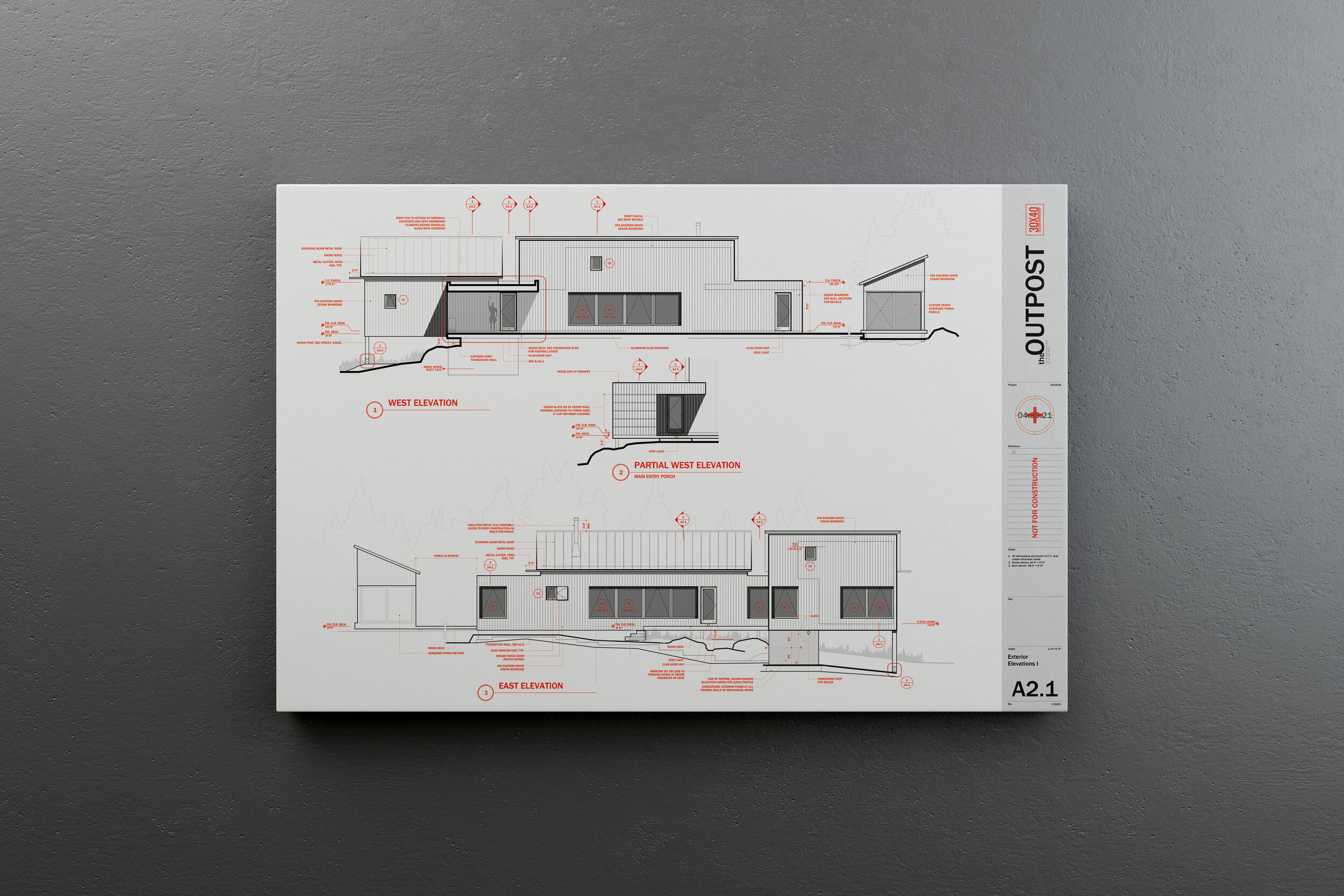
Outpost Updates - July 2023
To see all the latest progress + the current interior design iteration check out the links below:
Latest Blog Post: Interior Design with an Architect’s Eye
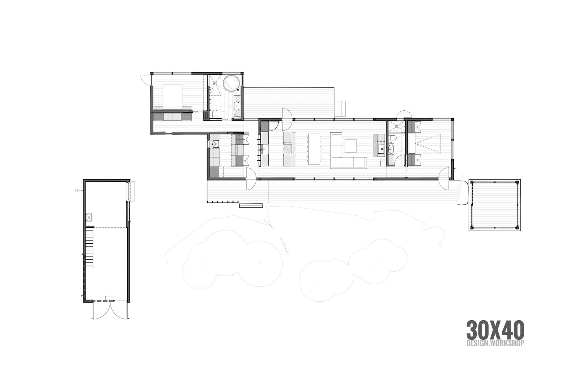
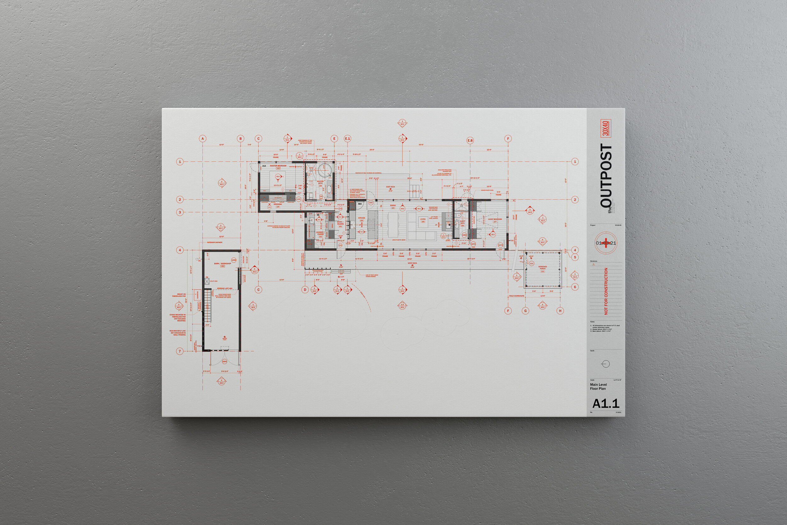
Download the floor plan: Architectural Floor Plan Working Drawing

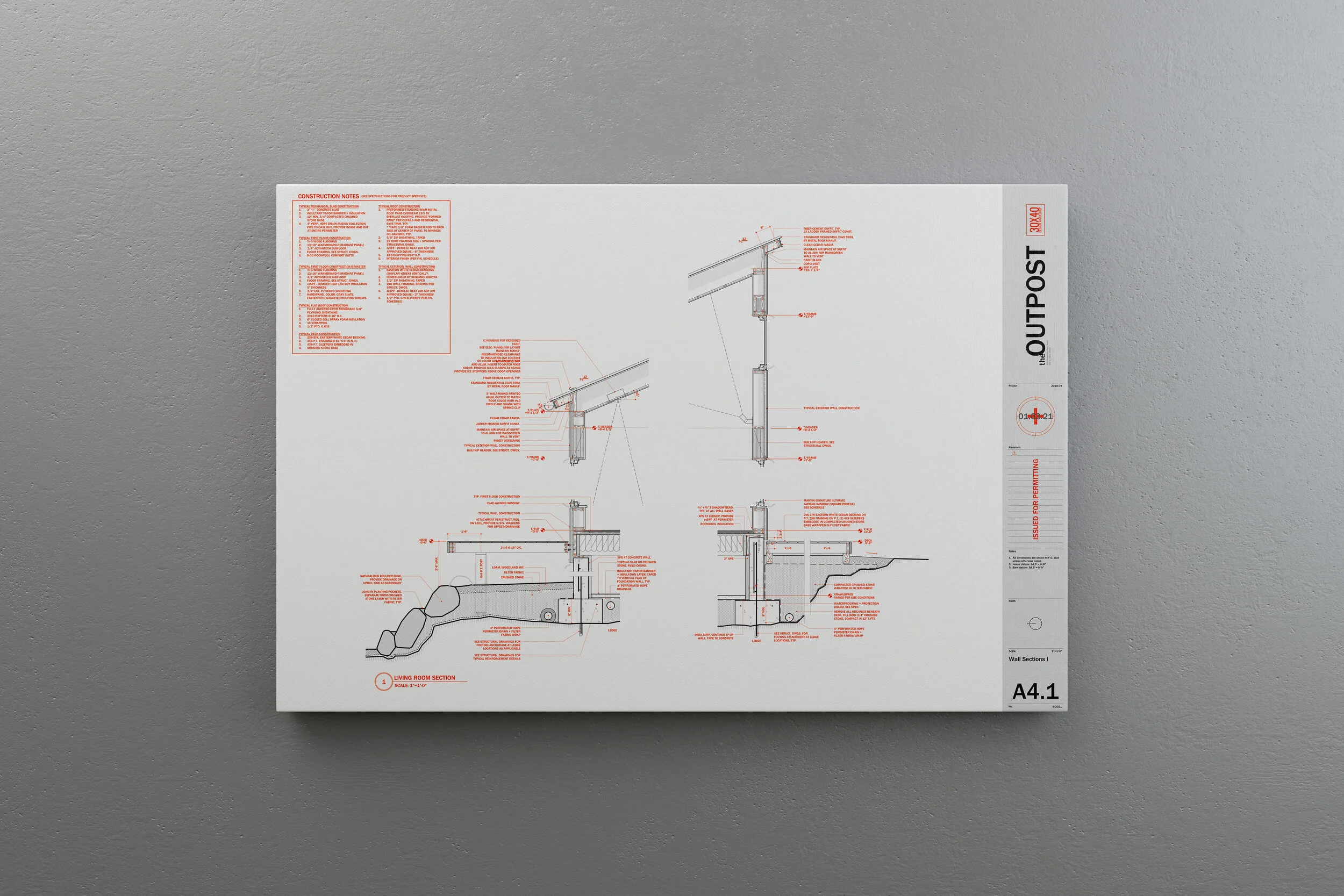
Door Jamb Head Reveal Detail

Door Jamb + Base Reveal Detail