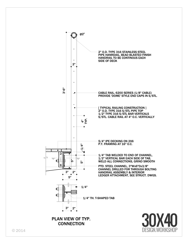
I thought it would be interesting to explore the ideas at work behind the design of a guardrail for a recent project of mine. While it's one small component of the larger design it speaks to the architectural process at work. The guardrail sought to carefully balance the competing desires of an unobstructed view, safety and of course aesthetics.
Concept
I always reference the building concept when designing each individual component of my buildings. The concept for this project was inspired by the fishing shacks and wharf structures of coastal Maine and resulted in a trio of cottages. Two are situated at the edge of the tidal salt pond and the third extends out over it - a modern wharf of sorts. The marine references are clear in the built-form, from the bright-work of the large sliding doors to the simple, utilitarian, expressive structural concept.
The wharf cottage contains the most public functions - the kitchen, living and dining rooms and has a large wrap around, cantilevered deck. The deck is positioned so as to welcome guests arriving and links the interior and exterior living spaces to the view to the fjord beyond. Because it's cantilevered, the deck appears to float as a thin plane above the water below. So as I design different pieces of the architecture, I'm always cognizant of ideas about slimness, simplicity, honest expression of construction, and the influence of the watery site. I wanted to maximize the client's view to the fjord from both inside and out and of course maintain a safe gathering space - and it had to look good.
Deck Design
Before I can get to the guard design, I must design the deck. Each of the decks for the project were conceived of as thin planes floating above the landscape. To do this I created a steel channel frame at the edge of the deck. This steel channel not only references the simple steel shapes used on the docks and piers here on the coast but it also provides a very thin profile to the deck edge which was important to the design. The structural beams and foundation piers for all of the decks are set back from the edge to further enhance the hovering effect.
Guardrail Design
All of the effort at slimming down the deck edge profile would be lost if I were to place a substantial, meaty guardrail system on top of it. Cable rail seemed an obvious choice with references to boat rigging and its near invisible and weightless stature. But cable rail has must meet all of our code concerns too, which means we need intermediate supports. That's easy you say, every three feet add a post. True, I could've done that and probably been fine, but it would've looked ad hoc, not considered. I wanted to be sure that we had an even spacing along the length of the deckf and I also wanted it lined up with the regular module of the large sliding doors and the structural columns which are the dominant ordering system of the wharf cottage. Why? Mostly because I like lining things up, but also because the order makes sense and feels better. It allowed the corner offsets to be the same and it fits the tidy aesthetic which contrasts the disordered organic surroundings. I'm always battling entropy - unsuccessfully I might add.
Here's where the added advantage of the channel deck edge comes into play. That allowed us to offset the vertical supports to the outside edge of the deck extending them down by the Ipe decking and welding them to tabs on the steel channel. The added bonus is that it gives over the deck edge to people rather than a guardrail system.
Is it perfect? No. It turns out that welding the vertical fins to the tabs on the steel channel at the deck edge is difficult to do when suspended over a pond. I'm not afraid to say that I'm always learning. And, I'm always humbled on job sites by the skill of the contractors that work so hard to make my drawings a reality.


