Book Launch and Guest Post on Entrepreneur Architect

I'm quite honored to have written a guest post featured this week on Entrepreneur Architect, a website run by my friend, architect, and talented businessman, Mark R. LePage. Not only do we share an alma mater, Roger Williams University, but we also share in our mission to help small firm architects looking to change the world one project at a time. Mark has been delivering on his goal to be "a force for change in the world of architecture" since he doubled down on his commitment on 12/12/2012 with good advice and positive mentoring. In the post, I discuss four basic things every pro needs to attend to when using Houzz and a back door trick for entering their image-based ecosystem.

The post is my small contribution to Mark's broader mission and it supports the release of my book this past week on Amazon, The Unofficial Guide to Houzz.com . I wrote the book to help architects and designers find relevancy and rank in more searches on Houzz.  I have quite a bit of experience writing there and successfully securing work for 30X40. My writing has been a force for change in my own life, helping me to sort through ideas and help others and I think it shines through clearly in the book.

See the article entitled, "4 Things You're Not Doing on Houzz (But Should Be)" on the Entrepreneur Architect site.

Thanks to Mark for featuring my work and for the excellent resource he continues to build

If you like the book, I'd so appreciate and welcome an honest review on Amazon.com and I'd love to hear what's working for your business on Houzz.

The One Space You Can't Live Without

I'm convinced I was born in the wrong part of the world. Have you ever had this feeling? I love my family, don't get me wrong, it's got nothing to do with them. My parents moved from my birthplace on central Long Island in New York a few hours north - upstate - to a small town baseball fans know well, Cooperstown. It was baseball that connected the economy to the outside world drawing thousands of tourists to see heroic players inducted into its hall each August. It was farm country and when it wasn't farm country, it was snow country.

I never played baseball, and the smell of manure made me long for the trade winds of the tropics, and the searing heat of the desert, the salt air of Big Sur, and a lush, green Kyoto.

Katsura Imperial Villa

Not coincidentally, all places more temperate than upstate New York and also places where it's possible to live somewhere between inside and outside. Not fully one or the other. Something I never had a chance to do.

I'm fascinated by open air living as a human first and of course professionally as an architect. It certainly isn't a recent invention, but it's one that has been co-opted by modern architects as an instrument to connect people more fully to their surrounding environment. As a modern architect myself, now practicing in the northerly, marine climate of Maine, I can't help but drool over the imagery and apparent freedom of my colleagues practicing in more temperate climes. No need for screen doors, or tightly controlled waterproof building shells their architecture flows from inside to outside unobstructed. These structures define places for being, for living - without constraints or boundaries.

But I know as an architect too, that even though we may have black flies and mosquitos and snow - which flies for more of the year than we'd like - we still have a need for transition spaces in our architecture. Open air living isn't completely possible but these transitions can afford the suggestion and on rare days even deliver on the promise.

I would argue that transition space is the one space no work of architecture can exist without. No matter where we practice, architects follow similar rules about the need for transitions between enclosed (indoor) and unsheltered and open (outdoor) space. These buffer zones, where we move from one activity to the next are not only extremely useful, utility-driven spaces but they're integral to our comfort and our experience of a place.

Imagine stepping into the the Pantheon's cavernous dome without the large sheltering portico transition. It's not the same. The Greek's and Roman's of antiquity understood this, their architecture is rife with colonnades, porticoes, the agora, the forum - each one had a preamble. Hardly superfluous, they're necessary and comforting architectural devices.

via Campos Leckie Studio

A more contemporary example everyone is familiar with is the porch. Porches give us a place to kick off the mud from our boots, a place to sit outside while it rains or sheltered from the sun and reduce the apparent size of our two or three story homes to something more in tune with the size and shape of our bodies.

We instinctively notice the absence of transition spaces too. Think of almost any tract house in suburbia built in the last 20 years. Are you picturing arriving to a garage door? I know I was. Suburbia has asked that we eliminate the transition space in favor of our car. Step out of your car an into the four walls of your home.

Architects understand the need for transition spaces and leverage their utility. They provide a sense of scale, shelter, enclosure, protection, a sense of arrival and departure and because they lack the strict requirements of conditioned (or heated) space they can be more sculpturally free and expressive.

via Campos Leckie Studio

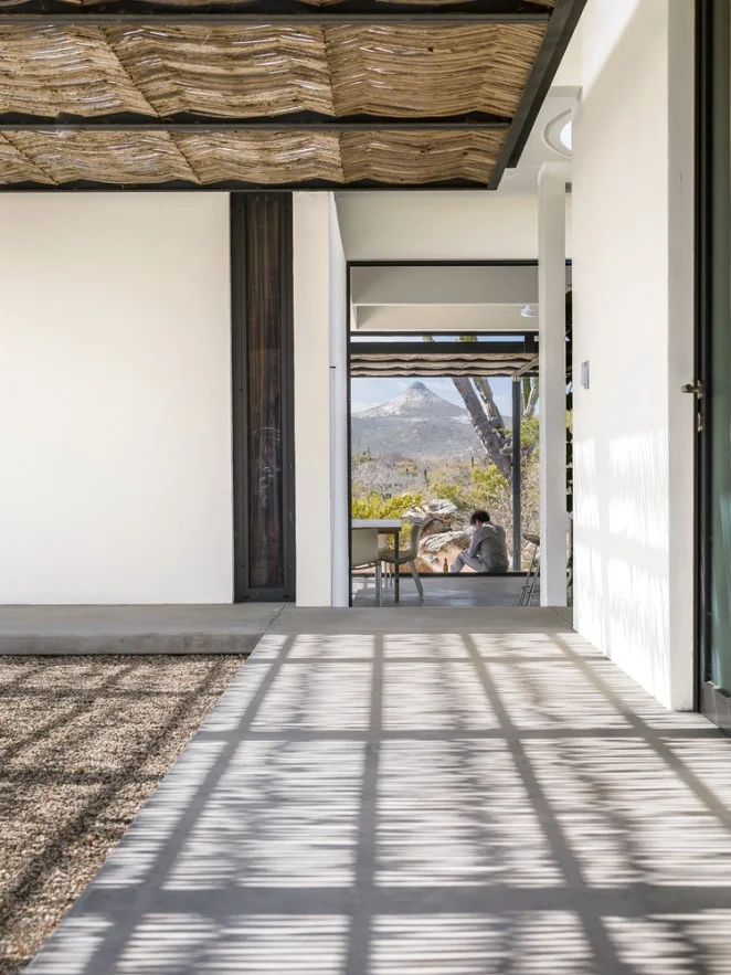
Modern architecture has surely sought to connect us to our place in a more direct way than its predecessors and transition spaces make this possible as evidenced by these seductive photos of a project in the desert southwest. Almost like nomadic tent structures, the architecture is reaching out to the land, buffering the extreme environment creating pools of shade around the home. This makes the interior environment more comfortable and it provides places to sit out of the intense sun for the inhabitants.

Transition space is the one space you can't live without (there just might be one other one too).

Minimal Deck Guards and Edges

I thought it would be interesting to explore the ideas at work behind the design of a guardrail for a recent project of mine. While it's one small component of the larger design it speaks to the architectural process at work. The guardrail sought to carefully balance the competing desires of an unobstructed view,  safety and of course aesthetics.

Concept

Pond House guardrail edge

I always reference the building concept when designing each individual component of my buildings. The concept for this project was inspired by the fishing shacks and wharf structures of coastal Maine and resulted in a trio of cottages. Two are situated at the edge of the tidal salt pond and the third extends out over it - a modern wharf of sorts. The marine references are clear in the built-form, from the bright-work of the large sliding doors to the simple, utilitarian, expressive structural concept.

The wharf cottage contains the most public functions - the kitchen, living and dining rooms and has a large wrap around, cantilevered deck. The deck is positioned so as to welcome guests arriving and links the interior and exterior living spaces to the view to the fjord beyond. Because it's cantilevered, the deck appears to float as a thin plane above the water below.  So as I design different pieces of the architecture, I'm always cognizant of ideas about slimness, simplicity, honest expression of construction, and the influence of the watery site. I wanted to maximize the client's view to the fjord from both inside and out and of course maintain a safe gathering space - and it had to look good.

Deck Design

Before I can get to the guard design, I must design the deck. Each of the decks for the project were conceived of as thin planes floating above the landscape. To do this I created a steel channel frame at the edge of the deck. This steel channel not only references the simple steel shapes used on the docks and piers here on the coast but it also provides a very thin profile to the deck edge which was important to the design. The structural beams and foundation piers for all of the decks are set back from the edge to further enhance the hovering effect.

Guardrail Design

Guardrail section detail

All of the effort at slimming down the deck edge profile would be lost if I were to place a substantial, meaty guardrail system on top of it. Cable rail seemed an obvious choice with references to boat rigging and its near invisible and weightless stature. But cable rail has must meet all of our code concerns too, which means we need intermediate supports. That's easy you say, every three feet add a post. True, I could've done that and probably been fine, but it would've looked ad hoc, not considered. I wanted to be sure that we had an even spacing along the length of the deckf and I also wanted it lined up with the regular module of the large sliding doors and the structural columns which are the dominant ordering system of the wharf cottage. Why? Mostly because I like lining things up, but also because the order makes sense and feels better. It allowed the corner offsets to be the same and it fits the tidy aesthetic which contrasts the disordered organic surroundings.  I'm always battling entropy - unsuccessfully I might add.

Here's where the added advantage of the channel deck edge comes into play. That allowed us to offset the vertical supports to the outside edge of the deck extending them down by the Ipe decking and welding them to tabs on the steel channel. The added bonus is that it gives over the deck edge to people rather than a guardrail system.

Is it perfect? No. It turns out that welding the vertical fins to the tabs on the steel channel at the deck edge is difficult to do when suspended over a pond. I'm not afraid to say that I'm always learning. And, I'm always humbled on job sites by the skill of the contractors that work so hard to make my drawings a reality.

Natural Wood Siding Minus the Maintenance

Architects, designers and homeowners go to great lengths to keep the weather out of buildings, a worthy and necessary goal. But the task of creating home exteriors that resist weather’s effects — including washing, sanding, stripping and refinishing — is significant, time consuming and expensive. Rejecting this unending cycle of maintenance and accepting weathering as part of a home’s design aesthetic makes good environmental, economic and design sense. The homes in this video embrace weathering as part of their aesthetic — and even celebrate it.

Twists on window trim

Architects often think about projects in terms of systems. It’s one of our strategies for organizing the complexities of construction into a coherent whole. Each system has an order and interfaces with the other building components in a clear way. Windows have a special place in our systems. They help to define site connections, permit or screen views, and modulate natural light entering our spaces. When thinking about how window systems integrate into the larger structure, I like to develop a clear logic that describes how they’re placed in walls, which always requires adopting an attitude toward trim. Trim is a standard vehicle for hiding joints where materials come together — the edges of Sheetrock are a good example. Trim can also set a building in a particular time period.

But to me, the more integrated even a small detail such as trim is with an idea about a place or structure, the more it can support the overall logic of a building. The following projects eschew traditional ideas about trim in service of a bigger, modern idea.

Putting Narrow Windows to Work

Without windows, our architecture would be lifeless, heavy and dark. We use window openings to control light, admit fresh air and connect our interiors to the outside world. Because they control these key components of our built environment, windows are integral to setting the mood of a space. Sliver, or ribbon, windows have a particularly unique way of controlling the way we feel in a space. Used high in a wall, they wash the ceiling with an even light, making a space feel secure yet luminous and introspective. Used low in a wall, they create a dramatic shift in focus, highlighting and reflecting the adjacent ground color, material and weather outside. Used at or just below eye level, sliver windows create a carefully controlled horizontal framed view to the building’s surroundings.

My video discusses how you can put these narrow openings to work in your home.

Design Workshop : The Beauty of Humble Materials

Humble materials aren’t costly or luxurious, but using them in residential design doesn’t mean you have to sacrifice interest or refinement. Many architects find inspiration in the humble beauty of simple structures dressed in plain materials that are used honestly. These materials don’t draw attention to themselves or pretend to be something they’re not. They’re chosen to modestly serve their purpose.