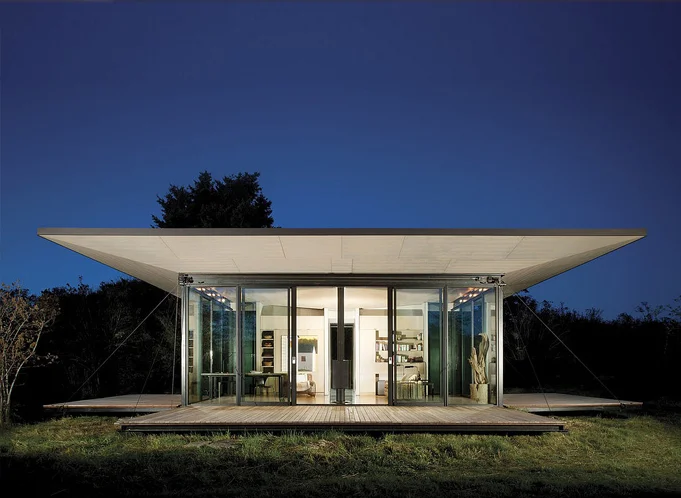
Flat roofs and snow: 5 myths (busted)

In this video I dispel 5 common myths surrounding the use of flat roofs in snowy climates. The very notion of shelter is linked to the image of a roof above our heads. And while the elements of snow and rain may shape our living habits, advances in material technology and application now afford us a broad range of choice when it comes to the shape of the roofs over our heads. Contrary to popular belief, even those of us living in extremely snowy, wet environments are able to live beneath a flat roof. 


Designing a Small Studio - Lighting Plan (Part 7)

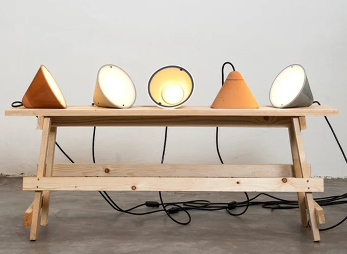
In this video I discuss the development of the lighting plan for our small studio project. I begin by discussed the (3) elements every professional lighting plan includes: ambient, task, & accent lights. I also describe a useful guideline for figuring out the amount of light required in a space as well as how I've applied the building concept to the lighting plan.I end the video by discussing a simple affordable fixture, why I chose not to use exposed conduit in spite of the aesthetics, and how to think about the location of your electrical panel (stay until the end for a cool little trick I employed).

Thanks for watching...

Four Homes Built on Boundaries

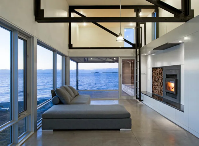
In this video I explore four homes built on boundaries. It's a look at how a home can challenge the natural environment and occupy the boundary between architectural convention and stunning natural beauty. When confronted with a design brief and an undeveloped site, architects often look to the edges of that site for inspiration and meaningful architectural solutions. These boundaries, both real and imagined, are exciting places to build. The boundary often gives rise to the form of the building, its materials and even how it’s structured.

Designing a Small Studio - Selecting Materials (Part 6)

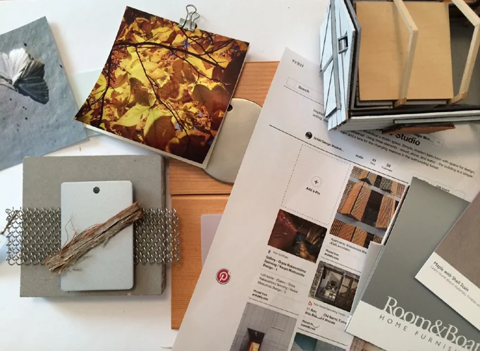
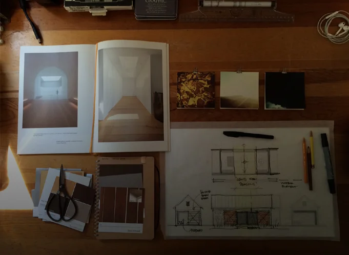
Materials can be used to convey the underlying concept of a building or in some cases they can function as the entire concept (Peter Zumthor is an excellent example). In this video I detail the process I used for connecting the "lens for the seasons" and "barn" concepts to an attitude about building materials.

I begin with abstract imagery, then build Pinterest boards with inspirational images, then I gather and collage materials. Instead of directly quoting the Pinterest images I draw upon their essential ideas to develop the material palette for the building.

The concepts are hard to compress into a short video (my apologies) if you stay tuned to the end I talk about a quick tip for securing free material samples I recently discovered.

How to Borrow Light

In this video I discuss natural daylighting strategies anyone can take advantage of. I begin with a short history lesson which describes how daylighting actually shaped the largest of cities in the US. In 1915 the 38-story Equitable Building in New York City was the largest office building in the world. Containing 1.2 million square feet of office space, it consumed nearly every available square foot of its diminutive lot and cast an equally large shadow on its neighborhood in lower Manhattan. Its construction inspired the enactment of the city’s 1916 Zoning Resolution, which was designed to preserve access to light and air at the street level. The resolution prescribed specific limitations for a building’s envelope — its outer walls — and would go on to shape the stepped forms that you see today on many of the iconic towers in the city.

This underscores the importance that access to daylight had in shaping even the largest of cities, the individual buildings that make up those cities and, more broadly, sensible building design. With an increasing focus on sustainable design practices, the smart use of natural daylight in our homes is no longer a luxury — it has become a necessity. At the heart of any good daylighting strategy is a concept of “borrowed” light: the capture of light falling on the exterior of a home and transporting it to the spaces where it’s needed.

Designing a Small Studio - Building a Study Model (Part 5)

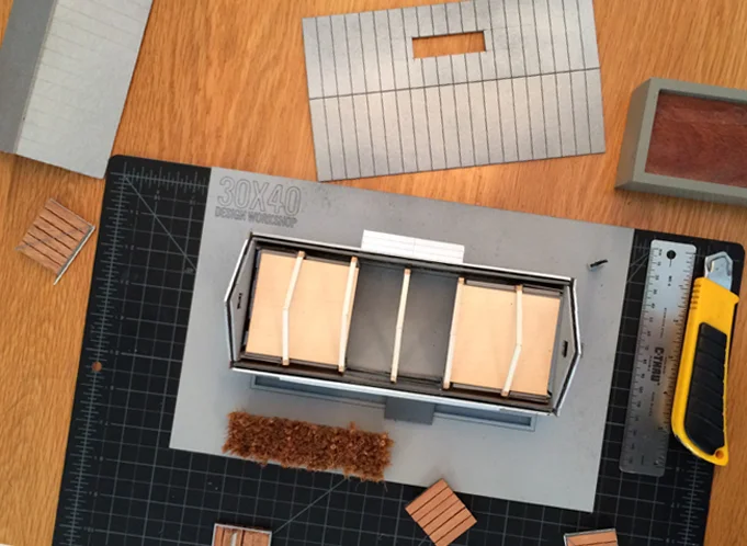
In this video I discuss the benefits of building a small scale, physical study model using the reference project I've been designing: my studio building. Computer models are excellent tools, but simple cardboard models allow real-time manipulation of forms and the development of ideas that don't always present themselves when working in a digital environment.

For me, model building has always been a part of the design process. They help: 1) To study building forms and spaces. 2) For real-time solar studies. 3) With envisioning scale of elements as they relate to the human form. 4) Allow one to explore a variety of material and color options, quickly and easily. 5) One can quickly flesh out ideas in much the same way a hand sketch might, however, model construction uniquely forces you to make decisions about building elements that sketching doesn't.

Future videos will describe sketchy model building hacks and tactics to more quickly build a useful avatar for your architectural project.

Designing a Small Studio - Revisiting and Integrating the Concept (Part 4)

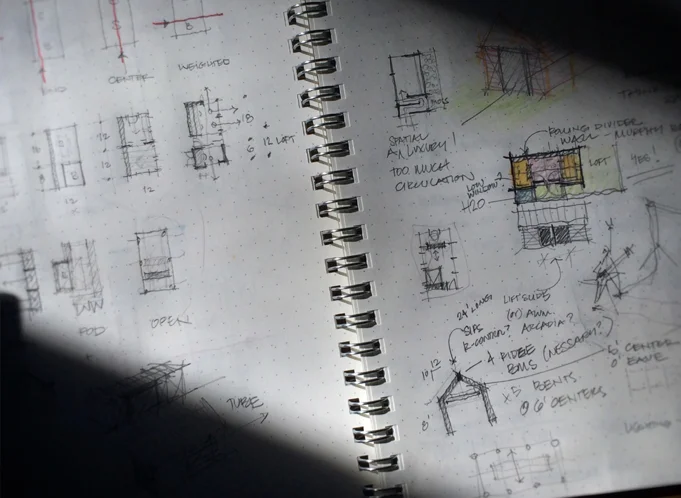
In this video I overlay the plan diagrams on the site plan which reveals a clear favorite. I go on to describe 6 tactics I use to turn a simple diagram into a meaningful floor plan. They are:

1) Study a building precedent (in this case a barn).

2) Develop an ordering system (grid, column layout, geometry, functional). Once it's established you can decide when to "disobey" the rules.

3) Create zones: entry, circulation, storage, living. Divide public and private spaces.

4) Analyze adjacencies - group common functions and support spaces. Make sure their orientation makes sense for the plan location.

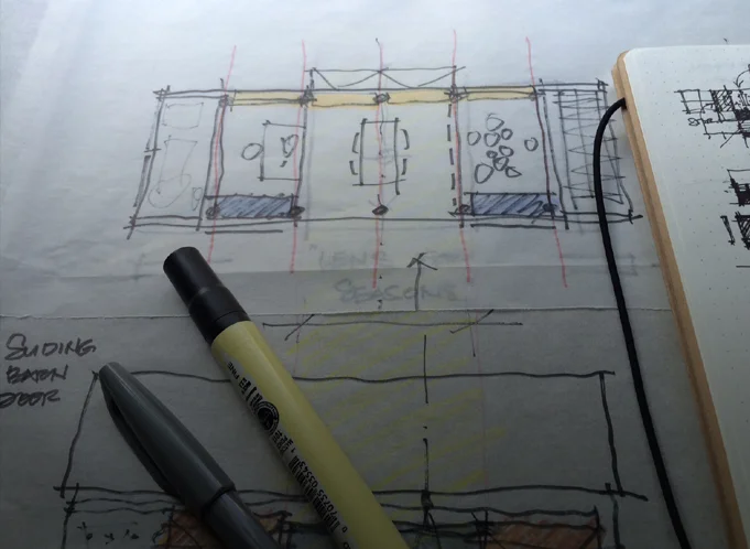
5) Refer back to the concept. In this case the "lens for the seasons" concept reinforced the barn plan typology and spurred on new ideas.

6) Create layers of meaning. Begin by thinking about the way we experience space or places and look for opportunities for the building to enhance daily life.

The next video explores the use of small physical study models for solar, material, and proportioning studies.

Designing a Small Studio - Plan Diagrams (Part 3)

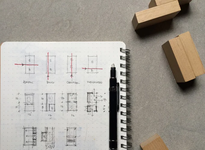
Part 3 in a multi-part video series where I dissect the design process for a small studio space. In this video I sketch out the four basic plan ideas I generated for the studio and describe the benefits and liabilities of each. Designing a floor plan begins with an understanding of the site, where the sun is, the winds, the approach, public and private areas and a precise listing of the spaces to be incorporated.

A well-designed floor plan synthesizes all of this information into a simple, logical connection of rooms. The process I describe works for buildings that are extremely simple - such as my studio - as well as very complex structures.

Designing a Small Studio - Inspiration (Part 1)

In this video I discuss the inspiration for the design of my small studio and workshop here on Mount Desert Island. This is part 1 in a multi-part series I've been recording as I continue to refine the design and prepare for the construction of this project. Part 1 discusses the site inspiration and how living on the coast of Maine has informed my design process. My work is site specific, narrative based and craft-driven; these concepts appear continually in my work and I hope this video offers some insight into how these abstract ideas develop into architecture. In part 2, I sketch out the plan concepts and parse the options to show you how I typically begin a project and move through the various options.

Ethanol Fireplaces - An Architect's Review

Two common alternatives to the traditional fireplace that have been gaining favor with consumers ready for a simpler installation, lower maintenance and ease of use are the ethanol and gel-fueled fireplaces. If you’re considering purchasing one, this video describes everything you need to know. In it, I discuss costs, configurations, types, layout, and fuels along with a few caveats.

Concealing the Garage

Cars are among the largest physical objects we own, which helps us rationalize the generous square footage we allocate to them on our property and in our homes. Because of their size, they’re not an easy aesthetic problem to solve. Architects and designers have always struggled with how best to orient the mass and large footprint of the garage. Detached, connected, trellised, to the side, to the rear, beneath — every possible location requires compromise. In this video I discuss various strategies to conceal the garage. In hopes that we can move beyond arriving to the garage door rather than the porch or the front door.

Accessory Dwelling Units

In this video I review the the accessory dwelling unit (ADU), which is an additional, self-contained home located either within or adjacent to an existing house. They're also known as in-law units, granny flats, multigenerational homes, and laneway houses. These offer a compelling solution to the problem of suburban sprawl and are an excellent means of increasing the utilization of existing municipal infrastructure.

I discuss the permitting procedures, restrictions, and general planning framework for the ADU, where to start and the costs involved.

Resources mentioned in the video:

AccessoryDwellingUnits.org

HUD ADU Model Ordinance

Lilypad Flexible Home Initiative

Design Inspirations

This is a short list of the threads and inspirations that have been influencing my work lately. Some lurk just beneath the surface, waiting for the right opportunity, the right site or the right client, while others are more thematic and make appearances again and again. I hope they’ll help to replenish your creative stores and inspire you to see the world around you through a new lens.

Plywood as Finish

Architects in search of novel uses for humble materials are now using plywood for a higher aesthetic purpose as a finished surface in living spaces. It’s become a handy means of modernizing and warming an interior for a relatively inexpensive cost. In this video I discuss ways to find out if it’s right for your project. I review: veneer types, grades, thickness, joinery, finishing, as well as where and how to use it.

Kinetic Architecture

Kinetic architecture, which moves or changes to adapt to seasonal, functional or daylight requirements has roots dating back to medieval times. A castle’s drawbridge served as a multifunctional kinetic wall, door and footbridge. The futurists and constructivists of the Russian art movement of the early 20th century explored kinetics by infusing their proposals with notions of highly mechanized, sleek, modern, industrial construction. In this video I discuss moving walls, roof planes, colossal doors, sliding screens, pivoting openings, and gizmos. These are all devices that can dramatically transform space and adapt a structure to its local environment.

Modern Shutters : A Passive Design Strategy

Passive design strategies are becoming widely accepted as a way to drastically reduce the amount of energy a home consumes and low-tech solutions are gaining favor with designers and homeowners alike. Shutters are one such low-tech means of passively controlling the environment around a building. Operable shutters control light, temper heat, shield or welcome wind, buffer noise and provide privacy. Like a versatile three-season jacket they can help make life more comfortable. This video explores a few modern examples of the multipurpose shutter.

Channel Glass: An Architect's Material Review

This video is a primer on channel glass and an architect's take on the material. It's a 10-minute short course describing:

- Cost

- Uses

- Physical and thermal properties

- Finish and color options

- Attachment specifics

- Special design considerations

- Benefits and liabilities

Unlike standard float glass, channel glass has a high recycled content and the opportunity for improved thermal performance over insulated glass units. It's translucent so it provides natural daylight to spaces with privacy requirements or in tight urban sites where undesirable views are a design constraint.