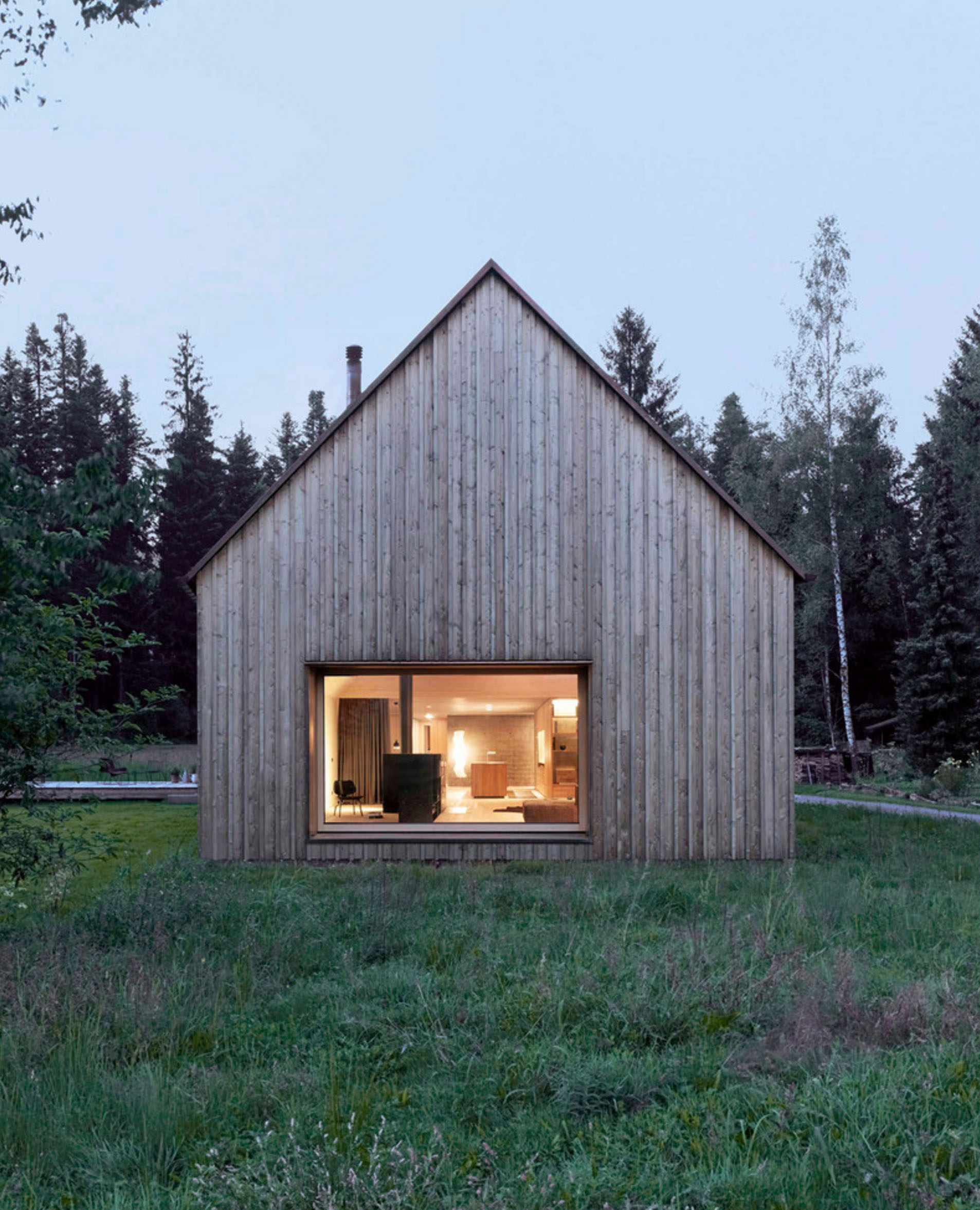
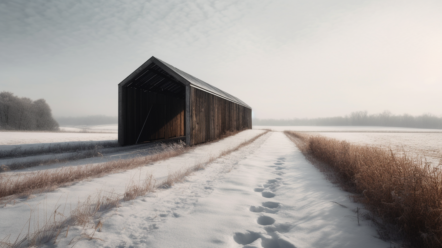
A short musing on simplicity; illustrated with residential architecture. Simplicity builds no more than necessary. Simplicity makes room for living rather than things. Simplicity is rational. Simplicity values craft... and material. Simplicity rejects excess. Simplicity invites reflection. Simplicity appears effortless. Simplicity is efficient. Simplicity lends small gestures... great importance.
A Kitchen Remodel That Costs More Than a School
As a residential architect, I've had the privilege of working with some amazing clients. I'm truly fortunate to be able to work on such interesting projects for people who care deeply about architecture. The impact of the single-family residential work that I'm commissioned to do – the work that supports my family – is naturally limited in scale and scope.
This year I'm committed to building something larger than 30X40 can do alone. To honor that commitment, I've chosen to give to Pencils of Promise, a non-profit that builds schools around the world. They offer a chance for all of us to expand the reach and impact we can have in the world. For less than the cost of a typical kitchen remodel in the United States today – which stands right around $28,000 – PoP can build a school in Ghana.
An entire school.
That’s a school in one of the 75% of communities they visit that doesn’t have one.
Imagine for a moment what your life might look like today without a school in your past. Every one of us can name a teacher who, at some point in our lives, made a difference, who inspired us, who pointed us in the right direction. Imagine your life without that teacher.
Without school, my life today would be profoundly different.
I'm just one architect building a small business, but I want to do something big. Something outside of the bounds of my private practice. With your help, I hope to fund the construction of a school in Ghana and give the gift of education to children who live very different lives than we do. These are children and communities that deserve the same educational opportunities we often take for granted here in the US.
Pencils of Promise is an organization that takes action and builds things. The fundraising goal I’ve set is for $25,000 - the average cost to build a school in Ghana. I can't do this alone though, I'm just one guy with a small business. It's a big goal, but it has big consequences, I hope you'll be a part of making the world the better place, one school at a time.
To that end, 30X40 Design Workshop will match every dollar of the first $2,500.00 contributed.
Thanks for supporting my campaign and Pencils of Promise.
The One Space You Can't Live Without
I'm convinced I was born in the wrong part of the world. Have you ever had this feeling? I love my family, don't get me wrong, it's got nothing to do with them. My parents moved from my birthplace on central Long Island in New York a few hours north - upstate - to a small town baseball fans know well, Cooperstown. It was baseball that connected the economy to the outside world drawing thousands of tourists to see heroic players inducted into its hall each August. It was farm country and when it wasn't farm country, it was snow country.
I never played baseball, and the smell of manure made me long for the trade winds of the tropics, and the searing heat of the desert, the salt air of Big Sur, and a lush, green Kyoto.
Not coincidentally, all places more temperate than upstate New York and also places where it's possible to live somewhere between inside and outside. Not fully one or the other. Something I never had a chance to do.
I'm fascinated by open air living as a human first and of course professionally as an architect. It certainly isn't a recent invention, but it's one that has been co-opted by modern architects as an instrument to connect people more fully to their surrounding environment. As a modern architect myself, now practicing in the northerly, marine climate of Maine, I can't help but drool over the imagery and apparent freedom of my colleagues practicing in more temperate climes. No need for screen doors, or tightly controlled waterproof building shells their architecture flows from inside to outside unobstructed. These structures define places for being, for living - without constraints or boundaries.
But I know as an architect too, that even though we may have black flies and mosquitos and snow - which flies for more of the year than we'd like - we still have a need for transition spaces in our architecture. Open air living isn't completely possible but these transitions can afford the suggestion and on rare days even deliver on the promise.
I would argue that transition space is the one space no work of architecture can exist without. No matter where we practice, architects follow similar rules about the need for transitions between enclosed (indoor) and unsheltered and open (outdoor) space. These buffer zones, where we move from one activity to the next are not only extremely useful, utility-driven spaces but they're integral to our comfort and our experience of a place.
Imagine stepping into the the Pantheon's cavernous dome without the large sheltering portico transition. It's not the same. The Greek's and Roman's of antiquity understood this, their architecture is rife with colonnades, porticoes, the agora, the forum - each one had a preamble. Hardly superfluous, they're necessary and comforting architectural devices.
A more contemporary example everyone is familiar with is the porch. Porches give us a place to kick off the mud from our boots, a place to sit outside while it rains or sheltered from the sun and reduce the apparent size of our two or three story homes to something more in tune with the size and shape of our bodies.
We instinctively notice the absence of transition spaces too. Think of almost any tract house in suburbia built in the last 20 years. Are you picturing arriving to a garage door? I know I was. Suburbia has asked that we eliminate the transition space in favor of our car. Step out of your car an into the four walls of your home.
Architects understand the need for transition spaces and leverage their utility. They provide a sense of scale, shelter, enclosure, protection, a sense of arrival and departure and because they lack the strict requirements of conditioned (or heated) space they can be more sculpturally free and expressive.
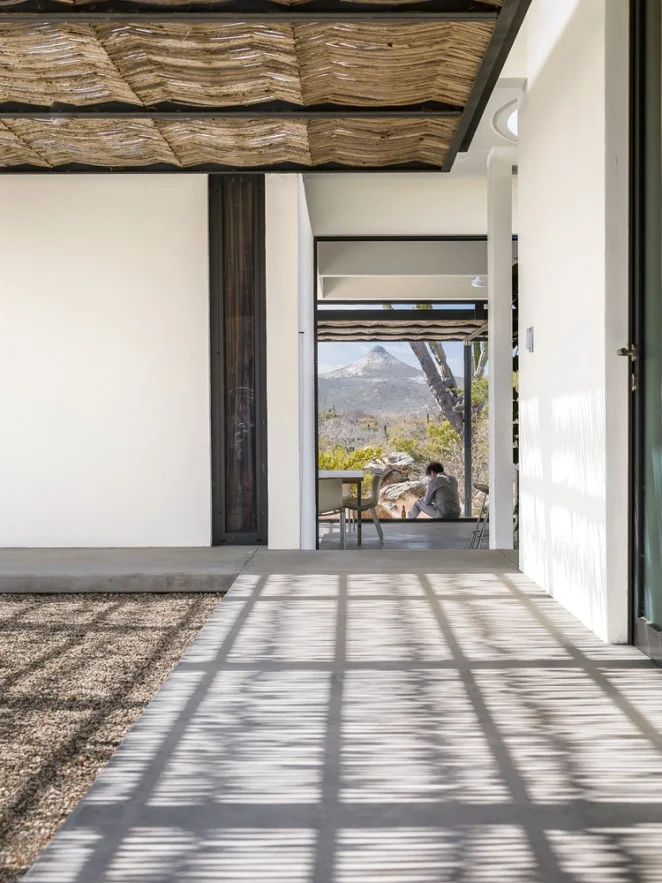
Modern architecture has surely sought to connect us to our place in a more direct way than its predecessors and transition spaces make this possible as evidenced by these seductive photos of a project in the desert southwest. Almost like nomadic tent structures, the architecture is reaching out to the land, buffering the extreme environment creating pools of shade around the home. This makes the interior environment more comfortable and it provides places to sit out of the intense sun for the inhabitants.
Transition space is the one space you can't live without (there just might be one other one too).
Winter's Exit
The changing of seasons marks the passage of time so plainly. The ever higher, warming sun melts snow during the day, refreezing it each night. Snowbanks retreat from the drive's end. Snow packed hiking trails give way to oozing ice floes. Footprints left in early storms reemerge. Frost-heaved roadways pitch us about on our travels. Roads are posted, "Heavy Loads Limited". The maples give up their sap. Gardens are being planned and seeds started. Nothing escapes the push and pull of this diurnal cycle as we inch closer to the days of summer.
I love this awakening - the transition back to daylight.
Spring also means that the ice huts that dot the hard-water around Mount Desert Island will soon be retreating. I've been watching this particular shack edge closer to shore each day over the past week. That's as sure a sign as any I know - spring is coming. I wasn't born in Maine, so I'm not technically a Mainer, but I've lived here long enough to know what to look for. Watching ice shacks retreat off the lakes is a reliable sign that warmth lies ahead.
These shacks are ad-hoc architecture at its best. Most share the quintessential gabled shape of home, with the occasional, unintentionally modernist, plywood boxes. They're the kind of humble creations that inspires much of my own work here in Maine. Driven by economy and a desire to escape - trading one cabin's fever for another in a cold, dark climate. Supported on skis for transport, they always make use of a salvaged window or two to let in light and sometimes a small stove. I love the idea that a small town can emerge and exist for a few months each year, hovering over a space that remains empty for the other half of the year - a summer space.
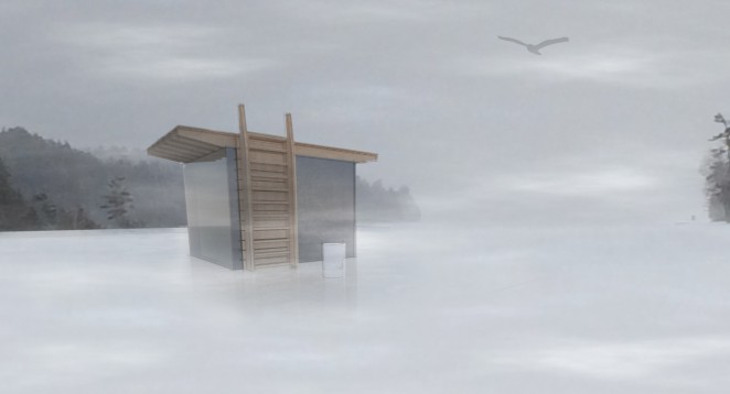
It has me thinking of making one. As a folly, an impermanent, portable, winter encampment. I'd love to make one entirely of ice, casting the walls as thick slabs and fabricate the roof as a wooden deck. In the spring it would slowly return to the water, the roof transforming into a swimming platform, the shack's door - a ladder and an anchor.
I'll need some help...any volunteers?
Modern House Materials + Place Making
Today is one of those rare days here on the coast of Maine where summer bullies the usually refreshing maritime air into the 90’s. The wind has shifted to the southwest. The chickadees are mobbing and the mosquitos swarming. The cat can’t seem to get comfortable beneath his coat. My children head off to camp to whittle, sling arrows, and pond swim. I pass the woodpile and remind myself that I should be cutting and splitting my wood now for the winter which is never far. And keep walking. You know this feeling, or something similar, something familiar. You pause a moment from your busy life to observe and realize - this is summer. Or to think -the screen door slamming shut means warm nights. This is the definition of place for me, the emotional intersection of smells, sounds, temperature, everything surrounding you.
PLACE
When designing a home one of the critical components in the initial conceptual thought process is always to define place. Determine what it is that makes a place different and unique. Whether it's the forces that shaped the land, the geology, or the climate. What cues can you learn from the local architecture? How do people build and with what materials? Do the buildings sit lightly upon the land or are they rooted in the land? What are the natural site rhythms and weather patterns?
If you’ve lived anywhere for a period of time you probably know these things intuitively - the things that comprise place. They can be very subjective and they should be - that's good. You may not even realize what a local expert you are. Where I live on Mount Desert Island, in Maine there are a myriad of things to that inform my thoughts about place. The rounded glacial till and sharp black spruce tips, the colored grids of stacked lobster traps on lawns in winter, weathered fishing shacks and barnacled piers. This is a damp place, almost everything is covered in moss and lichen - green drapes gray and always the silver sea. Prevailing winds from the water twist and sculpt the pine boughs.
Local buildings are typically clad in one of two materials: cedar shingles or wood clapboards. Wood is abundant and inexpensive. Our native cedar is naturally decay and rot resistant and weathers to a silvery gray without finish or maintenance. The salt air corrodes and sticks to everything and the wind is ever present.
Are you forming an image of what this place is like?
WHY IS PLACE IMPORTANT?
Understanding this is key to design thinking and an important part of what distinguishes a work of architecture from a structure. Linking buildings to their surroundings and place makes them more meaningful and responsive to the forces surrounding them. What's truly wonderful about this is that this thinking is accessible to anyone of any means and any budget. It costs nothing extra to be sensitive to these things, to think like this, to define place and act based on your perceptions. By linking your home to your place in your time you’ve effectively said, “These are things about this place that I think are important and noteworthy.”
For example, shaping your home’s roof in a way that allows light in while protecting against the winter winds and shedding snow does this in a very simple and meaningful way. Working with the local topography, in an around trees and geology does this. Using local materials and a color palette drawn from the local flora imbues your project with deeper meaning. Through these simple gestures, your home can tell the story of the place you’ve chosen to build. What’s more, I would argue that your home will actually function better.
DESIGNING PLACE
I'll close with an example of a home I designed as one possible way of approaching design with respect to place. The overall design concept for this home was one of integration. Integrate views to the water, views to the forest, integrate sunlight into the deepest rooms and integrate the sloping local topography. I created three shed roof forms, one for the garage and workshop, one for the bedrooms and private spaces (the two story volume) and one for the public living areas. The shed roof forms were drawn from local shingled sheds used for storing fishing gear.
While developing the shapes of the structures and their engagement with the land and each other, there were additional subtleties that informed the overall approach I took with the design concurrently. Probably the one most illustrative of place making was the selection of materials.
MATERIALS
Most people, save for architects and builders, have trouble interpreting a floor plan. Lines drawn on paper usually have little corollary to a typical person's experience of a home. This gulf between the real and imagined is because spaces are difficult to represent in two dimensions and floor plans often lack color or indication of real materials. Two houses with the same floor plan can be rendered quite differently by modifying only the materials used. So how can you infuse the meaning of place via material selection?
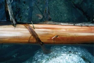
Typically, I look to the site to conceive of an exterior and interior material palette. I find this substantially reinforces ties to a particular place and it's a simple shortcut you can utilize too. For this project, I started with simple image I had taken of a fallen cedar in a local pond. Note the contrasts I talked about above (here it's grays and browns) and the muted color range. This particular site had a number of oak trees present, which lined the forest floor with leaves - like tiny rust-toned scales.
By simply applying an overlay of this image on the actual building forms I created a set of basic rules for the use of color and material.
1 - Exterior: tough, raw, textured. The bark of the tree.
2 - Interior: warm and inviting. The warm browns + heartwood of the tree. Bark peeled back to expose the warm interior.
3- Accents: smooth, scaly textured. These would link the warm interior with the rough exterior. The fallen oak leaves.
4- Changes in elevation: marked by stone walls extending out into the landscape, linking and mediating steps inside and out.
THE RESULT
The tough, bark-like exterior rendered in the textured stained shingles is peeled back and cut away to reveal the warm wood interior. The interior is comprised of two types of wood which again mimics the variety of coloration inside the photo of the log, not one brown, but many (not too many!). Copper shingles are abstracted oak leaves in color and form.
The copper weaves its way throughout the house, but is used in very specific ways, to enclose the more solid parts of the house, on all flat roof volumes and it mediates the intersection of the house and earth (as flashing). The stone walls define changes in site elevation both inside and out and add another contrasting gray to the material palette.
As you become aware of the thought process that led to the design outcome, the meaning behind it should reinforce a sense of this place and the home's connection to that place.
Hopefully this information allows it to transcend any emotional response you have to the images (like or dislike) and the narrative should make it more alive. It certainly does for me and it makes the design process and selection of materials systematized and aligned with the greater design goals of the project.
Even without knowing the backstory, I believe, the building feels innately a part of the site and right at home. More images of this project can be found in my portfolio.
Cairns...and way-finding
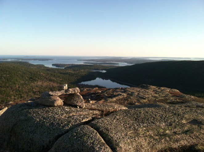 Hiking is an obsession for me, an integral part of my life. And, despite my best efforts to integrate it into my children's lives my pleas for Saturday afternoon family hikes are usually met with groans of protest. Someday perhaps they'll recognize the same deeper connection to the land that I've found so satisfying through hiking too.
Living near Acadia National Park allows me access to challenging and uber-scenic hiking locations. If you've never visited Acadia, the bulk of the park is located just past the mid-coast area of Maine on Mount Desert Island. The island is a glacier worn grouping of granite domes perched at the edge of the Atlantic ocean. Here the raw granite meets the sea and is cloaked by spruce forest, fog and salty air. People carve out their lives here by understanding and exploiting these natural resources and the people who come to visit. Artists, fisherman, scientists, cooks, potters, boat builders, we're all here charting out our lives often against, but more often in concert with nature.
The Bates Cairn
Aside from the physical activity and mental awareness hiking brings me, one of the things I find most rewarding about hiking is a deeper understanding of the world around me. I'm fascinated with the intersection of man's machine and nature. These are often forces which drive my architectural work, integrating buildings into their surrounding context, marveling at their weathering with time. This metaphorical tug-of-war is present everywhere, including the trails of Acadia.
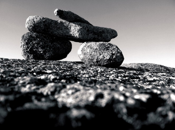
If you've ever hiked above the treeline on a large mountain, you're familiar with cairns. Rock piles crafted by man to mark trails and pathways. They're necessary in locations subject to poor visibility and can mean the difference between a cold night spent on the mountain or a warm night off of it. If you hike a lot, like me, you may reach a point where they're like trees...they're a part of the landscape and you pay little attention to them.
I can't count the times I've walked between these simple landmarks, thinking of them as nothing more than markers along a path, but so often relying on them to return me to less foggy elevations. While reading a favorite column of mine in the Bangor Daily News called, 1-Minute Hike, I was surprised to hear reference to these markers as Bates Cairns. Designed by Waldron Bates in the early 1900s as unique trail markers. Each cairn is comprised of two support posts and one lintel spanning the posts capped by a pointer rock paralleling the trail. It's precisely Laugier's primitive hut and I think it's simply genius. The open topography and granite precipices here can be visually flat in poor weather and fog. It's easy to lose your way, but the degree to which these constructions stand out is remarkable. The simple act of creating a shadow beneath the lintel helps identify these as path points. And, their geometry is distinct and separate from a standard conical cairn. Which, in this landscape, would only work to camouflage them among myriad other rock formations.
Because of the efforts of Waldron Bates, I'm not only a thankful patron of all of the path making he accomplished during his lifetime but also a little more appreciative of his weather beaten constructs.
New Trails
This week marks the first full week of me bootstrapping my own, newly minted, design firm. The past seven days have been an emotional ride. Having to leave a place that provided me with many opportunities, fulfilling work, professional mentoring and some really good friends was a very difficult thing for me. Traveling new trails is difficult work but it's often the most rewarding. You're not sure of the destination, how long it will take to arrive, or if there's even a somewhere to go. Way finding has suddenly become a much more crucial activity for me and I'm searching in earnest for the next cairn.
30X40...?
Everyone asks, “What’s with the name, 30X40?” Here’s my answer…
Read MoreHello...
In case we haven't met, I'm Eric. Among other things, I'm an architect, an avid mountain hiker and biker, a proud father of two, a husband, guitar player, documentary film fan, a home brewer and New Yorker. For now, I consider myself a Mainer, (although locals would disagree) living just off the coast of Maine on a rather large island, Mount Desert Island, home to Acadia National Park.
Please pardon all of the white space as I'm preparing material for my new blog entitled '30x40'. I've moved on from the Longhouse blog, started back in 2006/2007 to chronicle the construction of our home. Although I no longer publish posts there, it continues to serve as an online resource documenting the process of an architect creating a modest home on a tight budget.
My plans for this new space are still taking shape. Part of this project is to seek out new opportunities for collaboration, forge new connections to a wider world and to fulfill a promise to myself to continue to reinvent life and remain creatively challenged. I owe many thanks to Pat Flynn, Chris Guillebeau and Tim Ferriss for the inspiration to commit and do something. I'm equal parts excited and apprehensive...I'd be honored if you'd stay tuned...

