Architect Approved Gift Guide 2023

This year’s curated list of gift ideas is - in part - influenced by my shifting perspective having recently turned 50. Do you sense a theme? Please enjoy!

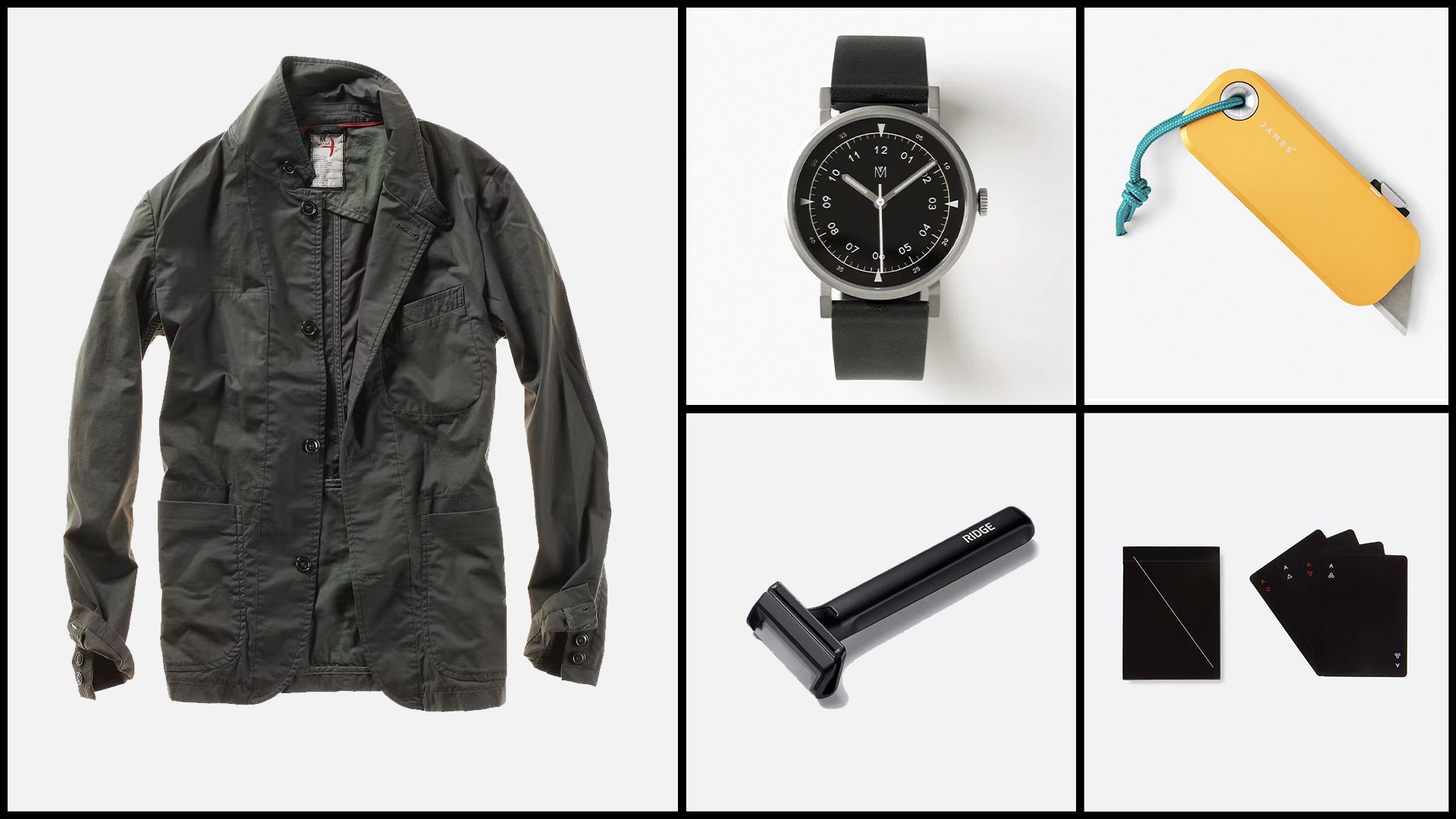
EDC

Ephemeral

  • Wine. You don’t have to be an expert to appreciate how a nice bottle of wine shared amongst friends connects past + present. It’s impossible not to savor both in the moment. Really loving Cabernet Franc single varietals lately.

  • Pair it with this book, Wine Folly The Master Guide for an accessible deep-dive into tasting.

  • Experiences. Things wither and fade, the memory of shared experiences persist.

    • To celebrate our milestone birthdays, my wife and I along with some friends splurged on a trip to the French Laundry in Yountville, CA. Touring Snøhetta’s addition to the original structure alone was worth the price of admission.

    • Side trip to Paso Robles for a Cave tasting at Eberle Winery (lower left). With more than 250 wineries and tasting rooms to choose from you won’t leave thirsty.

    • My wife and I love combining shows + travel: Pantera, LoG, Megadeth, InFlames…these are just a few of the shows we took in this year. More in the queue for 2024 as we become empty nesters.

  • Die with Zero by Bill Perkins is a great read to accompany this category.

    “The utility of money changes over time, and it does so in a fairly predictable way: starting sometime in your twenties, your health very subtly starts to decline, causing a corresponding decline in your ability to enjoy money. The ability to enjoy experiences based on health is limited as everyone's health declines with age.”

Tech

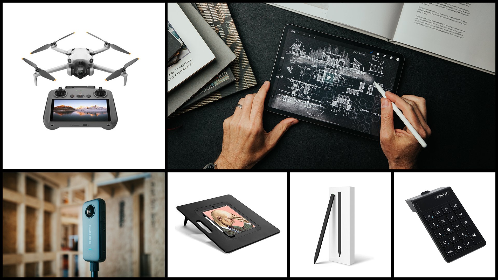
  • DJI Mini 4 Pro Fly More Combo - Integrated screen on the controller is a massive upgrade from the Gen 1 model I started with.

  • Procreate - Intuitive, beautifully minimal UI, effortless and so close to the real thing you may throw out your old sketchbooks.

  • 11” iPad Pro (128GB) Sketching on glass was hard to get used to. Now, I use it every. single. day.

  • Procreate Custom Canvases - Blueprint canvas shown with my custom “Prismacolor pencil” brush

  • AOIKTYE Keyboard for Procreate - use with Procreate to speed up your workflow.

  • Black Stylus for iPad - Because…black, IYKYK

  • Sketchboard Pro - a larger surface for your hand to rest while you’re sketching and allows you to actually sketch to the edge of the iPad rather than zoom/pan. The angled surface improves ergonomics and saves your back, no more hunching over your desk.

  • Insta 360 Camera (One X2 shown, $299) Incredible time saver for site walk-throughs and documenting interior spaces at the rough-in stage. Makes it easy to reference later when you find yourself asking, “Where exactly did they run that plumbing line?”

Storage

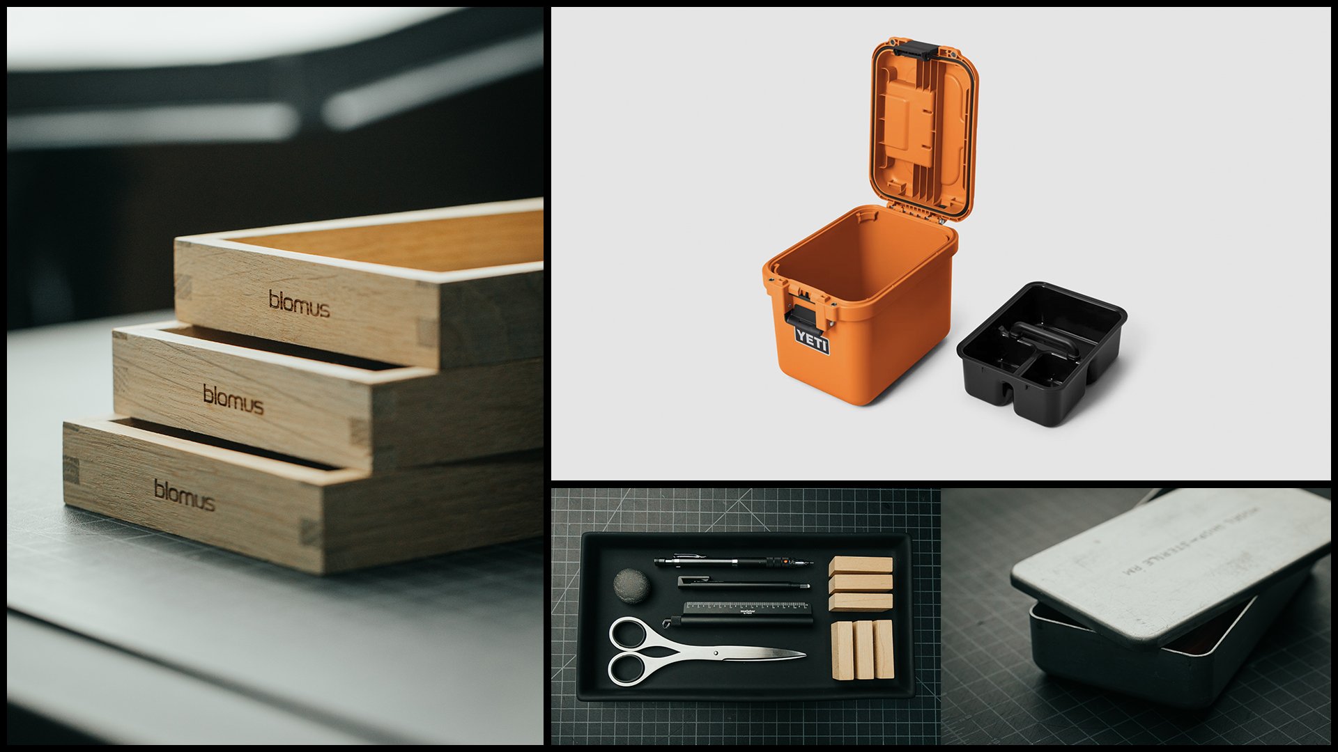
Smart, beautifully designed storage is my guilty pleasure. I’m sure I don’t need any more boxes or trays to store or organize things in, I just can’t seem to help myself.

Books

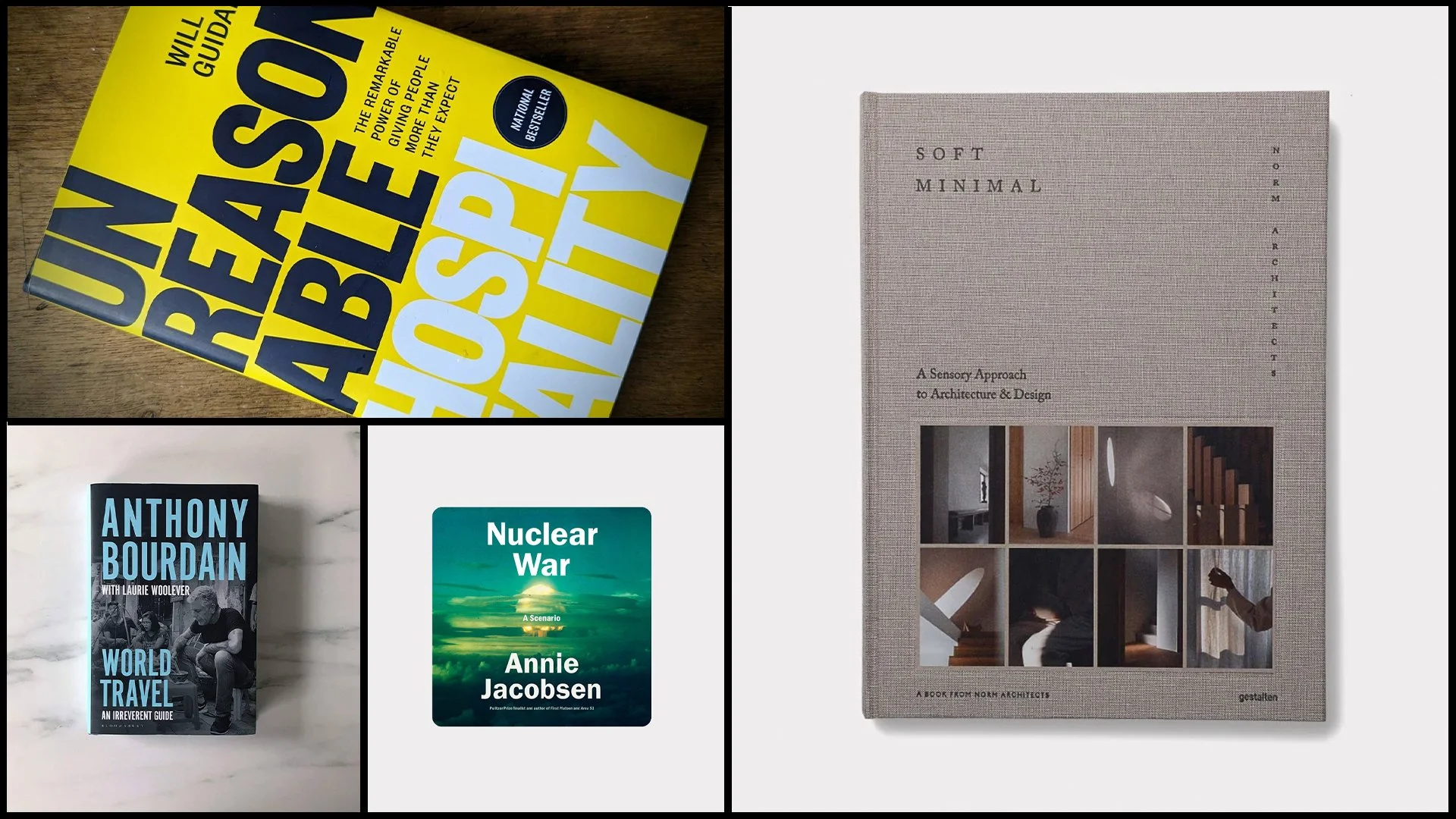
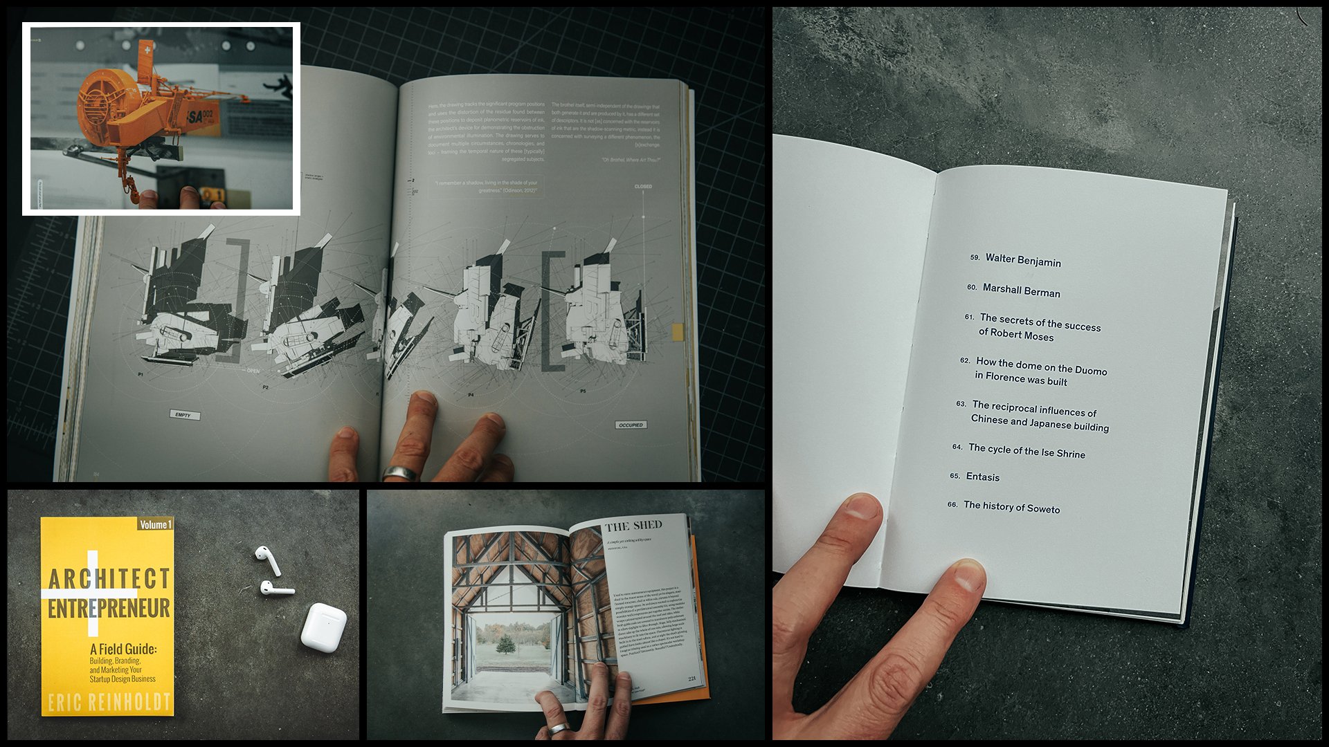
A few favorites from 2023 (architecture + non-architecture):

Art

Collecting and consuming art always fills the creative reserves and tops my list of things to do when traveling.

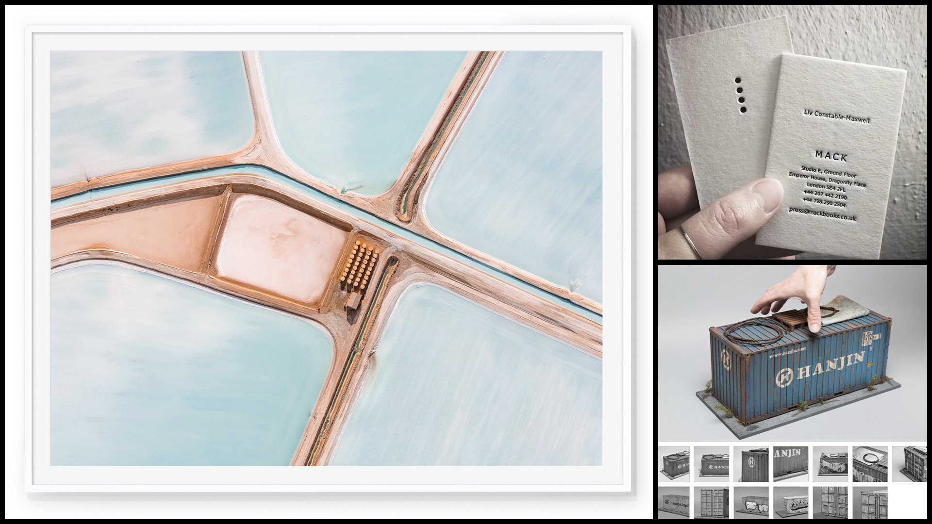
  • Tom Hegen - Exploring the relationship between man and nature from above. I’m lucky to own one of his framed prints.

  • Letterpress Anything - I try to support craftspeople practicing this dying craft.

  • I Know Joshua Smith - Miniatures: cool. Urban + industrial decay: cool. Miniatures depicting urban industrial decay = irresistible.

  • Architect Cards - Runcible Studios. Sign-up for Marilyn’s newsletter while you’re there, it’s filled with BTS, insider, hard-won, architect-knowledge delivered in an accessible style.


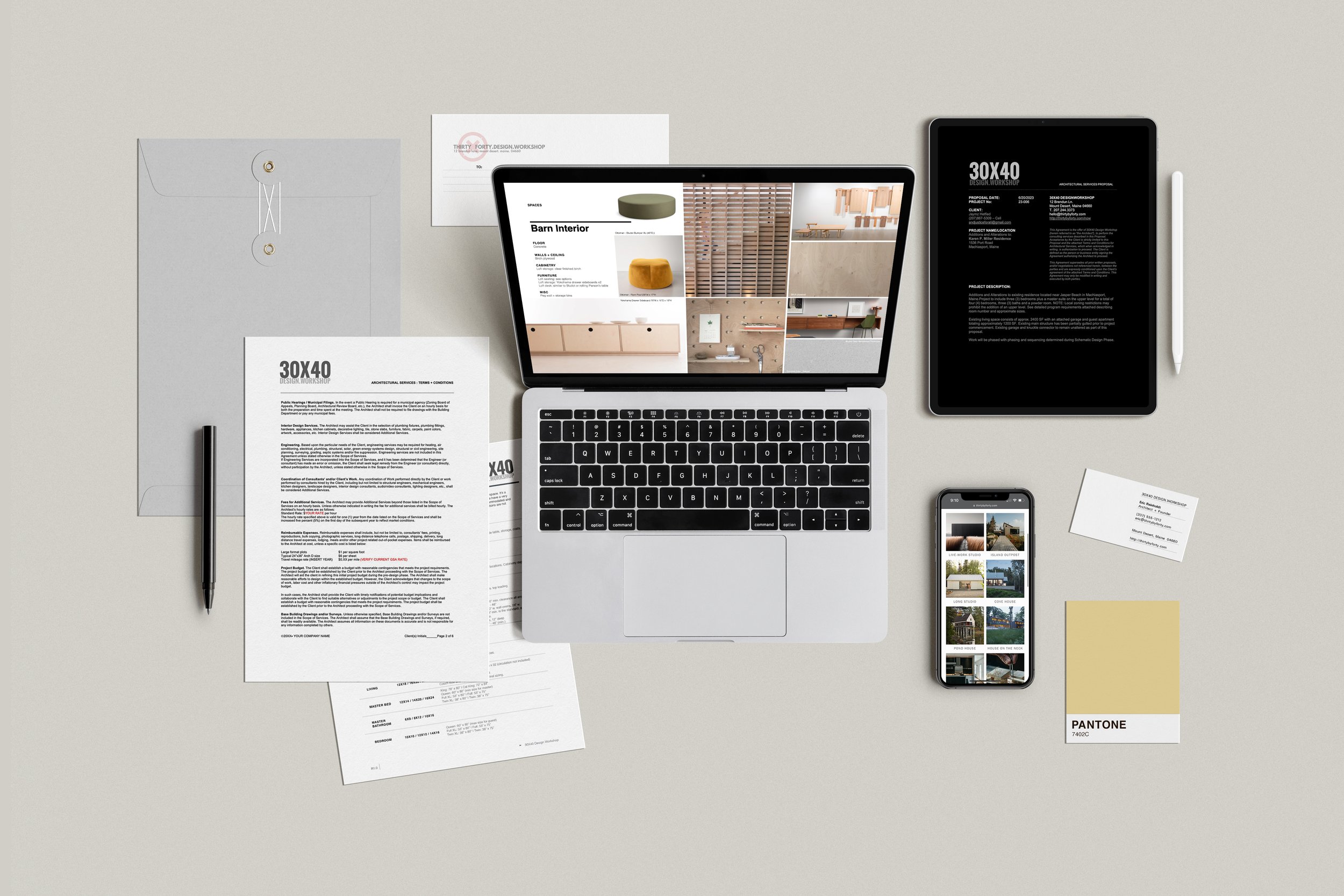
Flat lay of business assets included with the Start Your Design Business Bundle

Get Organized for 2024 with the Start Your Design Business Bundle

A few of the links above are affiliate links which cost you nothing extra but may provide a small commission to me if you choose to purchase using them. Many thanks for your support!

Inside My Sketchbook - An Architect's Essential Tools

A look inside my sketchbook as I start a new project and review my current favorite sketching tools. See my go-to paper, pens, pencils, markers; everything in my everyday carry kit for sketching.
Instead of the chronological approach I've used in the past, I now dedicate entire sketchbooks to individual projects, tasks, or idea categories. I've found this helps me to organize information and find it quickly when I'm searching for it later.


Sketchbook

BLANK Sketchbook - Custom designed + manufactured by 30X40

Pencils

Kuru Toga .5mm - I use this for sketching currently. If you prefer a chunkier lead, try this lead holder clutch made by E+M

Colored Pencils

Pens + Markers

Pilot Precise V7

Signo

Sign Pen

Markers

Accessories

Pencil Case

Eraser

Eraser Pen

Desk Brush

Chop Stamp

Architecture Photography Tips

Looking to improve your architectural photography? Learn the stylistic and technical fundamentals to help you take better photographs of architecture whether it's your own work, or someone else's. In this video I share with you some of the amateur mistakes I made when I was first starting out so you can avoid them in your work. 
Photography is an essential meta skill I think every creative needs in their toolkit, it teaches you about light, composition, texture, color and narrative and it will help you document your surroundings, your design projects and your travels in a more professional style.

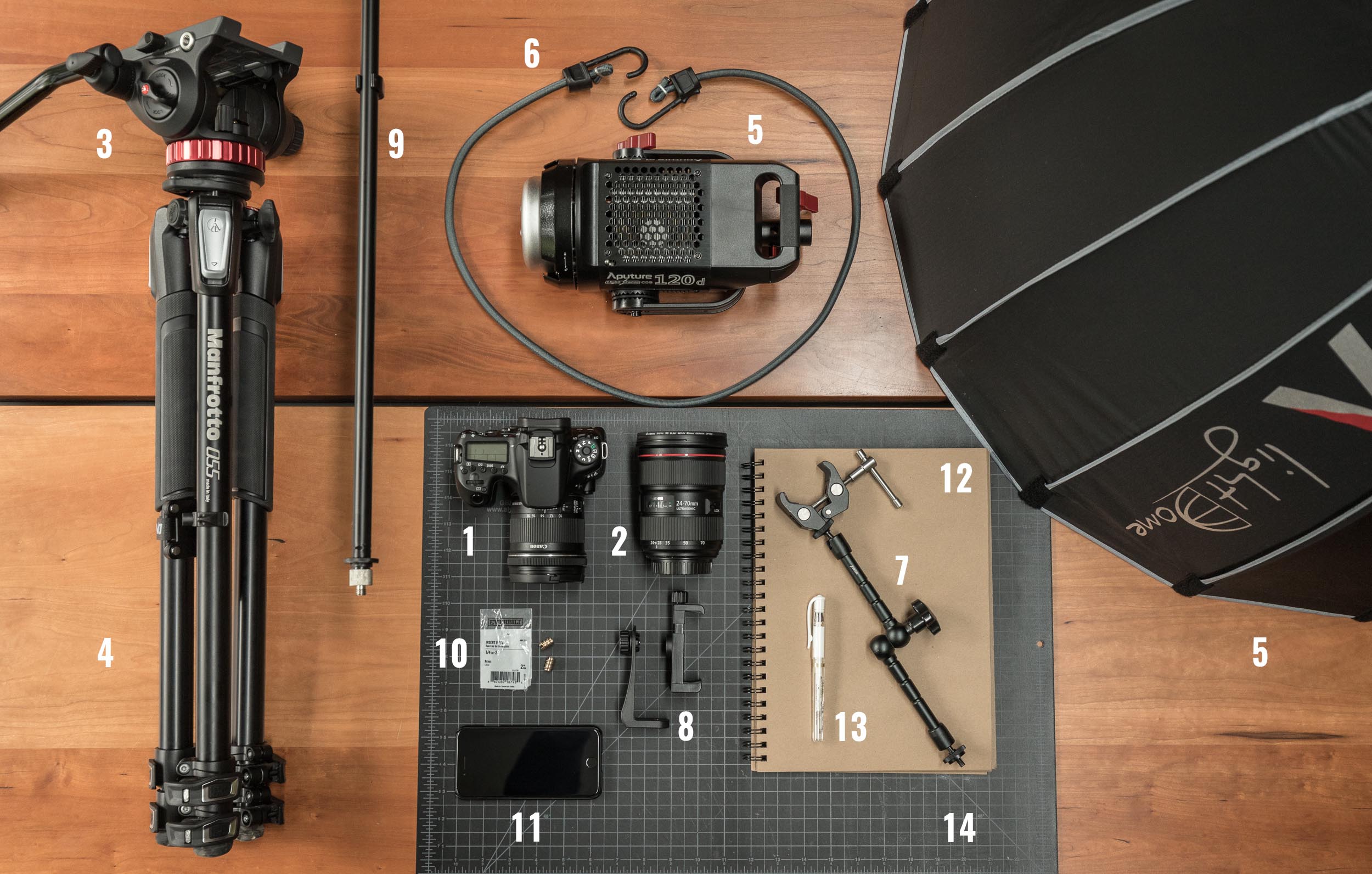
Links to the gear I use:

DSLR CAMERA:
* Canon 6DMKII http://thirtybyforty.com/6dmkii
* Canon 80D: http://amzn.to/2fBWGMQ

LENSES: 
* Canon 24mm f2.8 Lens: http://amzn.to/29l7ac5
* Canon 40mm f2.8 Lens: http://amzn.to/29x2QcI
* Canon 10 - 18mm f4.5 - 5.6 IS Lens: http://amzn.to/2vyErvS
* Canon 24-70mm f2.8L Lens: http://amzn.to/2DMt0Y5
* Canon 16-35mm f4L IS Lens: https://amzn.to/2Emj9Ev

Book Review: Operative Design + Conditional Design

Reviewing two architecture books: Operative Design + Conditional Design and sharing my thoughts on the kit-of-parts design methodology they promote. Together these volumes are an excellent primer on architectural form making, iterative design, and can serve as handy portable, pocket-sized reference manuals. The diagrams are beautifully composed in full-color and the accompanying text - although brief - offers enough information to guide the reader / viewer on the book’s use. Recommended for: architecture students, teachers and professionals looking to revisit first principles or reinvent their own tired formal language.

**Operative Design: A Catalogue of Spatial Verbs**
**Conditional Design: An Introduction to Elemental Architecture**

Best Computer for Architects

See our updated guide of the best computers for architects here.

A guide to choosing the best computers for architecture. Whether you're a student, pro, or in a related discipline, this video will walk you through my methodology and selection criteria. I discuss in detail:

  • Laptops vs. Desktop Systems

  • Mac vs. Windows

  • Software (commonly used and requirements)

  • Hardware: CPU, Graphics Cards, Monitors

Discover why I chose the system I did and what it means to my architecture practice and daily workflow. A behind-the-scenes look at how architects use computers. 

LAPTOP: 2017 MacBook Pro
DESKTOP: 2017 Apple iMac

Frank Gehry MasterClass Review

An architect's review of the Frank Gehry Masterclass: what to expect, what you’ll get, who I think it’s for, my favorite lessons, and whether I think it’s worth taking.

Gehry is a polarizing figure in the architecture world. But, whether you love or hate his work, the fact that he’s realized - what are sure to be - some of the timeless architectural icons of our time demands respect and further study.

Watch the video to see whether I think the course delivers on all that it promises.

Storing Architectural Samples in the Studio

I'm limited in the studio by the amount of space available to store things and material samples can take up a lot of room. I've seen many types of storage racks used in studios where I’ve worked and tried a number of things myself here in the studio – from metro shelving, to archival folios and wooden, felt and cardboard boxes and bookcases. The problem: they all keep the materials hidden. So although they’re great from an organizational standpoint from a creative standpoint they're stifling. I’m much less likely to grab a material while designing to help me solve a problem or during a meeting if I have to dig through boxes to find what I’m looking for.

When I stumbled across this inexpensive baking cart it seemed perfect and I had to try it out. Learn more in the video.

Drones and Architecture | How Creatives Are Using Technology

An in-depth gear review of - what I think - is the best drone on the market today for architects, architectural photographers, and creatives. I discuss the factors that influenced my decision to purchase the Mavic Pro from DJI, unbox it, and describe the use cases and features architects and creatives will care most about.

Factors influencing my decision to purchase the Mavic: cost, portability, camera quality, ease of use, and flight time. The Mavic Pro managed to come out on top in each category almost every time. 

I purchased the Fly More Combo which included extra batteries, a four-hub charger, a car charger, extra propellers, carrying case and a power hub. See the video for the entire unboxing.

I'm using the Mavic Pro as a portable drone for:
- Project documentation
- Presentation + marketing
- Architectural cinematography
- Site analysis
- Topographic mapping
- Construction observation
- Educational tool
- Lead generation (working with Realtors)

I also discuss the essential accessories and apps you'll need to operate the Mavic Pro
- ND filters by PolarPro, Airmap, DJI Go 4, UAV Forecast, SunSeeker

I close the video by reviewing current FAA regulations regarding hobby and commercial use of drones in the USA.

Essential Architecture Books

The books in an architect's library provide context for their work: history, precedent, theory, technics, best practices, fresh perspectives and creative stimuli. The ones I return to often are like harmonic frequencies, which continue to vibrate and resonate over time even as my ideology is evolving.

Is it a coincidence that some of the most emotive connections to books and architectural writings were forged in architecture school many years ago? You know how they say the music you’ll listen to the rest of your life is the music you were into when you were 18? That’s how many of these books are for me. So, these precise books may not find the same resonance with you, but as a thought exercise, consider what your library currently says about you, your interests and your blind spots or your knowledge gaps one you might want to fill in.

Books feed the intellect, and a studio full of books assures we're surrounded by the ideas of many – the masters, colleagues, artists, entrepreneurs, performers, and documentarians. They’re a great equalizer when it comes to education and at a fraction of the cost of architecture school.

Be sure to check the resource page for links to all the books I mention in the video. 

Modern Baseboard Design - 4 Ways

In this video I discuss four modern design attitudes toward the baseboard design and detailing in residential architecture. They are: no base, reveal base, flush base, and the applied base. Baseboard protects a highly trafficked (and abused) part of the home and covers the messy joint between the finished wall and floor. This collection of modern base details highlights the aesthetic language of modernism: functional, spare, humble, minimalist and expressive.

For modern baseboard details I've designed see:

Pond House

House on the Neck

Longhouse

Warmboard Radiant Panel - An Architect's Review

In this video I review a new flooring product we've been using - Warmboard. Reasons to Consider Using Warmboard:

  • Low mass radiant flooring option - fewer BTUs to get to operating temperature, faster response times
  • Highly conductive aluminum face on subfloor - lower boiler temps, lower energy bills, geothermal/solar compatibility
  • Fast install times - structural subfloor + heat tubing layout all-in-one
  • Aluminum sheet diffuses heat along top surface of subfloor for even heating
  • Compatible with multiple flooring types can be overlaid - hardwood, tile + carpet
  • Zoning + panel layout design included in the price - assembly arrives with a numbered diagram for installation
  • Tubing is visible on top face of subfloor - minimizes tubing penetrations via errant fasteners during floor finish application.
  • 20% recycled content in alum. facing, OSB + Plywood panels are efficient use of natural resources
  • Warmboard R (retrofit) can be used in renovation projects where floor build-up and thickness is a concern

Video Review: Decking

A follow-up to my previous post on wood decking. Remember, try and source local materials (within 500 miles) whenever possible.  These products tend to consume fewer resources (less fossil fuels to transport), they support local economies and they're generally better suited to your local climate. A quick call to your local lumberyard should net you current pricing on each of these options. In my experience a ranked list from most affordable to most expensive would look like this:

  • P/Treated Southern Yellow Pine
  • Eastern White STK
  • Atlantic White Cedar
  • Douglas Fir
  • Western Red Cedar
  • Port Orford
  • Redwood
  • Tropical Hardwoods - Ipe, Mahogany, Teak...

Check out Wood, Steel + Glas' site for more information on Atlantic White Cedar, they're a great resource and happily send samples.  As always, I'd love to hear from you with your comments or questions.

Material Review : Wood Decking

DESIGN

Pond house deck

Pond house deck

Most of my projects utilize decks as transition elements between the inside finished floor of the house and the ground level surrounding the house.  While I try to keep the floor as close to the adjacent grade and topography I usually aim for about 1'-0" +/- and depending on the slope of the site in places it may be 1'-6" or more.  Keeping close to the 1'-0" dimension at transition elements allows for a 4" step down to the deck surface and an ~8" step to grade from the deck, which could also utilize a stone step element or other site feature to bridge the gap.  This offset to finished floor from grade also allows for drainage around the house and ensures snow build-up doesn't become a problem. One thing to keep in mind when planning your transition deck elements is to try to keep the top of the deck surface within 30" of the adjacent topography.  Anything higher than this will require a 42" high guardrail or wall by code (and for safety!)

As transition elements, decks can engage the site in a way the house can't.  If they're freestanding and not connected to the house (which I recommend whenever possible) they can be set at almost any height without the same concerns one has with setting the building floor too low.  Keeping decks as separate elements has the added benefit of not puncturing holes in the siding or foundation or all the worry of flashing details.

Generally, I prefer to keep decks as simple as possible: regular, rectangular forms, no chamfered corners or multi-level every-trick-in-the-bag affairs.  Regularized, rectangular forms accommodate seating groups well and they make economical use of framing materials.  The key to integrating your deck into the architecture of your home is to reference the interior and exterior spaces with the geometry of the deck.  Try to wrap these elements around a building corner which engages the architecture and feels deliberate.

Try to connect interior and exterior floor planes with decks, generally large glazed exterior walls are natural locations to connect interior and exterior spaces.  My advice with any design element is to make the gesture large, singular and with purpose. Note how the Pond House deck is a long singular gesture, almost wharf-like.   It follows the geometry of the house, wraps the corner and connects the interior and exterior spaces.  It transitions from land to water and while it's more than 30" above the adjacent topography the cable rail guard virtually disappears.

MATERIALS

There general categories of natural wood decking are: Pressure treated lumber, Cedars + Redwood, and Tropical Hardwoods.  Let's start with the most common of all decking materials...

Pressure treated wood

PT, the colloquial term, is made from Southern Yellow Pine and is soaked in chemicals under pressure to preserve it, this lends a green tint to the fresh wood, which over time weathers to a muddy brown. The chemical formulations used to treat wood have changed over time as manufacturers discover which ones are carcinogens and choose a new 'greener' formula. Beyond the toxic nature of the preservatives in PT wood, pine is generally considererd dimensionally unstable and is prone to warping and cracking...doesn't sound great if it's a surface you or your children will walk on with bare feet, right? Many people choose PT wood because it's inexpensive and readily available in all of the big box stores, but I would urge you, if you're able, to steer away from this as an option even if it means making your deck smaller and use one of the following materials.

Cedars + Redwood

wood decking various types

wood decking various types

These woods are naturally rot and decay resistant, their resins and tannins protect them even without finish and they weather to a soft, silvery gray if left untreated (which I recommend).  These woods have the added benefit of being easy to cut and fasten, they're lightweight and they look very tailored. Because they're softwoods they will dent and scratch with time but equally they're soft underfoot.  Typically these woods are graded by appearance, clearer grades being more expensive.  Buy the best grade you can afford, and each lumberyard has different terminology related to each grade.  Do be afraid to ask and look at their stock, they're there to help.  A vertical grain board will be more dimensionally stable and look better than a plainsawn board. The Western Red Cedar Association has an excellent guide to selecting cedar for decking, you can find it here.

Here at 30X40 Design Workshop I try to use local products whenever possible.  Local is generally accepted to mean any location within 500 miles, which ensures that the product has low embodied energy (the total energy cost associated with getting the product to market) and doesn't negate the 'green' aspect of choosing a natural product in the first place.  The local products I have access to are Eastern White Cedar STK 1x6 decking and Atlantic White Cedar decking.  The Eastern White Cedars are known for being knotty but the STK grade assures you receive only small tight knots.  This also limits the board lengths to about 8', which is totally workable with both 16" + 24" framing modules that you'll be fastening the decking to.  I've used Western Red Cedar and Port Orford Cedar in quite a few projects and while neither material is local, I still prefer them to pressure treated.  If you request FSC certified wood you can be assured you'll receive wood that was sustainably harvested.

Douglas Fir Decking

Douglas Fir Decking

Another softwood that bears mentioning is Douglas Fir.  It will typically be less expensive than Western Red, Port Orford, and the Atlantic White, but with similar characteristics.  Fir doesn't have the same rot resistance as the cedars, but it looks great and if you're able to finish it with a penetrating oil sealer it will last.  It has the added benefit of being slightly harder than redwood and cedar.  Use this if you've used fir in other areas of your project, it can help tie things together.

Tropical Hardwoods

These woods are even more durable and rot resistant than the Cedars + Redwoods.  However, they have two downsides that I would consider fairly substantial.  First, harvesting practices of tropical hardwoods are extremely variable and, because they often come from developing nations, are often environmentally devastating.  The embodied energy of these materials is subsequently very high, traveling from rainforest by truck > rail > port > port > rail > truck > lumberyard, not to mention the carbon sink you remove from clearing rainforest. Secondly, because the materials are so dense they're difficult to work with, they dull tools and require pre-drilling of holes prior to fastening.  There are too may species to mention by name, but you've probably heard of some of the most popular, Mahogany, Teak, and the very popular Ipe (say: ee-pay) or Ironwood.  True to its name Ipe is solid, strong and looks beautiful.  It weathers to a soft gray and can be brought back to its original color by lightly power-washing.  Again, I've used this material on projects (Pond House above) and can attest to its durability, strength and beauty, but it comes at a cost...both environmental and financial. Request FSC certified if your conscience suggests it and while you'll pay more for the chain of custody certification you'll know while sipping your G&T on your deck that you didn't clear cut a developing nation to make it possible.

Size/Thickness

Most decking I use is 5/4x6  (the actual dimensions are 1"x5 1/2", as they surface the boards removing 1/4" of total thickness and 1/2" of width).  Not all projects call for this size, but generally wider boards=lower labor costs to install and fewer fasteners.  Each material can be sourced in differing widths or even set on their sides down to about 2" in width.  With the softwoods you won't want to go less than 5/4 thickness as the material can feel spongy underfoot...remember it's a softwood.  The 4" wide boards can look very boat-like and tailored sI have a soft spot for that look.

Fasteners

Ipe square drive screws

Ipe square drive screws

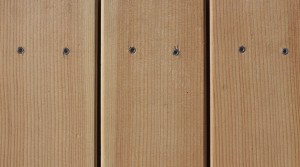
I prefer stainless steel screws.  They hold well, they don't require pre drilling (on most woods), they allow you to pull boards for replacement at any time and I think they look great.  Choose your head pattern...personally, I prefer the square drive but many contractors don't like how easy the screws can strip.  Star drive heads don't look as nice but they install quite easily and the added torque resistance keeps them from stripping.  Many of the tropical hardwoods will require pre drilling with a countersink bit to keep the head below the surface level.  Some contractors swear by ring shank stainless steel nails...those work too, good holding power, but around softwoods think about flying hammers and dented wood.  Not my favorite...and the drive depth can vary which can mean you're feeling the nail heads under foot.

Finishing

Don't.  Seriously, let the wood weather naturally...you have other things to maintain don't you?  Choose a wood that silvers and resists rot and decay and you'll be able to relax and enjoy your deck rather than washing, sanding, and sealing.  If you like tedious work or want to preserve the color of your new wood, choose a penetrating oil rather than a film forming protective coating.  Penetrating oils mimic the natural oils in products like cedar and help keep it from warping and cracking while letting the wood breathe and dry after wetting.  Beware, this is an ongoing chore and if you neglect it you'll work even harder to get the new wood look back.

What about plastic decking?

Esthetically, if you care at all how your deck looks or you want to brag about what good taste you have...please don't use plastic decking.  I always argue for the natural over the synthetic and this is a case where some of the materials in these products (like PVC) are harmful to people and the environment.  They may outlast you and require very little maintenance, but in my opinion they're truly a strange beast.  They imitate everything about the natural product you'll wish you'd bought, wood graining, coloration, and size.  Save the plastic for your drain pipes.

Do you have a favorite material I've left out?  I'd love to hear from you...meanwhile, I'm planning to post a price comparison for some of the products I specify regularly.