In this video I discuss how to put metal mesh to work in your home. I'm always searching for new materials to use in my residential work. I’m particularly drawn to adapting simple, utilitarian, industrial materials for use in the home. Industrial metal mesh is an excellent example of this and one that deserves consideration for both interior and exterior use. In the video I review the different types of mesh available from bar grating and metal fabrics to screening and wire meshes. I discuss the substrates and specific applications. Each is illustrated with images depicting their use.
Phased Construction for Residential Construction
In this video I discuss the advantages and disadvantages of phasing your home construction project. Phasing intentionally and selectively plans for and delays certain aspects of a home's construction. While it saves money up front, it usually costs more in the long-term. The advantages of phased construction are:
- Lower Initial Investment - it takes less overall to get started and can spread the costs of a larger project out over time.
- Shorter Construction Time - the smaller scope of work nets a reduced (initial) construction timeline.
- Experience - living in a partially completed home while its under construction not only offsets living costs but allows you to truly experience the size and scale of the home before undertaking future phases.
- Design Changes - phasing opens the door to pivoting design ideas over time. You may decide you don't want the detached guest house planned in phase two, rather you want it incorporated into the home as an addition.
The disadvantages are:
- Complexity - overall phased construction is more complex.
- Longer Total Construction Time - even though the initial construction sequence is shorter it will take longer to realize the entire project.
- Higher Total Cost - because of the longer time frames involved, financing costs, higher design fees and the extra mobilization costs, phased projects are inherently more costly to undertake.
I discuss the details of financing concerns, planning issues, sequencing, phasing plans, staging, scheduling, and living with the mess of construction.
Phasing is an overall more complex process, but it makes sense in certain cases, the video explains those cases supported with lots of visuals.
Garage Style Doors for the Home
In this video I review new ways to put the common garage door to use around your home. I review the types of garage doors: pivoting, sectional, and coiling as well as the materials, hardware options and special considerations you'll want to review before committing to using this design element in your home. The images offer proof that the overhead door doesn't have to be relegated to only the garage anymore.
How to Separate Space in an Open Floor Plan
In this video I review seven of the most common tricks I use as an architect to separate space in an open floor plan. I talk about the advantages and disadvantages of each including: the room within a room concept, open shelving, thin wall planes, thick wall masses, sliding walls, fabrics (metal and cloth), and hybrid systems.
Choosing Pocket Door Hardware - Pro Tips
In this video I discuss the secret to pocket doors' success - selecting the proper hardware. I discuss quality architectural hardware specifics from manufacturers like: Hafele, FSB, MWE, Halliday & Ballie, Sugatsune, Accurate and others. I review the optimal track configurations, flush pull handle sizing and shape considerations, and the all important lockable pocket door function.
Embracing the Narrow Home
The simplicity, directness and beauty of a narrow floor plan makes it suitable for many building sites, not only those on tight lots. In the video I discuss in detail twelve compelling reasons to embrace a narrow home design. If I've convinced you; be sure to check out my offering of efficiently designed, affordable, narrow home designs in the shop.
Advantages:
- Light
- Warmth
- Ventilation
- Efficiency
- Flexibility
- Expandability
- Vertical Separation
- Horizontal Separation
- Cost Savings
- Sense of Exploration
- Borrowed Space
- Diversity

Pencils of Promise Fundraising Campaign
A Kitchen Remodel That Costs More Than a School
As a residential architect, I've had the privilege of working with some amazing clients. I'm truly fortunate to be able to work on such interesting projects for people who care deeply about architecture. The impact of the single-family residential work that I'm commissioned to do – the work that supports my family – is naturally limited in scale and scope.
This year I'm committed to building something larger than 30X40 can do alone. To honor that commitment, I've chosen to give to Pencils of Promise, a non-profit that builds schools around the world. They offer a chance for all of us to expand the reach and impact we can have in the world. For less than the cost of a typical kitchen remodel in the United States today – which stands right around $28,000 – PoP can build a school in Ghana.
An entire school.
That’s a school in one of the 75% of communities they visit that doesn’t have one.
Imagine for a moment what your life might look like today without a school in your past. Every one of us can name a teacher who, at some point in our lives, made a difference, who inspired us, who pointed us in the right direction. Imagine your life without that teacher.
Without school, my life today would be profoundly different.
I'm just one architect building a small business, but I want to do something big. Something outside of the bounds of my private practice. With your help, I hope to fund the construction of a school in Ghana and give the gift of education to children who live very different lives than we do. These are children and communities that deserve the same educational opportunities we often take for granted here in the US.
Pencils of Promise is an organization that takes action and builds things. The fundraising goal I’ve set is for $25,000 - the average cost to build a school in Ghana. I can't do this alone though, I'm just one guy with a small business. It's a big goal, but it has big consequences, I hope you'll be a part of making the world the better place, one school at a time.
To that end, 30X40 Design Workshop will match every dollar of the first $2,500.00 contributed.
Thanks for supporting my campaign and Pencils of Promise.

Concrete and Wood Samples
An Architectural Recipe...of sorts...
I received a box of concrete samples from Get Real Surfaces recently. Small, 3"x3" squares of varying finishes and color mixes. Perfectly sized to fit in your hand, for sharing with a client in a meeting, or for toting around to the job site to imagine them in a finished space. The samples themselves are beautifully rendered objects in their own right. For an architect, materials are the cooking equivalent of ingredients. Just as a chef enters the pantry to select ingredients for an entree, the architect consults their sample library. For me, this happens throughout the design process. In the very beginning a material concept informs the building concept. As we move deeper into the design that concept is shaped by the building layout, the client and the site. Together it evolves.
Stone, concrete, wood, tile, glass, metal - the raw materials of building can be chosen for their reference to particular place, one's taste or just because of their beauty. But I have favorites and they're a narrow few.
Here's why.
The paradox of choice is such that having more options doesn't actually yield more freedom to choose; rather it makes it even more difficult to feel like any selection you might make is 'correct'. Having a few favorites means the project quickly can focus on the features inherent to the design - its form, light and the environment all of which the material selection can highlight and not simply on using the most fashionable faux pebble tile.
The Japanese Pritzker prize winning architect, Tadao Ando's work offers a rather extreme take of this position. His material of choice is reinforced concrete and he uses it everywhere, in every project. It's weighty, but there are moments of extreme lightness too in the scale of the volumes. The gray of concrete is a canvas upon which light softly renders form and space. The earth and weather develop a patina on the concrete that helps to fold it into the site, it's rugged and supple at once. I admire the stillness of his work and his ability to achieve such depth of emotion from a singular material. Less, in fact, is more.

Tadao Ando Koshino House
Focused choice in material selection allows this kind of a simple dialogue to take place. It allows the place and the building a voice. Solid and void. Weight and weightless. Dark and light. Warm and cool.
I love concrete as a building material deeply. Not only for its color and its tone, for its feel and its weight; but also because it's expressive of the process by which it was created. The form-work permanently reveals the skill of the craftsman who built it and the subtle markings of the ties and the aggregates that comprise its mass.
For me, concrete also needs the warm counterpoint of wood. The informality of Douglas fir, the ruggedness of Red Oak, the refinement of Maple, the tailored appearance of Mahogany, the evenness of White Oak. Each of these pairs beautifully with concrete and elicits different emotions. Like concrete, wood can be subtly effected by the way it's finished or cut: plain sawn, rift-sawn, or quartersawn; each reveals a different graining pattern and tonal character. Subtle but wholly beautiful.
These are effects that are heightened and only appreciated when there's little other noise to drown them out. Just as the tenderloin requires salt, concrete requires wood. Nothing more.
...except perhaps a side of glass?
Book Launch and Guest Post on Entrepreneur Architect
I'm quite honored to have written a guest post featured this week on Entrepreneur Architect, a website run by my friend, architect, and talented businessman, Mark R. LePage. Not only do we share an alma mater, Roger Williams University, but we also share in our mission to help small firm architects looking to change the world one project at a time. Mark has been delivering on his goal to be "a force for change in the world of architecture" since he doubled down on his commitment on 12/12/2012 with good advice and positive mentoring. In the post, I discuss four basic things every pro needs to attend to when using Houzz and a back door trick for entering their image-based ecosystem.
The post is my small contribution to Mark's broader mission and it supports the release of my book this past week on Amazon, The Unofficial Guide to Houzz.com . I wrote the book to help architects and designers find relevancy and rank in more searches on Houzz. I have quite a bit of experience writing there and successfully securing work for 30X40. My writing has been a force for change in my own life, helping me to sort through ideas and help others and I think it shines through clearly in the book.
See the article entitled, "4 Things You're Not Doing on Houzz (But Should Be)" on the Entrepreneur Architect site.
Thanks to Mark for featuring my work and for the excellent resource he continues to build
If you like the book, I'd so appreciate and welcome an honest review on Amazon.com and I'd love to hear what's working for your business on Houzz.
8 Habits of Successful Architects
One of our most popular videos to date. I describe eight (of the many) architectural habits which I practice that lead to good architecture.
Design Inspiration
For me, the beginning of a new design project brings with it, in equal measure, both excitement and fear. Fear because the quest for design inspiration is an unknown path. The idea may arrive in an hour, a day, a month or, the deep nerve of fear: never. The architect Maya Lin, perhaps best known for her Vietnam War Memorial, likened her design process -- the discovery and inspiration -- to that of laying an egg. Her egg is an idea that arrives "fully formed" and it's the result of an unknowable amount of thought, study, sculpting , sketching and writing.
I'll admit to some envy of her process. Mostly because it results in a completely fleshed out idea, ready to develop into a coherent, beautifully articulated project. I console myself with the thought that she suffers the same anxieties all designers face.
I find my own search for design inspiration as elusive today as it was when I entered architecture school in 1991. It's an unpredictable muse. What I know now, that I didn't know then is that my ideas only come as a result of sketching. Much like writing, the ideas flow from the act of putting pen (or key) to paper (or pixel). The process of sketching is one that is taught early on in school as a means of thinking. It's a way to arrive at the genesis idea that sets a project in motion. Architects call this idea a ‘parti’. From the French, Prendre parti meaning "to make a decision".
And for an architect, nothing can replicate that moment when that idea arrives.
The Problem
I use sketching to document and synthesize thoughts about the site, surrounding buildings, the client, the necessary spaces, the climate, zoning restrictions, budget - basically all of the situational factors that represent the context of the architecture. While that seems like a lot to absorb, there are always certain themes that demand more attention than others. This makes the process easier for me as I dig deeper, a natural hierarchy begins to establish itself. There are building codes, restrictions, design review boards, wetland's commissions, budget, client proclivities - these are constraints that every project confronts. The goal is to understand all of the rules for the project and then set about creatively following them. It's often these constraints that can be the genesis for an exciting work of architecture.
A new project I've been working on is an interesting case-study for how this process works.
The client brief was to replace an existing, one-story dilapidated structure and double the leasable space of the property with retail on the ground floor and a restaurant on the upper level and an apartment on the uppermost level. The small 20-foot by 80-foot lot meant that the additional square footage would require a multi-story solution. Because it's in a business district it shares a property line with a neighboring structure to one side and to the other it looks out on a parking area and an unappealing, cluttered rooftop.
Seems straightforward, right? The building next door has windows along the entire shared property line and some of them serve bedrooms. So, legally we can't build right up against the property line and obstruct the bedroom windows. Given that the lot is only 20-feet wide, sacrificing any square footage would limit the leasable area and the monthly ROI for my client. The lot is also in a downtown business district with a Design Review Board which requires buildings to fit with the established character of the neighborhood, which is, buildings constructed to the lot lines. Add to this, the fact that the lot is oriented along a north-south line means collecting southern light for an upper story restaurant will be tough. It's a tricky problem, but there's one thing that stands out above all else when I think about how I'll organize the structure, that's where I begin to focus my efforts and my search for inspiration.
The Idea

Venetian Alley
Knowing that I had to preserve the exit pathway for the upper story windows of the neighboring structure reminded me of the complex network of foot paths that predominate the walkable European city. There, alleys were usually remnants of old pedestrian streets. And, while these pathways have become ever smaller as the cities became more dense and the land more valuable, the alley has persisted because they're essential for service, access, light, and air.
It was this realization, that I could create an alley between the two structures that was the spark that led me to the organizational design solution. But, this had to be more than just an alley. To maximize its functional potential on the small lot it had to provide the circulation for both my client's building and for the neighboring structure's exit windows, entry, exit, light, air - all of the things that an alley provides we can make use of. I won't get into the legal and code implications of actually constructing an alley between buildings, as it's complicated and somewhat uninteresting - let's just say it's a good solution to a complex problem.
The alley idea is a simple organizational concept, that helps me to begin laying out the building spaces on the site. But there are other ideas that I began to explore too and those informed how the building might consciously work to affect the environment around it.
In Part II, we'll discuss the visual inspiration and see the building take shape.
The One Space You Can't Live Without
I'm convinced I was born in the wrong part of the world. Have you ever had this feeling? I love my family, don't get me wrong, it's got nothing to do with them. My parents moved from my birthplace on central Long Island in New York a few hours north - upstate - to a small town baseball fans know well, Cooperstown. It was baseball that connected the economy to the outside world drawing thousands of tourists to see heroic players inducted into its hall each August. It was farm country and when it wasn't farm country, it was snow country.
I never played baseball, and the smell of manure made me long for the trade winds of the tropics, and the searing heat of the desert, the salt air of Big Sur, and a lush, green Kyoto.

Katsura Imperial Villa
Not coincidentally, all places more temperate than upstate New York and also places where it's possible to live somewhere between inside and outside. Not fully one or the other. Something I never had a chance to do.
I'm fascinated by open air living as a human first and of course professionally as an architect. It certainly isn't a recent invention, but it's one that has been co-opted by modern architects as an instrument to connect people more fully to their surrounding environment. As a modern architect myself, now practicing in the northerly, marine climate of Maine, I can't help but drool over the imagery and apparent freedom of my colleagues practicing in more temperate climes. No need for screen doors, or tightly controlled waterproof building shells their architecture flows from inside to outside unobstructed. These structures define places for being, for living - without constraints or boundaries.
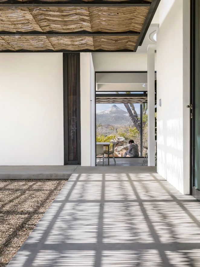
But I know as an architect too, that even though we may have black flies and mosquitos and snow - which flies for more of the year than we'd like - we still have a need for transition spaces in our architecture. Open air living isn't completely possible but these transitions can afford the suggestion and on rare days even deliver on the promise.
I would argue that transition space is the one space no work of architecture can exist without. No matter where we practice, architects follow similar rules about the need for transitions between enclosed (indoor) and unsheltered and open (outdoor) space. These buffer zones, where we move from one activity to the next are not only extremely useful, utility-driven spaces but they're integral to our comfort and our experience of a place.
Imagine stepping into the the Pantheon's cavernous dome without the large sheltering portico transition. It's not the same. The Greek's and Roman's of antiquity understood this, their architecture is rife with colonnades, porticoes, the agora, the forum - each one had a preamble. Hardly superfluous, they're necessary and comforting architectural devices.
via Campos Leckie Studio
A more contemporary example everyone is familiar with is the porch. Porches give us a place to kick off the mud from our boots, a place to sit outside while it rains or sheltered from the sun and reduce the apparent size of our two or three story homes to something more in tune with the size and shape of our bodies.
We instinctively notice the absence of transition spaces too. Think of almost any tract house in suburbia built in the last 20 years. Are you picturing arriving to a garage door? I know I was. Suburbia has asked that we eliminate the transition space in favor of our car. Step out of your car an into the four walls of your home.
Architects understand the need for transition spaces and leverage their utility. They provide a sense of scale, shelter, enclosure, protection, a sense of arrival and departure and because they lack the strict requirements of conditioned (or heated) space they can be more sculpturally free and expressive.

via Campos Leckie Studio
Modern architecture has surely sought to connect us to our place in a more direct way than its predecessors and transition spaces make this possible as evidenced by these seductive photos of a project in the desert southwest. Almost like nomadic tent structures, the architecture is reaching out to the land, buffering the extreme environment creating pools of shade around the home. This makes the interior environment more comfortable and it provides places to sit out of the intense sun for the inhabitants.
Transition space is the one space you can't live without (there just might be one other one too).
Minimal Deck Guards and Edges
I thought it would be interesting to explore the ideas at work behind the design of a guardrail for a recent project of mine. While it's one small component of the larger design it speaks to the architectural process at work. The guardrail sought to carefully balance the competing desires of an unobstructed view, safety and of course aesthetics.
Concept

Pond House guardrail edge
I always reference the building concept when designing each individual component of my buildings. The concept for this project was inspired by the fishing shacks and wharf structures of coastal Maine and resulted in a trio of cottages. Two are situated at the edge of the tidal salt pond and the third extends out over it - a modern wharf of sorts. The marine references are clear in the built-form, from the bright-work of the large sliding doors to the simple, utilitarian, expressive structural concept.
The wharf cottage contains the most public functions - the kitchen, living and dining rooms and has a large wrap around, cantilevered deck. The deck is positioned so as to welcome guests arriving and links the interior and exterior living spaces to the view to the fjord beyond. Because it's cantilevered, the deck appears to float as a thin plane above the water below. So as I design different pieces of the architecture, I'm always cognizant of ideas about slimness, simplicity, honest expression of construction, and the influence of the watery site. I wanted to maximize the client's view to the fjord from both inside and out and of course maintain a safe gathering space - and it had to look good.
Deck Design
Before I can get to the guard design, I must design the deck. Each of the decks for the project were conceived of as thin planes floating above the landscape. To do this I created a steel channel frame at the edge of the deck. This steel channel not only references the simple steel shapes used on the docks and piers here on the coast but it also provides a very thin profile to the deck edge which was important to the design. The structural beams and foundation piers for all of the decks are set back from the edge to further enhance the hovering effect.
Guardrail Design
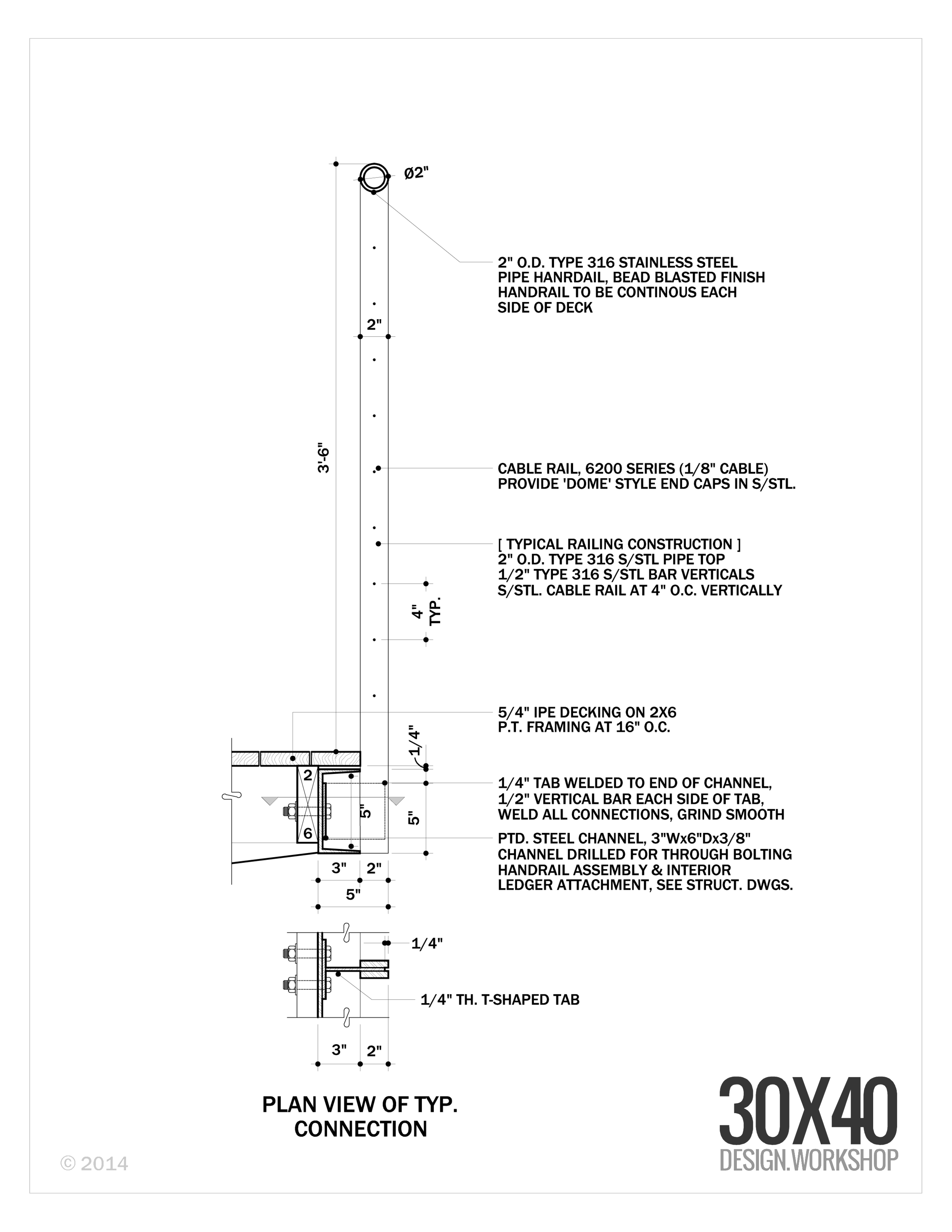
Guardrail section detail
All of the effort at slimming down the deck edge profile would be lost if I were to place a substantial, meaty guardrail system on top of it. Cable rail seemed an obvious choice with references to boat rigging and its near invisible and weightless stature. But cable rail has must meet all of our code concerns too, which means we need intermediate supports. That's easy you say, every three feet add a post. True, I could've done that and probably been fine, but it would've looked ad hoc, not considered. I wanted to be sure that we had an even spacing along the length of the deckf and I also wanted it lined up with the regular module of the large sliding doors and the structural columns which are the dominant ordering system of the wharf cottage. Why? Mostly because I like lining things up, but also because the order makes sense and feels better. It allowed the corner offsets to be the same and it fits the tidy aesthetic which contrasts the disordered organic surroundings. I'm always battling entropy - unsuccessfully I might add.
Here's where the added advantage of the channel deck edge comes into play. That allowed us to offset the vertical supports to the outside edge of the deck extending them down by the Ipe decking and welding them to tabs on the steel channel. The added bonus is that it gives over the deck edge to people rather than a guardrail system.
Is it perfect? No. It turns out that welding the vertical fins to the tabs on the steel channel at the deck edge is difficult to do when suspended over a pond. I'm not afraid to say that I'm always learning. And, I'm always humbled on job sites by the skill of the contractors that work so hard to make my drawings a reality.
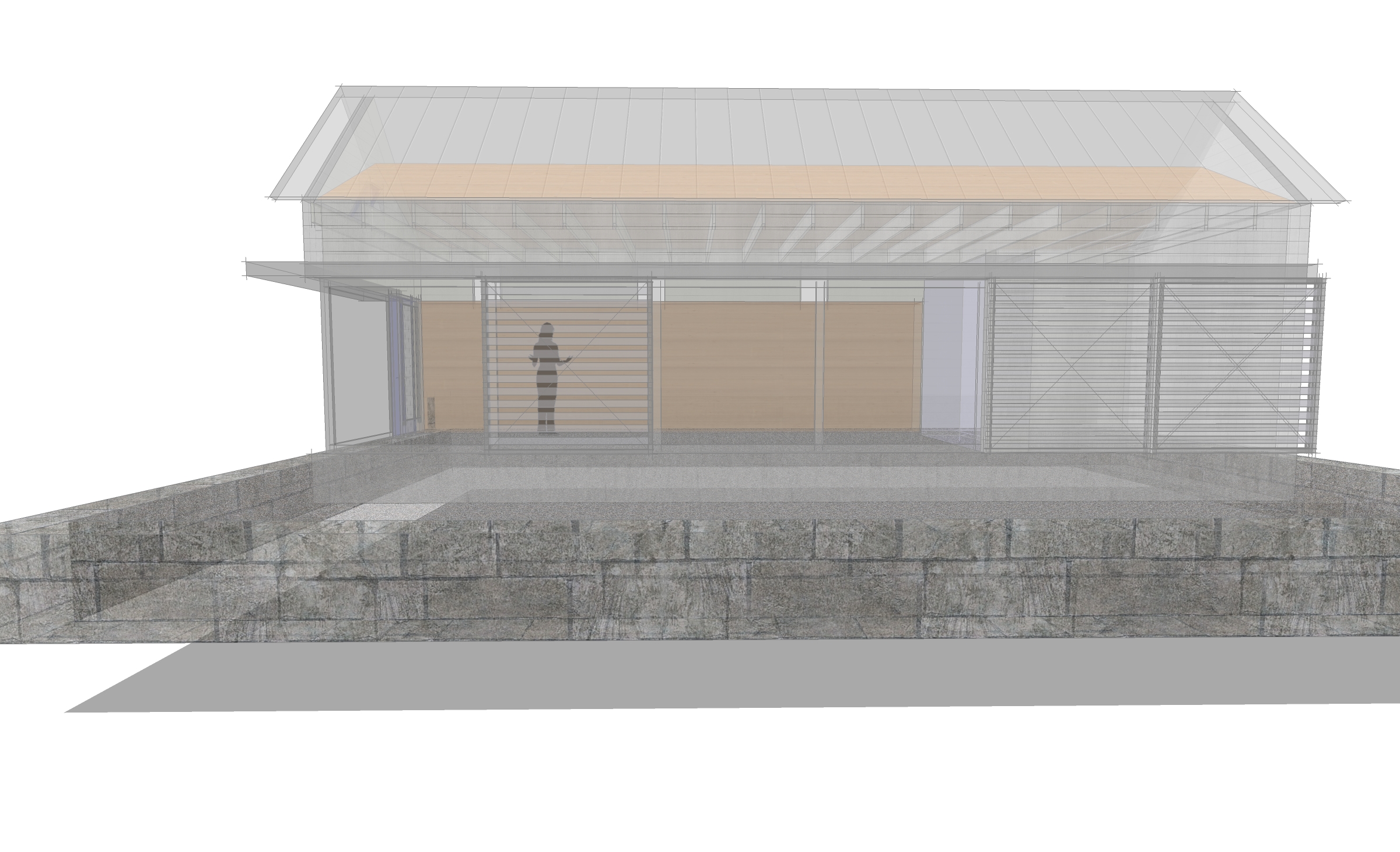
Design Process - Selecting Materials
This is the third in a mini-series I've created which chronicles the design process for small project I've been working on - the design of a modern Barn Studio outbuilding. In the first post I talk about how I developed the design concept and the second post describes the evolution of the elevations, which shapes the final appearance of the barn studio. I've recorded a video that discusses the material selection process for this small project.
Read on for the specifics not covered in the video.
Material Ideas
I can never seem to make enough room for material samples in my personal sample library. They take up more room than my physical book collection. For me, they offer inspiration and they speak to who I am as an architect. I’m driven by the process that turns these raw materials into a home. I love how they can speak about a client or a site - it’s part of the magic of architecture for me.
Selecting materials usually comes from a larger idea about the site, the place, or a specific building reference. For this project, the material inspiration comes from the barn typology. Barns were often frugal constructions clad in whatever materials were locally available to the farmer. Historically, local sawmills would mill the trees felled from a building site into rough lumber. This was used for both the timber frame structural system as well as the exterior sheathing. Wood sheathing was an obvious material choice for the side walls.
Walls
Knowing what material we'll be using is only one aspect to consider. Will the siding be horizontal boarding, vertical tongue and groove, clapboards, shingles? What's the finish? My client requested I consider board and batten in a vertical configuration - this was their image of what a barn was. It wasn't my first choice, but it's a perfectly reasonable and appropriate aesthetic. So that was the foundation for one of the three options. I usually propose at least three options for our discussions. The first is an expected option, usually based on a specific client request. The second is an option they may not have considered at all, something unexpected. The third is usually a hybrid that combines the two - a middle ground. This way we're sure we've explored a range of possibility. There's usually a fourth that comes out of my client's feedback that hybridizes these options in ways even I hadn't expected. I love this aspect of the process.
Back to the vertical board and batten. The reason I didn't like it? The vertical scale of the barn. It's much shorter than it is long. My preference, especially for small structures, is to reinforce whatever the dominant ordering proportion is with the siding. The barn's dominant scale is its horizontal scale, it's length.
To highlight the building's horizontality, I'm proposing a horizontal tongue and groove siding up to the seven foot level. This reinforces our earlier decision to go with a shorter seven foot door and canopy height to achieve a taller, more barn-like proportion. We're tricking the eye into thinking the building is taller than it is by creating this horizontal band with blank wall above it. Above this horizontal band would then be shingles to create a finer texture, smaller scale and let the upper portion of the structure recede - again this reinforces the scale shift we're looking to achieve.
Roof
For the roof, metal was another obvious choice - an appropriate agrarian reference, with a durable and clean aesthetic. To me it was a better choice than wood because it has a crisp, tailored look that fits with the tight, simple geometry of the outbuilding. However, the design review committee didn't agree. It was apparently deemed too industrial for the neighborhood. So, wood shingles was a next best option, and this reinforced the decision to use shingles in the zone above the seven foot level.
Doors, Windows, Hardware, Flat Roof
For the doors and windows, hardware, and flat roof canopy element - gray metal and stainless steel. Simple, durable, utilitarian and monochromatic.
Trim
I opted to minimize the trim on the structure completely eliminating the corner trim and keeping the other profiles as narrow as possible. The siding boards are mitered at the corners and the shingles are woven allowing the horizontal lines to continue uninterrupted along all faces of the building. Window trim is minimal at only two and one-half inches wide and it will be stained to match the gray of the shingles.
Color
All siding is left to weather naturally to a gray color. We may use a bleaching oil or weathering stain to control the process ensuring it weathers evenly, but the idea is to minimize any maintenance. Low maintenance is a hallmark of the barn typology.
Site Elements
The main house siding is partially clad in stone and the property has a number of dry-laid stone walls as well. It was the inspiration for the long dry-laid retaining wall to the north edge and it fits well with our neutral gray palette.
So this is the basic process by which I go about selecting the materials. It's informed by a number of factors but there's an overriding logic to the decisions. They're decisions made with intent to achieve certain effects. Decisions drawn not only from an idea about what a barn should be clad in, but also from the proportion and size of the building. We look to the architecture to help us make decisions about the right solution.
I hope you'll continue to follow the process as we move forward with the next steps designing the Barn Studio. We'll discuss lighting and the interior materials in a future post. If you’d like your very own Barn Studio it's available for download. And, there are a few other variations I'd gladly share if you're interested, just drop me a line and let me know.
Design Process - The Elevations
This is the second in a mini-series I've created which chronicles the design process for small project I've been working on - the design of a modern Barn Studio outbuilding. If you haven't watched the first video where I talk about the design concept and how the floor plan was conceived be sure to check that out first. I've chosen this project to use as an example because it's so simple. For an average 2,200 square foot house the back and forth developing floor plans, the site plan, and the elevations typically takes quite a while - several weeks is average. But because the program (the number and types of spaces) isn't overly complex and the structure isn't very large it's the ideal candidate to describe my process. I've recorded a video that summarizes the evolution of the elevation options presented to my client.
https://youtu.be/6Sxg1r8MnVE
Having developed the concept and designed a series of working floor plan options around that concept my next step was to submit it to my client for their review and comment. Our dialogue revealed the things that were working and the things that weren't working about each of the concepts. I request that my clients are honest and upfront about likes and dislikes, I have a thick skin and my goal is to design a structure that meets their needs - not mine. Iteration and revision is fundamental to the design process. I sketch, design, draw, erase, redraw, submit for review and iterate again. While this back and forth was abbreviated because of the scale of the structure and the limited number of decisions to be made, larger projects can take quite a while to finalize the plans. In every project I'm in a constant state of revision and reevaluation. If I find an opportunity to make something better along the way, even when I'm much further into the design process, I do encourage the revisiting of prior decisions when better alternatives present themselves.
My client had some really useful feedback which I then incorporated into the plans in preparation for the next steps. For me, that step, is to define exactly what the exterior of the building is going to look like. This means materials, proportions of walls, windows, doors, lighting, roof shapes - everything that makes up the exterior look and feel of a structure.
Read on for a few of the insights that didn't make their way into the video.
Proportions
The first and most basic step when designing the exterior elevations is to develop an initial proportion. There are two things that inform my decisions on this project, the primary one is the barn concept. In the end, the structure must appear barn-like. The second is the size relative to the existing structures on the property. We could easily overpower the main home if we were to borrow from typical barn eave heights which can be quite tall. Because this is a residential neighborhood, I need to be sensitive to a residential scale. The existing home's walls have a 10' plate, which seems like a reasonable starting point for this building. I'll draw that as the wall height on the eaves to get started and revise it up or down later as needed. The actual proportion of the wall can appear different depending on the size opening I place in it. The video describes this concept in more detail, it's an interesting visual trick.
The other proportional exercise will be the roof shape and pitch. I'll be matching the existing house's roof pitch at 12:12 - which means for every 12" in horizontal run, the roof rises 12"; a 45 degree pitch. Orienting the roof along the length of the structure allows me to maintain a minimal profile facing the street and it orients the pitched roof to work with the short span of the building. At 14' wide, we'll have no trouble purchasing simple trusses to structure the roof.
I sketch out the basic shape as an extruded gable and begin thinking about openings next.
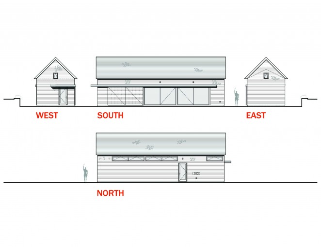 Doors
Doors

Again we revisit the barn concept when thinking about doors. A standard door will be fine for accessing the side of the structure closest to the pool but the doors flanking the studio space should be large. My client and I have shared the initial image of large sliding barn doors on the exterior of the building to signify 'barn'. I've developed a flat canopy as a modern way of concealing the track required for these sliding panels and you'll notice that it wraps the corner and turns into a deeper overhang at the side door. This keeps the weather out and marks that area an an entry zone. Architects are always looking for ways to tell the story of how to use a building without words - overhangs communicate entry.
Large sliding barn door panels are relatively inexpensive, large sliding glass doors are, by contrast, not. I developed five different door options for my client to review using differing configurations of sliding doors ranging from the relatively expensive to the extremely expensive. The trick with these doors is find the balance between a convenient size, function, and cost. Sliding doors make sense because the space is narrow and taking up any of the floor space with a swinging door just didn't make sense.
I first tried using French sliders, basically a 4 panel sliding door unit with two center panels that slide to either side. Standard sizes limit their cost, but also limit the overall opening. In my case the overall opening in the studio wall I was looking to fill was 24'. So, I placed two 12' units side by side using a total of four of the standard 3' wide panels. The two center panels slide to provide a 6' center opening. This didn't seem barn-like enough to me. So, among other less successful options, I transitioned manufacturers and embraced a more commercial system without the same limitations. The commercial system would allow me a 12' wide unit and 6' of that would be operable. If I put two side by side, that would leave me with a center opening of 12' in width. Much more barn-like, see what you think.
Windows
There are limited options for openings in this project, I'm recommending the bulk of the money be put toward large doors. But we'll need some windows for light, balance and ventilation. Usually with windows I start by envisioning the desired quality of each space they're looking to serve. Does the space require a large window or a small one, does it need privacy, or should it feel connected to the outdoors? I then go about sketching an underlying ordering system which they'll fit into.
In this case, the two spaces that absolutely required windows were the bath and the studio space. Since the studio had more light requirements I started there. The project is sited near the northern edge of their property with the long studio flank facing any future development. This immediately suggested a clerestory window configuration as it preserves privacy while still letting light in. Clerestory windows because they're positioned higher in the wall also permit light deeper into the space. This line of reasoning translates nicely to the bath space as well where privacy is paramount to views out. I developed a repetitive ordered system of clerestory windows to the north aligning them with the openings on the south wall as a starting point.
One last window detail to think about was the addition of a couple of small windows. You'll often see barns utilize either very small openings, or very large openings. The large openings were for letting in large equipment, the small for ventilation and light. They seemed even smaller than they actually were because they were usually placed in large blank walls. I added one on each gable as a reference to the barn aesthetic even though they'll contribute relatively little light to the overall space.
Materials
In the next post, I'll describe the process for selecting the material palette and what we have planned.
Please continue to follow the process as we move forward with the next steps designing the Barn Studio. If you’d like your very own Barn Studio it's now available for download. I would happily share some of the interesting variants I've been developing just drop me a line and let me know.
Natural Wood Siding Minus the Maintenance
Architects, designers and homeowners go to great lengths to keep the weather out of buildings, a worthy and necessary goal. But the task of creating home exteriors that resist weather’s effects — including washing, sanding, stripping and refinishing — is significant, time consuming and expensive. Rejecting this unending cycle of maintenance and accepting weathering as part of a home’s design aesthetic makes good environmental, economic and design sense. The homes in this video embrace weathering as part of their aesthetic — and even celebrate it.
Design Process - The Plans
The floor plan is probably the most widely recognized sign of an architect's work. To someone unfamiliar with the design process it's appears as simple definitions of rooms in space. To an architect, it represents much more. It's the manifestation of ideas, concepts, and a considered synthesis of many disparate pieces of information: the site, the client, the budget, cultural context, and building traditions to name a few. I thought it would be fun to walk through the design process for a small project I’m just digging into in my studio. It reveals my early design thinking and more importantly how design problem solving works. Here's a short video I recorded that describes the early evolution of the floor plan.
The details of how I arrived at these options are described below.
The Request
We begin with a client’s simple request for a multifunctional recreation and studio space. It must also have a bathroom to support a nearby pool, overflow guest-sleeping space, entertaining space (indoor and outdoor), a kitchenette and the flexibility to convert it into an in-law apartment in future – oh, right - I almost forgot the fireplace. This will be an ancillary structure on an existing property and it must be subservient to the existing architecture of the site and modest in size.
As it turns out, there’s a lot we’re asking of this little structure.
However, this isn’t everything we’ll need to include. What isn’t in the client’s wish list is often just as important. The infrastructure. We’ll need circulation space or walking space to get into and out of and around, storage space, and mechanical space too. These are items I know we’ll need given the things my client has already said – the idea that it will accommodate sleeping means it must be heated and of course that means it needs a heating plant. Walking space and storage must be baked in just to accommodate every day life. This is what architects call ‘The Program’. It’s a list of all of the required spaces.
Larger projects will have extensive program lists, this one is fairly small and manageable. Once the program list is developed, the next step is to assign each space a square footage estimate. The main flexible space will be the dominant element in the plan. I know from my client that the new structure is to appear secondary and play a supporting role on the estate. I also know that it’s to be positioned close to the driveway and pool. At this point I can make some informed guesses at the size of the structure. If I make it too wide it will compete with the existing structures as the wider it gets the taller the roof becomes. If the structure becomes too long – again it begins to compete.
Sizing the Structure
The existing nearby garage is about 44’ long. That's a good reference point to shape the building and I can revise it later if need be so I’ll start there. Many people think that architects have an innate sense for the size a building should be – immediately. While we have a general sense of the size of spaces, garages, living rooms, kitchens, the more important exercise for an architect is determining the scale in relation to the context. A 44’ long structure next to a 24’ long cottage will dominate while a 44’ long structure next to a rambling, highly detailed, 150’ long home will read as an ancillary structure. The context determines the scale.
Usually, my client’s arrive with a notion of what the structure will look like. While this isn’t always appropriate, in this particular case their image was that of a barn. Which, to me, makes perfect sense. Barns are open, multifunctional, flexible, simple, supporting structures. This already satisfies almost every parameter we’re working with.
The Building Site
The one thing we haven’t mentioned yet is the site. The site can be an extremely strong generator of form and layout for my projects. In this case, I have to know a little more about the site than I already do, but because it’s an existing property in a relatively flat area it holds a secondary place in the design process. The existing buildings and adjacencies will dictate where the Barn Studio will be located. The client has sent me their site plan and I’ll make do a cursory site analysis to get started.
Site analysis for a new project on an undeveloped site can be quite extensive. In general all sites will require an understanding of topography, local climate conditions, how the sun moves, and other significant site features (trees, water, neighboring properties) and of course code and zoning restrictions.
For this project, one of the initial priorities is for me is to determine whether or not the site can accommodate an additional dwelling unit. Whenever I'm designing a structure for habitation, zoning regulations will play a role. Many properties are zoned based on an allowable square footage per dwelling unit. This property already has one dwelling unit in place and we’ve determined that a second is allowable. The general principles at work in this phase, beyond the environmental factors (which are easily divined for most sites) are a confirmation of the rules governing construction. Zoning is the key player at this stage – dictating development, height, setbacks, lot coverage and other constraints. Deed restrictions and special restrictions based on the site’s location can be factors in the general design process, but for this one it’s straightforward. We can move on.
Sketching
Now the fun begins. I’ll pick up my favorite lead pencil, my black sign pen, and a sharpie and begin by quickly sketching concepts on tracing paper. I’ll block out plan shapes on the site plan where I can think about access, building size and location. I’ll sketch out my initial impressions along with a three dimensional concept for the building. I like to work at all scales at this point. I’ll think about what the materials might be, what the doors might look like, and very specific nuances of how the building meets the ground and sky. These sketches frame the problem and help me to quickly test and work through ideas without a lot of commitment. The process of sketching for me reveals the latent possibilities of the project.
Design is an iterative process, where I test and re-test, either confirming or repositioning and re-testing all the while building on previous set of decisions.
The Plans
Once I’ve narrowed it to a few strong organizational ideas, I begin blocking out the floor plans, the process is best described in the video.
Client feedback is of course extremely important. Once we get to this stage, I’ve already put a lot of time and thought into the project. Unfortunately, all of this thought isn’t explicit or necessarily visible. By the time I’ve generated floor plans in my CAD (computer aided drafting) program, I’ve internalized, processed and devised a solution to many of the problems presented by the client. Now, it’s my job to communicate that to the client and solicit their feedback. Which will necessitate the next iteration and an evolution of the design.
I'm eager to hear from them about what they liked and what they didn't. This is where the building begins to take on a life of its own - with the client weighing in. To me, it's the best part. We all engage and contribute, fine tuning and pivoting and each step brings the final building more into better focus.
Stay tuned as we move forward with the next steps designing the Barn Studio. If you’d like your very own Barn Studio it's now available for download.
Winter's Exit
The changing of seasons marks the passage of time so plainly. The ever higher, warming sun melts snow during the day, refreezing it each night. Snowbanks retreat from the drive's end. Snow packed hiking trails give way to oozing ice floes. Footprints left in early storms reemerge. Frost-heaved roadways pitch us about on our travels. Roads are posted, "Heavy Loads Limited". The maples give up their sap. Gardens are being planned and seeds started. Nothing escapes the push and pull of this diurnal cycle as we inch closer to the days of summer.

I love this awakening - the transition back to daylight.
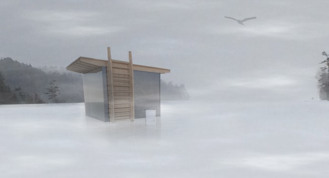
Spring also means that the ice huts that dot the hard-water around Mount Desert Island will soon be retreating. I've been watching this particular shack edge closer to shore each day over the past week. That's as sure a sign as any I know - spring is coming. I wasn't born in Maine, so I'm not technically a Mainer, but I've lived here long enough to know what to look for. Watching ice shacks retreat off the lakes is a reliable sign that warmth lies ahead.
These shacks are ad-hoc architecture at its best. Most share the quintessential gabled shape of home, with the occasional, unintentionally modernist, plywood boxes. They're the kind of humble creations that inspires much of my own work here in Maine. Driven by economy and a desire to escape - trading one cabin's fever for another in a cold, dark climate. Supported on skis for transport, they always make use of a salvaged window or two to let in light and sometimes a small stove. I love the idea that a small town can emerge and exist for a few months each year, hovering over a space that remains empty for the other half of the year - a summer space.
It has me thinking of making one. As a folly, an impermanent, portable, winter encampment. I'd love to make one entirely of ice, casting the walls as thick slabs and fabricate the roof as a wooden deck. In the spring it would slowly return to the water, the roof transforming into a swimming platform, the shack's door - a ladder and an anchor.
I'll need some help...any volunteers?

A heavy dose of Dogtrot
Dogtrot [ dog·trot ] - a roofed passage similar to a breezeway; especially : one connecting two parts of a cabin. I'm a bit of a Dogtrot nerd - if that's even possible. I've long admired its simple form and the power of a single, well-proportioned void in an otherwise long, rectangular building. I've studied the building type in depth and offer you here an abridged 'design workshop', if you will. I particularly love knowing the origin story of this humble structure - see if you agree.
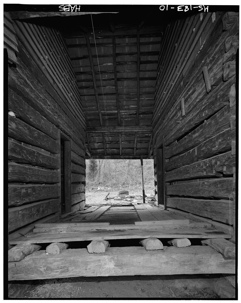
Dogtrot Breezeway
The dogtrot is a wonderfully versatile building typology that has endured differing building climates and cultures not only because of its utility, but also because of its simplicity and beauty.
Origins
While it’s hard to pin down the exact origin or antecedent of this building typology in the United States, there’s much evidence that earliest forms of dogtrots came into existence here in the lower Delaware Valley colony of New Sweden in what we now know as New Jersey, Pennsylvania, and Delaware. It is believed that Swedish and Finnish settlers of North America in the mid-1600s brought a building typology know as the ‘pair-cottage’, from Northern Europe. These pair-cottages consisted of a pair of log cabins stationed side-by-side and joined with a common grass-covered roof. The Fenno-Swedish settlers were accustomed to working with large timbers and hewing logs for construction and as early settlers of the lower Delaware Valley it made sense that their woodworking skills were put to use in constructing their early homes.
The origin of the early dogtrot’s construction methods as linked log cabins is telling as well. There were two major limiting factors in the construction of log cabins - the first was the length of log that a team of men and livestock could handle. The second was the availability of such raw materials. Selecting logs of a length able to easily be moved into place, especially above one’s head, limited the size logs one could use to build the log structure with and thus the length of the walls. Equally, a log’s taper was a critical factor as the taller log sections yielded more taper. Accounting for these factors during construction ensured the log cabins remained small and one-story.
Once a log structure was completed, adding to it presented difficulty. In stick frame construction of the present day, additions are accomplished simply without much thought and in virtually any location. Lacking any way to modify the supporting walls of the log structures meant the only means of adding to the structure was to build yet a neighboring structure - again subject to all of the previously noted limitations. Building the second cabin only a few feet away would’ve resulted in a useless and dark intervening space. But by separating it a rooms’ width (12 – 16 feet) away it doubled as an additional outdoor, multipurpose room. All of this was accomplished with a simple, singular gesture.
Layout
The dogtrot plan layout is characterized by two equal rectangular shaped, single-story rooms termed ‘pens’; separated by between sixteen and twenty feet connected by a common, usually gabled, roof and a floored breezeway or dogtrot which spans the full depth of the plan. Each of the pens was accessed via a door opening onto the dogtrot separating the structures. The dogtrot behaved as an additional room. The functions of each of the flanking pens were usually different. One was used as private living space and the other as a kitchen and dining or any number of secondary uses: workshop, office, apartment, storage, tavern, or inn.
The intervening space, the dogtrot, served many purposes. Access between either pen and the dogtrot was simple and direct. Some historical examples omitted the floor in the dogtrot breezeway leaving bare earth. This created a covered place to service wagons - a sort of modern day carport. The more common configuration placed the floor coplanar with the interior space. In this way it functioned more like an additional outdoor room - a porch, a place to store farm implements and a place to sit out of the sun. This ensured a social status to the dogtrot as the central gathering point in these early homes.
The dogtrot design is known well in southern building cultures of the United States. It permeated southern pioneer architecture in part because it had offered an ingenious solution to the region’s hot climate. The dogtrot’s breezeway, positioned centrally in the plan, naturally created a cooler pool of air between the warmer interior spaces. This cool pocket of air could easily be drawn into the flanking pens by opening the doors at either end of the gables. In a time before air conditioning, one can see the draw of this passive cooling effect.
Chimneys
Providing heat to the enclosed ‘pens’, one chimney could be found on the gable ends of each structure. Early incarnations were constructed of wood, but proved extremely dangerous. Later versions were more fire-resistant and permanent built of brick and stone.
Porches
Many dogtrots included a porch along an entire eave wall. The porch usually had a shed roof with a lower pitch than the main roof and over time the exterior spaces of these porches were enclosed and apportioned to interior use.
Windows
Symmetrical window configurations were most common, with one or two windows per pen on each eave wall and two windows flanking the chimneys on the gable ends.
Attics
In keeping with the efficient use of space, full adoption of the attic space for both storage and even extra living space was common. This expanded the use of an often extremely compact building footprint.
Additions
The historical record indicates that dogtrots were of two origins. Those that began with one structure added a second and connected the two with the roofed dogtrot. And, those that began by constructing and connecting both pens at once.
Other additions took to enclosing porches, making each pen two rooms deep leaving essentially a foursquare plan, and even separated structures. The separate structure was popular in the south, where the kitchen would be housed in this separate building connected by a covered breezeway. This removed the largest source of heat from the living space and limited losses in the frequently devastating fires.
Construction
In the south, where ventilation and cooling are bigger concerns than insulating, dogtrots were commonly constructed on piers. In the north, fieldstone comprised many a farmer’s foundation because the glacial till was plentiful, required removal from fields used for crops and frost depth had to be taken into account. Stone provided a durable means of stabilizing the building’s support to ground not subject to freezing.
Materials
Log construction formed the basis for early dogtrots; the joint imperfections were filled with clay and twig chinking to keep out the elements. The interiors of these log structures used clapboards and board and batten wood finishes to conceal the roughly hewn logs. The limitations of log length and taper, as discussed earlier, had a substantial impact on the scale of early dogtrots. Equally, the raw materials available locally meant most of the structures utilized the wood from the surrounding forest - notably pine and spruce.
With advent of large scale lumber mills and the mass-produced wire nail in the late 1800’s the raw materials and methods of home construction transitioned away from log construction toward light frame construction which persists today as the most popular form of construction. Stick-frame construction being modular and infinitely flexible changed the construction requirements of additions and renovations. Sticks could easily create additions and loads could be transferred to the foundation by simply joining them together to create headers. Holes could be cut in walls and extensions weren’t limited to the size of logs.
Modern Dogtrot
With the necessity for additions no longer hindered by the dimensions and heft of the log, and social pressure to promote one's status via their home, the dogtrot succumbed to other more stately building types. Today those in the south who grew up knowing the typology often recall the dogtrot fondly, but at the time it was considered to be a very humble shelter. Which is to say, built for the poor. As such these homes didn’t correlate well with wealthy plantation owners and with time it gave way to grander and more sprawling architectural styles found in the south to this day.
As an architect interested in humble structures, I find the dogtrot to be particularly compelling – in its climactic response, its simplicity, its affordability and fort its flexible, integrated indoor/outdoor space. I think it’s why the dogtrot remains a viable and sought after plan for many.

Longhouse Dogtrot Floorplan
While the climate of the Northeast, where I live and practice, isn't subject to the same stifling heat as the deep south, our winters and shoulder seasons beg for flexible transition zones between indoors and out. The dogtrot layout is the perfect corollary and it addresses this need elegantly. I think of it as an expanded mudroom, a place to store kayaks paddles and kick off your snowshoes under cover of weather. Pair it with a set of sliding screens and it's a screened porch. Add a fireplace and it's a sheltered outdoor dining area. Add benches and it's a living room or sleeping porch, or play space. The very lack of any strict functionality makes it inordinately useful and adaptable. Isn't that what our modern lives demand?
Interested in your own? I've developed a few dogtrots as predesigned plan packages, and more are on the ways - as always you can find them in the shop.
Twists on window trim
Architects often think about projects in terms of systems. It’s one of our strategies for organizing the complexities of construction into a coherent whole. Each system has an order and interfaces with the other building components in a clear way. Windows have a special place in our systems. They help to define site connections, permit or screen views, and modulate natural light entering our spaces. When thinking about how window systems integrate into the larger structure, I like to develop a clear logic that describes how they’re placed in walls, which always requires adopting an attitude toward trim. Trim is a standard vehicle for hiding joints where materials come together — the edges of Sheetrock are a good example. Trim can also set a building in a particular time period.
But to me, the more integrated even a small detail such as trim is with an idea about a place or structure, the more it can support the overall logic of a building. The following projects eschew traditional ideas about trim in service of a bigger, modern idea.