Book Review: Operative Design + Conditional Design

Reviewing two architecture books: Operative Design + Conditional Design and sharing my thoughts on the kit-of-parts design methodology they promote. Together these volumes are an excellent primer on architectural form making, iterative design, and can serve as handy portable, pocket-sized reference manuals. The diagrams are beautifully composed in full-color and the accompanying text - although brief - offers enough information to guide the reader / viewer on the book’s use. Recommended for: architecture students, teachers and professionals looking to revisit first principles or reinvent their own tired formal language.

**Operative Design: A Catalogue of Spatial Verbs**
**Conditional Design: An Introduction to Elemental Architecture**

Be an Amateur (Architect)

Learning from the life and work of Charles and Ray Eames, in this video I discuss why it's important to approach problems with the mind of an amateur. The Eameses believed in never delegating understanding and that one must learn by doing. It's this ethos of experimentation and the use of various media types for artistic expression that's fueling my architecture practice today. And, it's positively effecting how many people I'm able to reach and impact in the world. You'll learn how I've applied the amateur strategy to release my first film and to make better architecture.
***I'm also proud to announce that my short film: A Choice to Make (you've seen it on YouTube right?) was selected to be screened at the 9th annual Architecture and Design Film Festival held in NYC (adfilmfest.com) on November 1st through 5th of 2017. I'll be there and if you're in town, I'd love to meet you there too. Come say hi and feast on some architecture films at the CINÉPOLIS CHELSEA, 260 W 23RD St, NY, NY.

Architectural Plans Tutorial - How I Draw Floor Plans

Want to see all of my tools + gear?

In this architectural plan drawing tutorial I'll walk you through the exact settings, line weights, pen styles and layers I use to develop digital architectural drawings for my residential architecture practice. We’ll focus on how to recreate the floor plan you see in the thumbnail image below. You'll also learn how architects choose what to draw, how we approach our drawings conceptually, and how we organize information.

I use AutoCAD for all my drawing work right now, but you can do this with any tool you have on hand: pen, pencil, Revit, another BIM software, whatever you choose. Tools don’t make the drawing, you do. I use probably the most primitive form of CAD there is, Autocad LT; so that’s proof in itself that you don’t need multiple thousand dollar BIM software to make nice drawings. Use whatever tools you have available.

An architect’s job is to order things and this certainly extends to our drawings too. There’s the organization of the linework on the page - the layout of the sheet - and there’s also the order of information that you’re depicting - the overall drawing hierarchy. Each requires that you know exactly what you’re trying to communicate. Now, I want to keep this simple for this tutorial so I’ll really just be going over how I draw floor plans but the principles apply to all the different types of drawings. The goal of a floor plan is to show the relationship of the spaces to one another, all the physical features of the interior and exterior spaces and to precisely describe the real dimensions of those relationships. It also serves as a sort of overall map to show the team of tradespeople – the ones you’re relying on to construct your architecture -  where to look for supplemental information. So it’s naturally a diagram; we can’t show everything, we have to decide just what’s important and leave out the rest.

A floor plan is an overhead view of a horizontal cut through the building usually taken at 4’ above the floor level and of course, it’s drawn to scale. And so, the first ordering principle is that the things you’re cutting through – primarily the walls – should always be the heaviest lines on the page. So key concept number one has to do with lineweight, and if that’s a confusing term check the video in the cards for another tutorial where I describe exactly what that is and its importance.

These drawings look this way because there’s a strong contrast between lineweight the very thin lines and the very thick ones. In CAD when we’re drawing we draw on different layers. Each layer is transparent and they stack together to form the drawing. You can control what you see and what you don’t by turning layers on and off. Separating things into layers allows us to modify our lineweights – among other things – to quickly change what’s being depicted as heavy and what’s not. The process of design involves many changes, so keeping things organized on separate layers will allow you to change things efficiently. Now, I like to keep things ultra-simple and for this exercise especially: I set up my layer groups by lineweight, that’s all. Some architects and consultants use hundreds of layers and I suppose in some cases it makes sense assuming you need that level of control, but I recommend starting with just a few. Mine are in a template file that I use to start new drawings and they’re described very simply: from heavy all the way to superfine. I also have a few additional layers which are helpful: one is for annotations – things like text, dimensions and detail bubbles, one for hidden lines – to show something above or below and then one for hatch patterns. I can turn off any of the layers I don’t need, so I can work more quickly or in a less-cluttered environment. So, you may need more or less depending on the type of work you do, but this is a nice simple place to start. Any heavy lines you want to draw, you’ll put on the heavy layer, very thin ones on the superfine and so forth. In this way, it’s a bulletproof system for forcing you to pay attention to lineweight, which is – I think - the most important thing in making your drawings graphically convincing.

My CAD program is setup to print these lines according to their color and color is assigned by layer. So if I’m drawing on the heavy layer, the line is always white and white always corresponds with a certain line thickness. Make sense? White is always associated with a certain thickness which is set in - what Autocad calls - the color table. But all of that is not really important, because whether or not you’re not using Autocad you can simply change the thickness of the line. In Autocad I use polylines to change thickness but there are other ways even in autocad and your software might call it something altogether different. By changing thickness, this adds even more control over how much punch your drawing has and what’s nice is that it’s clearly visible on the screen as having a heavier lineweight. Now, if you start making really thick lines everywhere just appreciate the fact that when you change the scale you’re printing your drawing at, the lines will look thicker or thinner so just be aware of that. For the quarter inch scale residential floor plans I’m drawing here, I like to draw the outer edges of the exterior walls on the heavy layer and add a little extra punch by using a 1” thick polyline. If you make a template drawing with a variety of thicknesses in it, you can adjust to whatever scale you’re printing or working at. If you’re drawing by hand, lay your walls out first, then come back later and add a heavier outline with a softer lead or darker pen.

To get into the nitty gritty, on the floor plan drawing, exterior walls are assigned to the heavy layer and I show them as a 1” thick polyline as I said. The medium layer is very close to the heavy one in weight and so I use it for accenting things like the top risers of stairs, or site retaining walls, or site boulder groupings. I use the ‘light’ layer for floor edges, door slabs, window frames, counters, cabinetry, and plumbing fixtures, while door swings and window sills I put on the superfine layer. Also on the ‘superfine’ layer I put all the wall sub-assemblies, things like stud framing lines or substrates like plywood sheathing or tile backer. But, more on this shortly. Furniture is drawn on the extra-fine layer, floor hatches on the hatch layer, cabinets and counters are hatched differently depending on how tall they are too. Overhead lines are on the ‘hidden’ layer and text and annotations are on the ‘text’ layer, again more on this in a minute.

The next key concept is to use screening. Now, I’m not talking about hatches per se here, but using screened pen weights. I use everything from a 10% screen all the way up to an 80% screen. In my color table - the file that tells my printer what to print - I’ve assigned the colors 201 – 208 different corresponding screened pen weights. So, anything assigned color 201 prints as a 10% screen, 202 is 20% and so on. And, you can apply this to your thick lines for even more control over how something looks and for even more variety, you might change the linetype too. Take a 1” thick line and assign it the 201 color and a hidden linetype and now you have a thick dashed line with a 10% screen which might be great for showing ventilation runs on a floor plan for example or use a solid one for a handrail or a louver vent in an elevation.

You can also apply this technique to our next key concept which is: using hatches to add depth and detail. Hatches are basically patterns that infill certain boundaries in your drawing, they can be made up of tiny dots, shapes, crisscrossing lines or dash-dot lines, or – my personal favorite - solids. When you start using hatches along with the screened pen weights, you have nearly infinite options for creating depth and subtlety in your drawings.

I use hatches to shade in the exterior walls – what architects call poche – in this drawing it’s an 80% screen on a solid hatch so color 208 on the hatch layer. I use hatches to indicate materials: like wood flooring, concrete block or tile patterns and I also use them for shade and shadow to call attention to something important in the drawing. On floor plans I use a variety of scales of dot pattern hatches on say descending stairs or as angled lines to show a partial height wall or cabinetry or a countertop surface. I also use solid screened hatches on all my glazed surfaces on exterior elevations, from between 40 and 60% screening. I use them in for the tree backgrounds too the ones you see here in the elevation drawings. I basically use them everywhere I can because they help call attention to things that are important and they add a softness to the drawing that I think looks I don’t know, painterly I guess.

Scale elements: By adding furniture, scale figures, cars, trees and other elements to indicate scale you’ll introduce a real sense that your architecture is meant to be inhabited. Doing this also ensures you’re accommodating the regular elements your end users will need to functionally use the architecture as well. Knowing your client wants to use an 8’ sofa will help you locate the floor outlets nearby and ensure it’s not obstructing a door swing.

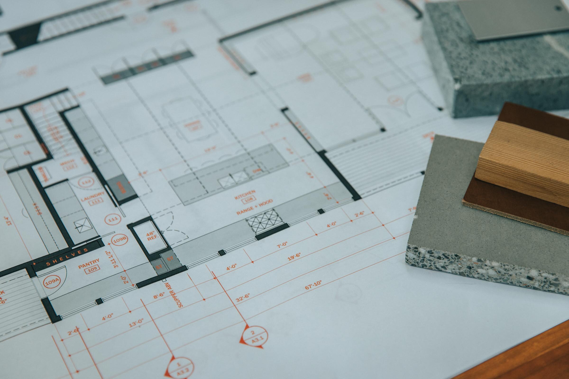
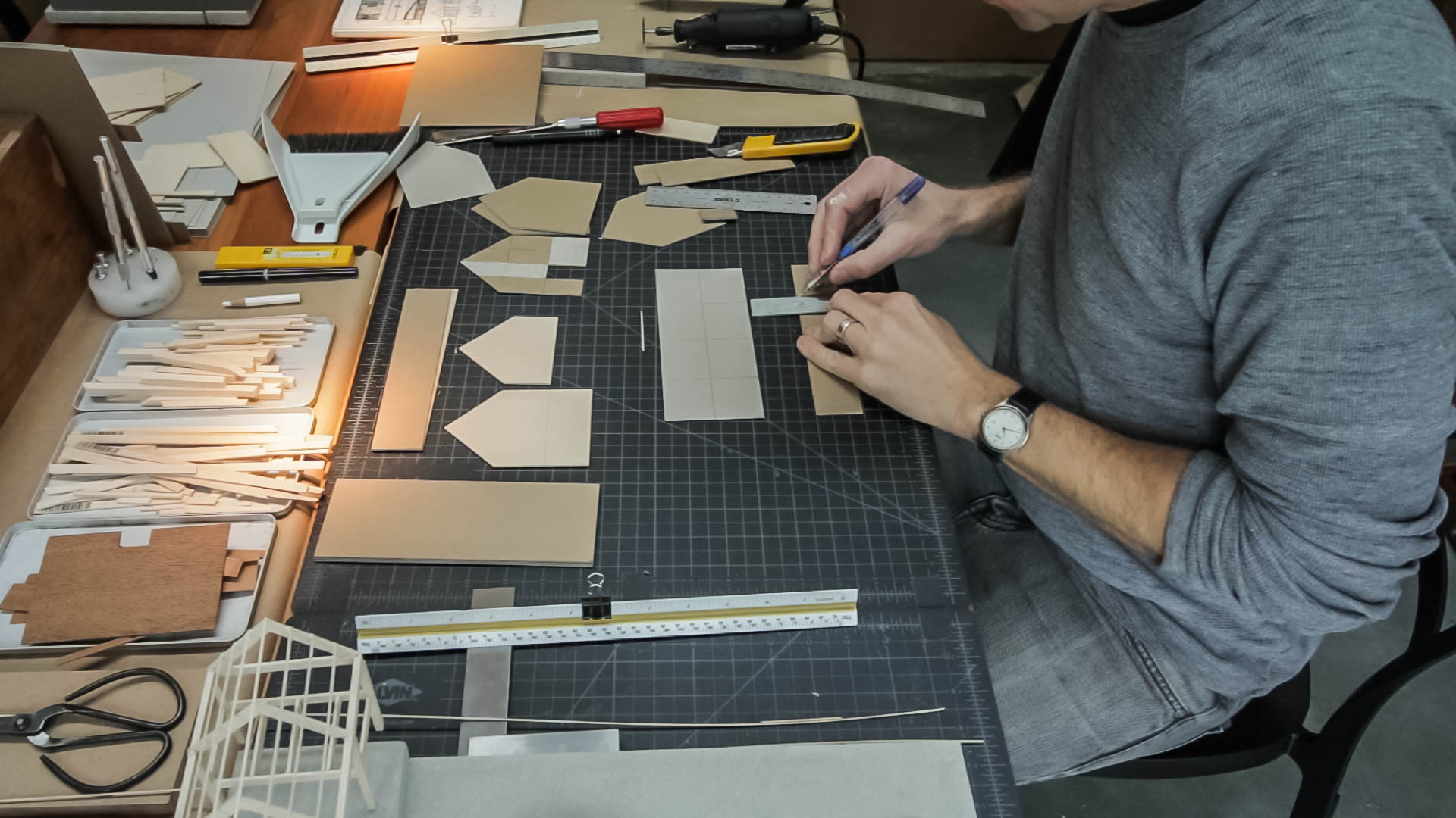
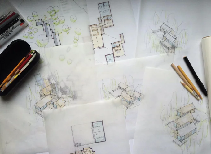
When you’re drawing plans it’s good to begin thinking about materials and systems too. It’s okay if you’re missing this information early on and you’re working on conceptual plans, but I like to begin with at least some idea of how I’ll be constructing the building. For example, is it a masonry exterior? Is there a glass curtain wall? Concrete, wood framed walls, finishes, each of these materials has a thickness and when you start to turn corners and add jogs or if you begin intersecting different buildings or surfaces, knowing what those materials are becomes really important when you’re drawing.

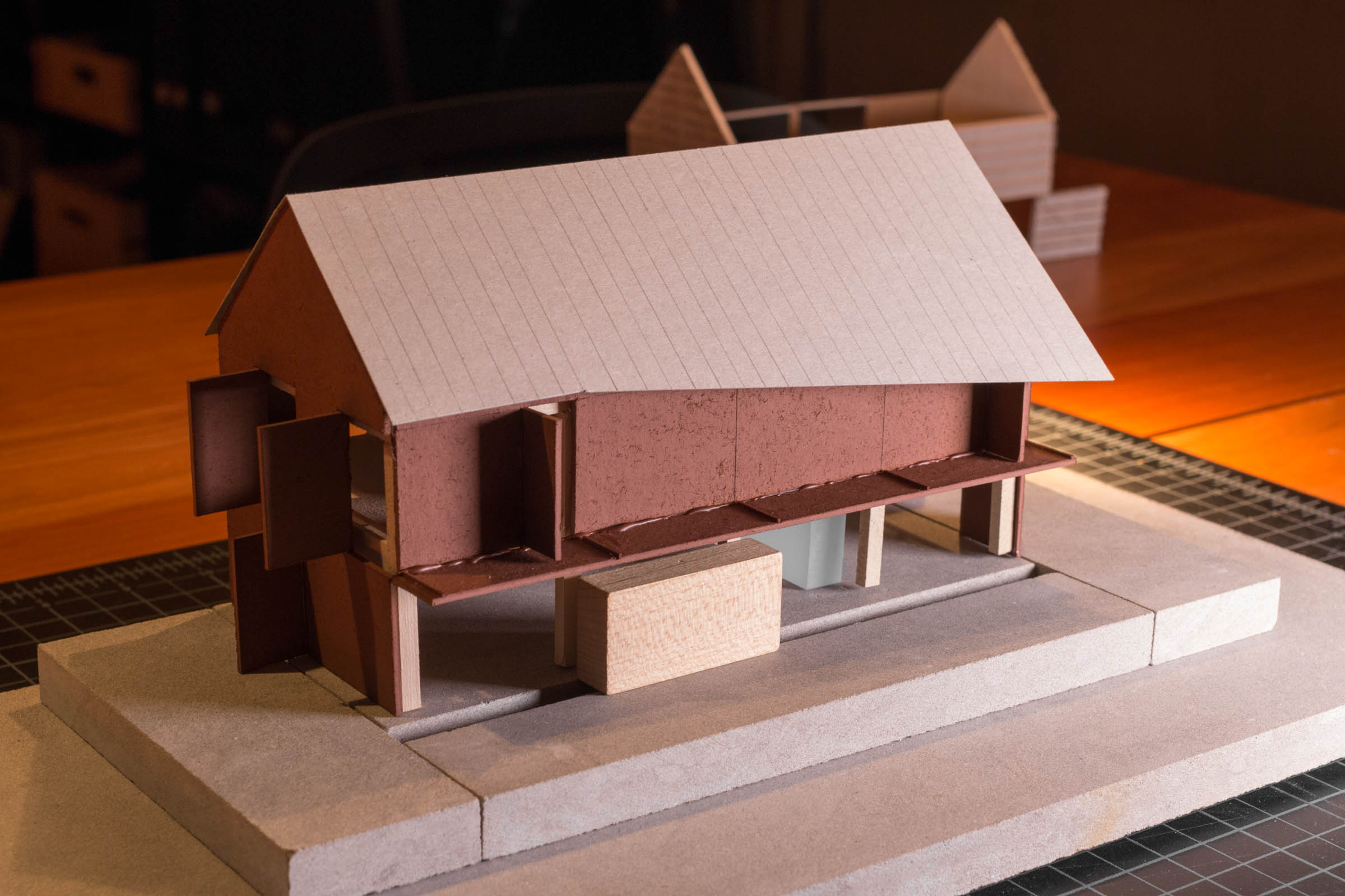
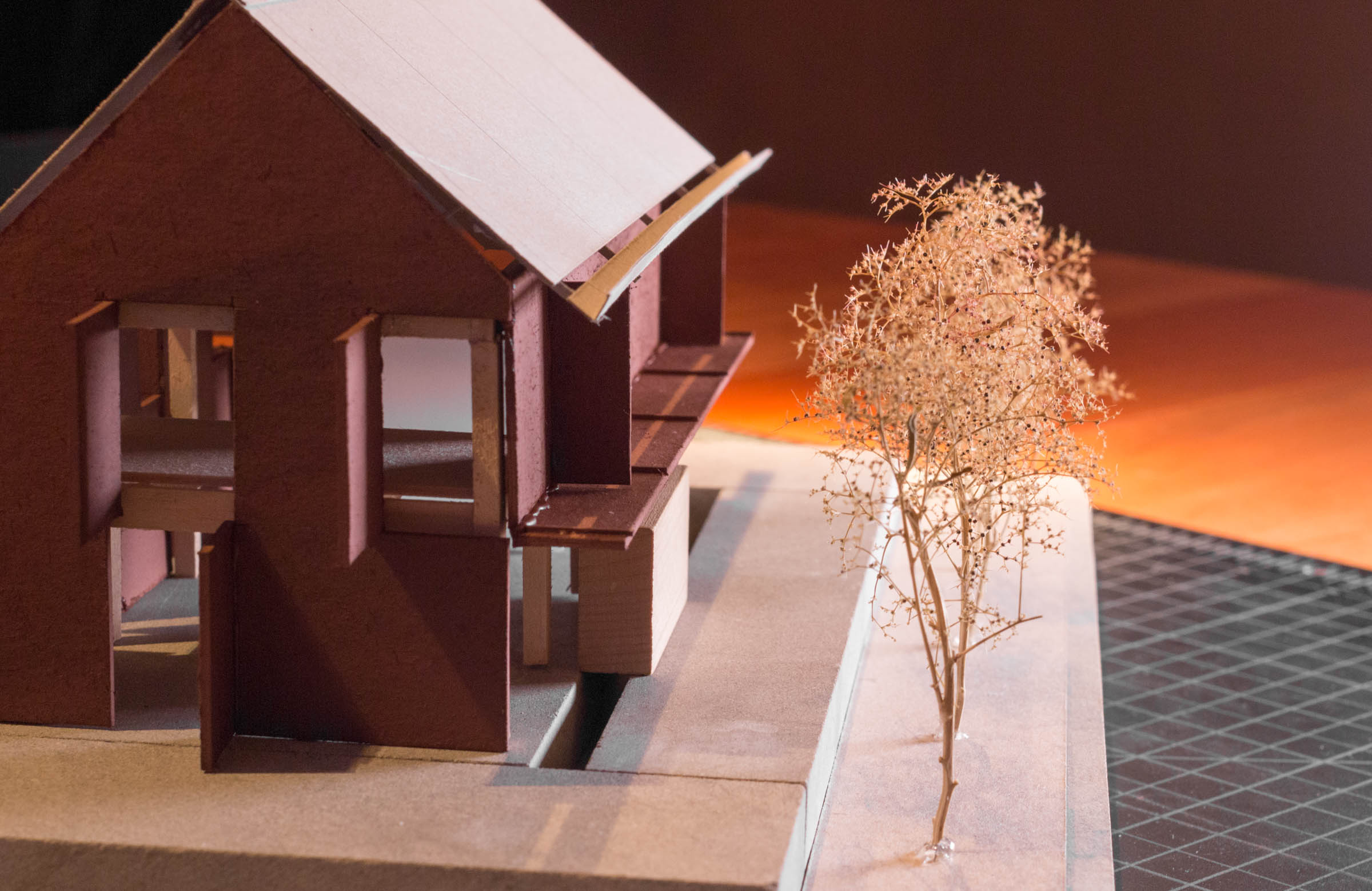
Your final floor plan drawing can be as general or as detailed as you’d like, but the more detail you imbue your drawing with, the more useful a tool it will be later on when you’re drawing column details or figuring out how the glazed wall meets the concrete retaining wall. When I begin drawing a plan, I choose a wall thickness and some basic finishes as a starting point. So here I started by laying out the exterior face of the stud wall on the superfine layer. For our squid cove project we actually started with a double 2x4 stud wall on the exterior spaced apart to prevent thermal bridging. So I offset the outer perimeter by three and a half inches the width of a 2x4 wall, and then a quarter inch for the break, then another three and a half for the inner stud wall. Then I offset the interior finish thickness of ½” for the gypsum wallboard, then on the outside 1/2” for the exterior sheathing and another inch for the exterior shingled walls, Now, along the way, as the pricing came back for the double 2x4 wall system it was a lot more expensive than we anticipated so we had to change it back to 2x6 walls. Now, because windows take a long time to fabricate, this change actually happened after our windows had been ordered and so those openings were fixed on the plan, we had to use those openings. So, we were left with this detail at the interior corners to resolve. Knowing the actual systems and sizes of everything around them allowed us to design the trim around the windows that not only matched the detailing on the rest of the project but made it look like it was an intentional design decision. So when you can, show finishes. They also fill in this fine layer of linework that makes the contrast between thick and thin really pop.

Lastly, sort of the icing on the cake, we have the annotations. Annotations round out the information you’re conveying on the plan. They’re really important wayfinding tools for the contractor so they need be very clearly organized. I use red text to make it clear that the annotations are a part of another ordering system and also something they need to pay attention to. And, the ink is just pennies more to print them in color, honestly…I think it’s so worth it. You could make it blue or gray too, whatever you choose. I like the red because it’s easy to point to a note and say, it’s noted in red, hard to miss, right? This works in both directions by the way, so if it’s your mistake it’ll be pretty apparent! Annotations describe things you’re not able to draw, they reference other drawings and details, and should all be on the ‘text’ layer so you can turn them on and off as needed for presentation or while you’re making other changes to the plan. Annotations grow over time, they’ll be basic at first things like room labels and they’ll get progressively more numerous as you make design decisions. Now, I’m begging you please…please, please…don’t use those hand-lettered fonts…just uninstall those from your computer. I use Franklin Gothic for mine, but anything but the chiseled pseudo-hand lettering should be fine.

You’ll know you’ve done this all correctly when you squint your eyes and you can easily see what’s important. Do the walls stand out? Do the annotations fade. As you spend more time looking for information, more information should become apparent, almost like a pull focus or slow reveal. Light lines of the hatches should be the first to fade and last to come into focus.

So that’s it, I hope it was helpful!

If you want my template, there are two versions available:

AutoCAD template

Revit template

Best Computer for Architects

See our updated guide of the best computers for architects here.

A guide to choosing the best computers for architecture. Whether you're a student, pro, or in a related discipline, this video will walk you through my methodology and selection criteria. I discuss in detail:

  • Laptops vs. Desktop Systems

  • Mac vs. Windows

  • Software (commonly used and requirements)

  • Hardware: CPU, Graphics Cards, Monitors

Discover why I chose the system I did and what it means to my architecture practice and daily workflow. A behind-the-scenes look at how architects use computers. 

LAPTOP: 2017 MacBook Pro
DESKTOP: 2017 Apple iMac

How I find Architectural Ideas

Eight strategies I use to find architectural ideas and confront - the intimidating - blank page.

Topics covered:

  • Bisociation 

  • Trusting the design process

  • Embracing constraints

  • Inventing deadlines

  • Doing the opposite (anti-project)

  • Subtracting to solve

  • Stealing (like an artist)

These are just a few of the design tricks I use to help grease the creative wheels and instill the confidence I need to keep moving forward. What's great is these techniques work for a whole host of disciplines and creative fields, they're not exclusive to architecture.

Books mentioned: 
The Art of Thought
The Act of Creation


Frank Gehry MasterClass Review

An architect's review of the Frank Gehry Masterclass: what to expect, what you’ll get, who I think it’s for, my favorite lessons, and whether I think it’s worth taking.

Gehry is a polarizing figure in the architecture world. But, whether you love or hate his work, the fact that he’s realized - what are sure to be - some of the timeless architectural icons of our time demands respect and further study.

Watch the video to see whether I think the course delivers on all that it promises.

Storing Architectural Samples in the Studio

I'm limited in the studio by the amount of space available to store things and material samples can take up a lot of room. I've seen many types of storage racks used in studios where I’ve worked and tried a number of things myself here in the studio – from metro shelving, to archival folios and wooden, felt and cardboard boxes and bookcases. The problem: they all keep the materials hidden. So although they’re great from an organizational standpoint from a creative standpoint they're stifling. I’m much less likely to grab a material while designing to help me solve a problem or during a meeting if I have to dig through boxes to find what I’m looking for.

When I stumbled across this inexpensive baking cart it seemed perfect and I had to try it out. Learn more in the video.

How to Choose Architectural Materials

Architecture can’t exist on a page it must be built. Transforming drawings and tiny cardboard models into physical reality means choosing materials to represent our ideas. In part four of the architecture short course I discuss materials – how architects choose them, how we know what’s right, how they can shape how we feel in a space, how they influence our designs, and a rubric you can use when selecting your own.

Instead of an abstract exercise, I walk through the precise process I used to choose the materials for the case study project we’ve been following throughout the course.

Links to all my favorite material resources.

Drawing Like an Architect

In this video I share my essential tips for better architectural drawings. It's easy to forget that architectural delineation is part of our craft and - I believe - beautiful drawings communicate more clearly. 
Important concepts discussed:

Making a Short Architecture Film | Behind-the-Scenes

A behind-the-scenes look at the making of a short architecture film. I commissioned this project - a collaboration with Trent Bell Photography - to introduce a little creative friction in my life and architecture practice. I've been thinking about making a documentary film for a long time and this was the year I decided it was time to stop talking about it and make it happen.
Along the way I learned the importance of story and script, how to craft an emotional narrative, how to collect and compose stunning visuals and I expect there's even more ahead as we edit and turn our ideas into reality.

This short vlog catalogues the two-day shoot.

The process indulged my curiosity about film-making and forced me to engage and learn from other professionals with far more experience than I in story-telling and film production. 

This project was treated like everything in my architecture practice: as an experiment and it proved to be a wellspring of new ideas and approaches; exceeding my expectations.

Architecture takes a long time to make. In this way, the short film is a much more immediately gratifying creative outlet. I'd encourage all architects, students and fans of architecture to experiment with it in practice. If you ask similar things of your architecture that you do of a film you may find some surprising inspiration and outcomes.

My deepest thanks to Elise DeRosa for helping me find the story amongst a sea of ideas. To Corey for all his technical support, his keen eye for detail and for fearlessly facing the ravenous bugs here. And, special thanks to Trent for his expert vision and relentless drive to get things aesthetically perfect. I so enjoyed working with you.

I'm excited to share the finished product with all of you shortly. Stay tuned and thanks as always for sharing and supporting my work.

Drones and Architecture | How Creatives Are Using Technology

An in-depth gear review of - what I think - is the best drone on the market today for architects, architectural photographers, and creatives. I discuss the factors that influenced my decision to purchase the Mavic Pro from DJI, unbox it, and describe the use cases and features architects and creatives will care most about.

Factors influencing my decision to purchase the Mavic: cost, portability, camera quality, ease of use, and flight time. The Mavic Pro managed to come out on top in each category almost every time. 

I purchased the Fly More Combo which included extra batteries, a four-hub charger, a car charger, extra propellers, carrying case and a power hub. See the video for the entire unboxing.

I'm using the Mavic Pro as a portable drone for:
- Project documentation
- Presentation + marketing
- Architectural cinematography
- Site analysis
- Topographic mapping
- Construction observation
- Educational tool
- Lead generation (working with Realtors)

I also discuss the essential accessories and apps you'll need to operate the Mavic Pro
- ND filters by PolarPro, Airmap, DJI Go 4, UAV Forecast, SunSeeker

I close the video by reviewing current FAA regulations regarding hobby and commercial use of drones in the USA.

Essential Architecture Books

The books in an architect's library provide context for their work: history, precedent, theory, technics, best practices, fresh perspectives and creative stimuli. The ones I return to often are like harmonic frequencies, which continue to vibrate and resonate over time even as my ideology is evolving.

Is it a coincidence that some of the most emotive connections to books and architectural writings were forged in architecture school many years ago? You know how they say the music you’ll listen to the rest of your life is the music you were into when you were 18? That’s how many of these books are for me. So, these precise books may not find the same resonance with you, but as a thought exercise, consider what your library currently says about you, your interests and your blind spots or your knowledge gaps one you might want to fill in.

Books feed the intellect, and a studio full of books assures we're surrounded by the ideas of many – the masters, colleagues, artists, entrepreneurs, performers, and documentarians. They’re a great equalizer when it comes to education and at a fraction of the cost of architecture school.

Be sure to check the resource page for links to all the books I mention in the video. 

Developing the Concept: Architecture Short Course (part 2)

Developing the architectural concept into floor plans, designing the form, and refining the spatial ideas are all covered in part 2 of our architecture short course.

The first step in making the abstract concept real is to sketch a floor plan and then give that plan a three-dimensional form. A floor plan is a quick way of describing the hierarchy and relationship of spaces and it begins fixing their real physical dimensions and shapes. Throughout the design process architects must continually consider the design in both the plan, or overhead view, and the sectional, or volumetric view. The easiest way I’ve found to do this is to begin by sketching a plan and then construct a three-dimensional version of that plan either in model form or by sketching.

In order to get to three dimensions, we have to make some decisions about form, space, and order. When we speak about form we’re referring not only to a building’s shape but also to its size, scale, color, and texture…basically, all the visual properties of an object. Form has a direct relationship to space in that it influences both interior and exterior rooms. And lastly, order is how we choose to orient and relate the forms and spaces to each other. This directs the inhabitant’s experience of a place.

We'll review strategies for refining the floor plan, designing meaningful building forms, editing, and converting two-dimensional abstract concepts into three-dimensional buildings.

Architectural Model Making Techniques + Tutorial

One of the driving forces behind my desire to become an architect from a very young age, was model making. Architecture was one of the few professions where sketching and constructing scale models out of cardboard and balsa – what I viewed as playing – was not only acceptable but encouraged.

Although many architects have abandoned physical modeling in favor of computer modeling I've kept it alive in my daily practice. In this video tutorial, I share the techniques I use to make models in hopes that the craft persists as not only a design tool but so we all can experience the pleasure of seeing the world from a different perspective.


Architecture Short Course - How Architects Begin the Design Process

All architecture begins with a concept. If you’re struggling to find one, curious as to what one is, or simply wondering how architects begin their projects, this short video course will walk you through the process I use and some of the techniques I rely on to develop architectural concepts all illustrated with one of my residential projects.

Very simply stated, a concept is an idea that underpins your project. To an architect, the concept is what distinguishes a work of architecture from a mere building. At its core, architecture seeks to solve problems. It’s the questions we ask that will determine which problems our architecture will solve. Developing a concept allows us to frame the questions we’re asking and it guides the design process. Choosing the starting point for your design can be intimidating and an early stumbling block for designers of any skill level. But it doesn’t have to be.  

A concept shouldn’t be rigorous; the more malleable it is, the better. In fact, most architecture can’t be reduced to one singular concept diagram rather it’s informed by many concepts working in concert. There may be organizational concepts, material concepts, functional, or structural or formal concepts. Don’t fret if your design idea isn’t reducible to a single elegant black stroke on the page. It’s best to illustrate concept development with a real project as I said. So, we’ll use our Squid Cove Residence as an example. Before we can develop the concept, we have to first understand the practical constraints.

My design process begins only after gathering and assessing all the given parameters for a project. Now, this primarily consists of three types of information. There’s information derived from the site - things like: local climate, the prevailing winds, the solar aspect, vegetation, neighboring structures, the site’s history, and any unique liabilities or opportunities. The site of course also comes along with legal frameworks for development, which describe where and what we can and can’t build. The second type of information we’ll gather is from the client. Every client has a set of cultural beliefs and preconceptions, preferences and agendas. Of course, we’ll want to determine their budget, and understand the personality traits and organizational politics which might also shape the design. The client and the building type together determine what architects call, “the program” which is essentially a detailed accounting of all the spaces the building will contain.

And, the third type of information I gather is related to the building typology – is it a museum, a home…or a school for example? To learn about a building typology we often conduct an analysis of notable or relevant historical precedents. We want to know the essential problems these types of structures grapple with. Understanding the history of the archetype allows us to approach a problem from a fresh perspective. All of this is necessary information that we collect for every project. This inventory can also serve as the progenitor for the design concept – our seed idea. Rather than shunting creativity, these constraints often incite the creative process.

As with a good film, the setting, the characters, the cinematography, and the plot all conspire to make it what it is. It’s the experience you’ll recall rather than the concept per se. Sure, the concept sets the film in motion and it’s the starting point for all that follows. But this concept – the one or two-line description – can’t possible capture the richness and depth of the finished film…or in our case the architecture. Yet without it, the work is unfulfilling and so it should be clear that the concept is necessary for all our work as architects.

Be sure to watch the video for an inside look at how I craft an abstract idea into a home.

Exterior Lighting Concepts

There are two fundamental points to understand about outdoor lighting. The first is that we actually require much less light in outdoor living situations than indoors, which means the overall lighting can generally be more theatrical and less focused on tasks. 

The second is that in lower ambient light situations, we actually prefer lower color temperature light (warmer); it’s actually visually more comfortable. Whether it’s our primal draw to the flickering flame of fire or the fact that warm light renders the skin so naturally, our outdoor design objective is to aim for low, warmly toned lighting levels.

In this video we'll review the general concepts pros think about when considering how to light outdoor spaces. Specific topics covered are:

  1. The Lantern Effect - using a structure's glazed walls to provide ambient light to nearby exterior spaces.
  2. Layering of light - ambient, task and accent light tips.
  3. Path lighting
  4. Color (and) temperature
  5. Object or sentinel lighting
  6. Fire
  7. Wall washing
  8. Dynamic range and dimming
  9. Uplighting
  10. Light pollution

Simplicity - An Architectural Manifesto

A short musing on simplicity; illustrated with residential architecture. Simplicity builds no more than necessary. Simplicity makes room for living rather than things. Simplicity is rational. Simplicity values craft... and material. Simplicity rejects excess. Simplicity invites reflection. Simplicity appears effortless. Simplicity is efficient. Simplicity lends small gestures... great importance.

Translucency (An Architect's Guide)

“Light is to architecture what sound is to music.” (Steven Holl) At the two ends of the spectrum of light control and transmission stand transparency and opacity. Translucency inhabits the broad middle ground between those two. The word “translucent” is derived from the Latin “trans“ ("through") and “lucere“ ("to shine"). Translucent surfaces permit the passage of light while visually obscuring what’s behind it. Historical examples of the use of translucency in architecture abound: the poetic sliced alabaster window above the main altar in St. Peter’s Basilica in Rome, the shoji (screens) at the Katsura Villa in Kyoto, the stained glass rose windows at the great Chartres Cathedral in France. And there are countless others.

Translucency promotes ambiguity, a sense of mystery and a complexity that allows for multiple understandings of what a space can be. In the video I review examples which illustrate the power of this ambiguity as well as the practical things you need to know when employing translucent materials in your project.

Other topics covered: - How iron impacts the color of glass - Walls, floors, stairs - Material properties and options - Using transparency to imbue a design with meaning (be sure to catch the last project in the video)

How a site can shape a home

Good design is the result of strong, simple concepts that give meaning to a home's shape, form and materials. When you look to your site for inspiration, these ideas often arise very naturally. A site is composed of many things: topography, plants, trees, regional and local climate, surrounding structures, water bodies and zoning and code regulations. Each site has very specific solar orientations, views (good and bad) and often a very explicit character. Each one of these areas is an opportunity to generate a meaningful conceptual approach for your home design — a way to devise its shape, layout, form and materials. In this video I discuss the strategies architects use to find design inspiration and derive meaningful architecture from a home's site.