Essential Architecture Books

The books in an architect's library provide context for their work: history, precedent, theory, technics, best practices, fresh perspectives and creative stimuli. The ones I return to often are like harmonic frequencies, which continue to vibrate and resonate over time even as my ideology is evolving.

Is it a coincidence that some of the most emotive connections to books and architectural writings were forged in architecture school many years ago? You know how they say the music you’ll listen to the rest of your life is the music you were into when you were 18? That’s how many of these books are for me. So, these precise books may not find the same resonance with you, but as a thought exercise, consider what your library currently says about you, your interests and your blind spots or your knowledge gaps one you might want to fill in.

Books feed the intellect, and a studio full of books assures we're surrounded by the ideas of many – the masters, colleagues, artists, entrepreneurs, performers, and documentarians. They’re a great equalizer when it comes to education and at a fraction of the cost of architecture school.

Be sure to check the resource page for links to all the books I mention in the video. 

Developing the Concept: Architecture Short Course (part 2)

Developing the architectural concept into floor plans, designing the form, and refining the spatial ideas are all covered in part 2 of our architecture short course.

The first step in making the abstract concept real is to sketch a floor plan and then give that plan a three-dimensional form. A floor plan is a quick way of describing the hierarchy and relationship of spaces and it begins fixing their real physical dimensions and shapes. Throughout the design process architects must continually consider the design in both the plan, or overhead view, and the sectional, or volumetric view. The easiest way I’ve found to do this is to begin by sketching a plan and then construct a three-dimensional version of that plan either in model form or by sketching.

In order to get to three dimensions, we have to make some decisions about form, space, and order. When we speak about form we’re referring not only to a building’s shape but also to its size, scale, color, and texture…basically, all the visual properties of an object. Form has a direct relationship to space in that it influences both interior and exterior rooms. And lastly, order is how we choose to orient and relate the forms and spaces to each other. This directs the inhabitant’s experience of a place.

We'll review strategies for refining the floor plan, designing meaningful building forms, editing, and converting two-dimensional abstract concepts into three-dimensional buildings.

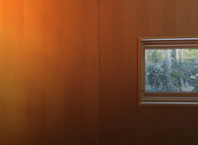
Studio Project: Plywood (as a wall finish)

My design studio acts a lab for experimentation, in this video I discuss lessons learned from installing plywood as a finished wall surface. The four main discussion points covered are:

1) Material thickness: 1/2" - 3/4" typical range. NOTE: if you're using sprayed foam insulation in your walls, the plywood covering must act as an ignition barrier for the foam - thickness will be critical. Thickness also affects: translation of framing inconsistencies to the finished surface, stability and price.

2) Panel cores and veneer faces. Steer clear of the Chinese Plywoods. Choose panels from the same lot and age if possible. Veneer plywood has a front and back side; the less banded side is the finished face. Take care when cutting to avoid material blow-out.

3) Attachment. Concealed versus exposed fastener. I recommend a concealed clip as well as a tip for aligning the finished face of the panels (it's a special fastener).

4) Finishing. Determine the project goals first, then select the finish. Mine were: - Low sheen - Preserve natural wood appearance - Easy to apply - Non-yellowing

I review oil-based and water-based finishes, Danish oil, spar varnish, paste wax, natural soap (Hans Wenger furniture), and finally WOCA oil + lye.

For a broader material discussion please see the video for part 1...

As always I welcome questions and feedback; you can reach me at: eric (at) thirtybyforty.com

Studio Project: Concrete Slab (as finished floor)

In this video I discuss five important considerations with a concrete slab that will act as a finished floor:

  1. Installer / subcontractor

  2. Color

  3. Consistency

  4. Control joints

  5. Reinforcing

You might also consider building a mock-up especially for large floor areas to ensure you’re getting the finish you expect.

I finish the video reviewing progress with a time lapse video of the slab placement and finishing.

Framing is up next...

Flat roofs and snow: 5 myths (busted)

In this video I dispel 5 common myths surrounding the use of flat roofs in snowy climates. The very notion of shelter is linked to the image of a roof above our heads. And while the elements of snow and rain may shape our living habits, advances in material technology and application now afford us a broad range of choice when it comes to the shape of the roofs over our heads. Contrary to popular belief, even those of us living in extremely snowy, wet environments are able to live beneath a flat roof. 


Designing a Small Studio - Lighting Plan (Part 7)

In this video I discuss the development of the lighting plan for our small studio project. I begin by discussed the (3) elements every professional lighting plan includes: ambient, task, & accent lights. I also describe a useful guideline for figuring out the amount of light required in a space as well as how I've applied the building concept to the lighting plan.I end the video by discussing a simple affordable fixture, why I chose not to use exposed conduit in spite of the aesthetics, and how to think about the location of your electrical panel (stay until the end for a cool little trick I employed).

Thanks for watching...

Four Homes Built on Boundaries

In this video I explore four homes built on boundaries. It's a look at how a home can challenge the natural environment and occupy the boundary between architectural convention and stunning natural beauty. When confronted with a design brief and an undeveloped site, architects often look to the edges of that site for inspiration and meaningful architectural solutions. These boundaries, both real and imagined, are exciting places to build. The boundary often gives rise to the form of the building, its materials and even how it’s structured.

Designing a Small Studio - Selecting Materials (Part 6)

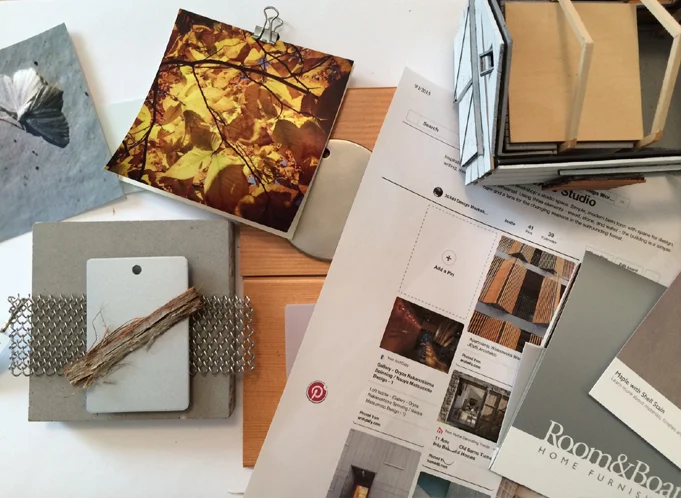
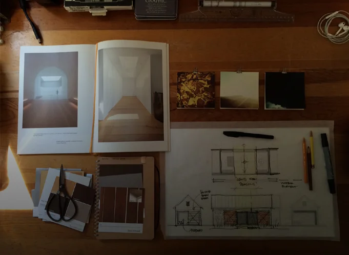
Materials can be used to convey the underlying concept of a building or in some cases they can function as the entire concept (Peter Zumthor is an excellent example). In this video I detail the process I used for connecting the "lens for the seasons" and "barn" concepts to an attitude about building materials.

I begin with abstract imagery, then build Pinterest boards with inspirational images, then I gather and collage materials. Instead of directly quoting the Pinterest images I draw upon their essential ideas to develop the material palette for the building.

The concepts are hard to compress into a short video (my apologies) if you stay tuned to the end I talk about a quick tip for securing free material samples I recently discovered.

Designing a Small Studio - Building a Study Model (Part 5)

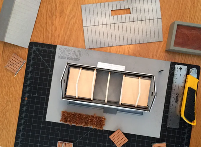
In this video I discuss the benefits of building a small scale, physical study model using the reference project I've been designing: my studio building. Computer models are excellent tools, but simple cardboard models allow real-time manipulation of forms and the development of ideas that don't always present themselves when working in a digital environment.

For me, model building has always been a part of the design process. They help: 1) To study building forms and spaces. 2) For real-time solar studies. 3) With envisioning scale of elements as they relate to the human form. 4) Allow one to explore a variety of material and color options, quickly and easily. 5) One can quickly flesh out ideas in much the same way a hand sketch might, however, model construction uniquely forces you to make decisions about building elements that sketching doesn't.

Future videos will describe sketchy model building hacks and tactics to more quickly build a useful avatar for your architectural project.

Designing a Small Studio - Revisiting and Integrating the Concept (Part 4)

In this video I overlay the plan diagrams on the site plan which reveals a clear favorite. I go on to describe 6 tactics I use to turn a simple diagram into a meaningful floor plan. They are:

1) Study a building precedent (in this case a barn).

2) Develop an ordering system (grid, column layout, geometry, functional). Once it's established you can decide when to "disobey" the rules.

3) Create zones: entry, circulation, storage, living. Divide public and private spaces.

4) Analyze adjacencies - group common functions and support spaces. Make sure their orientation makes sense for the plan location.

5) Refer back to the concept. In this case the "lens for the seasons" concept reinforced the barn plan typology and spurred on new ideas.

6) Create layers of meaning. Begin by thinking about the way we experience space or places and look for opportunities for the building to enhance daily life.

The next video explores the use of small physical study models for solar, material, and proportioning studies.

Minimal Deck Guards and Edges

I thought it would be interesting to explore the ideas at work behind the design of a guardrail for a recent project of mine. While it's one small component of the larger design it speaks to the architectural process at work. The guardrail sought to carefully balance the competing desires of an unobstructed view,  safety and of course aesthetics.

Concept

Pond House guardrail edge

I always reference the building concept when designing each individual component of my buildings. The concept for this project was inspired by the fishing shacks and wharf structures of coastal Maine and resulted in a trio of cottages. Two are situated at the edge of the tidal salt pond and the third extends out over it - a modern wharf of sorts. The marine references are clear in the built-form, from the bright-work of the large sliding doors to the simple, utilitarian, expressive structural concept.

The wharf cottage contains the most public functions - the kitchen, living and dining rooms and has a large wrap around, cantilevered deck. The deck is positioned so as to welcome guests arriving and links the interior and exterior living spaces to the view to the fjord beyond. Because it's cantilevered, the deck appears to float as a thin plane above the water below.  So as I design different pieces of the architecture, I'm always cognizant of ideas about slimness, simplicity, honest expression of construction, and the influence of the watery site. I wanted to maximize the client's view to the fjord from both inside and out and of course maintain a safe gathering space - and it had to look good.

Deck Design

Before I can get to the guard design, I must design the deck. Each of the decks for the project were conceived of as thin planes floating above the landscape. To do this I created a steel channel frame at the edge of the deck. This steel channel not only references the simple steel shapes used on the docks and piers here on the coast but it also provides a very thin profile to the deck edge which was important to the design. The structural beams and foundation piers for all of the decks are set back from the edge to further enhance the hovering effect.

Guardrail Design

Guardrail section detail

All of the effort at slimming down the deck edge profile would be lost if I were to place a substantial, meaty guardrail system on top of it. Cable rail seemed an obvious choice with references to boat rigging and its near invisible and weightless stature. But cable rail has must meet all of our code concerns too, which means we need intermediate supports. That's easy you say, every three feet add a post. True, I could've done that and probably been fine, but it would've looked ad hoc, not considered. I wanted to be sure that we had an even spacing along the length of the deckf and I also wanted it lined up with the regular module of the large sliding doors and the structural columns which are the dominant ordering system of the wharf cottage. Why? Mostly because I like lining things up, but also because the order makes sense and feels better. It allowed the corner offsets to be the same and it fits the tidy aesthetic which contrasts the disordered organic surroundings.  I'm always battling entropy - unsuccessfully I might add.

Here's where the added advantage of the channel deck edge comes into play. That allowed us to offset the vertical supports to the outside edge of the deck extending them down by the Ipe decking and welding them to tabs on the steel channel. The added bonus is that it gives over the deck edge to people rather than a guardrail system.

Is it perfect? No. It turns out that welding the vertical fins to the tabs on the steel channel at the deck edge is difficult to do when suspended over a pond. I'm not afraid to say that I'm always learning. And, I'm always humbled on job sites by the skill of the contractors that work so hard to make my drawings a reality.

Design Process - Selecting Materials

This is the third in a mini-series I've created which chronicles the design process for small project I've been working on - the design of a modern Barn Studio outbuilding.  In the first post I talk about how I developed the design concept and the second post describes the evolution of the elevations, which shapes the final appearance of the barn studio. I've recorded a video that discusses the material selection process for this small project.

Read on for the specifics not covered in the video.

Material Ideas

I can never seem to make enough room for material samples in my personal sample library. They take up more room than my physical book collection. For me, they offer inspiration and they speak to who I am as an architect. I’m driven by the process that turns these raw materials into a home. I love how they can speak about a client or a site - it’s part of the magic of architecture for me. 

Selecting materials usually comes from a larger idea about the site, the place, or a specific building reference. For this project, the material inspiration comes from the barn typology. Barns were often frugal constructions clad in whatever materials were locally available to the farmer. Historically, local sawmills would mill the trees felled from a building site into rough lumber. This was used for both the timber frame structural system as well as the exterior sheathing. Wood sheathing was an obvious material choice for the side walls.

Walls

Knowing what material we'll be using is only one aspect to consider. Will the siding be horizontal boarding, vertical tongue and groove, clapboards, shingles? What's the finish? My client requested I consider board and batten in a vertical configuration - this was their image of what a barn was. It wasn't my first choice, but it's a perfectly reasonable and appropriate aesthetic. So that was the foundation for one of the three options. I usually propose at least three options for our discussions. The first is an expected option, usually based on a specific client request. The second is an option they may not have considered at all, something unexpected. The third is usually a hybrid that combines the two - a middle ground. This way we're sure we've explored a range of possibility. There's usually a fourth that comes out of my client's feedback that hybridizes these options in ways even I hadn't expected. I love this aspect of the process.

Back to the vertical board and batten. The reason I didn't like it? The vertical scale of the barn. It's much shorter than it is long. My preference, especially for small structures, is to reinforce whatever the dominant ordering proportion is with the siding. The barn's dominant scale is its horizontal scale, it's length.

To highlight the building's horizontality, I'm proposing a horizontal tongue and groove siding up to the seven foot level. This reinforces our earlier decision to go with a shorter seven foot door and canopy height to achieve a taller, more barn-like proportion. We're tricking the eye into thinking the building is taller than it is by creating this horizontal band with blank wall above it.  Above this horizontal band would then be shingles to create a finer texture, smaller scale and let the upper portion of the structure recede - again this reinforces the scale shift we're looking to achieve.

Roof

For the roof, metal was another obvious choice - an appropriate agrarian reference, with a durable and clean aesthetic.  To me it was a better choice than wood because it has a crisp, tailored look that fits with the tight, simple geometry of the outbuilding. However, the design review committee didn't agree. It was apparently deemed too industrial for the neighborhood. So, wood shingles was a next best option, and this reinforced the decision to use shingles in the zone above the seven foot level.

Doors, Windows, Hardware, Flat Roof

For the doors and windows, hardware, and flat roof canopy element - gray metal and stainless steel. Simple, durable, utilitarian and monochromatic.

Trim

I opted to minimize the trim on the structure completely eliminating the corner trim and keeping the other profiles as narrow as possible. The siding boards are mitered at the corners and the shingles are woven allowing the horizontal lines to continue uninterrupted along all faces of the building. Window trim is minimal at only two and one-half inches wide and it will be stained to match the gray of the shingles.

Color

All siding is left to weather naturally to a gray color. We may use a bleaching oil or weathering stain to control the process ensuring it weathers evenly, but the idea is to minimize any maintenance. Low maintenance is a hallmark of the barn typology.

Site Elements

The main house siding is partially clad in stone and the property has a number of dry-laid stone walls as well. It was the inspiration for the long dry-laid retaining wall to the north edge and it fits well with our neutral gray palette.

So this is the basic process by which I go about selecting the materials. It's informed by a number of factors but there's an overriding logic to the decisions. They're decisions made with intent to achieve certain effects. Decisions drawn not only from an idea about what a barn should be clad in, but also from the proportion and size of the building. We look to the architecture to help us make decisions about the right solution.

I hope you'll continue to follow the process as we move forward with the next steps designing the Barn Studio. We'll discuss lighting and the interior materials in a future post. If you’d like your very own Barn Studio it's available for download. And, there are a few other variations I'd gladly share if you're interested, just drop me a line and let me know.

Design Process - The Elevations

This is the second in a mini-series I've created which chronicles the design process for small project I've been working on - the design of a modern Barn Studio outbuilding. If you haven't watched the first video where I talk about the design concept and how the floor plan was conceived be sure to check that out first. I've chosen this project to use as an example because it's so simple. For an average 2,200 square foot house the back and forth developing floor plans, the site plan, and the elevations typically takes quite a while - several weeks is average. But because the program (the number and types of spaces) isn't overly complex and the structure isn't very large it's the ideal candidate to describe my process. I've recorded a video that summarizes the evolution of the elevation options presented to my client.

https://youtu.be/6Sxg1r8MnVE

Having developed the concept and designed a series of working floor plan options around that concept my next step was to submit it to my client for their review and comment. Our dialogue revealed the things that were working and the things that weren't working about each of the concepts. I request that my clients are honest and upfront about likes and dislikes, I have a thick skin and my goal is to design a structure that meets their needs - not mine. Iteration and revision is fundamental to the design process. I sketch, design, draw, erase, redraw, submit for review and iterate again. While this back and forth was abbreviated because of the scale of the structure and the limited number of decisions to be made, larger projects can take quite a while to finalize the plans. In every project I'm in a constant state of revision and reevaluation. If I find an opportunity to make something better along the way, even when I'm much further into the design process, I do encourage the revisiting of prior decisions when better alternatives present themselves.

My client had some really useful feedback which I then incorporated into the plans in preparation for the next steps. For me, that step, is to define exactly what the exterior of the building is going to look like. This means materials, proportions of walls, windows, doors, lighting, roof shapes - everything that makes up the exterior look and feel of a structure.

Read on for a few of the insights that didn't make their way into the video.

Proportions

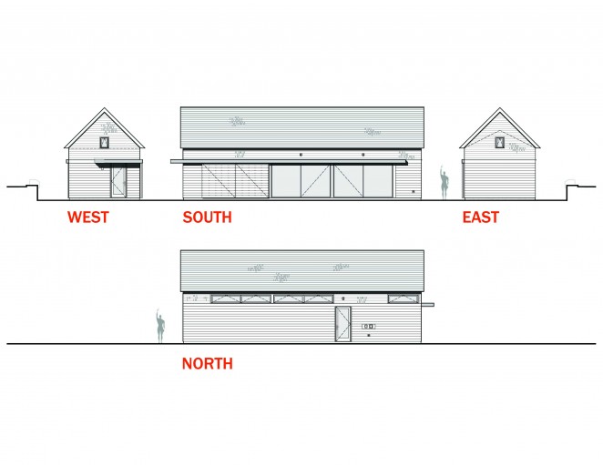
The first and most basic step when designing the exterior elevations is to develop an initial proportion. There are two things that inform my decisions on this project, the primary one is the barn concept. In the end, the structure must appear barn-like. The second is the size relative to the existing structures on the property. We could easily overpower the main home if we were to borrow from typical barn eave heights which can be quite tall. Because this is a residential neighborhood, I need to be sensitive to a residential scale. The existing home's walls have a 10' plate, which seems like a reasonable starting point for this building. I'll draw that as the wall height on the eaves to get started and revise it up or down later as needed. The actual proportion of the wall can appear different depending on the size opening I place in it. The video describes this concept in more detail, it's an interesting visual trick.

The other proportional exercise will be the roof shape and pitch. I'll be matching the existing house's roof pitch at 12:12 - which means for every 12" in horizontal run, the roof rises 12"; a 45 degree pitch. Orienting the roof along the length of the structure allows me to maintain a minimal profile facing the street and it orients the pitched roof to work with the short span of the building. At 14' wide, we'll have no trouble purchasing simple trusses to structure the roof.

I sketch out the basic shape as an extruded gable and begin thinking about openings next.

Barn Studio Exterior ElevationsDoors

Again we revisit the barn concept when thinking about doors. A standard door will be fine for accessing the side of the structure closest to the pool but the doors flanking the studio space should be large. My client and I have shared the initial image of large sliding barn doors on the exterior of the building to signify 'barn'. I've developed a flat canopy as a modern way of concealing the track required for these sliding panels and you'll notice that it wraps the corner and turns into a deeper overhang at the side door. This keeps the weather out and marks that area an an entry zone. Architects are always looking for ways to tell the story of how to use a building without words - overhangs communicate entry.

Large sliding barn door panels are relatively inexpensive, large sliding glass doors are, by contrast, not. I developed five different door options for my client to review using differing configurations of sliding doors ranging from the relatively expensive to the extremely expensive. The trick with these doors is find the balance between a convenient size, function, and cost.  Sliding doors make sense because the space is narrow and taking up any of the floor space with a swinging door just didn't make sense.

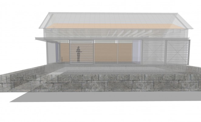
Barn Studio Transparent View

I first tried using French sliders, basically a 4 panel sliding door unit with two center panels that slide to either side. Standard sizes limit their cost, but also limit the overall opening. In my case the overall opening in the studio wall I was looking to fill was 24'. So, I placed two 12' units side by side using a total of four of the standard 3' wide panels. The two center panels slide to provide a 6' center opening. This didn't seem barn-like enough to me. So, among other less successful options, I transitioned manufacturers and embraced a more commercial system without the same limitations. The commercial system would allow me a 12' wide unit and 6' of that would be operable. If I put two side by side, that would leave me with a center opening of 12' in width. Much more barn-like, see what you think.

Windows

There are limited options for openings in this project, I'm recommending the bulk of the money be put toward large doors. But we'll need some windows for light, balance and ventilation. Usually with windows I start by envisioning the desired quality of each space they're looking to serve. Does the space require a large window or a small one, does it need privacy, or should it feel connected to the outdoors? I then go about sketching an underlying ordering system which they'll fit into.

In this case, the two spaces that absolutely required windows were the bath and the studio space. Since the studio had more light requirements I started there. The project is sited near the northern edge of their property with the long studio flank facing any future development. This immediately suggested a clerestory window configuration as it preserves privacy while still letting light in. Clerestory windows because they're positioned higher in the wall also permit light deeper into the space. This line of reasoning translates nicely to the bath space as well where privacy is paramount to views out. I developed a repetitive ordered system of clerestory windows to the north aligning them with the openings on the south wall as a starting point.

One last window detail to think about was the addition of a couple of small windows. You'll often see barns utilize either very small openings, or very large openings. The large openings were for letting in large equipment, the small for ventilation and light. They seemed even smaller than they actually were because they were usually placed in large blank walls. I added one on each gable as a reference to the barn aesthetic even though they'll contribute relatively little light to the overall space.

Materials

In the next post, I'll describe the process for selecting the material palette and what we have planned.

Please continue to follow the process as we move forward with the next steps designing the Barn Studio. If you’d like your very own Barn Studio it's now available for download.  I would happily share some of the interesting variants I've been developing just drop me a line and let me know.

Design Process - The Plans

The floor plan is probably the most widely recognized sign of an architect's work. To someone unfamiliar with the design process it's appears as simple definitions of rooms in space. To an architect, it represents much more. It's the manifestation of ideas, concepts, and a considered synthesis of many disparate pieces of information: the site, the client, the budget, cultural context, and building traditions to name a few. I thought it would be fun to walk through the design process for a small project I’m just digging into in my studio. It reveals my early design thinking and more importantly how design problem solving works. Here's a short video I recorded that describes the early evolution of the floor plan.

The details of how I arrived at these options are described below.

The Request

We begin with a client’s simple request for a multifunctional recreation and studio space. It must also have a bathroom to support a nearby pool, overflow guest-sleeping space, entertaining space (indoor and outdoor), a kitchenette and the flexibility to convert it into an in-law apartment in future – oh, right - I almost forgot the fireplace. This will be an ancillary structure on an existing property and it must be subservient to the existing architecture of the site and modest in size.

As it turns out, there’s a lot we’re asking of this little structure.

However, this isn’t everything we’ll need to include. What isn’t in the client’s wish list is often just as important. The infrastructure. We’ll need circulation space or walking space to get into and out of and around, storage space, and mechanical space too. These are items I know we’ll need given the things my client has already said – the idea that it will accommodate sleeping means it must be heated and of course that means it needs a heating plant. Walking space and storage must be baked in just to accommodate every day life. This is what architects call ‘The Program’. It’s a list of all of the required spaces.

Larger projects will have extensive program lists, this one is fairly small and manageable. Once the program list is developed, the next step is to assign each space a square footage estimate. The main flexible space will be the dominant element in the plan. I know from my client that the new structure is to appear secondary and play a supporting role on the estate. I also know that it’s to be positioned close to the driveway and pool. At this point I can make some informed guesses at the size of the structure. If I make it too wide it will compete with the existing structures as the wider it gets the taller the roof becomes. If the structure becomes too long – again it begins to compete.

Sizing the Structure

The existing nearby garage is about 44’ long. That's a good reference point to shape the building and I can revise it later if need be so I’ll start there. Many people think that architects have an innate sense for the size a building should be – immediately. While we have a general sense of the size of spaces, garages, living rooms, kitchens, the more important exercise for an architect is determining the scale in relation to the context. A 44’ long structure next to a 24’ long cottage will dominate while a 44’ long structure next to a rambling, highly detailed, 150’ long home will read as an ancillary structure. The context determines the scale.

Usually, my client’s arrive with a notion of what the structure will look like. While this isn’t always appropriate, in this particular case their image was that of a barn. Which, to me, makes perfect sense. Barns are open, multifunctional, flexible, simple, supporting structures. This already satisfies almost every parameter we’re working with.

The Building Site

The one thing we haven’t mentioned yet is the site. The site can be an extremely strong generator of form and layout for my projects. In this case, I have to know a little more about the site than I already do, but because it’s an existing property in a relatively flat area it holds a secondary place in the design process. The existing buildings and adjacencies will dictate where the Barn Studio will be located. The client has sent me their site plan and I’ll make do a cursory site analysis to get started.

Site analysis for a new project on an undeveloped site can be quite extensive. In general all sites will require an understanding of topography, local climate conditions, how the sun moves, and other significant site features (trees, water, neighboring properties) and of course code and zoning restrictions.

For this project, one of the initial priorities is for me is to determine whether or not the site can accommodate an additional dwelling unit. Whenever I'm designing a structure for habitation, zoning regulations will play a role. Many properties are zoned based on an allowable square footage per dwelling unit. This property already has one dwelling unit in place and we’ve determined that a second is allowable.  The general principles at work in this phase, beyond the environmental factors (which are easily divined for most sites) are a confirmation of the rules governing construction. Zoning is the key player at this stage – dictating development, height, setbacks, lot coverage and other constraints. Deed restrictions and special restrictions based on the site’s location can be factors in the general design process, but for this one it’s straightforward. We can move on.

Sketching

Now the fun begins. I’ll pick up my favorite lead pencil, my black sign pen, and a sharpie and begin by quickly sketching concepts on tracing paper. I’ll block out plan shapes on the site plan where I can think about access, building size and location. I’ll sketch out my initial impressions along with a three dimensional concept for the building. I like to work at all scales at this point. I’ll think about what the materials might be, what the doors might look like, and very specific nuances of how the building meets the ground and sky. These sketches frame the problem and help me to quickly test and work through ideas without a lot of commitment. The process of sketching for me reveals the latent possibilities of the project.

Design is an iterative process, where I test and re-test, either confirming or repositioning and re-testing all the while building on previous set of decisions.

The Plans

Once I’ve narrowed it to a few strong organizational ideas, I begin blocking out the floor plans, the process is best described in the video.

Client feedback is of course extremely important. Once we get to this stage, I’ve already put a lot of time and thought into the project. Unfortunately, all of this thought isn’t explicit or necessarily visible. By the time I’ve generated floor plans in my CAD (computer aided drafting) program, I’ve internalized, processed and devised a solution to many of the problems presented by the client. Now, it’s my job to communicate that to the client and solicit their feedback. Which will necessitate the next iteration and an evolution of the design.

I'm eager to hear from them about what they liked and what they didn't. This is where the building begins to take on a life of its own - with the client weighing in. To me, it's the best part. We all engage and contribute, fine tuning and pivoting and each step brings the final building more into better focus.

Stay tuned as we move forward with the next steps designing the Barn Studio. If you’d like your very own Barn Studio it's now available for download.

House Size - Balancing Wants, Needs and Budget

This post is the second in a series intended to walk you through the process of designing your own home where I guide you from the initial stages of your building project through construction.  Please check out my about page and my portfolio for more about what qualifies me to do this. So, here we are at step two (if you missed step one, be sure to read and watch that section first).  You've determined your building site and diagrammed the assets and liabilities, now it's time to figure out exactly what you'll be trying to fit within your home.  Architect’s call this second phase the ‘programming’ phase.  The ‘program’ is a detailed list of all of the spaces you’ll include in your home along with their sizes.  Think of it as a sort of ingredient list in a recipe you’re following.

A couple of things to keep in mind while developing your wish-list.  First, every square foot will cost you between $250-350+, choose carefully.   Secondly, and more importantly each added square foot is another one you'll have to heat, cool, light, maintain, and clean (!) for many years to come.  Homes use an incredible amount of energy and here in the USA our homes are substantially larger than our European counterparts.  Be ruthless about what you really need and what you can live without.  By consuming fewer resources your self-less act gives to generations that follow us.

Average House Size Comparison

Program Ingredients

A good place to start is by compiling a wish list of rooms.  Basically anything that will take up space in the home should be on the list.  While you’ve probably already considered many of the spaces listed below, there are undoubtedly some you haven’t accounted for.  Most often people overlook essential spaces like stairs, hallways, mechanical rooms and electrical closets.  These are critical to every successful floor plan, however mundane they may be, and they also account for a large percentage of the actual floor area, and by extension, your budget too.  Be sure not leave these out.

Some common spaces you’ll want to consider:

  • Entry/Mudroom
  • Living
  • Dining
  • Kitchen/Pantry
  • Study
  • Powder-1/2 Bath
  • Bathroom(s)
  • Laundry
  • Bedrooms
  • Porches
  • Decks
  • Mechanical/Electrical
  • Circulation (stairs/hallways)
  • Garage
  • Carport
  • Outdoor Terraces
  • Media Room
  • Game Room
  • Screened Room

Size Matters

Or should I say, matters of size?  Once you've compiled the list, you'll need to assign each room a rough size. A good place to begin thinking about the sizing of these spaces is to measure your current living spaces.  You'll have a sense for the scale of your furniture in those spaces and what works and what doesn't.  If your current bedroom is too small, roughly estimate the extra room it would take to make it more functional and account for that in your spreadsheet.

My worksheet lists basic room areas and sizes, but really it’s a guideline to help you get started.  Try not to take this too seriously to begin with.  It usually makes sense to stay in the general range of the room sizes I list but if your design vision calls for a living room in the shape of a bowling alley by all means, bend the rules.  Make the rules and then break the rules.  Develop a set of operating principles and consciously break them for effect.  Architect’s do this all of the time, when you do this with intent you’re one of us.

It’s important that along with the development of room sizes that you keep in mind ceiling heights.  Not exact ceiling heights, but a more generalized idea of which spaces might be taller than a standard 8’ ceiling.  You’ll note in the worksheet there’s a column labeled ‘factor’.  Ceiling heights are one thing that affects the factor; it’s essentially a multiplier that accounts for the extra materials (sheetrock, framing, paint, etc.) you’ll require when building a non-standard room volume (1.5 for cathedral/vaulted ceilings).  Some of the other factors listed account for unfinished basement spaces (0.1 because it’s significantly less costly than heated living space), as well as covered porches (0.75) and decks (0.5).  Landscape elements aren’t covered here but be sure to include terraces and other hard-scape elements in your program so you can allow for them in your budget.

What's Important?

When thinking about the size of spaces in relation to each other and the overall square footage try to think about them hierarchically.  Each should be relative in size to their importance in the floor plan.

Nothing says hierarchy like, “Check out our roof…we put a giant hole in it to show you how important it is for controlling light, for letting in the things we want and keeping out the things we don’t.”

A mudroom larger than a living room has certain connotations and functional implications.  The Romans were masters at spatial hierarchy.  Have a look at the Pantheon.

The Pantheon's Oculus

The large central space, flanked by smaller alcoves, with its’ oculus (the penultimate hierarchical move).  Nothing says hierarchy like, “Check out our roof…we put a giant hole in it to show you how important it is for controlling light, for letting in the things we want and keeping out the things we don’t.”

This is powerful and it’s really a marvelous space to stand in.  Look at the entry portico, and note the size of it.  It’s not wart-sized; it’s proportioned to the volume it’s attached to.  Now, have a look at your local convenience store entry (a gabled portico of sorts I’m guessing) and you’ll see the difference.  The convenience store is poorly proportioned, it’s too small and it’s too tall and it looks like the rest of the walls it’s adjacent to, except for the two doors.  While this example is intentionally simple I think it illustrates my point, which is once you’ve seen the difference, you’ll better appreciate the difference.

Pantheon Exterior View

The Pantheon, with just a few simple elements and architectural moves allows one to understand immediately upon arrival how one enters and what’s important.  This is the approach you must take when thinking about sizing your spaces.  You’ll have a chance to revise this as you begin your design when you realize that the dining room should be a little larger and the pantry a little smaller, etc.  Many architects rely too heavily on the exact sizing of the spaces in the Program.  I try not to get too hung up on the size of the living room before I get into the design a little deeper.  I prefer to use it as an outline.

Sticker Shock

Develop the list of spaces, assign them rough sizes, total it up and, most importantly, assign a square foot (SF) price range to the total.  This is where the exercise becomes particularly meaningful and dare I say, painful.  At the beginning stages of the design process your program serves as an essential budgeting tool.

I recommend assigning a price range for two reasons:

1)    Early on before you even have a design; this is by far the most accurate means of portraying the variability of the costs involved.  Having a range will hold you accountable as you work toward getting the upper number of the range to be your target number.  I’ll explain more below.

2)    No two contractors will look at your design, drawings and specifications the same way, even when given the exact same information.  Equally, building techniques vary from contractor to contractor as do subcontracts and labor rates.

Having said all of this, I want you to look at the upper end of the range and know that that number is real.  Don’t make the mistake of assuming you can make material or finish decisions (bamboo flooring, plywood walls, cheap toilet fixtures…) and have any real effect on the overall scope and scale of this number.

Way too expensive?

Building costs are always rising.  The addition you worked on 5 years ago, from a pricing perspective, is irrelevant.  To be serious about controlling costs at this stage is to eliminate square footage.  This will be the easiest and best opportunity you have to do so.  Work backwards if need be, determine the maximum you’re willing to spend and fit the program sizes to meet the budget.  This part of the process can be bruising.  Expect it and work through it.  Every client, of every means, that I've ever worked with at this stage agrees to move forward based on the false hope that the actual numbers from the contractor will come back at the lower end of the range.  Believe me, Scout’s honor, it’s never happened.  Not one time.  If you take this part of the process seriously then the bidding and/or negotiation phase will be much, much easier.

"What Square Foot Price Do I Use?"

If you’re not sure what range to use, make a few phone calls to local builders or architects in your area.  They’re usually more than accommodating when it comes to giving out such basic information, and they have the benefit of recent projects to back up their knowledge base.  In my local area, the range I tell people wanting to do custom work is $300-400/SF.  It’s possible to be around $200/SF, however, it requires special concessions not many people are willing to make.

Once you've worked through this process: revising your wish list, revising your budget and you’re comfortable with what you have, you’re ready for the next step.  Get out your markers, pencils and tracing paper, Schematic Design is up next.  Possibly my favorite…

Questions...Comments?

Drop me a line, I'm here to help.  I’d love to hear your thoughts or design conundrums.

If you subscribe you’ll be sure to receive my next post in your inbox, there’s also my YouTube channel with helpful videos.  I’ll also post some links to a few books that will help you through the programming phase and provide some inspiration as to what’s possible when you economize and double up on the functions of your spaces.

An Architect's Design Process

I've recorded a two-part video describing in more detail the process of siting my own home, a modern longhouse.  This expands on some of the concepts presented in my previous video post and supports it with a real world example.

Part I


Part II


fallen birch
fallen birch

There are a couple of important points that I didn't get to in the video.  First, the idea of a modern longhouse was a derivative of the site, it wasn't a preconceived strategy.  However, having used this plan I can see merits on many different types of sites, it's a versatile and economical plan to construct.  But, back to the idea behind the longhouse concept.  The swath of fallen birches, the proximity of neighbors, the solar aspect and the surrounding forest suggested a longer house to exploit the variety of textures surrounding us.  We adopted the idea of a longhouse for three reasons: one because it was an historical archetype of Native Americans that settled here long before we did.  Two, because the idea of the longhouse suggested a simple (and affordable) way to unite a family under one roof, the original longhouses housed up to 20 families under one roof.  And, three because it suggested more broad site connections to the swath of fallen birches we were clearing away to make our home.

As I said in the video, I'll be using our longhouse as a teaching tool in future videos and posts...stay tuned.  If you haven't looked over the portfolio images yet they're located here.  Please leave a comment below or feel free to contact me at eric@thirtybyforty.com with any questions.

Siting Your Home - An Architect's Tutorial

There's a lot of 'ground' to cover when talking about choosing the ideal location to place your home and given just how individual each site is it would make for a very long video.  So, I've outlined my process in more detail here to help guide you from purchase point to design concept.  I'd love to hear from you, let me know if this helped in any way and as always you can send your questions to eric@thirtybyforty.com

YOUR SITE

This is where it all begins.  More often than not, the site is a strong generator of building form and orientation, as well as material and color for my buildings, so this step is a critical one.  The site is the genius loci for your project, wine makers call it terroir and understand that the site is the key to the ultimate flavor of wine.  The site is really important to me and it should be to you too.  It can be the raw land you’ve purchased, an empty building lot in a subdivision, the street on which you bought a row house, or even the floor of a warehouse you purchased.

b_siteananalysis_2

b_siteananalysis_2

Sites vary widely in their scale and reach but they all share some basic characteristics.  The site will have topography, it will have utilities and if it’s remote enough and doesn’t have utilities then you’ll need to plan how you’ll get things like power, phone, cable, water supply and how you’ll address things like sewage disposal.  Sites will all have access points and boundaries.  Depending on your particular situation it may have streams, forest, a significant tree, an orchard, lawn, a glacial erratic, wetlands, a lake or pond, even other structures and roadways.

More broadly, your site exists within a cultural context and a set of local building traditions.  If you’ve lived near your site for a long time, you’re probably aware of these.  If you’re new to the area observe your surroundings, read a little about the history of your area.  I always take clues from industrial or agrarian structures, which derive maximum benefit from minimal expenditure.  These structures plainly exhibit local know-how because their limited budgets require it.  Their choice of materials reflect local building norms and practice and while many may be in a state of disrepair, look more deeply for the origins of these selections.

DOCUMENT EVERYTHING

siteimpression

siteimpression

It’s important to document as much of this information as you can, within reason.  I begin by walking the site without anything in my hands.  This allows me to focus on important site features (and avoid tripping) without distraction.  I make mental notes of things that stand out, where the sun is, where the wind is coming from, views, sounds.  If the site is urban, this will entail walking the neighborhood, think of your site as everything within a 5-10 minute stroll.  If possible, visit the site at different times of the day, and at least once in the morning and once in the evening.  You’ll come away from these site walks knowing a lot more about the site and surrounding area than you had before.  Take photographs from a variety of vantage points.  This records the site pre-intervention and serves as a nostalgic record (think before-after photos).  Additionally, your building permit process or design review board may require them and you’ll reference them at various times during design as a source of inspiration.  Document all of this in a sketchbook, on your tablet, with a voice recorder, whatever way you choose.  I usually quickly sketch my impressions in a diagram, which is my way of visually hardwiring this information.  I find it easier to recall when I have to generate it by hand.

If your site has varied topography, sits on a hillside, near a stream or if it will be subject to stringent review by a design review or zoning board, you’ll probably need a survey.  There are basic surveys and there are boundary surveys.  The type you will require will depend on your specific situation, but more often than not you’ll only require a basic survey.  A boundary survey will be required when your deed doesn’t specifically outline the property lines or if there is some questionable division of your lot.  This isn’t a normal situation, but if you purchase this type of lot it will require deed research by a law clerk to determine historical land transfers, which, isn’t cheap.

If you do require a survey, contact a local professional land surveyor and ask how much a basic survey would cost.  Local surveyors are a great resource to tap and meeting one on your site can provide insights into lot history, neighbors, contractors and potential pitfalls regarding the local permitting process.   Be sure to pick their brains, their local knowledge is often invaluable.

TIP: if you’re looking to save money have the surveyor provide you with 2’ contour only in and around the area you’re considering building.  You can walk the site together and with some surveyor’s flagging map out an area together.  They can help you determine other site features you may have overlooked and decide whether you’ll need to locate them on the plan or not.

SURVEY BASICS

  • Reference Point

  • Property Lines

  • Other Structures

  • Flood Elevation

  • Driveways

  • Utilities

  • Contour/Topography

  • Significant Trees

  • Other Significant Features

  • Setbacks

REFERENCE POINT

Always have your surveyor set an elevation benchmark or reference point.  This is usually in the form of a nail set with orange flagging somewhere on site and tied back to their plan and noted as E.R.P. (Elevation Reference Point).

PROPERTY LINES

Have them locate the property lines per your deed.

OTHER STRUCTURES

Sheds, nearby houses, garages, barns, silos.

FLOOD ELEVATION

If you’ll be living in a flood plan, you’ll need this for insurance and the bank will require it for loans.

DRIVEWAYS

Existing, other access points.

UTILITIES

Power (overhead/buried), propane tanks, gas lines, cable, water, sewer.

CONTOUR

In surveyor-speak, this refers to the exact elevation and slope of the land.  Contour lines on a map connect points of similar elevation.  These lines are set at a specific interval depending on the scale of the map.  Many topographic navigation maps use a 20’ interval, with each line representing a 20’ difference in elevation from the adjacent line.  The closer the lines are together on the map, the steeper the site is and conversely, the farther apart the more flat the site is.  For your purposes, a 2’ interval should be sufficient.  If you’re very concerned with how closely your building will adhere to your site contour you may wish to have a 1’ interval mapped, but this will be twice as expensive as the 2’ option.

SIGNIFICANT TREES

If preserving trees are important to you, have him pick up the trees within that zone that are greater than 16” in diameter.

OTHER SIGNIFICANT FEATURES

Water bodies, fencing, stone walls, etc.

SETBACKS

If there are setbacks from waterlines, wetlands, easements or restricted areas ask them to locate those on the plan as well.  Always request a CAD file and PDF of their work.  This will help save on survey costs, which can add up quickly.  Survey costs in Maine as of publication date range between $3500-5000 for a basic survey around a building site with 2’ contours indicated, tied to the National Geodetic Vertical Datum (NGVD).

TIP: Google Earth is a great tool to see your site in context at a variety of scales. You may even find historical views and maps of your site as a layer within Google Earth.  Print out the most current view of your site and use it to document your findings, it’s a great way to conduct a no-cost site analysis and see your site from a different perspective.

A few other items to consider at this stage:

1) Deed: secure a copy of your deed if you haven’t already and review it to be sure there are no restrictions listed that would prevent you from doing what you’re proposing.  Pay particular attention to easements (number of structures allowed, utilities, view, access, etc.).  You’re legally bound to this document even if the town doesn’t have jurisdiction to enforce it.

2) Septic system: if your site doesn’t have access to a municipal sewer system you’ll need to hire a soils scientist to design a subsurface wastewater disposal system.  Basically a septic system.

3) Power: contact your local utility to verify the process and more importantly, the timeline, for getting power to your site.  If it’s far from the grid expect to pay between $10-$20 per foot to construct overhead primary power line.  Buried power line, as you’d expect, is more expensive and depends on site conditions (bedrock, streams, etc.)

site analysis

site analysis

DIAGRAM

Once you’ve compiled as much of the information above, add it to your SITE file folder. You'll use all of this information to diagram the site.  It need not be particularly good looking or graceful, it only needs to be useful.  This synthesis of information usually quite quickly highlights areas of the site to be developed and suggests areas to explore.  It may even result in design concepts.  The diagram at left led me to a design concept for the house which I proposed for this site based on the idea of a camera lens.  The gradation of light and view along with the existing site textures set in motion a particular thought process that led to this and other concepts for this property.  My video describes a more fluid way of looking at all of these technicalities together but in the end, the goal is to get to a diagram that clearly describes the limitations of the site which at the same time graphically represents the possibilities of the site.

As always, I'd love to hear your thoughts and questions about your site, please feel free to contact me.  Please subscribe to my YouTube channel  if you'd like to keep up with future workshops.

Video Review: Decking

A follow-up to my previous post on wood decking. Remember, try and source local materials (within 500 miles) whenever possible.  These products tend to consume fewer resources (less fossil fuels to transport), they support local economies and they're generally better suited to your local climate. A quick call to your local lumberyard should net you current pricing on each of these options. In my experience a ranked list from most affordable to most expensive would look like this:

  • P/Treated Southern Yellow Pine
  • Eastern White STK
  • Atlantic White Cedar
  • Douglas Fir
  • Western Red Cedar
  • Port Orford
  • Redwood
  • Tropical Hardwoods - Ipe, Mahogany, Teak...

Check out Wood, Steel + Glas' site for more information on Atlantic White Cedar, they're a great resource and happily send samples.  As always, I'd love to hear from you with your comments or questions.