(Another) Day in the Life of an Architect vlog

In this installment of the vlog, look through a drawing set for a project under construction and learn how I approach and draw architectural details. I discuss one of the most common struggles of working alone, what happens when a project is delayed, how to create a balanced practice, and I share my thoughts on the innovative business plan presentations I reviewed as a juror for the architecture business plan competition.

Don't miss the view from my mid-day hike (!) and what I learned on the podcast I was listening to.

Learning to See (Like an Architect)


As architects, our job is to uncover what’s hidden...in a place, in our clients, in the materials we use. We're taught to make our discoveries visible and tangible. We're taught to give the silent a voice. To do this, we explore, analyze, consider, dissect, unearth and seek to understand the meaning of things which are often hiding in plain view. Finding a muse is one of the best tools I've discovered to teach the depth of research and skill required to become a more thoughtful designer. A muse will teach you how to truly see like an architect.

Learn more about mine here:

Why Do Architects Make Models?

Architects build scale models for many reasons: they're a form of three-dimensional sketching, they help us visualize how light will illuminate spaces, they help us analyze the best forms, spatial and material relationships. Even with so many digital tools that are faster, more accurate and easier to change architects still build physical models, why?  In part, because the act of making and manipulating things with your hands has been shown to produce more efficient, more creative, and insightful solutions to problems.

Learn more and watch as I build this tiny model in the video.

Architecture Photography Tips

Looking to improve your architectural photography? Learn the stylistic and technical fundamentals to help you take better photographs of architecture whether it's your own work, or someone else's. In this video I share with you some of the amateur mistakes I made when I was first starting out so you can avoid them in your work. 
Photography is an essential meta skill I think every creative needs in their toolkit, it teaches you about light, composition, texture, color and narrative and it will help you document your surroundings, your design projects and your travels in a more professional style.

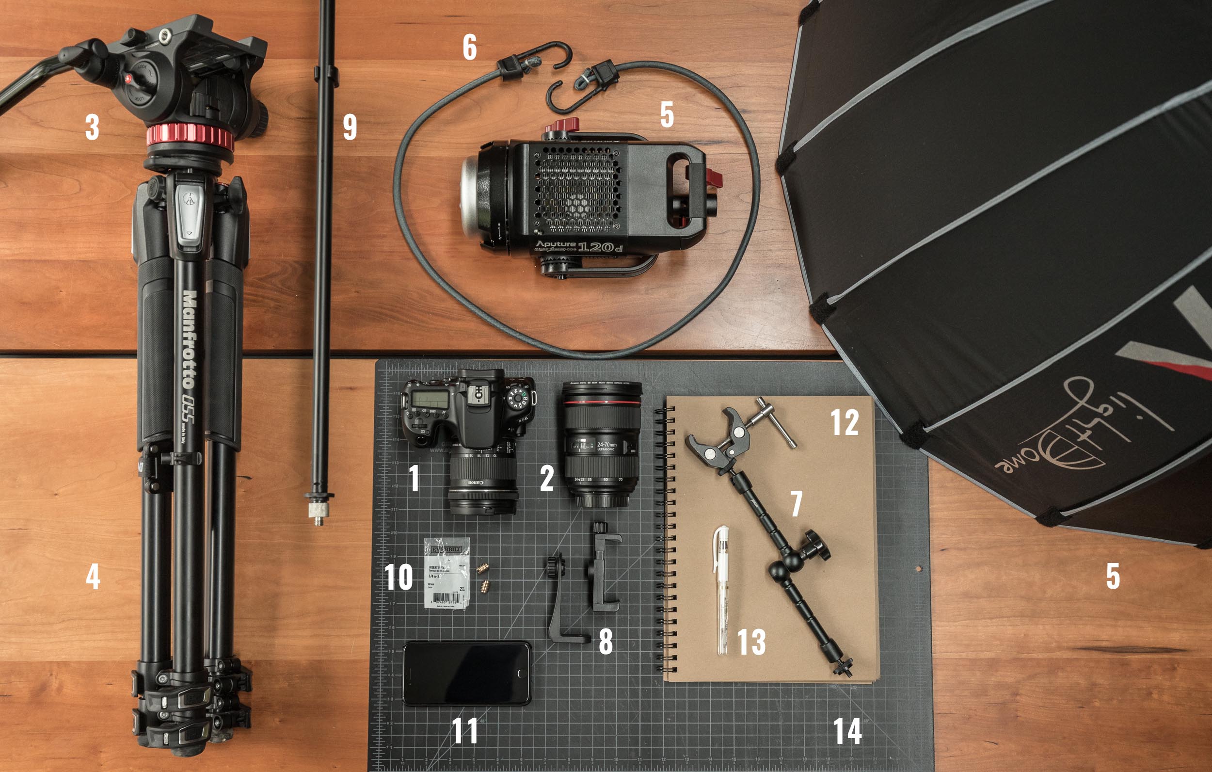
Links to the gear I use:

DSLR CAMERA:
* Canon 6DMKII http://thirtybyforty.com/6dmkii
* Canon 80D: http://amzn.to/2fBWGMQ

LENSES: 
* Canon 24mm f2.8 Lens: http://amzn.to/29l7ac5
* Canon 40mm f2.8 Lens: http://amzn.to/29x2QcI
* Canon 10 - 18mm f4.5 - 5.6 IS Lens: http://amzn.to/2vyErvS
* Canon 24-70mm f2.8L Lens: http://amzn.to/2DMt0Y5
* Canon 16-35mm f4L IS Lens: https://amzn.to/2Emj9Ev

Day in the Life - An Architecture Vlog

Follow a typical day in the life of an architect. Part architecture vlog, part behind-the-scenes look at some of the tasks architects work on each day: from designing a set of elevations to managing projects in construction, to writing specifications, to managing an office, and how to deal with the inevitable creative blocks creatives face on a daily basis.

I intentionally structure my day to be divided between making in the morning and managing in the afternoons, with a mid-day transition break for exercise. Learn why this works for me and follow along as I work through some of the most common struggles an architect faces in daily professional practice.

For aspiring architects, architecture students, and those curious about exactly what it is that architects do each day.

No Longer (Just) An Architect

An excerpt from a conversation I had with Maleick, a 22-year old architecture student from Baltimore. He’s preparing to graduate architecture school this spring, making plans, weighing his options and struggling with the anxiety of not knowing what’s next.

Twenty-two years ago, I stood where Maleick stands today, entering the profession with the same concerns, the same worries. And today - twenty-two years later - I’m no longer an architect. Yes, I have the degree and the license and buildings I’ve designed, but the profession I stepped into back then no longer exists. There are no more architects in the singular sense of the word. Today I’m a photographera graphic designer, a marketer, a filmmakera writer, a negotiator, an editor, a curator, and a creator. Professional practice is anything and everything we design it to be.

Approaching practice with a creator's mindset has allowed me to explore a spectrum of influences and interests and incorporate those into my work as an architect. In much the same way, my architectural training informs and colors my other creative pursuits.

The uncertainty remains though as a part of life. What do you think? Did I get it right?  What advice would you offer a soon-to-be graduate?

Happy New Year - 2018

After a brief break for the holidays, I'm excited welcome 2018 and get started on everything I have planned. With my design boards full of new work + new collaborations, and a renewed vision for the YouTube channel, I wanted to share one of my favorite videos from 2017 here on the blog. Cheers...!

5 Things Every ARCHITECT Needs (under $20)

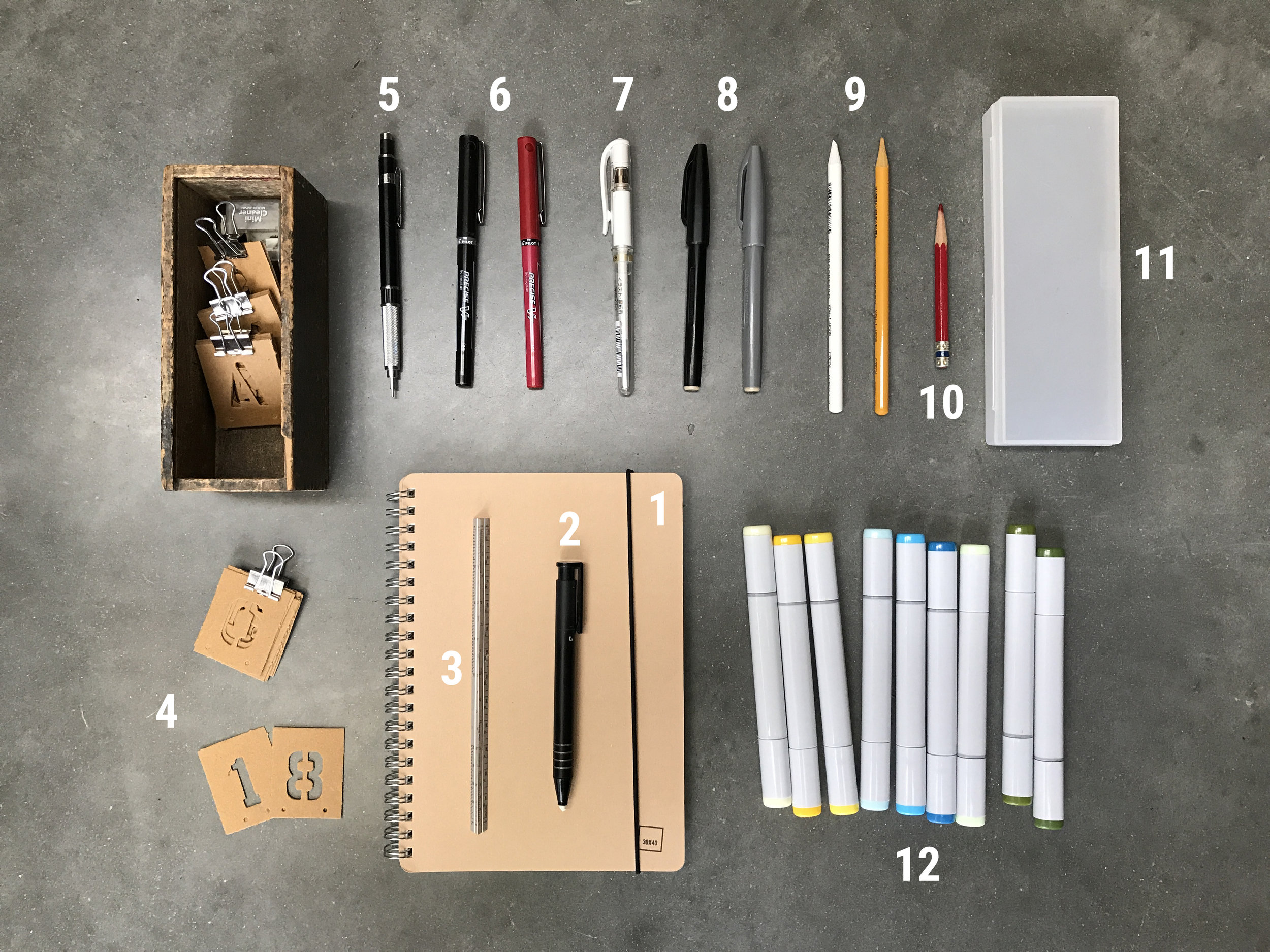
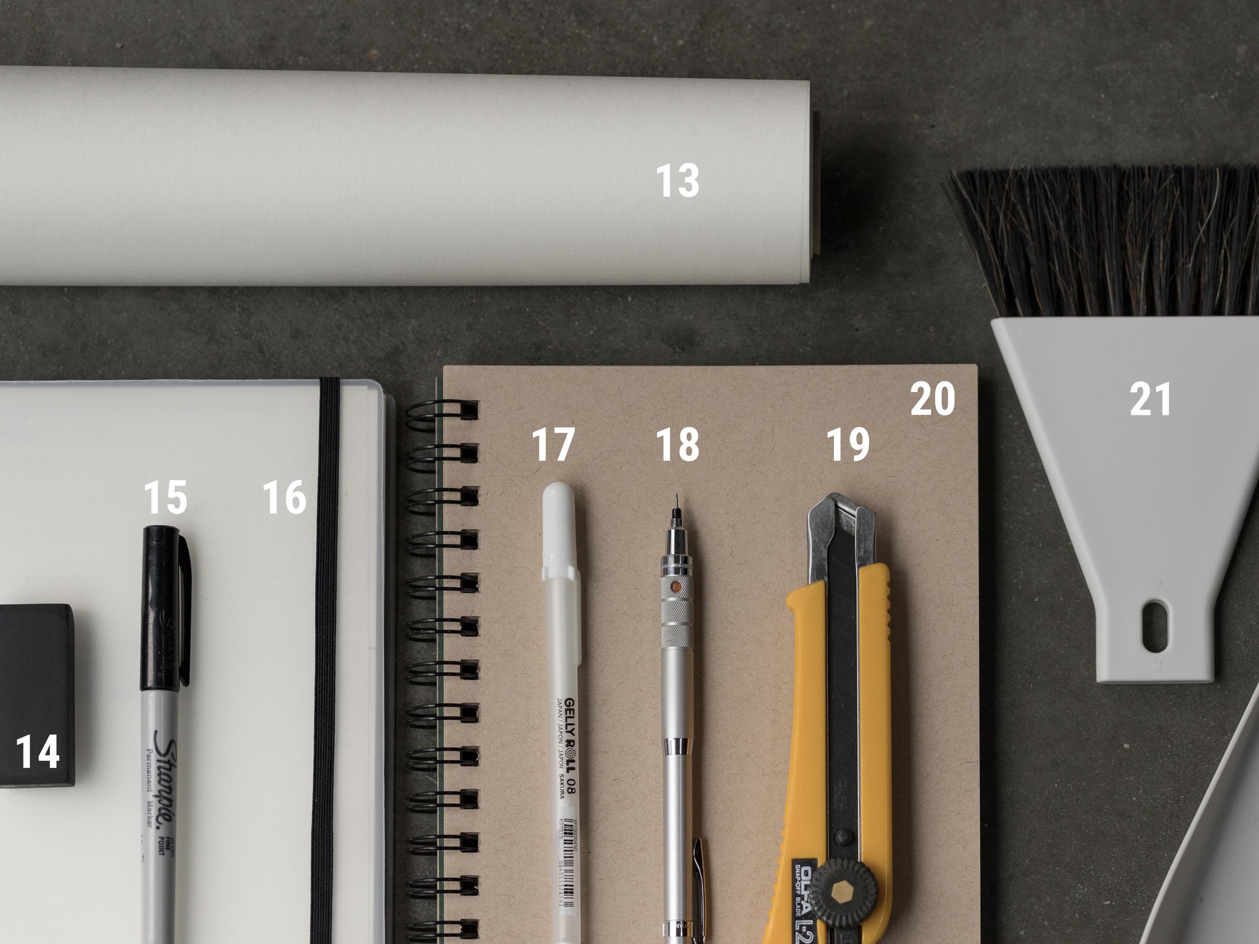
Sharing (a few) of my favorite items from my everyday carry - all under $20 - that every architect (and student) needs as well as a philosophy on living a creative life. These tools are the raw materials for design, the inspiration comes from within, in this video I share how I refill my creative stores week after week; it's a reminder for architects, aspiring architects, and students alike.

My updated list of daily carry can always be found here.

5-things-blog.jpg
5-more-things.jpg

Copic markers are alcohol based which makes them fantastic for blending. They’re what I use 100% of the time when working on trace. I’m always asked to share my favorite colors. If you’re just getting started sketching, I recommend starting with the neutral grays first.

Grays:

Neutral Gray Sketching Set (set of 5 + .5mm multiliner (won’t smudge like other inks will when used with the Copics)

Colors:

YR27, YR23, YR20 (set of three)

Y00, Y13, Y18 (set of three)

Links to other favorites in this post.

Architectural Design Process : Form, Orientation and Sunlight

Learn how you can use the Sun to locate, orient, shape, and inspire the details for your architectural design. In this video, I walk you through the design process for a project whose form, orientation, and details were all developed by carefully analyzing the solar path on the building site.

Floor Plan Design Tutorial

In this design tutorial I'll show you how I develop and sketch floor plan ideas quickly. From diagram to rough sketch and on to more formalized plan layouts, you can follow along as I show you everything you need to draw a floor plan using one of our new residential projects as an example.
 

I discuss in detail: 
- why you should start with diagrams (and not floor plans)
- information you'll need before drawing
- tools I use and recommend
- tips for developing better ideas
- form, space, and order (of course)
- using grids
- scale
- and what I listen to when designing...

Book Review: Operative Design + Conditional Design

Reviewing two architecture books: Operative Design + Conditional Design and sharing my thoughts on the kit-of-parts design methodology they promote. Together these volumes are an excellent primer on architectural form making, iterative design, and can serve as handy portable, pocket-sized reference manuals. The diagrams are beautifully composed in full-color and the accompanying text - although brief - offers enough information to guide the reader / viewer on the book’s use. Recommended for: architecture students, teachers and professionals looking to revisit first principles or reinvent their own tired formal language.

**Operative Design: A Catalogue of Spatial Verbs**
**Conditional Design: An Introduction to Elemental Architecture**

Be an Amateur (Architect)

Learning from the life and work of Charles and Ray Eames, in this video I discuss why it's important to approach problems with the mind of an amateur. The Eameses believed in never delegating understanding and that one must learn by doing. It's this ethos of experimentation and the use of various media types for artistic expression that's fueling my architecture practice today. And, it's positively effecting how many people I'm able to reach and impact in the world. You'll learn how I've applied the amateur strategy to release my first film and to make better architecture.
***I'm also proud to announce that my short film: A Choice to Make (you've seen it on YouTube right?) was selected to be screened at the 9th annual Architecture and Design Film Festival held in NYC (adfilmfest.com) on November 1st through 5th of 2017. I'll be there and if you're in town, I'd love to meet you there too. Come say hi and feast on some architecture films at the CINÉPOLIS CHELSEA, 260 W 23RD St, NY, NY.

Architectural Plans Tutorial - How I Draw Floor Plans

Want to see all of my tools + gear?

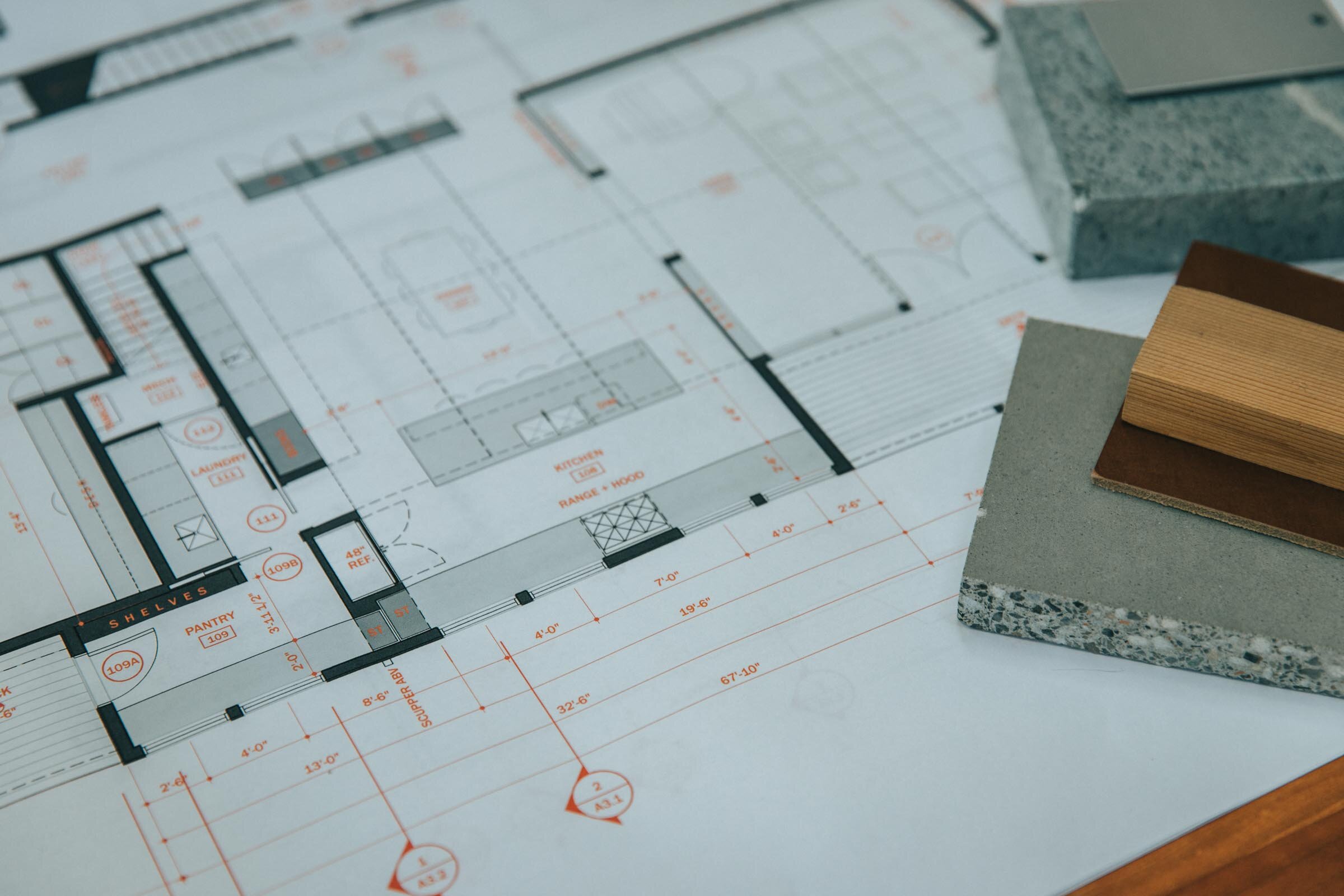
In this architectural plan drawing tutorial I'll walk you through the exact settings, line weights, pen styles and layers I use to develop digital architectural drawings for my residential architecture practice. We’ll focus on how to recreate the floor plan you see in the thumbnail image below. You'll also learn how architects choose what to draw, how we approach our drawings conceptually, and how we organize information.

I use AutoCAD for all my drawing work right now, but you can do this with any tool you have on hand: pen, pencil, Revit, another BIM software, whatever you choose. Tools don’t make the drawing, you do. I use probably the most primitive form of CAD there is, Autocad LT; so that’s proof in itself that you don’t need multiple thousand dollar BIM software to make nice drawings. Use whatever tools you have available.

An architect’s job is to order things and this certainly extends to our drawings too. There’s the organization of the linework on the page - the layout of the sheet - and there’s also the order of information that you’re depicting - the overall drawing hierarchy. Each requires that you know exactly what you’re trying to communicate. Now, I want to keep this simple for this tutorial so I’ll really just be going over how I draw floor plans but the principles apply to all the different types of drawings. The goal of a floor plan is to show the relationship of the spaces to one another, all the physical features of the interior and exterior spaces and to precisely describe the real dimensions of those relationships. It also serves as a sort of overall map to show the team of tradespeople – the ones you’re relying on to construct your architecture -  where to look for supplemental information. So it’s naturally a diagram; we can’t show everything, we have to decide just what’s important and leave out the rest.

A floor plan is an overhead view of a horizontal cut through the building usually taken at 4’ above the floor level and of course, it’s drawn to scale. And so, the first ordering principle is that the things you’re cutting through – primarily the walls – should always be the heaviest lines on the page. So key concept number one has to do with lineweight, and if that’s a confusing term check the video in the cards for another tutorial where I describe exactly what that is and its importance.

These drawings look this way because there’s a strong contrast between lineweight the very thin lines and the very thick ones. In CAD when we’re drawing we draw on different layers. Each layer is transparent and they stack together to form the drawing. You can control what you see and what you don’t by turning layers on and off. Separating things into layers allows us to modify our lineweights – among other things – to quickly change what’s being depicted as heavy and what’s not. The process of design involves many changes, so keeping things organized on separate layers will allow you to change things efficiently. Now, I like to keep things ultra-simple and for this exercise especially: I set up my layer groups by lineweight, that’s all. Some architects and consultants use hundreds of layers and I suppose in some cases it makes sense assuming you need that level of control, but I recommend starting with just a few. Mine are in a template file that I use to start new drawings and they’re described very simply: from heavy all the way to superfine. I also have a few additional layers which are helpful: one is for annotations – things like text, dimensions and detail bubbles, one for hidden lines – to show something above or below and then one for hatch patterns. I can turn off any of the layers I don’t need, so I can work more quickly or in a less-cluttered environment. So, you may need more or less depending on the type of work you do, but this is a nice simple place to start. Any heavy lines you want to draw, you’ll put on the heavy layer, very thin ones on the superfine and so forth. In this way, it’s a bulletproof system for forcing you to pay attention to lineweight, which is – I think - the most important thing in making your drawings graphically convincing.

My CAD program is setup to print these lines according to their color and color is assigned by layer. So if I’m drawing on the heavy layer, the line is always white and white always corresponds with a certain line thickness. Make sense? White is always associated with a certain thickness which is set in - what Autocad calls - the color table. But all of that is not really important, because whether or not you’re not using Autocad you can simply change the thickness of the line. In Autocad I use polylines to change thickness but there are other ways even in autocad and your software might call it something altogether different. By changing thickness, this adds even more control over how much punch your drawing has and what’s nice is that it’s clearly visible on the screen as having a heavier lineweight. Now, if you start making really thick lines everywhere just appreciate the fact that when you change the scale you’re printing your drawing at, the lines will look thicker or thinner so just be aware of that. For the quarter inch scale residential floor plans I’m drawing here, I like to draw the outer edges of the exterior walls on the heavy layer and add a little extra punch by using a 1” thick polyline. If you make a template drawing with a variety of thicknesses in it, you can adjust to whatever scale you’re printing or working at. If you’re drawing by hand, lay your walls out first, then come back later and add a heavier outline with a softer lead or darker pen.

To get into the nitty gritty, on the floor plan drawing, exterior walls are assigned to the heavy layer and I show them as a 1” thick polyline as I said. The medium layer is very close to the heavy one in weight and so I use it for accenting things like the top risers of stairs, or site retaining walls, or site boulder groupings. I use the ‘light’ layer for floor edges, door slabs, window frames, counters, cabinetry, and plumbing fixtures, while door swings and window sills I put on the superfine layer. Also on the ‘superfine’ layer I put all the wall sub-assemblies, things like stud framing lines or substrates like plywood sheathing or tile backer. But, more on this shortly. Furniture is drawn on the extra-fine layer, floor hatches on the hatch layer, cabinets and counters are hatched differently depending on how tall they are too. Overhead lines are on the ‘hidden’ layer and text and annotations are on the ‘text’ layer, again more on this in a minute.

The next key concept is to use screening. Now, I’m not talking about hatches per se here, but using screened pen weights. I use everything from a 10% screen all the way up to an 80% screen. In my color table - the file that tells my printer what to print - I’ve assigned the colors 201 – 208 different corresponding screened pen weights. So, anything assigned color 201 prints as a 10% screen, 202 is 20% and so on. And, you can apply this to your thick lines for even more control over how something looks and for even more variety, you might change the linetype too. Take a 1” thick line and assign it the 201 color and a hidden linetype and now you have a thick dashed line with a 10% screen which might be great for showing ventilation runs on a floor plan for example or use a solid one for a handrail or a louver vent in an elevation.

You can also apply this technique to our next key concept which is: using hatches to add depth and detail. Hatches are basically patterns that infill certain boundaries in your drawing, they can be made up of tiny dots, shapes, crisscrossing lines or dash-dot lines, or – my personal favorite - solids. When you start using hatches along with the screened pen weights, you have nearly infinite options for creating depth and subtlety in your drawings.

I use hatches to shade in the exterior walls – what architects call poche – in this drawing it’s an 80% screen on a solid hatch so color 208 on the hatch layer. I use hatches to indicate materials: like wood flooring, concrete block or tile patterns and I also use them for shade and shadow to call attention to something important in the drawing. On floor plans I use a variety of scales of dot pattern hatches on say descending stairs or as angled lines to show a partial height wall or cabinetry or a countertop surface. I also use solid screened hatches on all my glazed surfaces on exterior elevations, from between 40 and 60% screening. I use them in for the tree backgrounds too the ones you see here in the elevation drawings. I basically use them everywhere I can because they help call attention to things that are important and they add a softness to the drawing that I think looks I don’t know, painterly I guess.

Scale elements: By adding furniture, scale figures, cars, trees and other elements to indicate scale you’ll introduce a real sense that your architecture is meant to be inhabited. Doing this also ensures you’re accommodating the regular elements your end users will need to functionally use the architecture as well. Knowing your client wants to use an 8’ sofa will help you locate the floor outlets nearby and ensure it’s not obstructing a door swing.

When you’re drawing plans it’s good to begin thinking about materials and systems too. It’s okay if you’re missing this information early on and you’re working on conceptual plans, but I like to begin with at least some idea of how I’ll be constructing the building. For example, is it a masonry exterior? Is there a glass curtain wall? Concrete, wood framed walls, finishes, each of these materials has a thickness and when you start to turn corners and add jogs or if you begin intersecting different buildings or surfaces, knowing what those materials are becomes really important when you’re drawing.

Your final floor plan drawing can be as general or as detailed as you’d like, but the more detail you imbue your drawing with, the more useful a tool it will be later on when you’re drawing column details or figuring out how the glazed wall meets the concrete retaining wall. When I begin drawing a plan, I choose a wall thickness and some basic finishes as a starting point. So here I started by laying out the exterior face of the stud wall on the superfine layer. For our squid cove project we actually started with a double 2x4 stud wall on the exterior spaced apart to prevent thermal bridging. So I offset the outer perimeter by three and a half inches the width of a 2x4 wall, and then a quarter inch for the break, then another three and a half for the inner stud wall. Then I offset the interior finish thickness of ½” for the gypsum wallboard, then on the outside 1/2” for the exterior sheathing and another inch for the exterior shingled walls, Now, along the way, as the pricing came back for the double 2x4 wall system it was a lot more expensive than we anticipated so we had to change it back to 2x6 walls. Now, because windows take a long time to fabricate, this change actually happened after our windows had been ordered and so those openings were fixed on the plan, we had to use those openings. So, we were left with this detail at the interior corners to resolve. Knowing the actual systems and sizes of everything around them allowed us to design the trim around the windows that not only matched the detailing on the rest of the project but made it look like it was an intentional design decision. So when you can, show finishes. They also fill in this fine layer of linework that makes the contrast between thick and thin really pop.

Lastly, sort of the icing on the cake, we have the annotations. Annotations round out the information you’re conveying on the plan. They’re really important wayfinding tools for the contractor so they need be very clearly organized. I use red text to make it clear that the annotations are a part of another ordering system and also something they need to pay attention to. And, the ink is just pennies more to print them in color, honestly…I think it’s so worth it. You could make it blue or gray too, whatever you choose. I like the red because it’s easy to point to a note and say, it’s noted in red, hard to miss, right? This works in both directions by the way, so if it’s your mistake it’ll be pretty apparent! Annotations describe things you’re not able to draw, they reference other drawings and details, and should all be on the ‘text’ layer so you can turn them on and off as needed for presentation or while you’re making other changes to the plan. Annotations grow over time, they’ll be basic at first things like room labels and they’ll get progressively more numerous as you make design decisions. Now, I’m begging you please…please, please…don’t use those hand-lettered fonts…just uninstall those from your computer. I use Franklin Gothic for mine, but anything but the chiseled pseudo-hand lettering should be fine.

You’ll know you’ve done this all correctly when you squint your eyes and you can easily see what’s important. Do the walls stand out? Do the annotations fade. As you spend more time looking for information, more information should become apparent, almost like a pull focus or slow reveal. Light lines of the hatches should be the first to fade and last to come into focus.

So that’s it, I hope it was helpful!

If you want my template, there are two versions available:

AutoCAD template

Revit template

Best Computer for Architects

See our updated guide of the best computers for architects here.

A guide to choosing the best computers for architecture. Whether you're a student, pro, or in a related discipline, this video will walk you through my methodology and selection criteria. I discuss in detail:

  • Laptops vs. Desktop Systems

  • Mac vs. Windows

  • Software (commonly used and requirements)

  • Hardware: CPU, Graphics Cards, Monitors

Discover why I chose the system I did and what it means to my architecture practice and daily workflow. A behind-the-scenes look at how architects use computers. 

LAPTOP: 2017 MacBook Pro
DESKTOP: 2017 Apple iMac

How I find Architectural Ideas

Eight strategies I use to find architectural ideas and confront - the intimidating - blank page.

Topics covered:

  • Bisociation 

  • Trusting the design process

  • Embracing constraints

  • Inventing deadlines

  • Doing the opposite (anti-project)

  • Subtracting to solve

  • Stealing (like an artist)

These are just a few of the design tricks I use to help grease the creative wheels and instill the confidence I need to keep moving forward. What's great is these techniques work for a whole host of disciplines and creative fields, they're not exclusive to architecture.

Books mentioned: 
The Art of Thought
The Act of Creation


Frank Gehry MasterClass Review

An architect's review of the Frank Gehry Masterclass: what to expect, what you’ll get, who I think it’s for, my favorite lessons, and whether I think it’s worth taking.

Gehry is a polarizing figure in the architecture world. But, whether you love or hate his work, the fact that he’s realized - what are sure to be - some of the timeless architectural icons of our time demands respect and further study.

Watch the video to see whether I think the course delivers on all that it promises.

Storing Architectural Samples in the Studio

I'm limited in the studio by the amount of space available to store things and material samples can take up a lot of room. I've seen many types of storage racks used in studios where I’ve worked and tried a number of things myself here in the studio – from metro shelving, to archival folios and wooden, felt and cardboard boxes and bookcases. The problem: they all keep the materials hidden. So although they’re great from an organizational standpoint from a creative standpoint they're stifling. I’m much less likely to grab a material while designing to help me solve a problem or during a meeting if I have to dig through boxes to find what I’m looking for.

When I stumbled across this inexpensive baking cart it seemed perfect and I had to try it out. Learn more in the video.

How to Choose Architectural Materials

Architecture can’t exist on a page it must be built. Transforming drawings and tiny cardboard models into physical reality means choosing materials to represent our ideas. In part four of the architecture short course I discuss materials – how architects choose them, how we know what’s right, how they can shape how we feel in a space, how they influence our designs, and a rubric you can use when selecting your own.

Instead of an abstract exercise, I walk through the precise process I used to choose the materials for the case study project we’ve been following throughout the course.

Links to all my favorite material resources.